The guidelines below help you ask the right questions to create an on-brand video and apply best practices using video to represent our brand.
On-brand video checklist
1
Communicate a clear idea around “Smarter technology for all.”
2
Reflect our purposeful, unexpected and brave personality.
3
Follow our aesthetic guidance to reflect our brand personality.
4
Use our custom supporting elements to further produce your video.
5
Apply a sonic video end bumper.
6
Use music from our sonic asset library or choose a track that follows our music identity.
7
Check that all logos are correctly applied.
8
Use approved typeface in all instances.
9
Ask yourself, if I didn’t see the logo, would this video still feel like it came from Lenovo?
10
Reach out to the brand team if you have additional questions.
Formatting
Videos initially created for one purpose may have multiple use cases. To ensure a video can be used across markets, always follow these guidelines.
Aspect ratios for online
Aspect ratios are chosen based on content, platform and video consumption.
16:9 - Full landscape
The 16:9 aspect ratio, also known as widescreen, is commonly used for video content across various online platforms. It provides a wide viewing area, making it suitable for displaying videos on televisions, computer monitors and mobile devices.
2.39:1 - Anamorphic
The cinematic ultrawide aspect, known as anamorphic ratio, is great for shooting landscapes with dramatic framing. However, it may not suit small sets or locations as it exposes more of the filming area. For online viewing, anamorphic content can be converted to 16:9 through letterboxing, but this reduces image size and visibility on mobile devices. In such cases, consider using a different aspect ratio.
1:1 - Square
This aspect ratio delivers content through a perfect square and is used by Instagram and Facebook for its carousel format. Most cameras film in this ratio.
But you can film in 16:9 and place your subject in the center of the frame. Then repurpose the footage to 1:1 in post.
9:16 - Full portrait
This format is used by platforms such as Instagram Story, Facebook and TikTok.
It can be shot by turning your camera 90 degrees, but filming in landscape (16:9) may be preferable and offer more flexibility in how the footage is used.
Ensure the action is centered if you film in landscape and intend to crop to portrait in post.
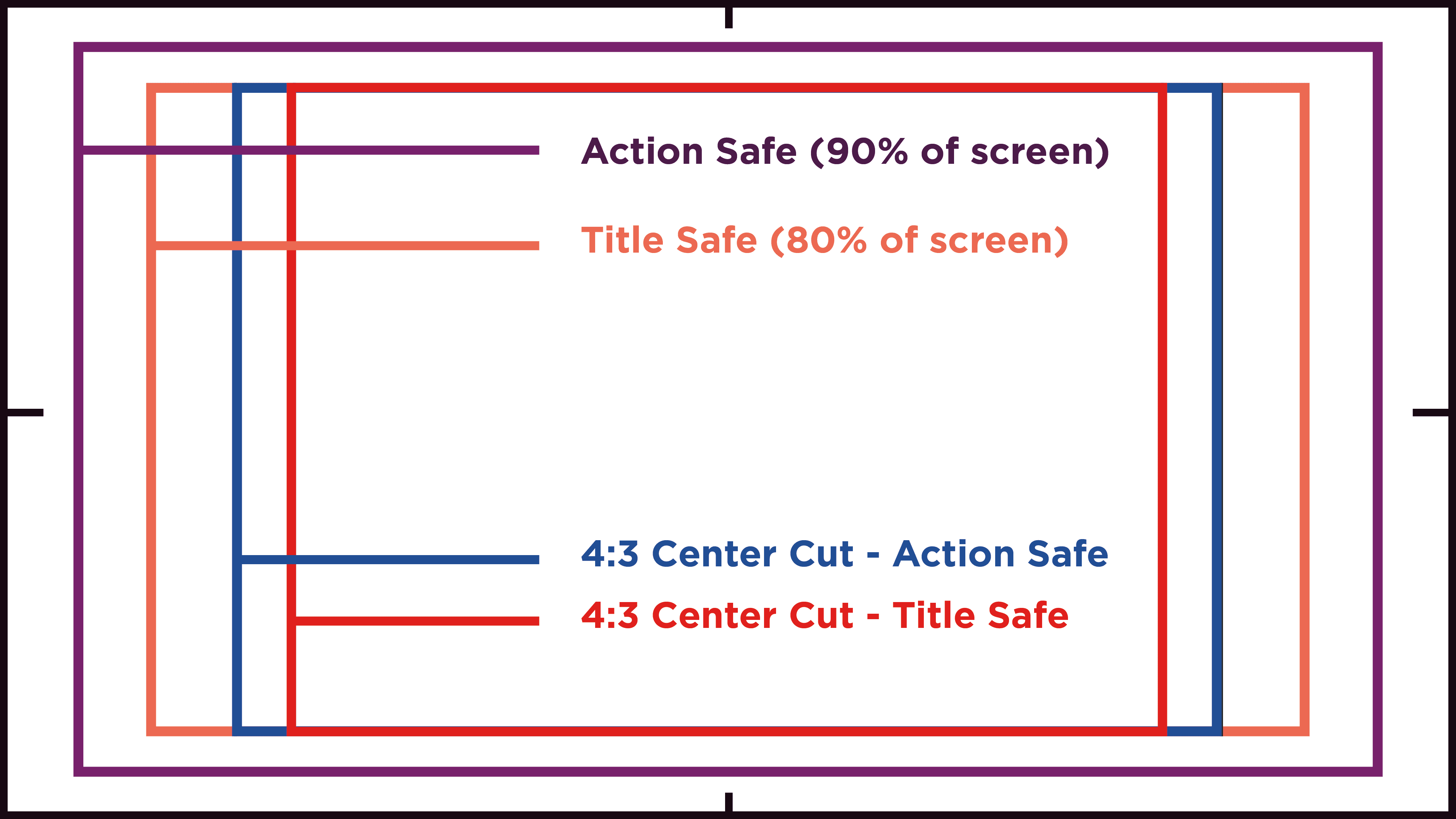
Content safe margins
Using safe areas ensures key content remains visible to most viewers on screens of varying sizes. To achieve this, it’s essential to adhere to industry standards for setting action, title, and formatting safe zones. These guidelines ensure that important visual elements are not cut off or obscured, regardless of the device or platform on which the content is viewed.
Action safe
To ensure visibility on all screens, all critical visual content such as characters, objects or important action should be placed within 90% of the screen size.
Title safe
All text elements, including logos, titles, subtitles and captions, should be placed within 80% of the screen size.
Center cut safe zone
Always create a center cut of footage where the majority of action appears in the center of the frame. This makes the video easier to resize for other formats such as 1:1 and 9:16 ratios.

Accessibility
Embracing accessibility standards fosters inclusivity and a commitment to a more equitable and inclusive digital landscape.
By adhering to accessibility standards, we guarantee that our content is inclusive and usable by individuals with disabilities, including those with visual, auditory, cognitive or motor impairments.
Global guidance
Across global assets, the importance of accessibility standards may vary due to cultural, technological, and regulatory differences. In some regions, there might be stringent legal requirements mandating accessibility in digital content, while in others, it may be more driven by corporate responsibility or market demand.
Considering global diversity, it’s crucial to adopt a flexible approach to accessibility. This involves understanding the specific needs of different audiences and tailoring video content accordingly.
Subtitles & captions
Recommended subtitle treatment:
- SRT: Gotham Book
- Opacity: 100%
- Font size: 47 (16×9), 33 (1×1)
- Font: Gotham Book
- Kerning Notes: None/0
- Background Shadow: 100% opacity, 15% size
Additional guidance:
- Provide uncaptioned videos containing separate SRT files for subtitles or captioning.
- SRT files should indicate dialogue, voiceover and any audio descriptions that affect comprehension.
- Provide a text transcript or document without timestamps.
- Ensure subtitle font legibility in size, contrast and pacing.
- Ensure appropriate safe area so that subtitles are not masked by platform/channel content.
- When using open captions, publish a text transcript with the video.
Video content
- Minimize the use of flashing lights, rapid transitions or intense visual effects that could trigger seizures.
- Use high-contrast color combinations for text and graphics to ensure readability.
- Avoid relying solely on color to convey important information or distinguish between elements.
External resources
Audio and Video Accessibility Guidelines (WCAG)
W3’s recommendations set the industry standards for accessible web and digital media experiences.
Text on Background Image Accessibility Check
This text-over-image accessibility tool helps you determine how legible text is based on color contrast.
