Red is our signature color. It doesn’t overwhelm but rather sets us apart from the competition and helps to create a strong and memorable visual identity.
Used first in the logo, our signature red represents the heart of the company and our passion to deliver smarter technology for all. The new palette works to elevate our signature red logo, allowing a bespoke vibrancy while streamlining options for a more harmonious and unified appearance.
Combining color
Visit the backgrounds section to explore smarter gradients, bespoke combinations of our brand palette that work to elevate our signature red.

Brand palette
Hierarchy
We have three levels of color in our brand palette: primary, connector, and secondary colors. Our signature red is always applied to the Lenovo logo. While red is our primary color, consider the entire spectrum and never use it without the connector and secondary color palettes to ensure the clarity and legibility of the Lenovo signature red logo.
Signature Red
PMS 485c
CMYK 0.95.100.0
RGB 225.37.27
Hex #E1251B
Primary
Red is the primary focus of our palette and should be present in all Lenovo touchpoints. It should rarely appear without our connector or secondary colors.
Connector
Purple is a harmonious companion to our red and is our connector color. It should be present in all Lenovo touchpoints.
Secondary
Blue is our secondary hue used to elevate the red and purple. It is vibrant and adds a bit of coolness to the palette when used together. The neutral palette is a cohesive selection of warm tones that should play a minimal role in backgrounds and typography.
Deep tones
Deep Red 1
PMS 1815c
CMYK 30.85.59.70
RGB 100.19.30
Hex #64131E
Deep Purple 1
PMS 262c
CMYK 58.92.12.54
RGB 77.20.74
Hex #4D144A
Deep Blue 1
PMS 2768c
CMYK 100.90.13.71
RGB 17.24.79
Hex #11184F
Black
PMS No conversion
CMYK 30.55.20.95
RGB 31.01.19
Hex #1E0013
Deep Red 2
PMS 7622c
CMYK 16.97.86.54
RGB 135.28.35
Hex #871C23
Deep Purple 2
PMS 7657c
CMYK 47.94.0.36
RGB 122.18.107
Hex #7A126B
Deep Blue 2
PMS 3584c
CMYK 99.83.0.17
RGB 41.78.149
Hex #294E95
Deep Gray
PMS No conversion
CMYK 20.30.10.75
RGB 78.68.78
Hex #4E444E
Mid tones
Mid Red 1
PMS 7620c
CMYK 0.95.94.28
RGB 184.37.46
Hex #B8252E


Mid Red 2
PMS 7416c
CMYK 0.69.65.0
RGB 242.106.82
Hex #F26A52


Mid Gray
PMS No conversion
CMYK 8.10.2.30
RGB 171.168.177
Hex #ABA8B1
Mid Red 3
PMS 487c
CMYK 0.43.40.0
RGB 255.185.162
Hex #FFB9A2


Pale tones
Pale Red 1
PMS 7520c
CMYK 4.26.16.0
RGB 240.199.191
Hex #F0C7BF
Pale Purple 1
PMS 5165c
CMYK 7.19.2.3
RGB 217.193.216
Hex #D9C1D8
Pale Blue 1
PMS 7450c
CMYK 25.13.0.0
RGB 201.208.240
Hex #C9D0F0
Pale Gray
PMS No conversion
CMYK 1.3.1.8
RGB 230.226.228
Hex #E6E2E4
Pale Red 2
PMS 7604c
CMYK 4.12.5.0
RGB 250.236.235
Hex #FAECEB
Pale Purple 2
PMS 663c
CMYK 3.6.0.2
RGB 241.225.237
Hex #F1E1ED
Pale Blue 2
PMS 649c
CMYK 10.2.0.0
RGB 234.238.245
Hex #EAEEF5
White
PMS No conversion
CMYK 0.0.0.0
RGB 255.255.255
Hex #FFFFFF
Specifying color
There are various ways to specify color. We’ve listed the standard and most commonly used systems with each color for accurate color representation across different applications and mediums. Click on the tabs for system descriptions or email the Brand Help Desk for additional color specification questions.
The Pantone Color Matching System (PMS) is largely a standardized color reproduction system for print and material specification.
The CMYK process is a method of printing color by using the four inks represented in the name — cyan, magenta, yellow and black. A majority of the world’s printed material is produced using the CMYK process.
The RGB color model is an additive color model in which red, green and blue light are added together in various ways to reproduce a broad array of colors. The main purpose of the RGB color model is for the sensing, representation and display of images in electronic systems.
A hex (hexadecimal format) color code is used in specifying colors in HTML and CSS. Hex colors are supported in all browsers and begin with a pound sign (#) followed by a combination of six letters and numbers (e.g., #C4BEB6).
RAL colors are used for information defining standard colors for varnish, powder coating and plastics. It is the most popular Central European color standard used today.
Applying color
Signature red should always be used for the Lenovo logo application. The overall composition should never feel monochromatic to ensure the logo is recognizable. Use the other colors in the palette to harmonize the composition, starting with the connecting color purple. When applicable, add accents from the secondary palette.
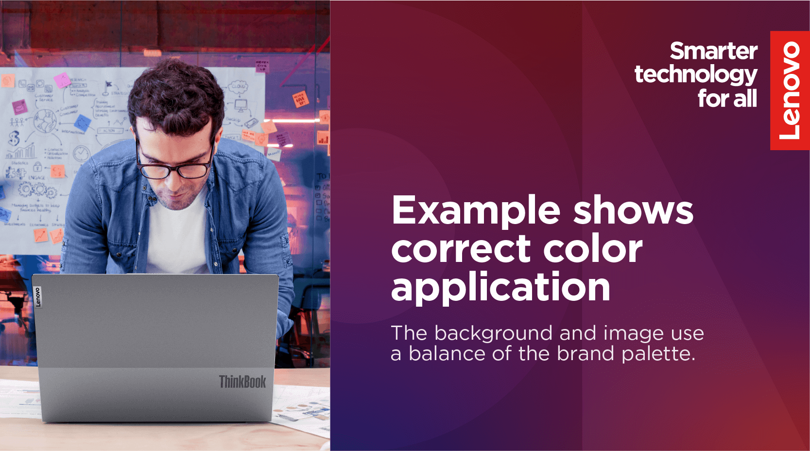
Always use a balanced application of color that allows the signature red logo to stand out clearly from the background color or image.
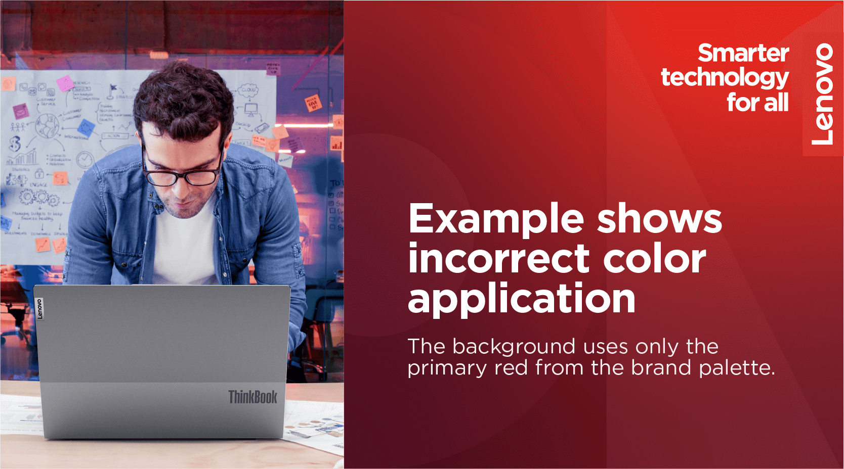
A monochromatic background does not provide enough contrast for the signature red logo or the inclusion of our connector color, purple.
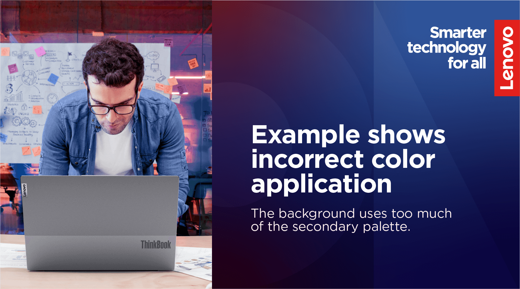
The background applies too much of the secondary palette and lacks the primary red and connector purple hues.
Principles to help apply the Lenovo palette successfully:
Accessibility: Designing for accessibility is crucial to ensure inclusivity for all users, regardless of abilities or limitations. Always adhere to WCAG standards for web and digital applications.
Color contrast: The contrast between the text and background is important for the legibility of elements for those with vision impairments. Use a color contrast checker to check for legibility. Our color combinations below show good choices for color contrast when using our smarter gradients.
Resting space: Use large areas of color to create a resting space for the eye, also known as negative space. Our brave use of color gives us a unique position in the market. Instead of using large areas of black or white, we prefer compositions with our unique smarter gradients.
Type size: Color in typography can help emphasize a key message. When using a smaller font size, consider only using white and black because the line weight can decrease contrast with the background color.
Color combinations
The color combinations below are the ideal color pairings for text and objects (i.e., buttons and icons) when paired with a smarter gradient. Size can be an accessibility factor when text and objects are small. When in doubt, opt for a color pairing that provides the most color contrast.
Passion smarter gradient
White
#FFFFFF
Pale Gray
#E6E2E4
Pale Red 2
#FAECEB
Pale Red 1
#F0C7BF

Pale Purple 2
#F1E1ED
Pale Purple 1
#D9C1D8
Pale Blue 2
#EAEEF5
Pale Blue 1
#C9D0F0
Ambition smarter gradient
White
#FFFFFF
Pale Gray
#E6E2E4
Pale Red 2
#FAECEB
Pale Red 1
#F0C7BF

Pale Purple 2
#F1E1ED
Pale Purple 1
#D9C1D8
Pale Blue 2
#EAEEF5
Pale Blue 1
#C9D0F0
Knowledge smarter gradient
White
#FFFFFF
Pale Gray
#E6E2E4
Pale Red 2
#FAECEB
Pale Red 1
#F0C7BF

Pale Purple 2
#F1E1ED
Pale Purple 1
#D9C1D8
Pale Blue 2
#EAEEF5
Pale Blue 1
#C9D0F0
Curious smarter gradient
Black
#1E0013
Deep Gray
#4E444E
Deep Red 2
#871C23
Deep Red 1
#64131E

Deep Purple 2
#7A126B
Deep Purple 1
#4D144A
Deep Blue 2
#294E95
Deep Blue 1
#11184F
Wonder smarter gradient
Black
#1E0013
Deep Gray
#4E444E
Deep Red 2
#871C23
Deep Red 1
#64131E

Deep Purple 2
#7A126B
Deep Purple 1
#4D144A
Deep Blue 2
#294E95
Deep Blue 1
#11184F
Creative smarter gradient
Black
#1E0013
Deep Gray
#4E444E
Deep Red 2
#871C23
Deep Red 1
#64131E

Deep Purple 2
#7A126B
Deep Purple 1
#4D144A
Deep Blue 2
#294E95
Deep Blue 1
#11184F
Examples of what not to do
These examples represent the wrong way to apply our brand elements. Email the Brand Help Desk for review and/or approval of an asset not within our brand library.
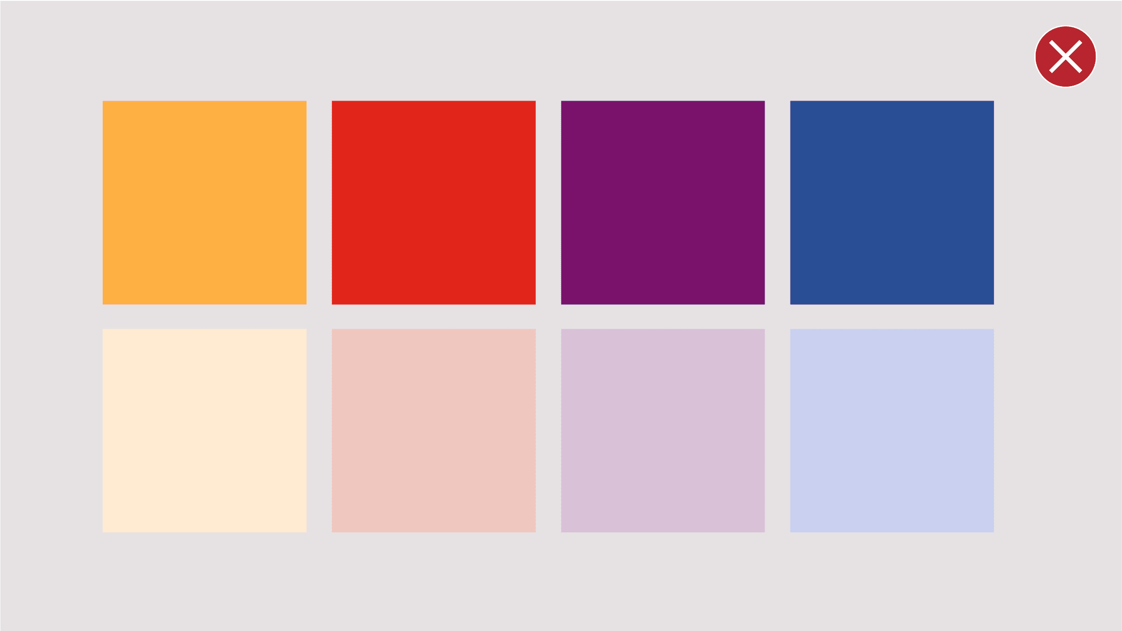
Do not add colors to the palette.
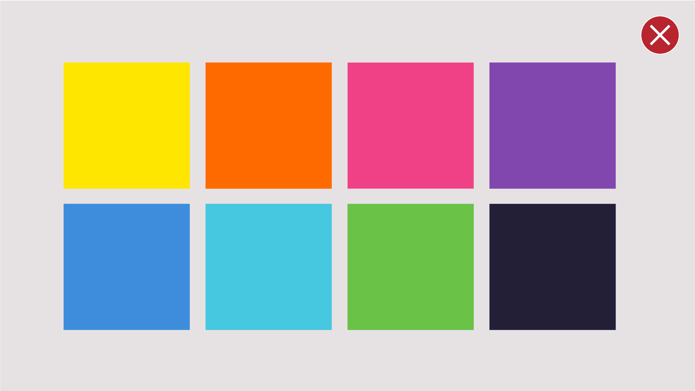
Do not use colors from the previous Lenovo color palette.
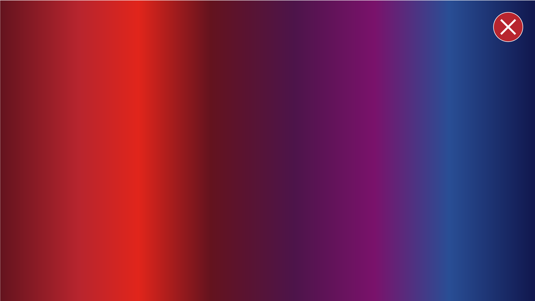
Do not use a combination of colors outside the smarter gradients. Visit our backgrounds section for approved color gradient combinations.
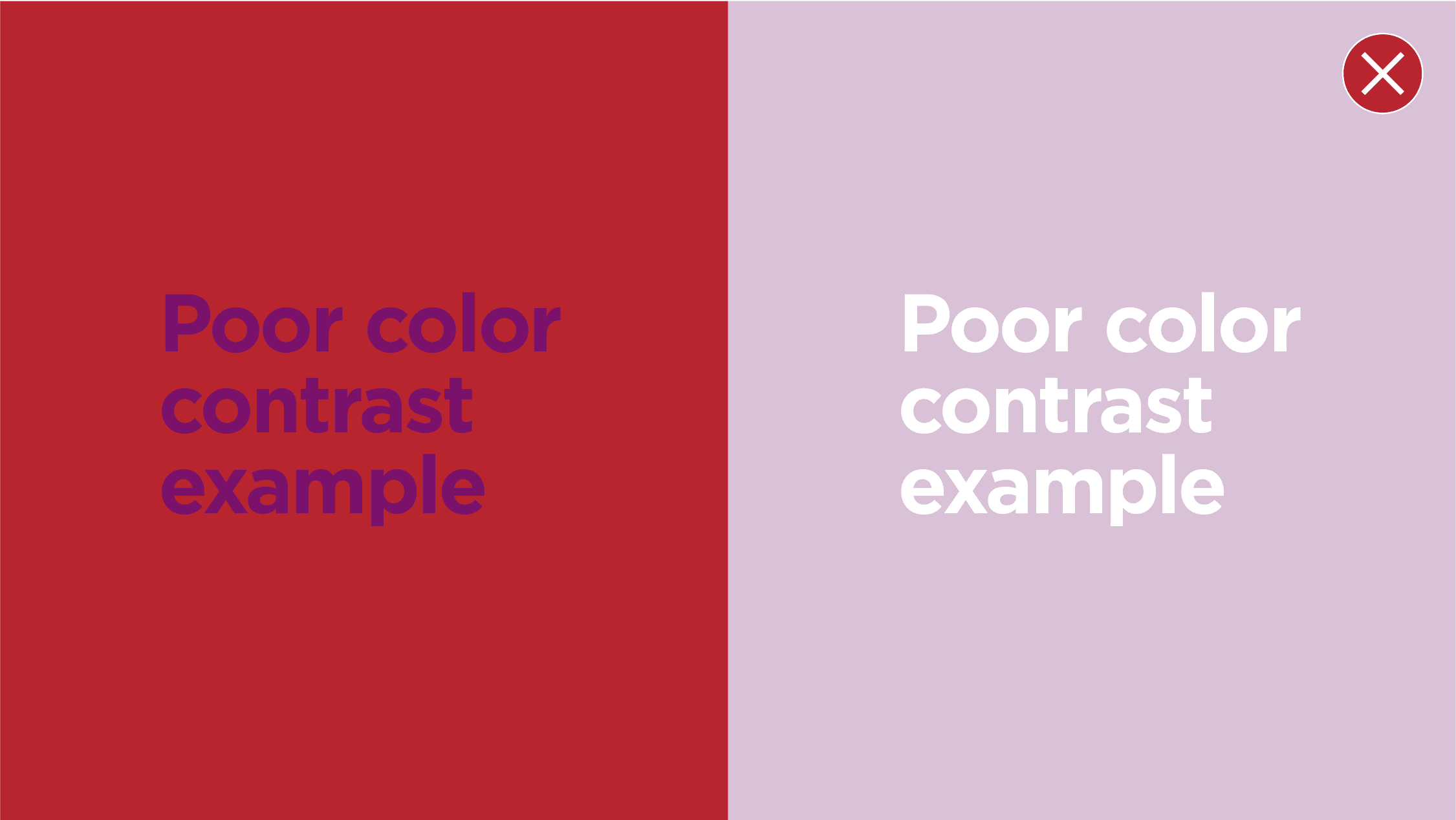
Do not use non-contrasting color in a layout, copy must always be legible.

Do not use the secondary blue palette as a prominent color in an application.

Do not use a single Lenovo brand color to recolor an image. Use the full spectrum of the brand palette.
