The 3×3 grid is our foundation to bring structure, efficiency, and continuity.
The Lenovo 3×3 grid was built using a modular system with the proportions of our Lenovo logo, connecting our visual applications back to our most recognizable asset, the logo. A modular grid uses units that when combined create spatial areas to use for alignment and provide flexibility for page size and overall composition.
Overview
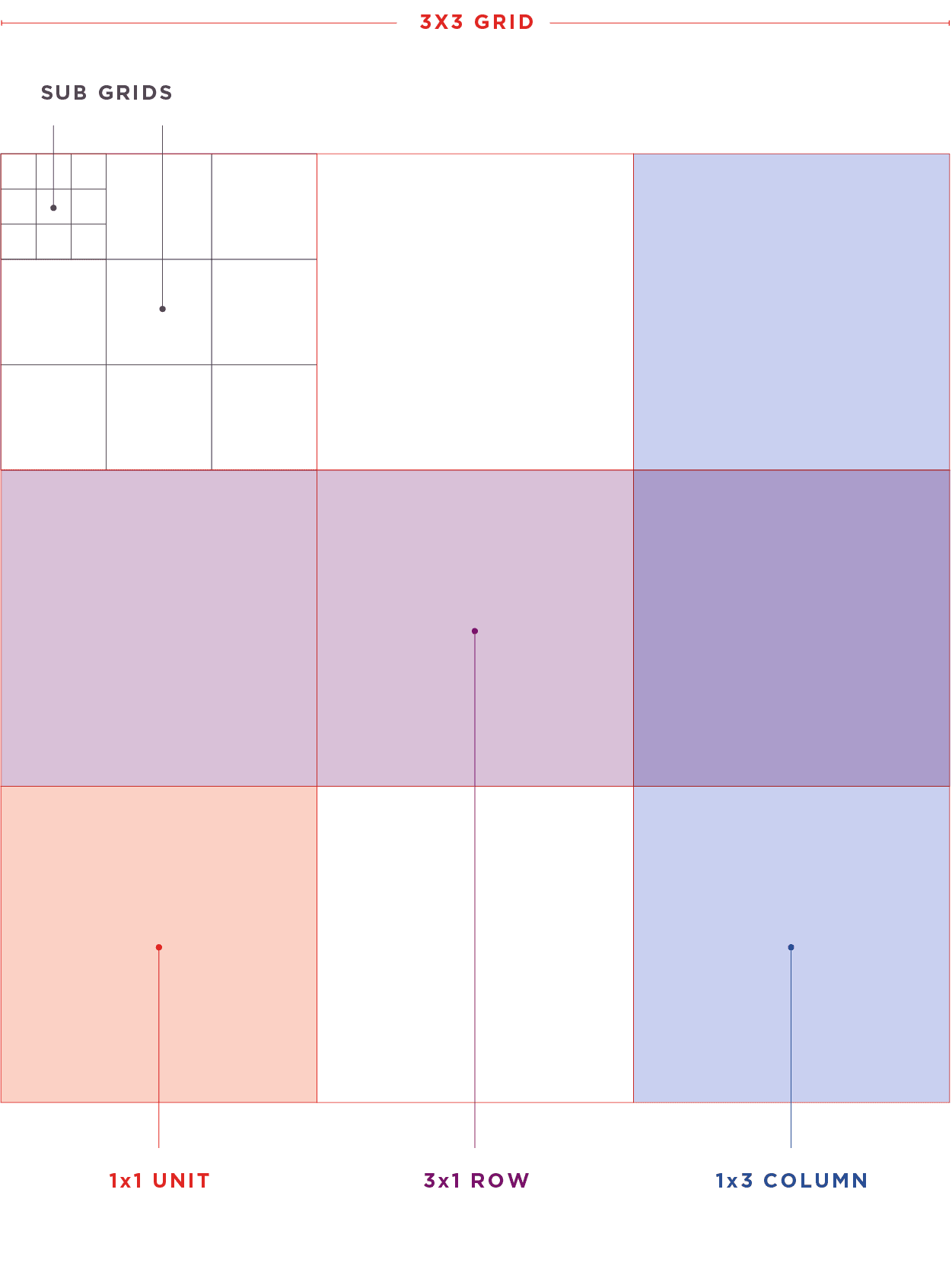
A breakdown of the parts that make up our ‘3×3’ grid.
Unit – Individual square with equal height and width, 1×1 in measurement.
1×3 columns – Three units stacked on top of each other to create the height of the 3×3 grid. This column has the same proportions as our Lenovo logo.
3×1 rows – Three units that sit side by side to create the width of the 3×3 grid. This row has the same proportions as our Lenovo logo.
Subgrids – smaller 3×3 grid that is sized to fit within a single unit.

Applying the grid
Using the grid
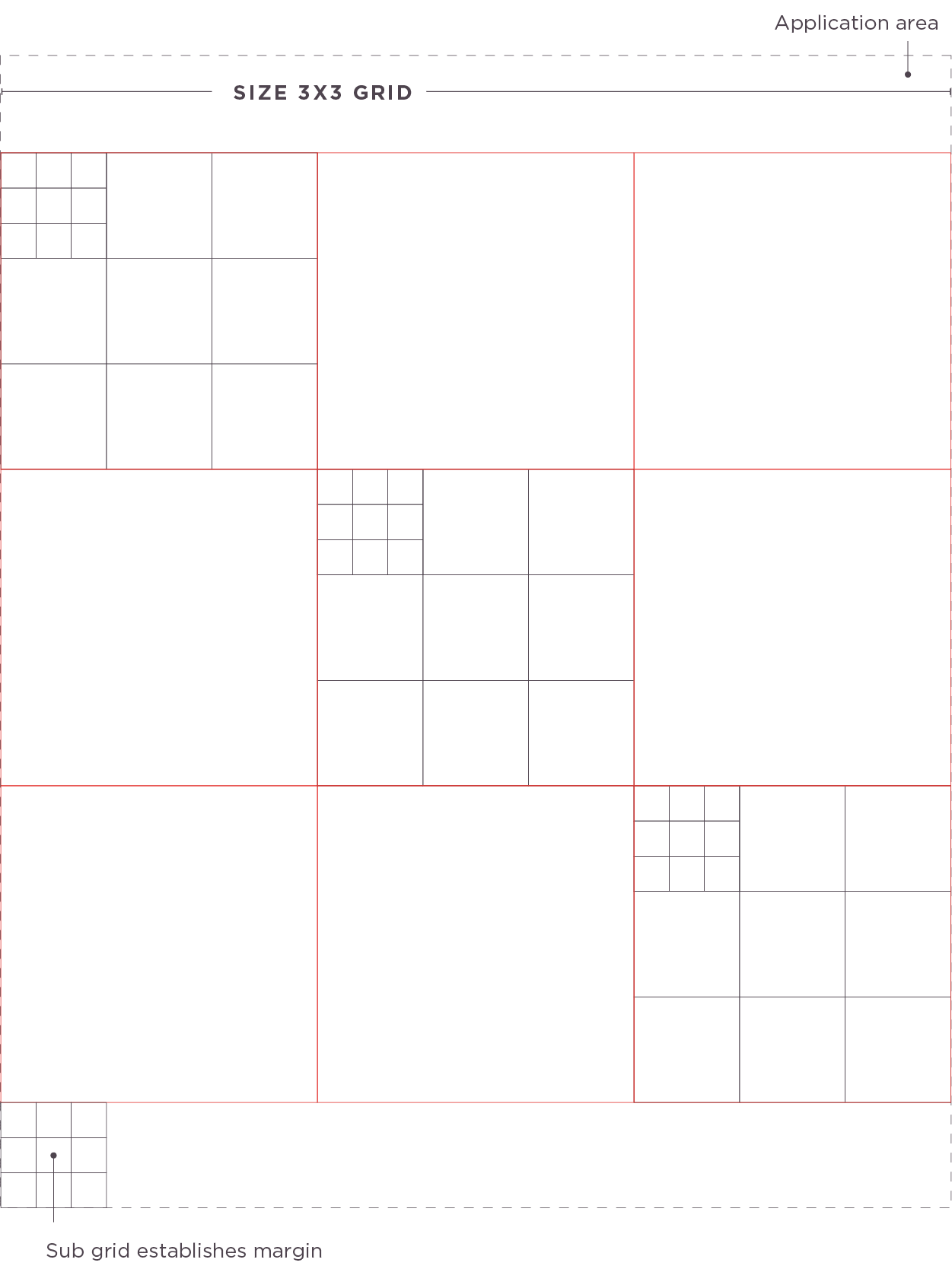
Apply the grid to an application by first positioning the 3×3 grid to fit within the application area, size either the height or the width to the shortest measurement.
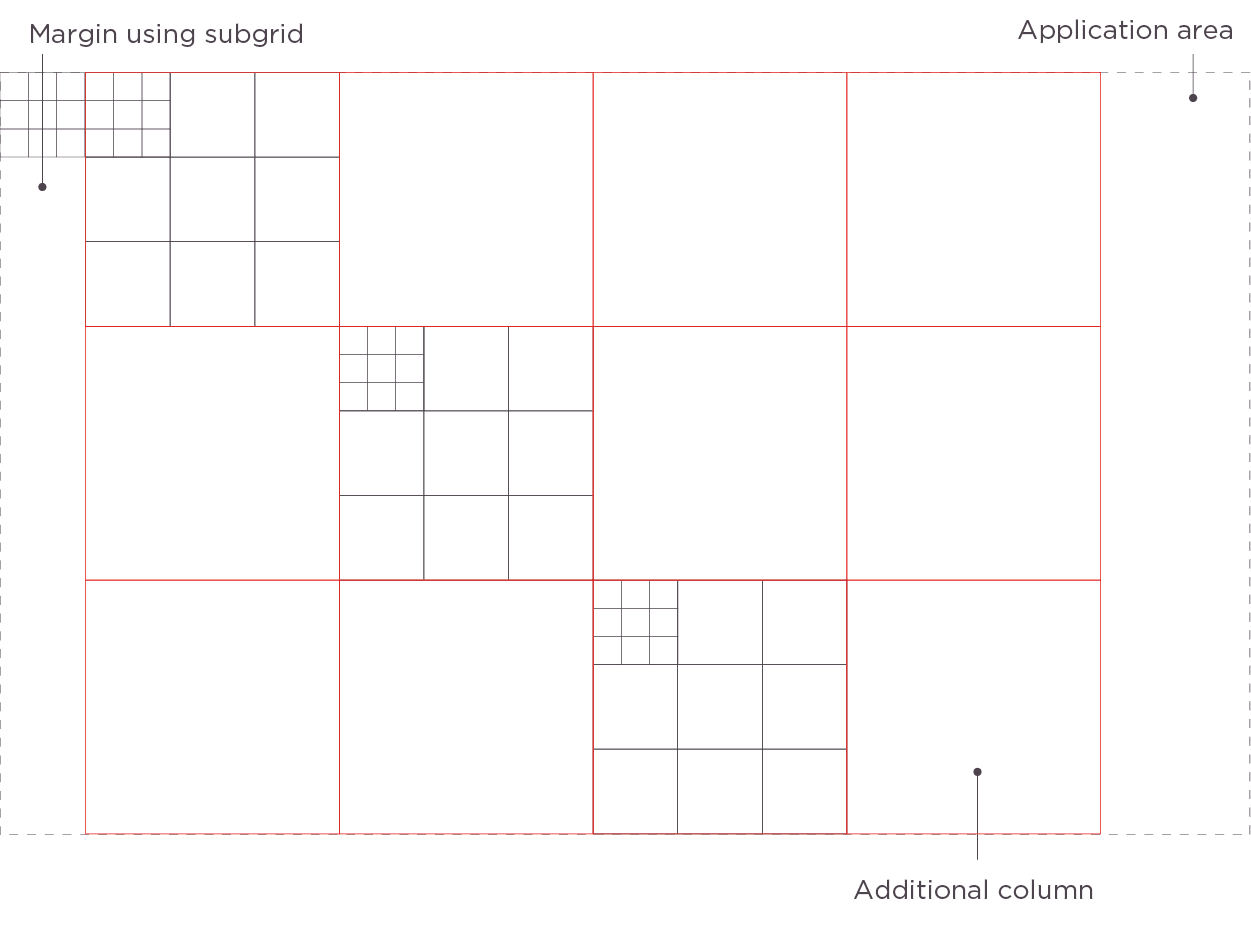
Step 1 – Position the 3×3 grid in the center of the application area, at an edge, or use the subgrids to establish a margin area.
Step 2 – Additional columns or rows (depending on application orientation) can be added to bring more structure as needed for the placement of graphics and elements.
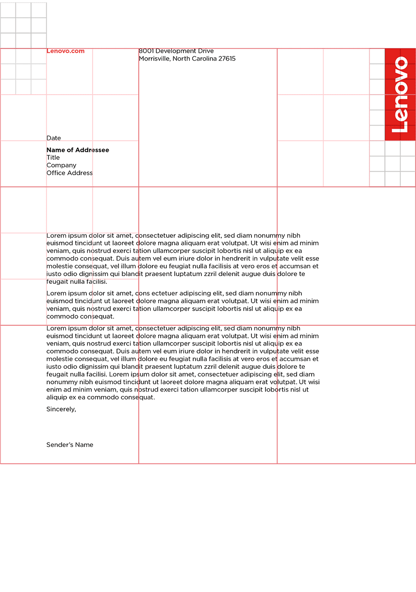
Step 3 – Use the 3×3 and subgrids to align objects, size the Lenovo logo and other necessary elements for efficient use of space, and help bring continuity to multiple applications.


Applications
Example applications of the 3×3 grid on a range of Lenovo communications.


