The red logo is our most recognizable visual asset. Our signature red color represents the heart of the company and our passion to deliver smarter technology for all.
The Lenovo logo should appear in red wherever possible to maximize recognition and enable connections to other visual elements through color.
The Lenovo logo is the combination of a white wordmark within a red-containing shape.
Download Lenovo logo
Important note: Brand assets, sonic or visual, cannot be used to train AI models as they are not licensed for that particular use.
Structure
Elements
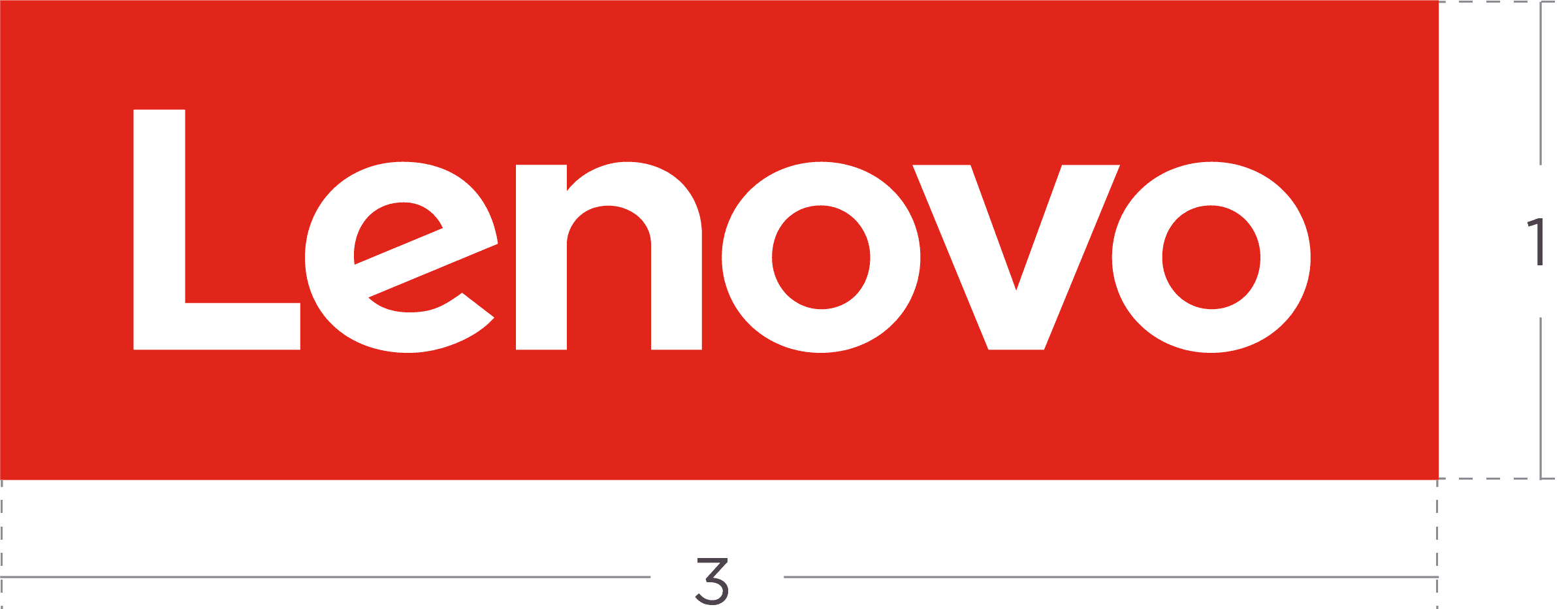
The containing shape is primarily our signature red and will always be a 3:1 ratio rectangle. The containing shape inspires many brand applications but should not be distorted or removed.
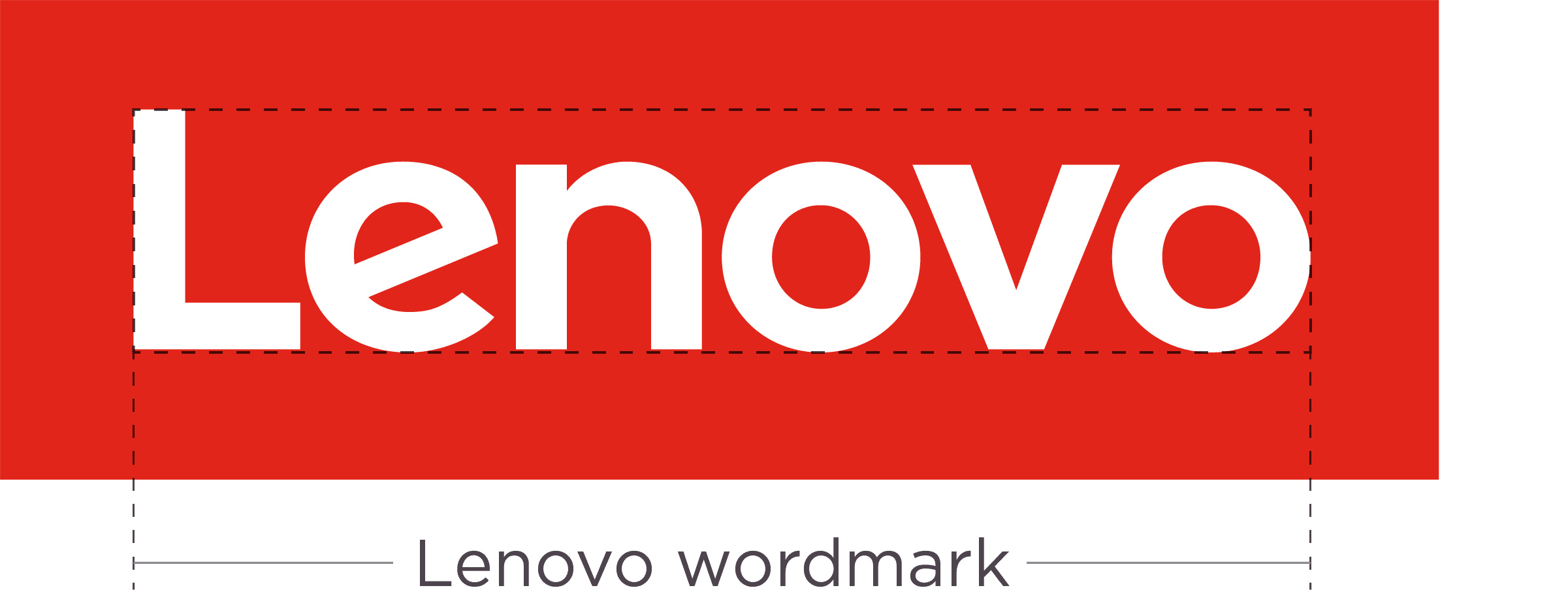
The Lenovo wordmark is a specialized type treatment of modified letters including a slanted ‘e’. The only approved application using the Lenovo wordmark without the red containing shape is for on-product branding.
The signature red Lenovo logo should be consistently used across all brand communications.
Never use the Lenovo wordmark (note slanted ‘e’) as a standalone element unless it is for on-product branding.

Use our approved fonts when using Lenovo in text treatments and sentence structures.

Never use the Lenovo wordmark (note slanted ‘e’) as a standalone element unless it is for on-product branding.
Orientation
Vertical
We want our logo to be disruptive and to always stand out. Wherever possible always use the vertical version of the logo. Make sure the logo always reads bottom to top when rotated.
Horizontal
Our horizontal logo is used where the vertical version is not applicable.

Clear space
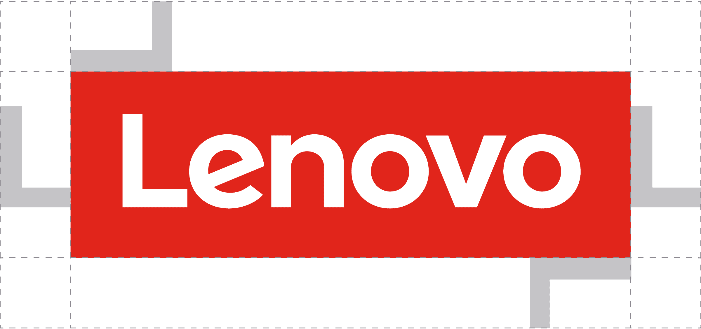
To preserve the integrity of the Lenovo logo, always maintain a minimum clear space around the logo. This clear space isolates the logo from any encroaching graphic elements such as other logos, copy or photography that may divert attention.
As illustrated, the clear space for the Lenovo logo is measured by using the width of the ‘L’.
Minimum size
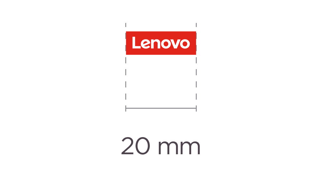
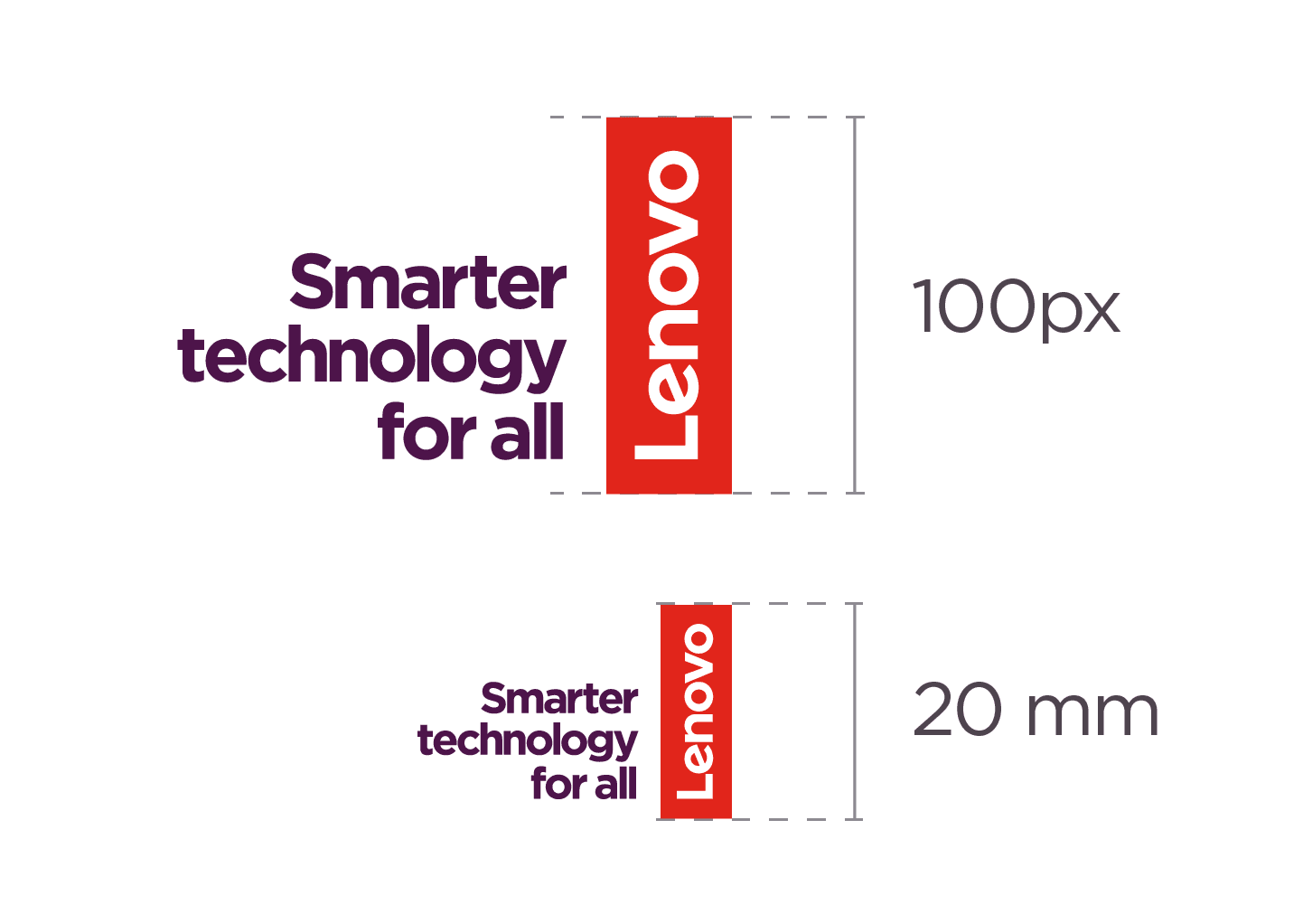
The Lenovo logo retains its visual strength in a wide range of sizes. However, when the logo is reproduced too small, it is no longer legible and its impact is diminished.
In print applications the Lenovo logo should never be reproduced in a width smaller than 20mm (0.79in).
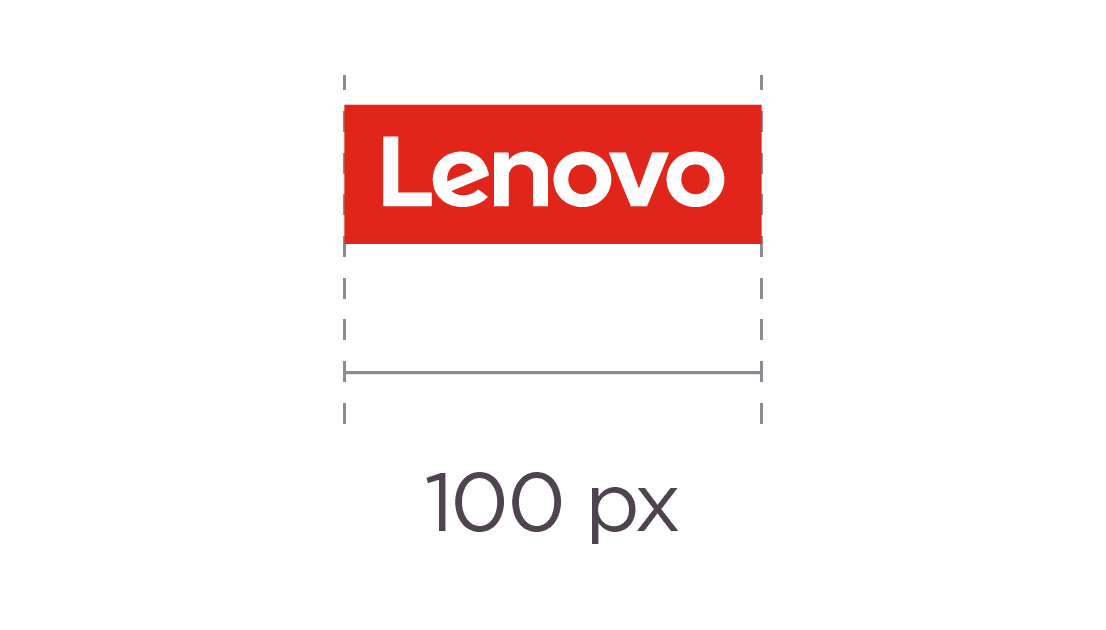
In digital applications the Lenovo logo should never be reproduced in a width smaller than 100px at 72dpi.
Attribution
The Lenovo logo is a valuable asset that we must protect to avoid confusion in the marketplace and to prevent unauthorized use.
A trademark followed by a ™ or ® or other trademark attribution statement puts the public on notice of our and our third party licensors’ trademark rights. Trademark rights can last forever, but incorrect use can result in trademark rights being lost. Lenovo protects its important properties and that of its partners by using a trademark attribution statement – instead of marking all uses of individual marks with trademark notice symbols. A copyright notice or statement (e.g., © 2025 Lenovo) gives credit to, or attributes the creator or owner of a work from whom it has been borrowed, whether it’s text, an image, a video or other item.
Appropriate trademark and copyright notices and/or attribution statements should be included on all materials wherever space permits. The statements/notices may be omitted from small promotional merchandise (e.g., pens, coffee mugs), small-format digital layouts, and other layouts where the statements/notices would be hard to read, or be overly distracting (e.g., building signage and events).
Attribution statements for Lenovo brand
For materials that only contain the Lenovo trademark
LENOVO and (INSERT OTHERS LENOVO OWNED TRADEMARKS) are trademarks of Lenovo. All others trademarks are the property of their prospective owners. © 2025
For materials that only contain the Lenovo trademark, and other trademarks owned by Lenovo
LENOVO and (INSERT OTHERS LENOVO OWNED TRADEMARKS) are trademarks of Lenovo. All others trademarks are the property of their prospective owners. © 2025
For materials that only contain the Lenovo trademark, other trademarks owned by Lenovo, and third-party marks for which attribution statements are required
LENOVO and (INSERT OTHERS LENOVO OWNED TRADEMARKS) are trademarks of Lenovo. (INSERT REQUIRED THIRD PARTY TRADEMARK ATTRIBUTIONS). All others trademarks are the property of their prospective owners. © 2025
Lenovo logo lockup
The Lenovo logo lockup has been carefully crafted to maximize its impact and reinforce the brand.
There are several variations of the logo lockup depending on application, positioning, and orientation. There are two primary and two alternate versions of the Lenovo logo lockup. The vertical logo is our preferred application of the Lenovo logo. And so, whenever possible, use the primary version of the logo lockup and only use the alternate version when space restriction dictates its use.
The text “Smarter technology for all” should never be recreated to align or stack differently than the versions provided. Do not recreate any element of the Lenovo logo lockup. Always use the logo files that are available.
Download Lenovo logo lockups
Logo–tagline lockup usage
The tagline appears as a lockup with our Lenovo logo on all our advertising and communication, except the following:
- When the size of the asset does not leave any room to use “Smarter technology for all” in a legible fashion.
- When using the tagline compromises the clarity or legibility of our Lenovo logo
- On Motorola communications
- With a partner lockup.
When using the logo–tagline lockup in advertising and communications that include partner badges and/or logos, sizing requirements are measured based on the Lenovo logo containing shape, NOT the lockup measurement.
These guidelines do not reflect the complete set of Intel or Microsoft program compliance guidelines. Please contact your Lenovo alliance team for more details.
For more examples of what NOT to do with the logo–tagline lockup, see the “What not to do” section below.
Logo–tagline lockup examples
These examples demonstrate appropriate placement and sizing of elements.


Primary
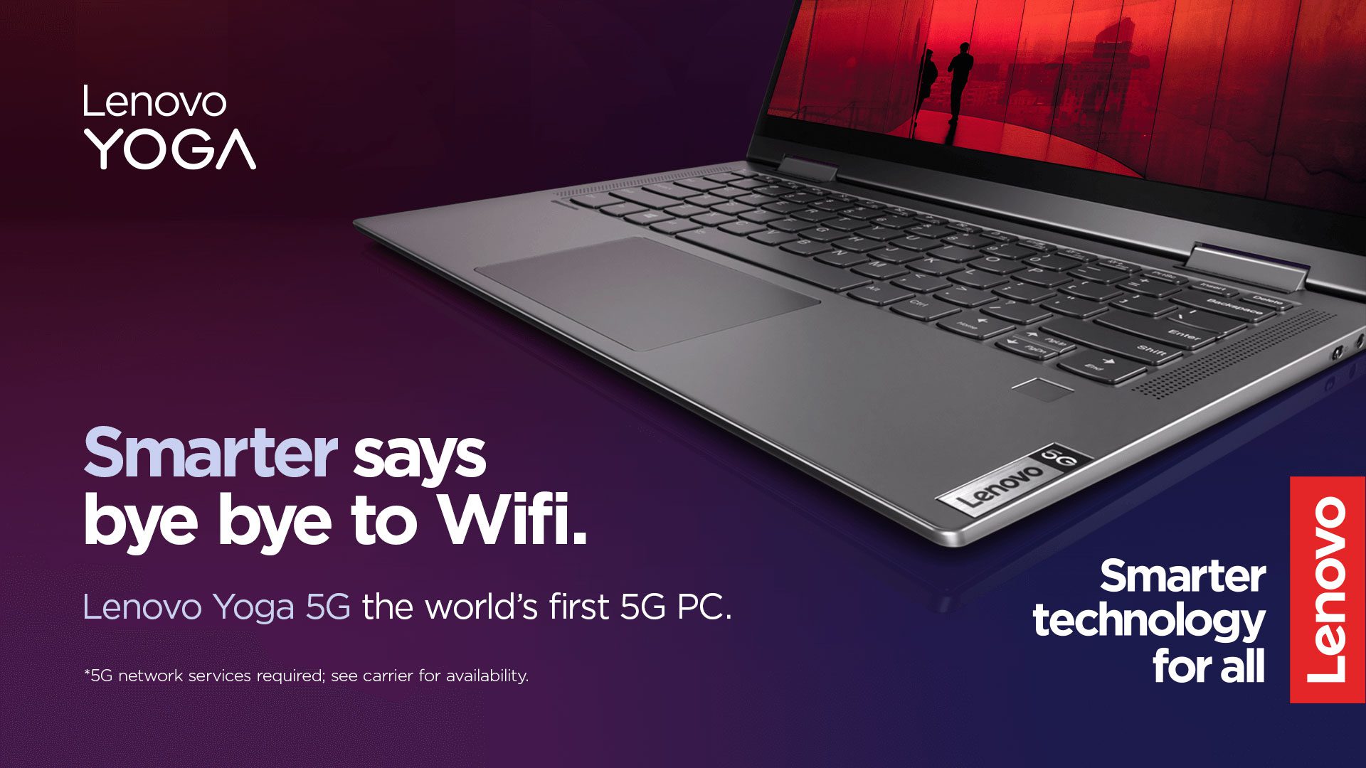
The Lenovo logo lockup examples are shown on a deep or pale smarter gradient background. Please determine the most legible version for your application.
STFA bottom alignment

Logo lockup with white STFA on a deep gradient background
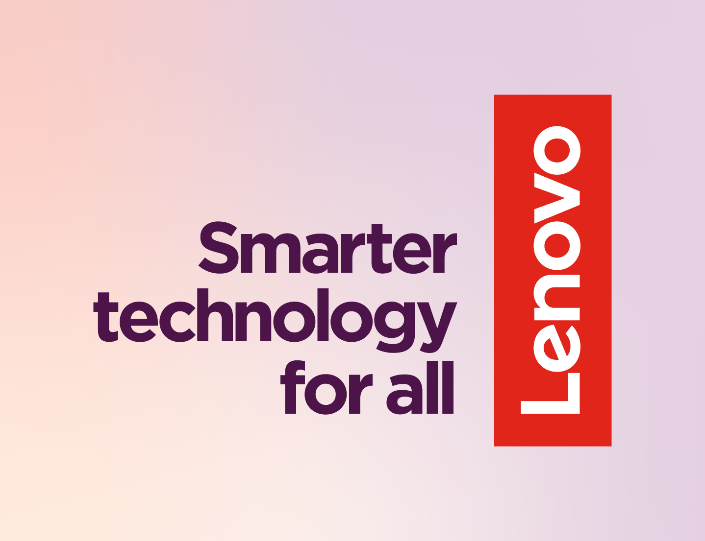
Logo lockup with deep purple STFA on a pale gradient background
STFA top alignment

Logo lockup with white STFA on a deep gradient background
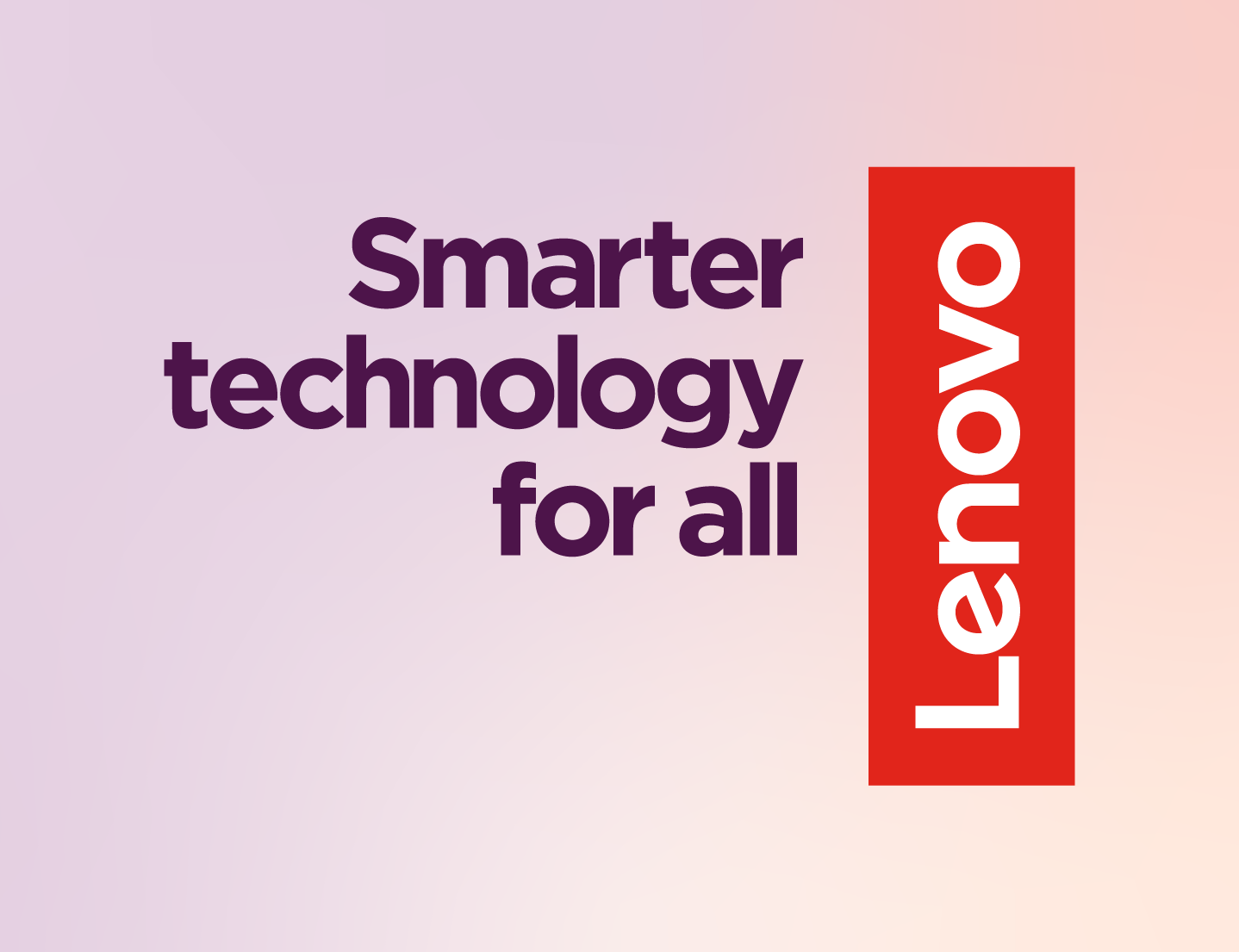
Logo lockup with deep purple STFA on a pale gradient background
Alternate
The Lenovo logo lockup examples are shown on a deep or pale smarter gradient background. Please determine the most legible version for your application.
STFA horizontal right alignment

Logo lockup with white STFA on a deep gradient background

Logo lockup with deep purple STFA on a pale gradient background
STFA horizontal left alignment

Logo lockup with white STFA on a deep gradient background

Logo lockup with deep purple STFA on a pale gradient background
Single Color
In LIMITED cases, for example, single color print applications, laser etching, material emboss, the single color Lenovo logo, and logo lockup can be used. When a single color is required our order of preference is:
- Single color red
- Single color white
- Single color black
To access these versions, contact the Brand Help Desk with the required use case explanation.
Clear space
To preserve the integrity of the Lenovo logo lockup, always maintain a minimum clear space around the logo and tagline. This clear space isolates the logo from any encroaching graphic elements such as other logos, copy or photography that may divert attention.
As illustrated below, the clear space for the Lenovo logo lockup is measured by using the width of the ‘L’.
Do not recreate the logo or STFA text, always use the artwork provided.
Allow the full height of a Lenovo “L” around the entire mark for whitespace


Minimum Size
The Lenovo logo and the tagline retain their visual strength in a wide range of sizes. However, when the logo and logo lockups are reproduced too small, they are no longer legible, and their impact is diminished. Always follow the minimum size rule for the Lenovo logo.

Moving media
Our Lenovo logo lockup is brought to life in digital moving media end bumper animations. For variations and guidance of the end bumper animations please visit the Sonic identity page.
Moving media Lenovo logo lockup

Translations
Most regions will use the English Lenovo logo lockup. But if comprehension is an issue, regional marketing teams may decide to translate “Smarter technology for all.” If your region requires a translated lockup, contact the Brand Help Desk for guidance on how to construct the lockup.
Positioning and sizing
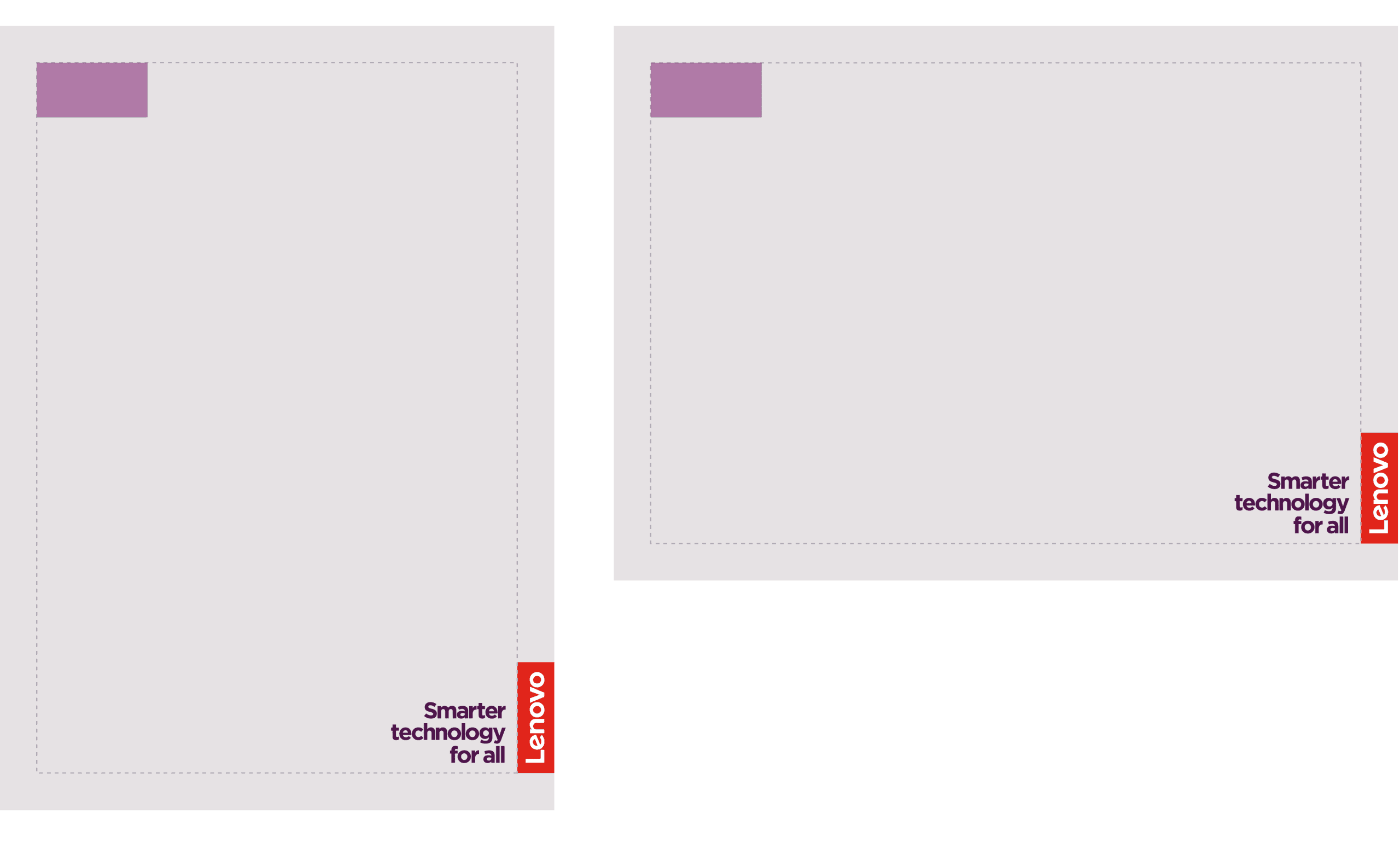
For static media, the Lenovo logo is always positioned on the right edge of any application.
Sized to sit within the margin, it can be moved up or down to allow for flexibility when developing layouts. The Lenovo logo should not sit in the logo-free zones when space permits otherwise.
- The top alignment logo lockup should be used in the top half of the composition
- The bottom alignment logo lockup should be used in the bottom half of the composition

Subbrand wordmark positioning
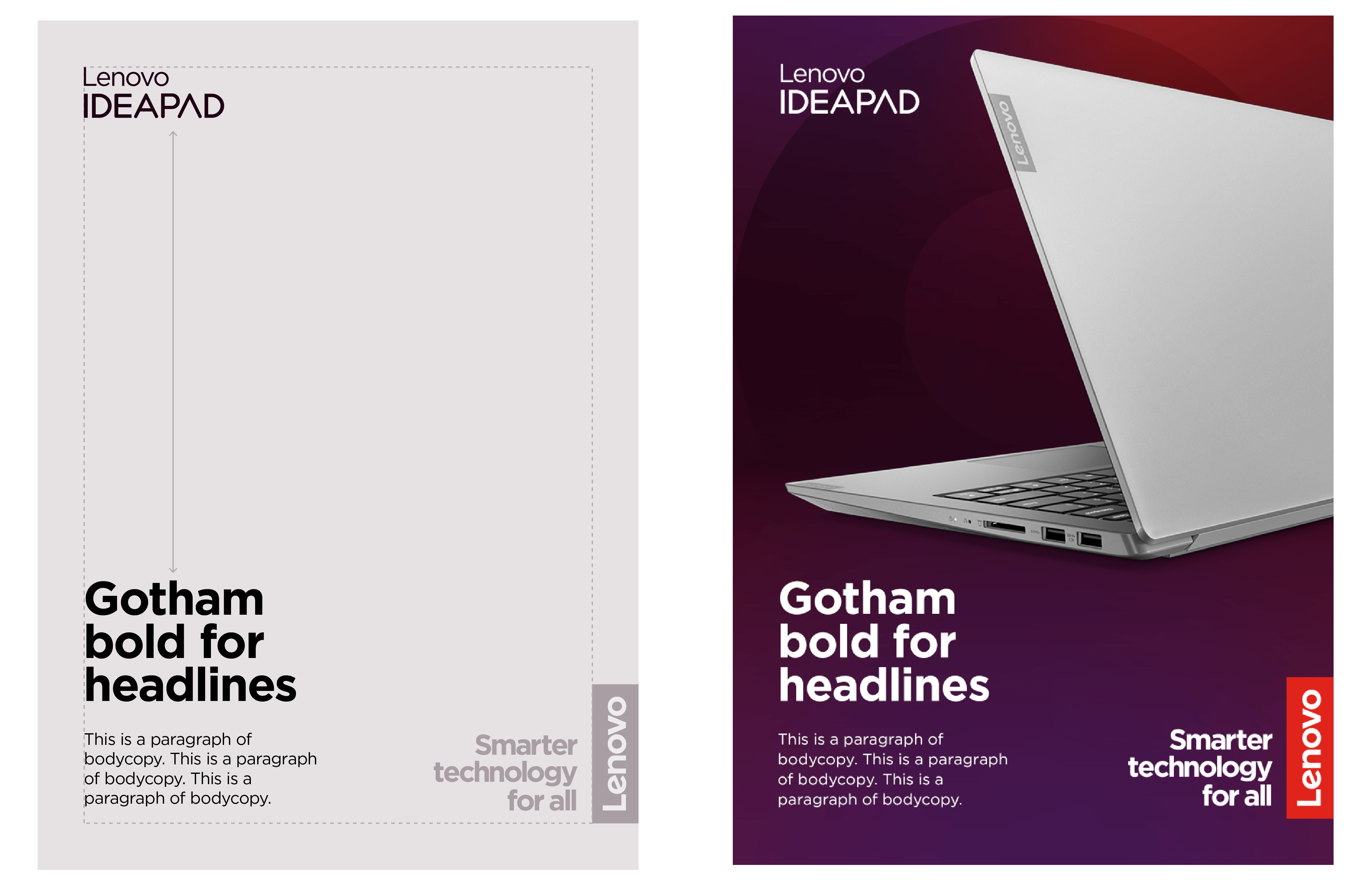
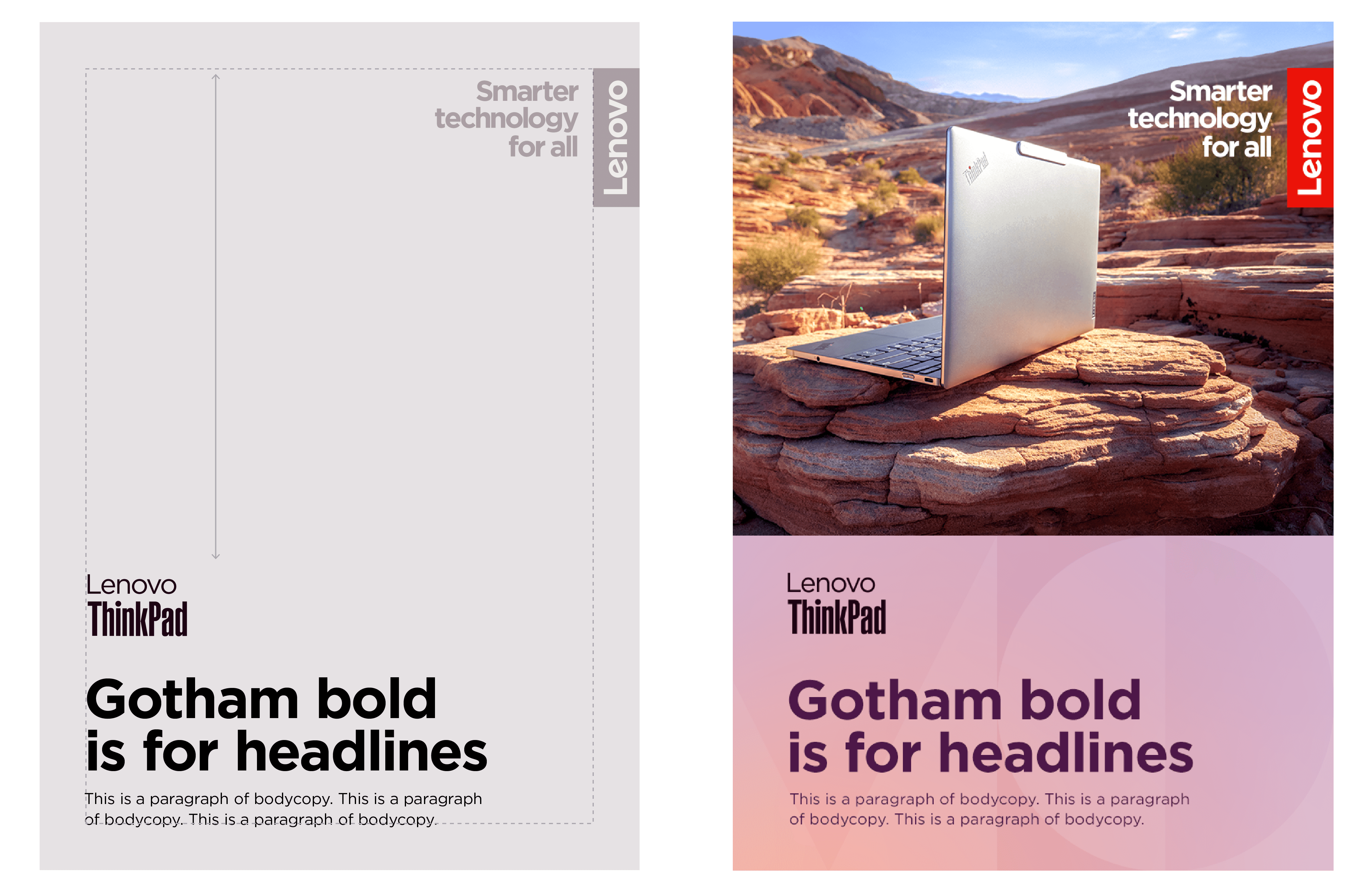
To ensure consistency across our communications, we have fixed wordmark positions for our product wordmarks and Lenovo logo.
Product wordmark positions allow for a flexible layout while maintaining a level of consistency. There are two types of positional options.
- Product wordmarks may be placed against the left-hand margin and positioned anywhere along the vertical suitable to the layout.
- Product wordmarks may also sit aligned within the copy grid and positioned anywhere along the vertical suitable to the layout.
Option 1 – shown with Consumer imagery and product wordmark
Option 2 – shown with Commercial imagery and product wordmark
Subbrand wordmarks on backgrounds
Legibility is essential when placing the Lenovo logo and subbrand wordmarks on backgrounds. Always ensure enough color contrast between the background, logo and wordmark elements.

Always place the logo lockup on areas with our connector (purples) and secondary (blues and neutrals) colors.

Avoid placing the logo on areas of red in the smarter gradient backgrounds.
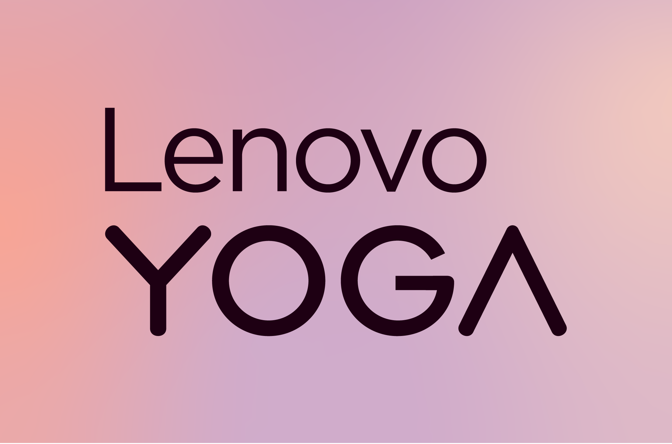
Use the black or Deep Purple 1 version on pale backgrounds and the white wordmark version on deep backgrounds.
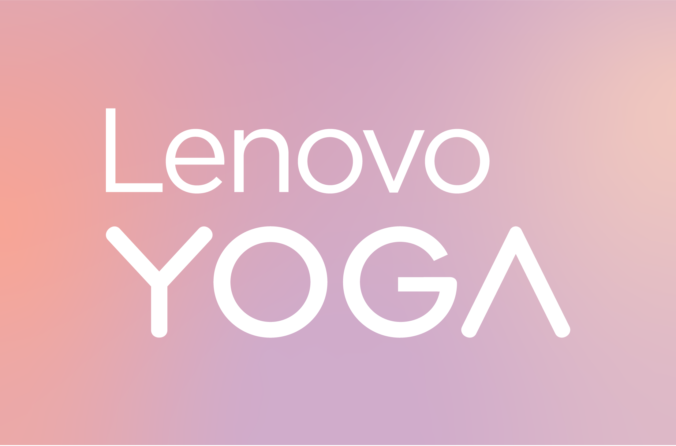
Avoid using white Lenovo subbrand wordmarks on pale colors.
Sizing templates
Calculating print sizes
To determine the size of the Lenovo logo lockup for standard print applications, use the following equation:
Shortest edge measurement / 5 = minimum vertical Lenovo logo height.
Ex: 8.5” / 5 = 1.7” (Remember that the minimum size allowed for the Lenovo Logo is 20mm (0.79”) unless otherwise noted.)*
When sizing the product wordmarks and Lenovo logos use the following principles:
- Set all four margins to the width of the Lenovo logo or use the grid system to establish the margins
- Refer to the “Lenovo logo height” shown below for standard Lenovo logo size and scale subbrand wordmarks appropriately by the guidelines.
- Maintain the relative size relationship between the subbrand wordmark and Lenovo logo wherever possible. This will ensure the right balance between the corporate and subbrand on all non-standard format applications.
- Maintain all clear space rules for specific subbrand wordmarks.
- The “Smarter technology for all” lockup should be used in all layouts unless size is prohibitive (minimum height = 100px).
- Refer to the examples shown throughout these guidelines as a guide.
For common print size applications view the table below for quick predetermined minimum logo sizing.
Sizing example using the Lenovo Yoga subbrand wordmark


Calculating digital sizes
To determine the size of the Lenovo logo lockup for digital applications, use the following equation:
Longest edge measurement / 5 = minimum vertical Lenovo logo height.
Ex: 800 px / 5 = 160 px (Remember that the minimum size allowed for the Lenovo Logo is 100 pixels unless otherwise noted.)*
Non-standard format sizes
For help determining sizing for nonstandard formats, please contact Brand Help Desk.
Sizing examples
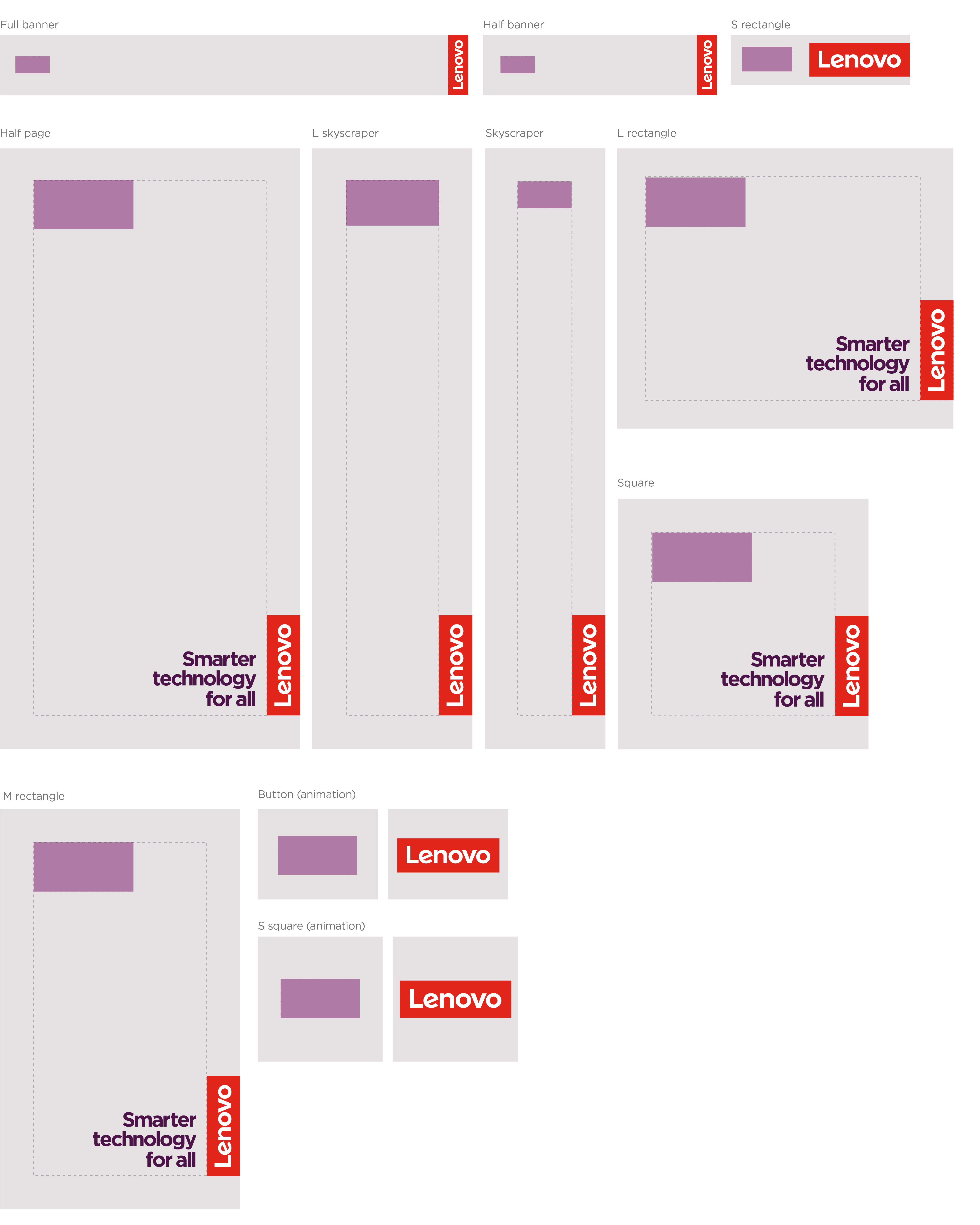
Lenovo logo, common sizing
These tables show common sizes in print and digital applications. If there is not a close size match in the ‘Logo sizes’ tables, use the pre-determined equation on this page to determine the minimum size required.
- Always set all four margins to the width of the Lenovo logo.
- When needed, round the logo sizes up or down to the nearest whole number for ease of use.
- Minimum logo sizes are 20mm (0.79”) for print and 100 px for digital. A few exceptions are noted with an asterisk.
- Extreme sizes too small to show both logos (marked with an double asterisk) should utilize animation and always end on the Lenovo logo.
- The Lenovo logo size may need to be reduced when working with multiple logos or product wordmarks. Please keep in mind minimum size requirements.
Common print: EU Standard
| Format | Format Dimensions (mm) | Minimum Lenovo logo height |
| A0 | 840 x 1188 | 168 |
| A1 | 594 x 840 | 119 |
| A2 | 420 x 594 | 84 |
| A3 | 297 x 420 | 60 |
| A4 | 210 x 297 | 42 |
| A5 | 148 x 210 | 30 |
| DL | 100 x 210 | 20 |
Common digital
| Format | Format Dimensions (mm) | Minimum Lenovo logo height |
| Full banner | 468 x 60 | 100** |
| Half banner | 234 x 60 | 100** |
| Button | 120 x 90 | 90* |
| Leaderboard | 728 x 90 | 90* |
| Half page | 300 x 600 | 120 |
| L skyscraper | 160 x 600 | 120 |
| Skyscraper | 120 x 600 | 120 |
| Square | 250 x 250 | 100 |
| L rectangle | 336 x 280 | 100 |
| M rectangle | 240 x 400 | 100 |
| S rectangle | 180 x 50 | 100** |
| S square | 125 x 125 | 100 |
Common print: US Standard
| Format | Format Dimensions (in) | Minimum Lenovo logo height |
| Half Letter | 5.5 x 8.5 | 1.1 |
| Letter | 8.5 x 11 | 1.7 |
| Junior Legal | 5 x 8 | 1 |
| Legal | 8.5 x 14 | 1.7 |
| Tabloid | 11 x 17 | 2.2 |
| A | 8.5 x 11 | 1.7 |
| B | 11 x 17 | 2.2 |
| C | 17 x 22 | 3.4 |
| D | 22 x 34 | 4.4 |
| E | 34 x 44 | 6.8 |
Partnerships
In the case of joint ventures, partnerships, and relationships with other companies, consider the use of the Lenovo name and trademarks carefully.
Partner lockup
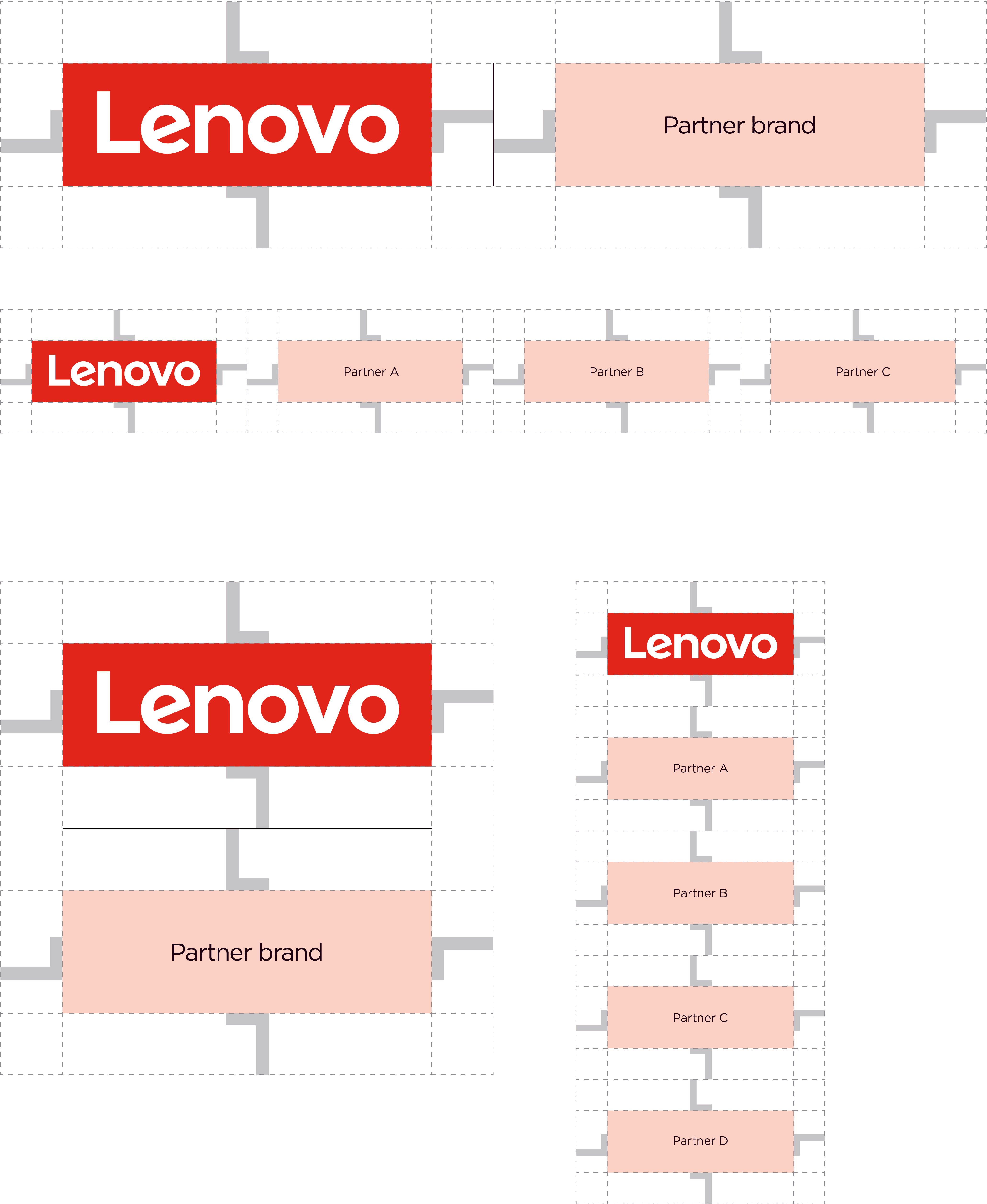
We reserve partner lockups for corporate brand-level partnerships, not product-level communications and/or embedded technology. The partner lockup should provide balance, show equal partnership and be reserved for the Lenovo corporate brand.
- Always use a signature red Lenovo logo when representing a partnership.
- A thin bar (2px or less) is preferred to divide the two logos but is not required.
- Multiple partner examples should follow the same spacing guidance, and a thin line is not recommended.
- Do not use subbrand wordmarks, descriptive names or regular text in partner lockups.
- The “Smarter technology for all” tagline and logo lockup must not be combined with partner logos.
- Distributors and resellers must not use the partner lockup.
When the company enters a new partnership or joint venture, contact the Brand Help Desk for the creation of a formal partnership lockup.
If a vertical logo or vertical lockup is needed to support brand visibility or meet partner guidelines, reach out to the Brand Help Desk for a custom solution.
Horizontal partnership lockup example
Spacing guidance
Alliance partnerships
When using the “Smarter technology for all” tagline + logo lockup in advertising and communications which have an alliance partner logo (e.g. AMD, Intel, Microsoft, etc.), the sizing of the alliance partner logo should be determined by the size, height and width of the Lenovo logo (not the size of the entire Lenovo logo lockup).
Please contact your Lenovo alliance team for more details and a complete set of alliance program compliance guidance for sizing and placement.

Cobranding and technology lockups
When positioning branding elements (i.e., subbrand wordmark, alliance partner branding, etc.) in a composition, consider hierarchy and the overall composition. The example shown is representational, with possible locations of branding elements and the Lenovo logo lockup.
- The Lenovo logo lockup should be used on all communications unless the asset size doesn’t leave room for the logo lockup (i.e., email and web banners).
- Only use the Lenovo logo when cobranding with distributors and resellers.
When a partner or alliance requires a technology lockup, work with your alliance partner for external brand requirements.
- Technology lockups can be used when working with limited space.
- When creating a technology lockup, always use the Lenovo subbrand wordmark and the ‘+’ sign, ensuring equal sizing.
- Do not add a descriptor to the subbrand wordmark or use regular text in the technology lockup.
Positioning for branding element(s) example
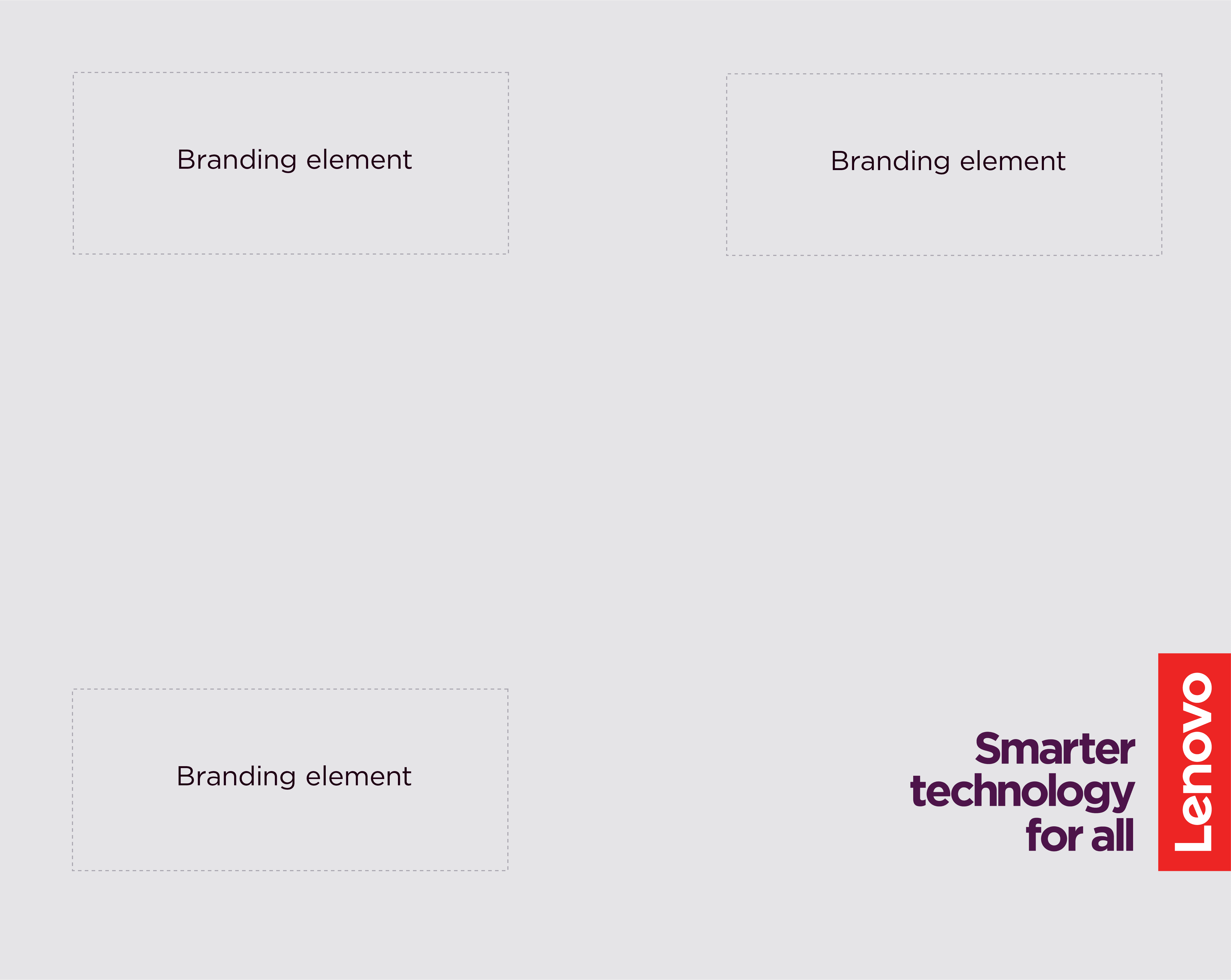
Technology lockup example

Application examples
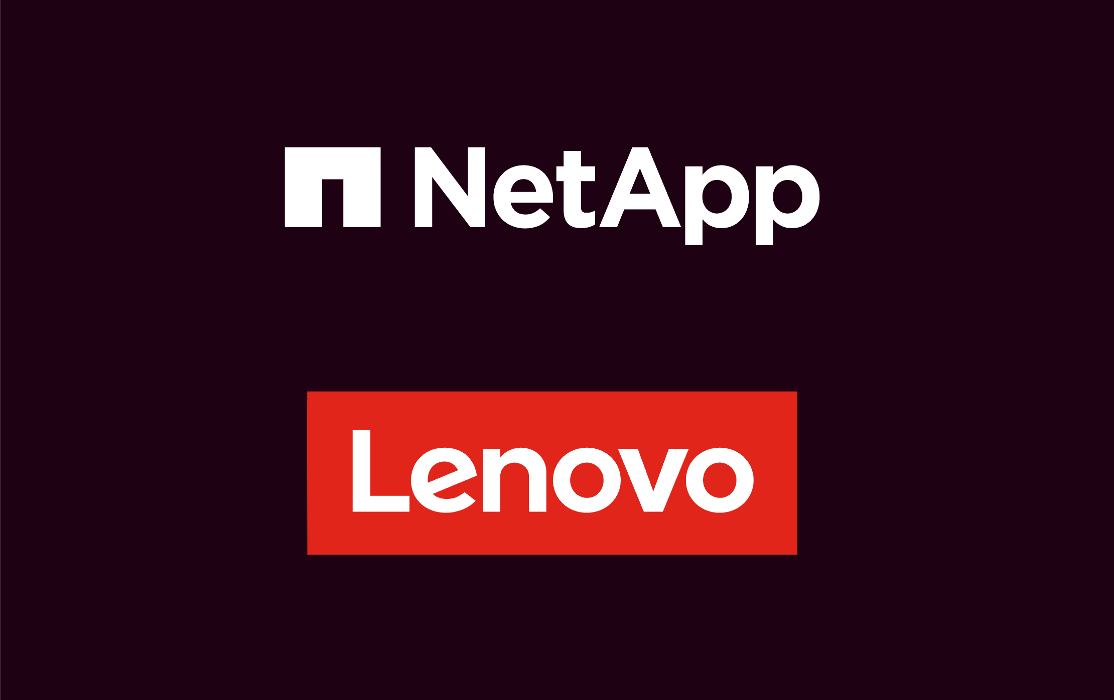
Choose a neutral background when placing the Lenovo logo with a partner or sponsor logo(s).

Avoid using busy and colorful backgrounds when pairing the Lenovo logo with a partner or sponsor logo(s).
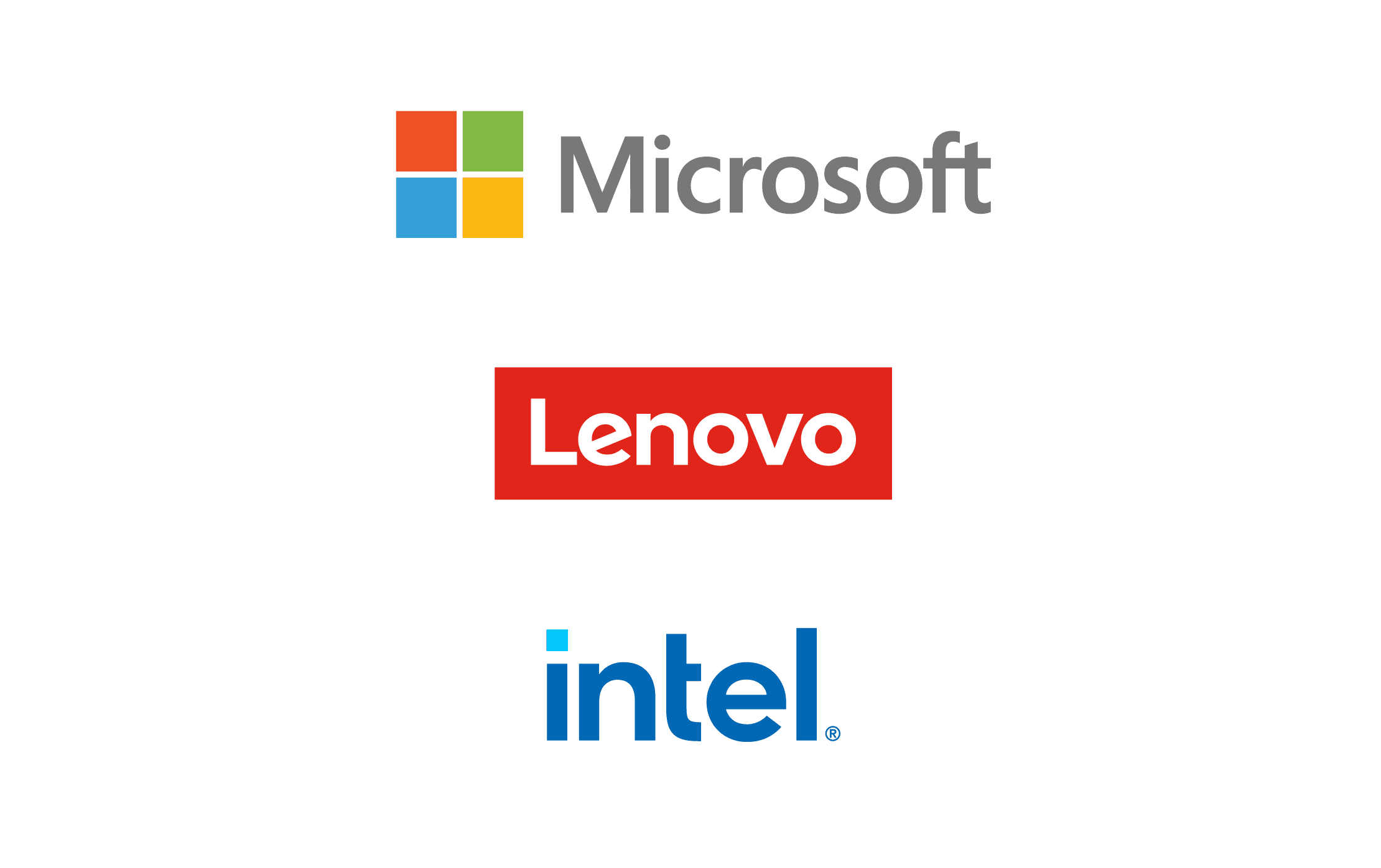
Always use the correct clear space for the Lenovo logo lockup and any partner logo(s).
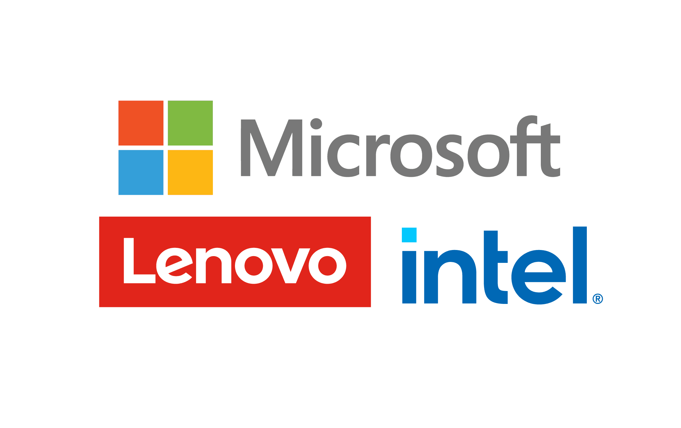
Avoid pairing multiple logos too close together without proper spacing.
Sponsorship
The Lenovo logo can be used to represent a sponsorship on third-party applications.
The Lenovo identity should always be retained unless the legal relationship states otherwise. Follow these basic rules for successful applications:
- Always use a horizontal, signature red Lenovo logo with sponsorship opportunities.
- Always follow the Lenovo logo’s clear space guidance when other elements, typography, logos, etc. are present.
- Always use a simplified description centered above or below the logo when possible. Linear elements can be used to separate the text and logo if clear space guidance is followed.
- Always use Lenovo brand typography when possible.
- Never use the Lenovo logo as a replacement for a word in a sentence, statement or headline.
- Never use the Lenovo logo lockup.
Examples of preferred text alignment and clear space guidance


Examples of incorrect text alignment and clear space guidance


Examples of what not to do
These examples represent the wrong way to apply our brand elements. Email the brand team at the Brand Help Desk for review and/or approval of an asset not within our brand library.
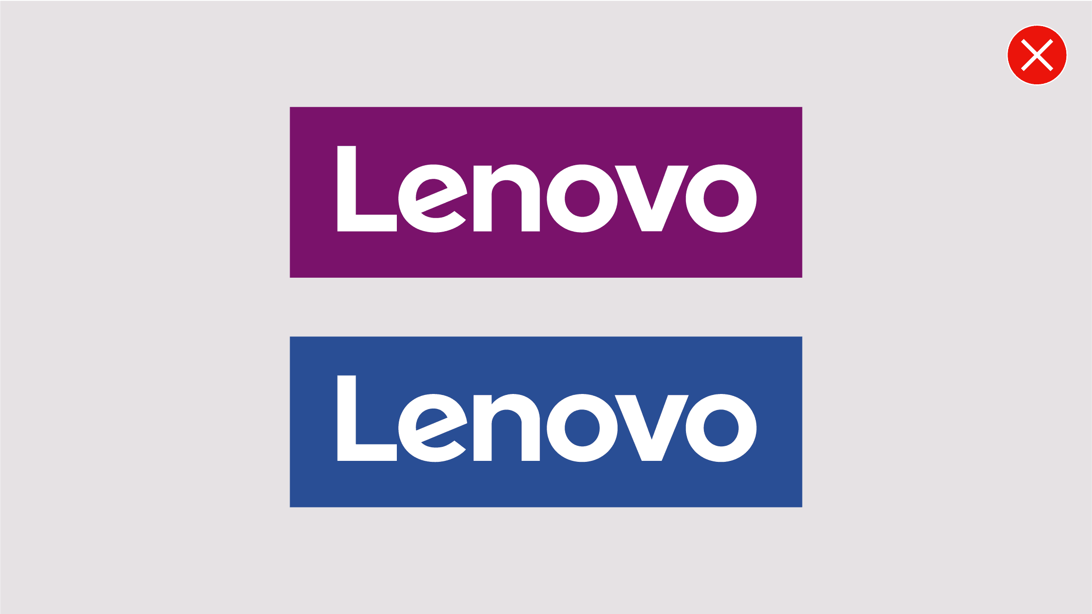
Don’t use any other brand color for the Lenovo logo containing shape. Only use the Lenovo signature red.

Don’t use the Lenovo wordmark without the containing shape on assets. This treatment is for on-product branding only.
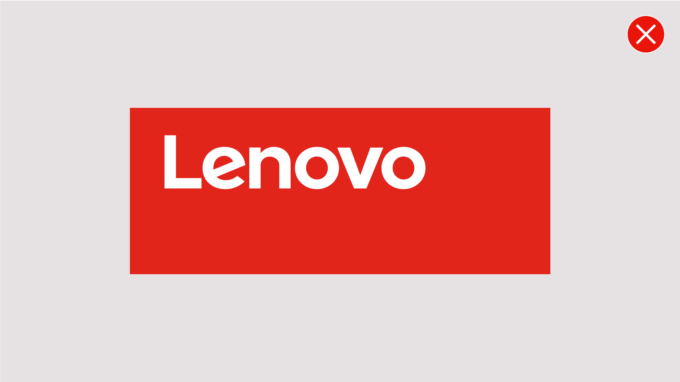
Don’t change the Lenovo logo containing shape dimensions or proportions.
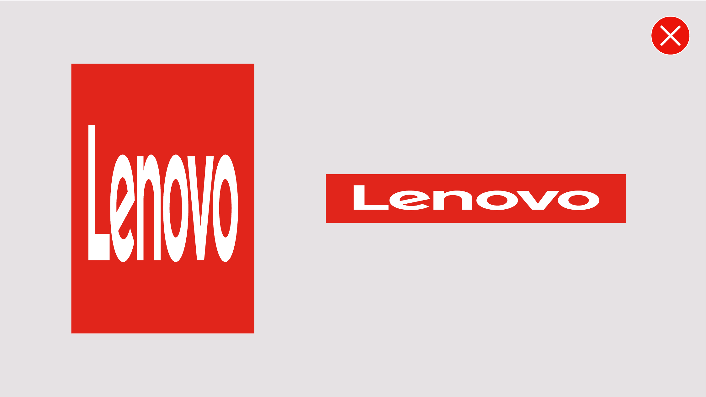
Don’t distort the logo.
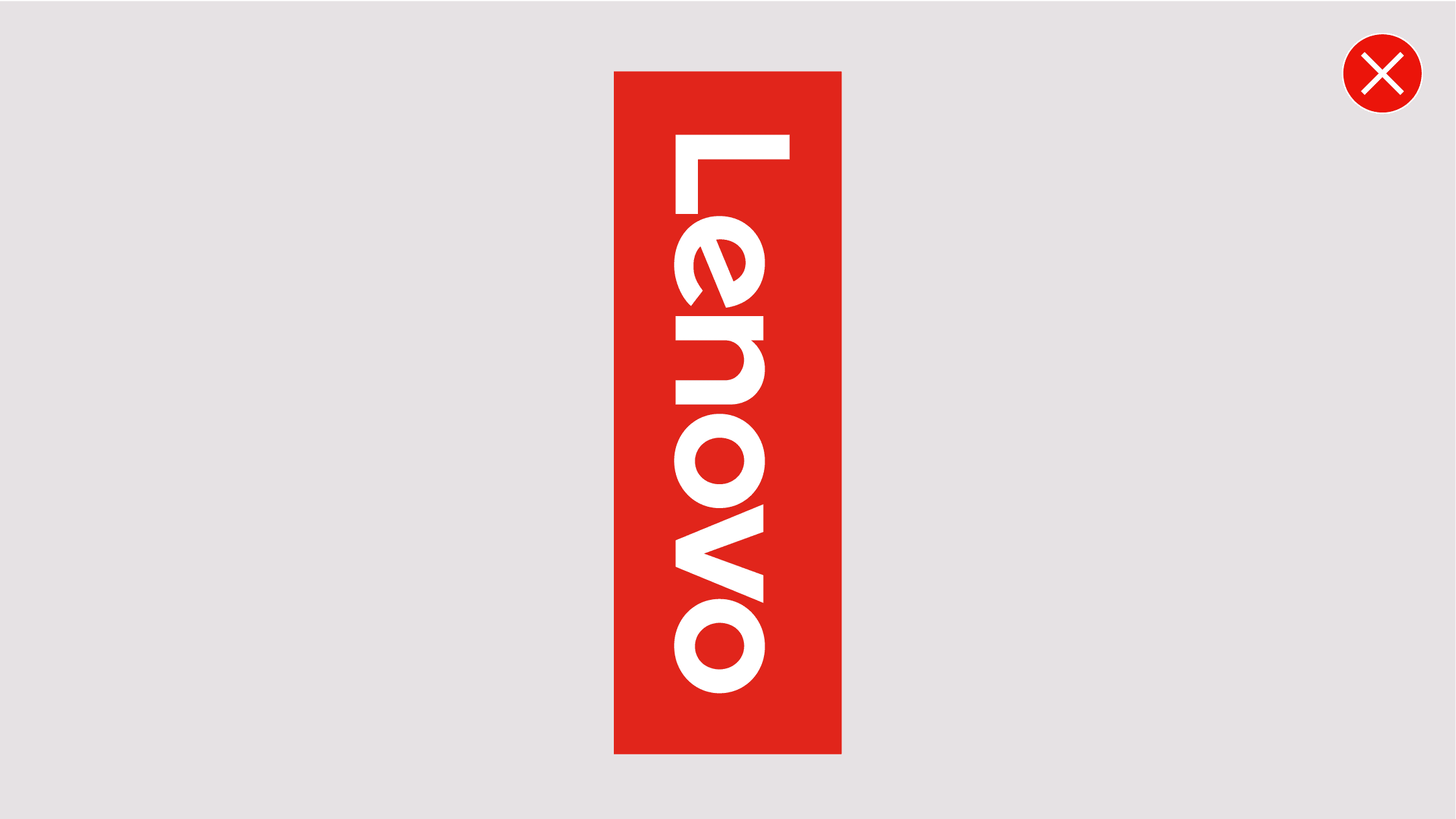
Don’t flip the logo or orientate the logo in the wrong direction.
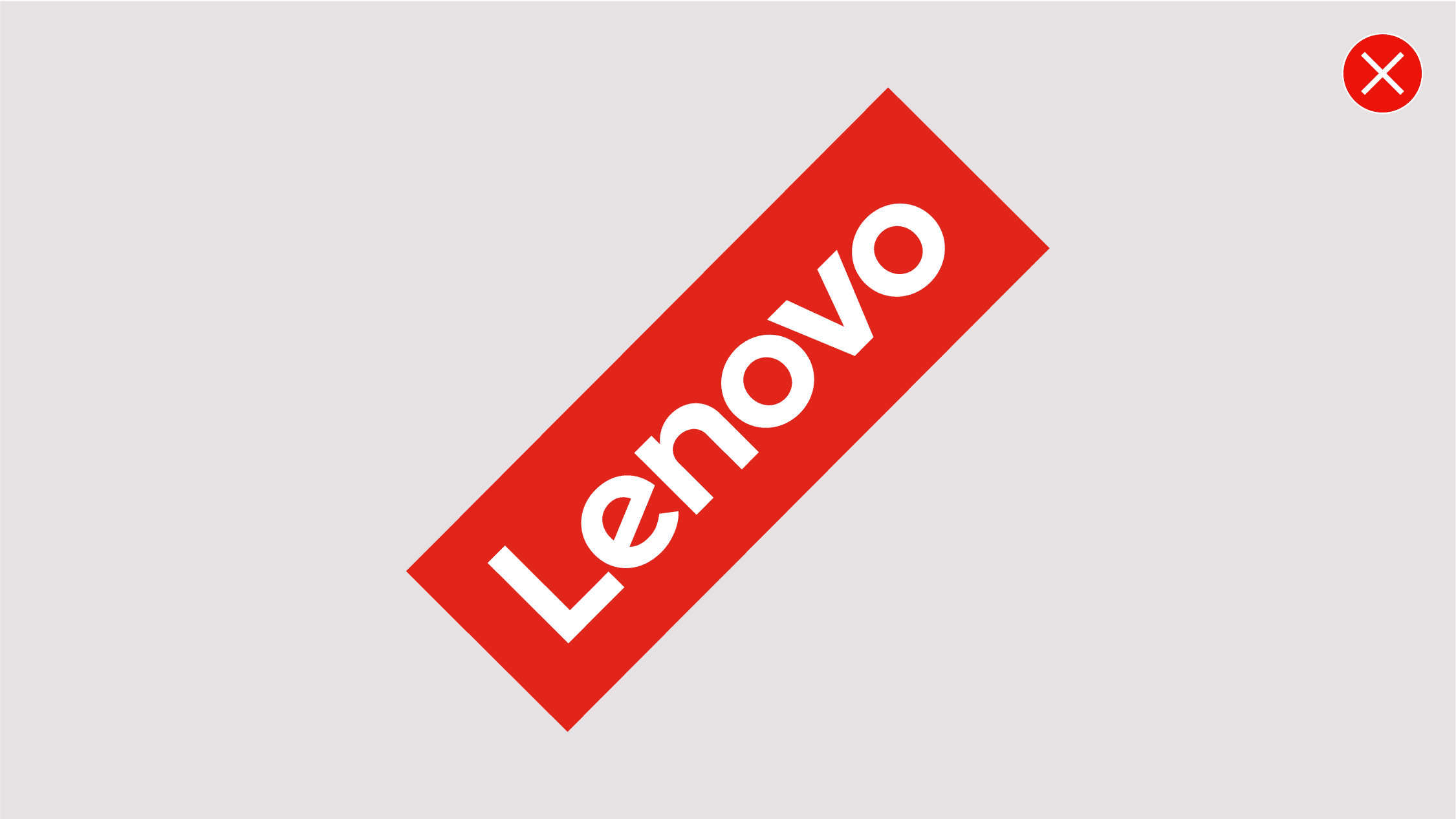
Don’t rotate the logo in any way other than the way outlined in the logo orientation guideline.
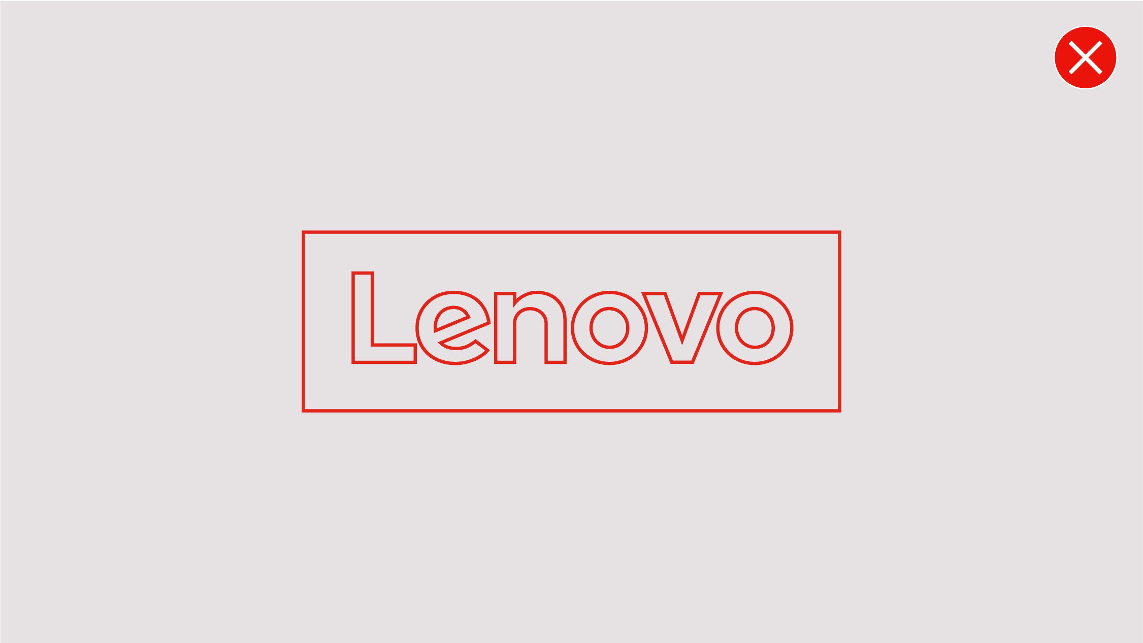
Don’t outline the logo.
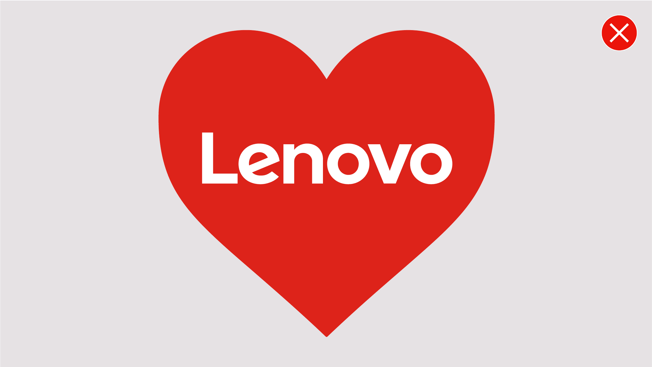
Don’t distort, reshape or resize the logo elements in any way.
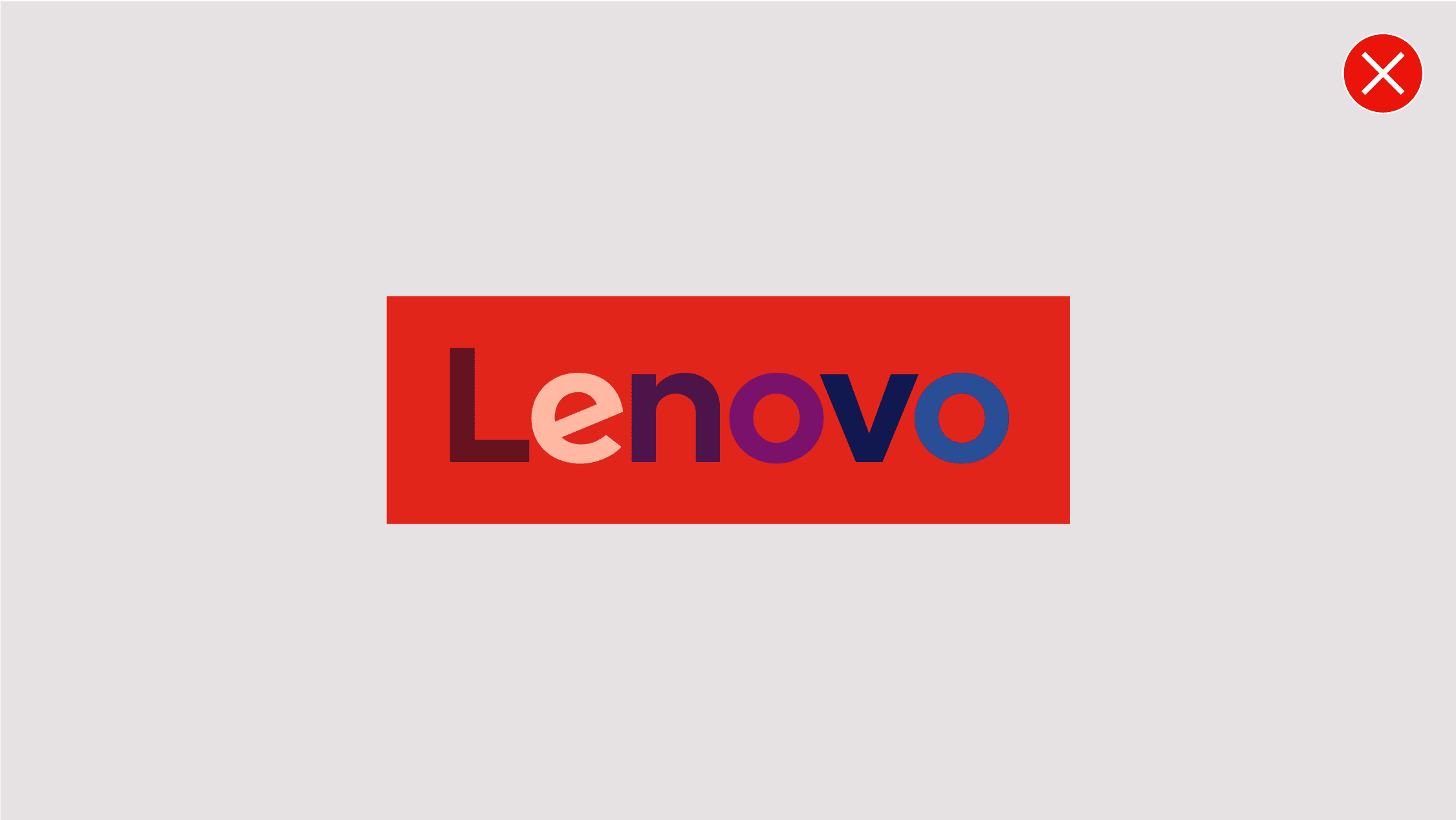
Don’t change the color of the Lenovo wordmark or use multiple colors in the Lenovo wordmark.
Don’t use a red background with the signature red logo.

Don’t recolor any element of the Lenovo logo or Lenovo logo lockup.

Don’t use other brand colors for the SFTA logo lockup. Use only the provided files.

Don’t change the size of the STFA text.

Don’t align the STFA text to the center of the Lenovo logo.

Don’t put STFA in containing shapes.

Don’t modify the text, reposition or alter any elements of the Lenovo logo lockup.
Don’t lockup STFA with product wordmarks.
Don’t use the Lenovo logo lockup in partner lockups. Only use the Lenovo logo.
Don’t provide the Lenovo logo lockup to partners for use in their own communications or co-marketing.
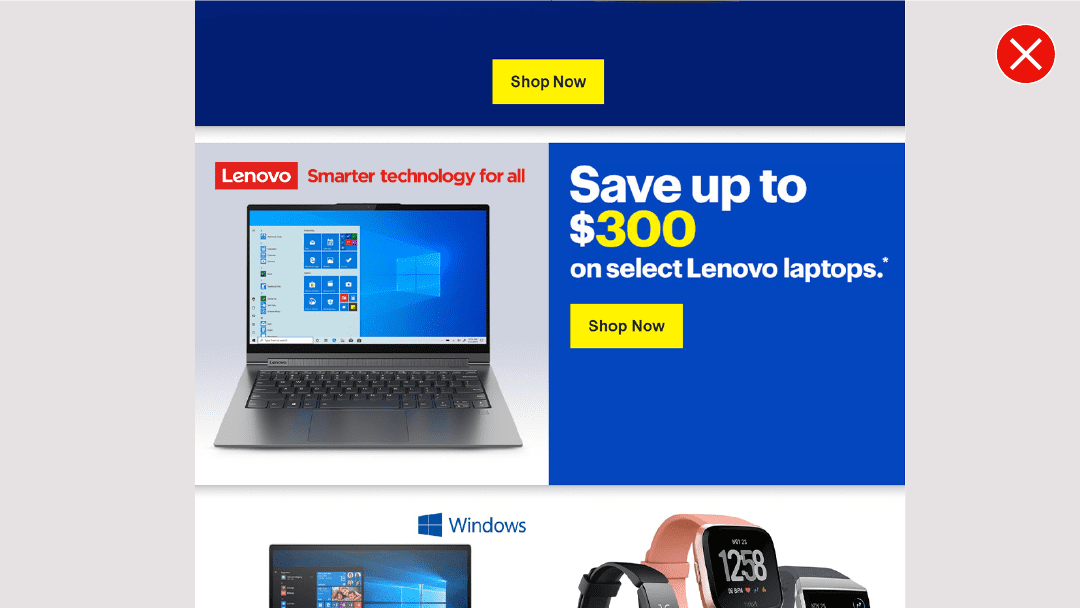
Don’t use the STFA logo lockup when it appears on partner communications.

Don’t use the Lenovo logo lockup on any built elements in office interiors. Use the Lenovo logo or brand patterns.
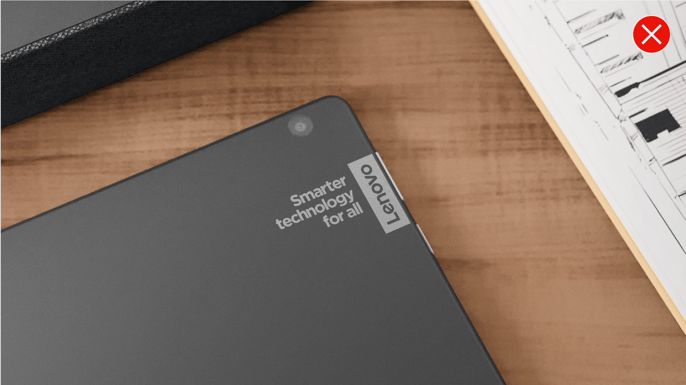
Don’t use the Lenovo logo lockup on products.

Don’t use the Lenovo logo lockup on building signage. Only use the Lenovo logo.


