A wordmark is a type of logo that only uses text to represent a brand. It consists of the brand’s name written in a unique or custom typographic style.
To achieve a consistent identity across our brand, product wordmarks have been carefully crafted for our products, solutions and services.
These guidelines provide details on how to use our wordmarks. For additional guidance on positioning and sizing within standard layouts, visit the positioning and sizing section on the logo page.
Download subbrand wordmarks
Important note: Brand assets, sonic or visual, cannot be used to train AI models as they are not licensed for that particular use.
Lenovo subbrand portfolio
Our portfolio of wordmarks has been designed to build a strong brand connection between Lenovo and our subbrands.
Structure
These wordmarks have been artfully crafted to include a unique typographic letterform to visually carry the most weight, with “Lenovo” always appearing first on a line by itself. These wordmarks should not be recreated, deconstructed or distorted from what is shown. Always use the artwork files provided on Brand World.

Sizing
Standard sizing
Subbrand wordmarks use a fixed scale relationship with the Lenovo logo and the standard size relationship should be applied for all applications. First, use our guidance on the minimum size of the Lenovo logo (H=height of the shortest edge), then use the multipliers indicated below to determine the height (H) of the subbrand wordmark.
The subbrand wordmarks should never exceed a height double the height (shortest edge) of the Lenovo logo containing shape.
Lenovo logo (H) = (H) Lenovo TruScale subbrand wordmarks (not all shown)

Lenovo logo (H) = 1.2 x (H) Lenovo Think subbrand wordmarks (not all shown)

Lenovo logo (H) = 1.1 x (H) Lenovo Legion, Lenovo LOQ, Lenovo Yoga, Lenovo Idea subbrand wordmarks

Clear Space
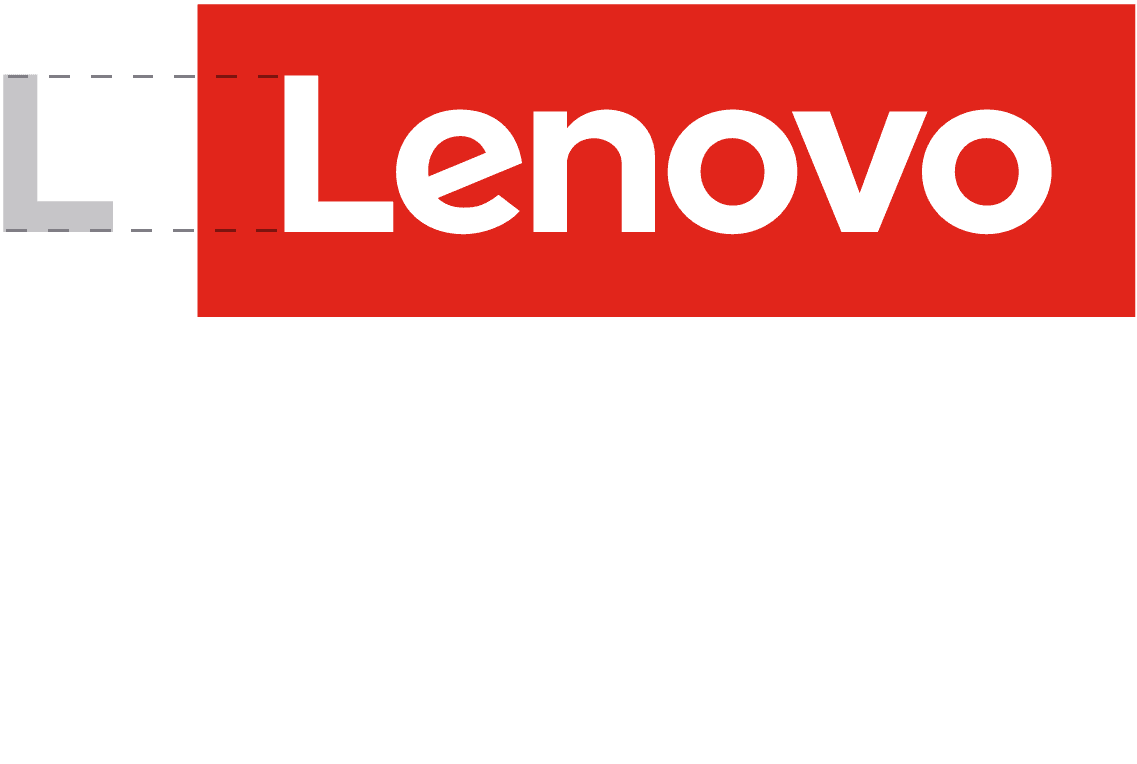
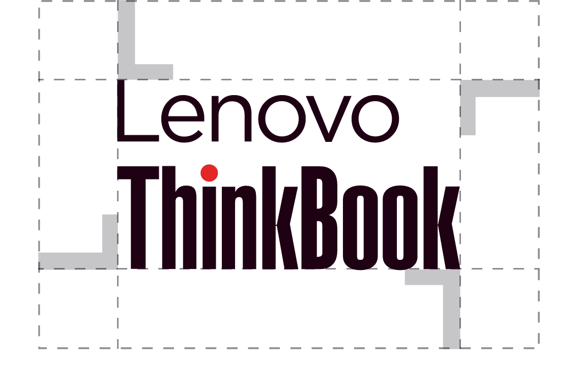
To preserve the integrity of our subbrand wordmarks, always maintain a minimum clear space around them. The clear space is determined by the height of the Lenovo logo “L” in the application. It should be applied as an invisible border to isolate the wordmark from competing graphic elements.


Long-form content
In copy, use Lenovo + subbrand or product name on the first mention. Subsequent uses can drop Lenovo.
Example A
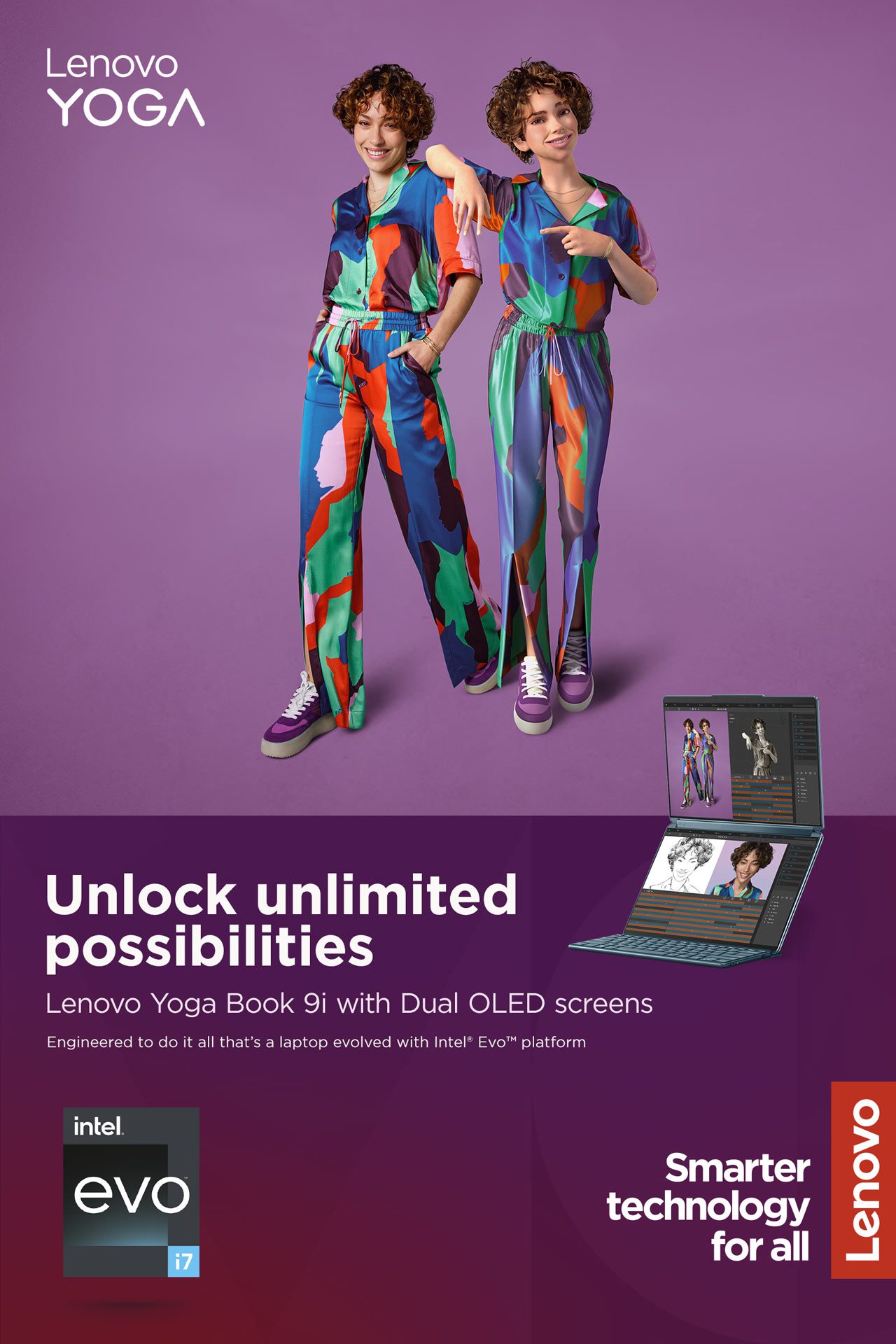
Welcome to the Lenovo Yoga family and our latest offering. Yoga Book 9i writes a new chapter on what a multimode laptop can be.
Alternate
Welcome to Lenovo Yoga 9i, the laptop that is rewriting the chapter on multimode functionality.
Example B
Lenovo ThinkPad systems are engineered for durability. We know your business depends on your PC to keep you going. So every ThinkPad is made to endure.
Alternate
Built for endurance, every Lenovo ThinkPad system is engineered for durability to keep your business going.
Orientation
Subbrand wordmarks should always be used in the horizontal orientation. The only exception is on extreme vertical formats where the width is limiting. For guidance on extreme formats, contact the Brand Help Desk.
Product descriptors
Product descriptors are important identifiers in our communications but should never be used as an add-on element to the subbrand wordmark. Always use a text-based treatment for descriptors in content in other parts of the layout.
- Use only our corporate typeface. Gotham for corporate communications, Arial for shareable documents, Montserrat for web applications and Noto Sans for languages where Gotham does not support the required special characters.
- No unique text treatments or lockup with the subbrand wordmarks
- Color can be used to balance the composition, always consider readability as a first priority when applying color to typography.
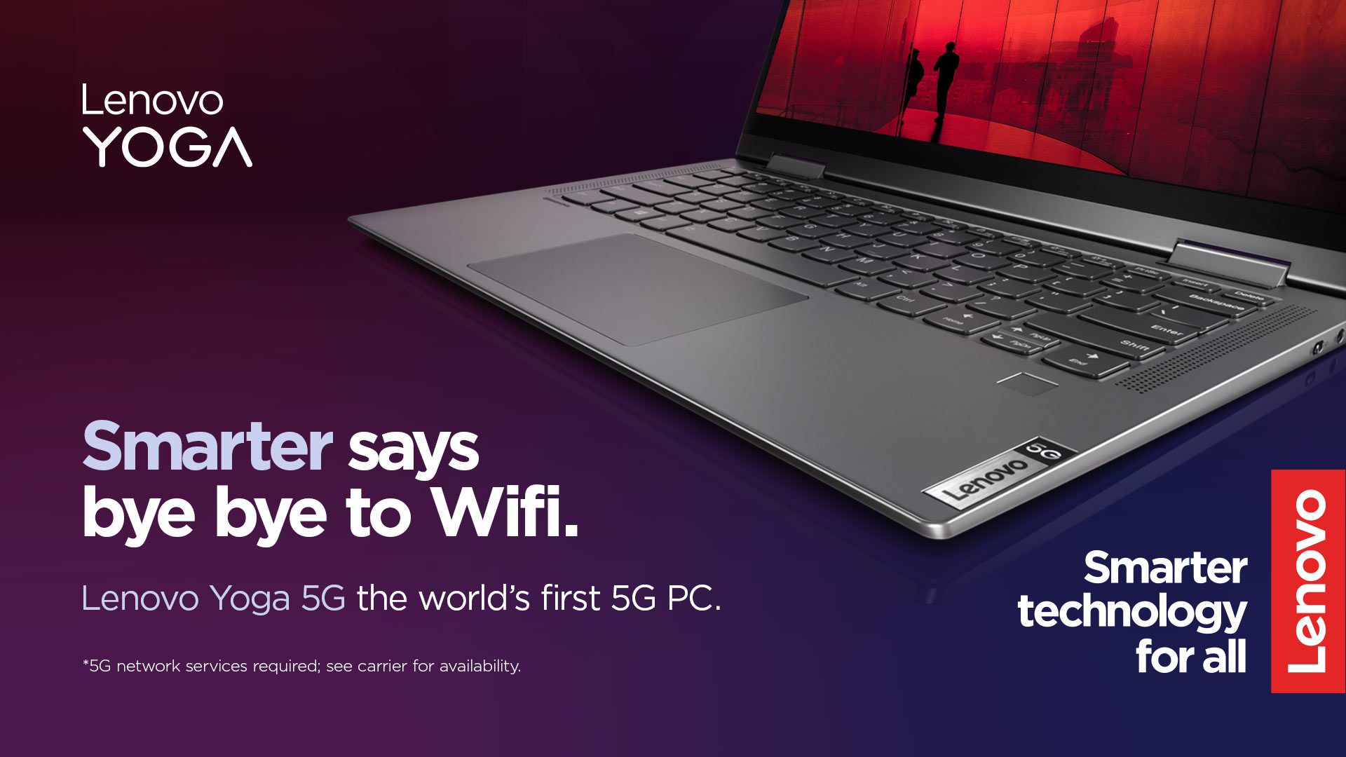
Alternative format
When working with limited space (i.e., digital banners, etc.), there is an option to use the subbrand in copy as regular text to balance the composition. The objective is to make the creative less cluttered with various branding elements.
Before using this approach, test the creative to ensure it achieves the defined objectives.
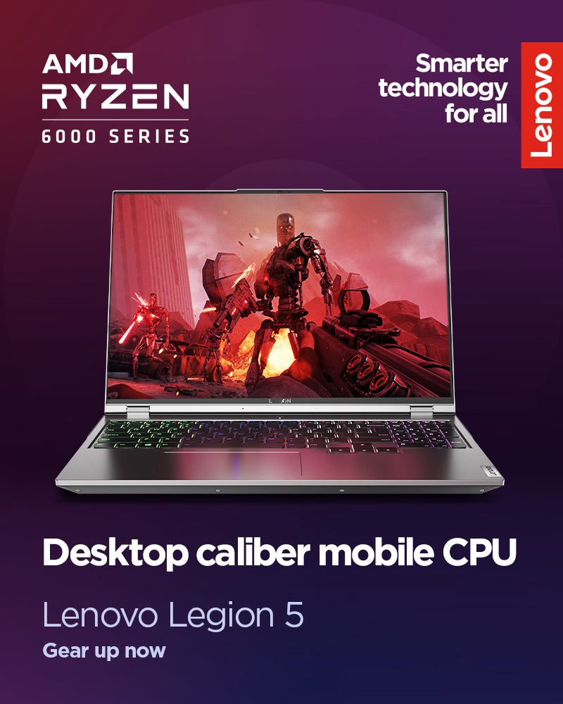
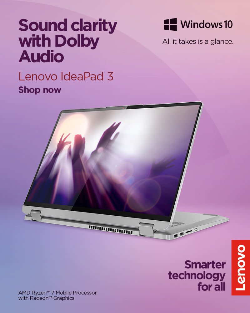
Color
Subbrand wordmarks should always appear in neutral (black or white) variations to elevate the signature red Lenovo logo.
Lenovo IdeaPad, Lenovo IdeaCentre, Lenovo Legion, Lenovo LOQ, Lenovo TruScale and Lenovo Yoga use only white or black for the subbrand wordmark.
The Lenovo Think family subbrand wordmarks have four variants:
- White and red version (negative): for use on a black or dark-colored background
- Black and red version (positive): for use when the product wordmark is placed on a white or light-colored background
- When needed, a one-color positive or negative product wordmark can be used.
Lenovo subbrand neutral wordmark color example

Lenovo Think family 2-color negative and positive (preferred)

Lenovo Think family one-color negative and positive

Positioning
The Lenovo logo lockup and the Lenovo logo must never be locked up with a wordmark to ensure legal rights and protections.
Follow these steps to achieve proper wordmark positioning:
- Establish the size of the Lenovo logo or Lenovo logo lockup (use the Lenovo grid system to assist with placement and a balanced composition).
- Size the Lenovo subbrand wordmark using the guidelines outlined above.
- Place the subbrand wordmarks on opposing sides of the composition (when possible) keeping with the clear space guidance outlined above.
- Reconfigure the layout if an additional partner or sponsor logo is required. This may impact the sizing of the Lenovo logo, Lenovo logo lockup and subbrand wordmark.
In some layouts, it is not practical to use the Lenovo logo lockup because the size of the asset does not leave any room to use “Smarter technology for all” in a legible fashion or when it compromises the legibility of our Lenovo logo.
While our wordmarks retain visual impact in a wide range of sizes, they are no longer legible when too small, and their impact is diminished. Please reference our guidance on the minimum size of the Lenovo logo and Lenovo logo lockup and size the wordmark accordingly.
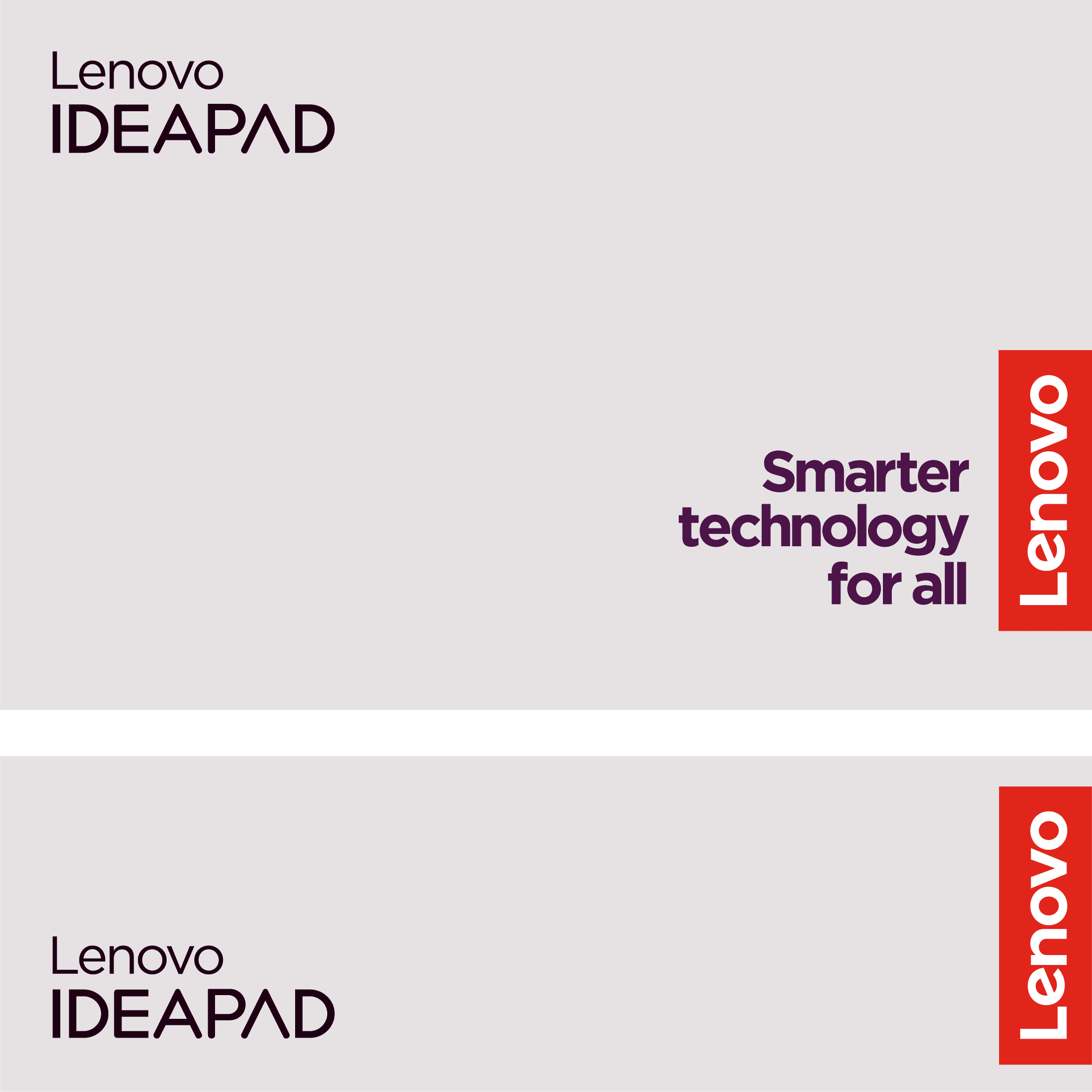
Example vertical layout applications
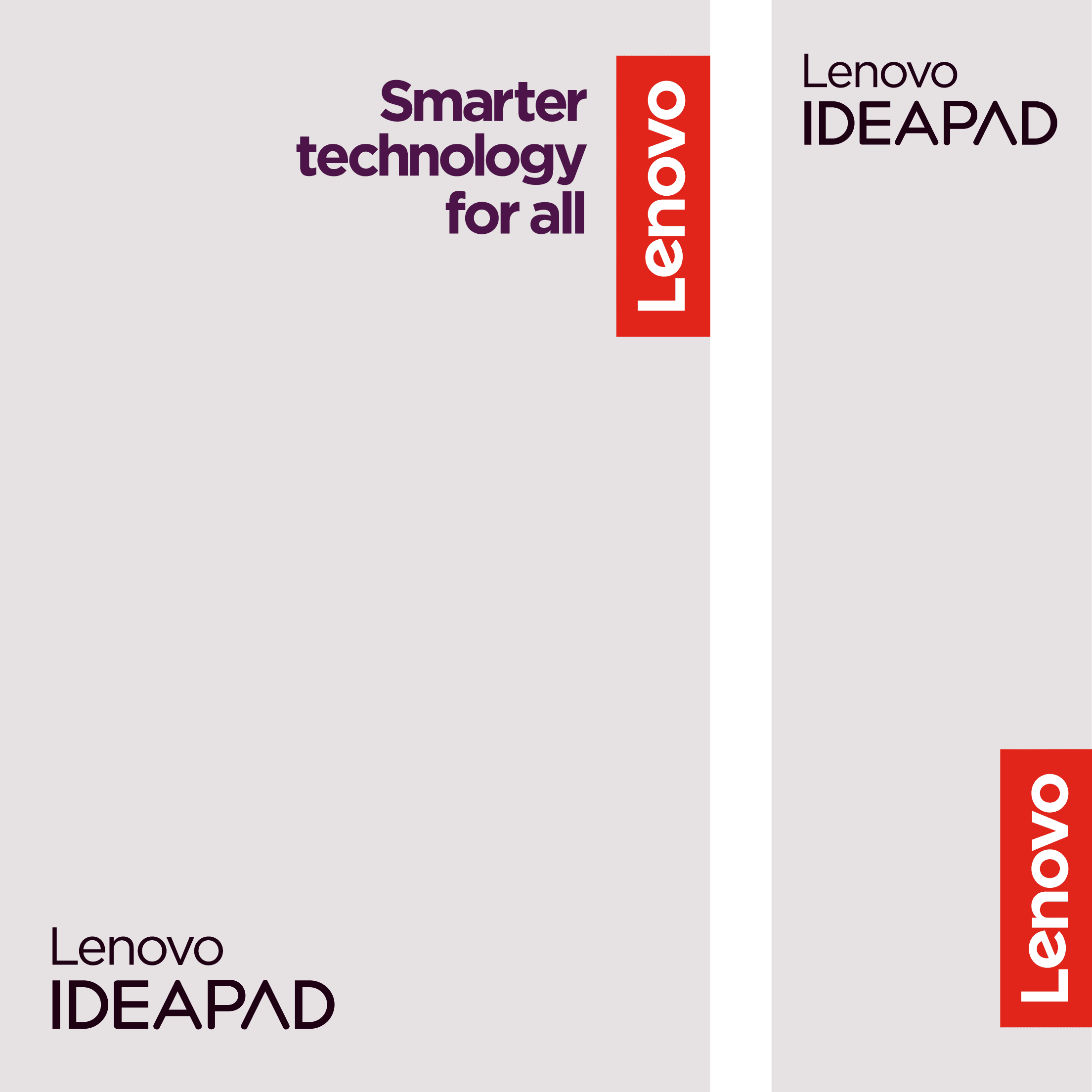
Example horizontal layout applications
Motorola guidance
When Lenovo and Motorola appear together as corporate brands, use the Lenovo logo and the ‘Motorola: A Lenovo company’ logo lockup.
There are three variations of the lockup. The version will depend on the application and where the lockup will appear in the composition.
Use cases include, but are not limited to, events and retail spaces sponsored by both brands, press releases featuring both companies and communication materials presented by both brands. Download the Lenovo and Motorola cobranding logo guidance for complete guidance and examples of applications. Download links and instructions are near the top of the page.
Applications
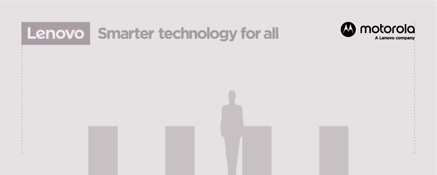
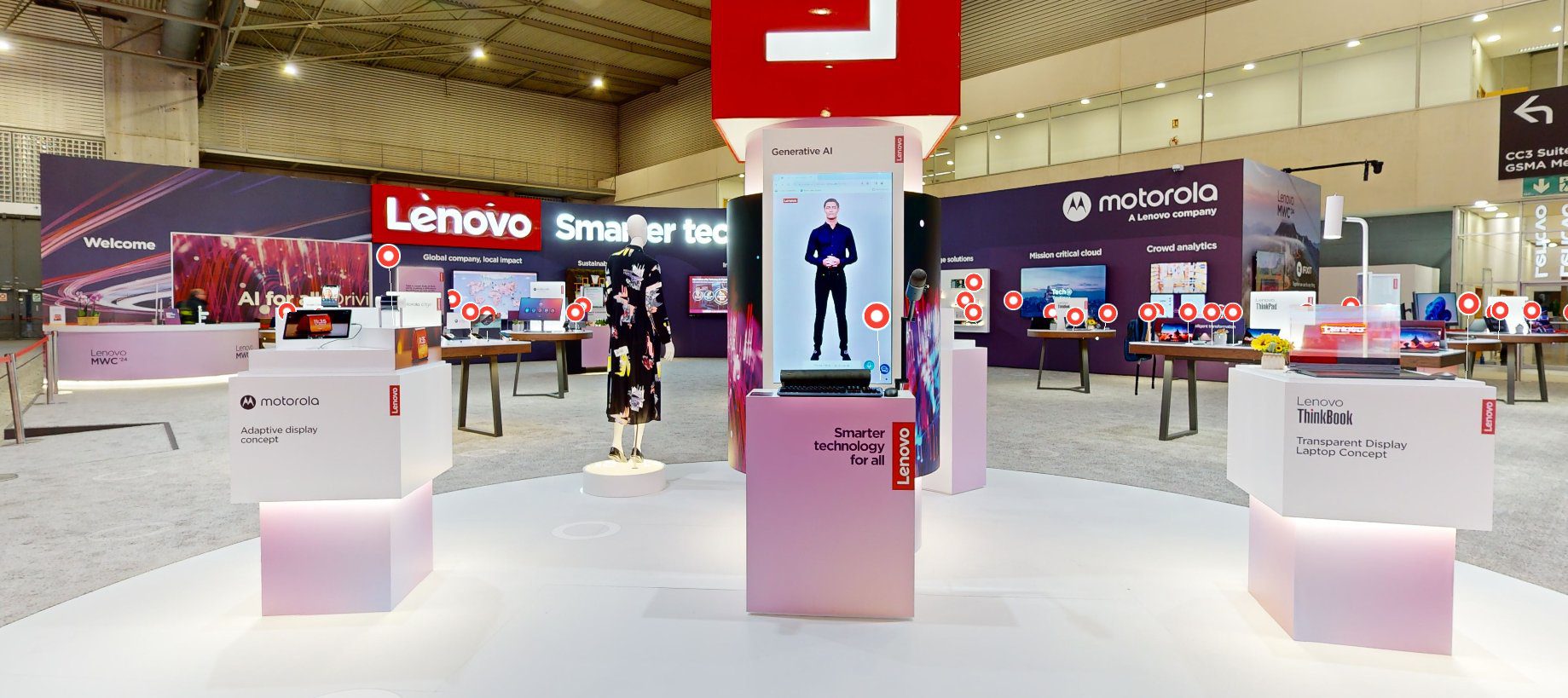
Always look for areas in the layout to show both logos separately and independently from each other. The Lenovo logo should be positioned on the right edge of any application when possible. This is not required for events, offices or retail experiences.
Event example
Communication examples
Lenovo descriptive names
Descriptive names live within the corporate brand identity and should not be given special graphic or typographical treatment.
Descriptive names include business unit organizations, communities, employee resource groups, podcasts, product features, programs, services, software, solutions, team names, technologies, unboxing videos, verticals and any other offerings outside the subbrand portfolio listed above.
Brand marks (logos, wordmarks, etc.) are used for brands only. Descriptive names are not brands and should use text-only treatment in a corporate-approved font.
For guidance on creating an information hierarchy or using a descriptive name as a label, reference the application examples in this section or visit the typography hierarchy section.
Do this:
- Use one solid color.
- Use tight leading and letter spacing.
- Use the same font weight (bold or nonbold).
- Use one line unless the application calls for two lines.
- Use an approved font (Gotham, Arial, Montserrat).
Avoid this:
- Avoid combining words or using multiple weights within one descriptive name (i.e., MyLenovo, LenovoExample, Lenovo Example).
- Avoid adding icons or special graphic treatments (i.e., Lenovo Rewards
).
- Avoid replicating the examples in the what not to do section.
Have questions or need a brand review? Reach out to the Brand Help Desk.
Advertising examples using Gotham, our default font for print communications.

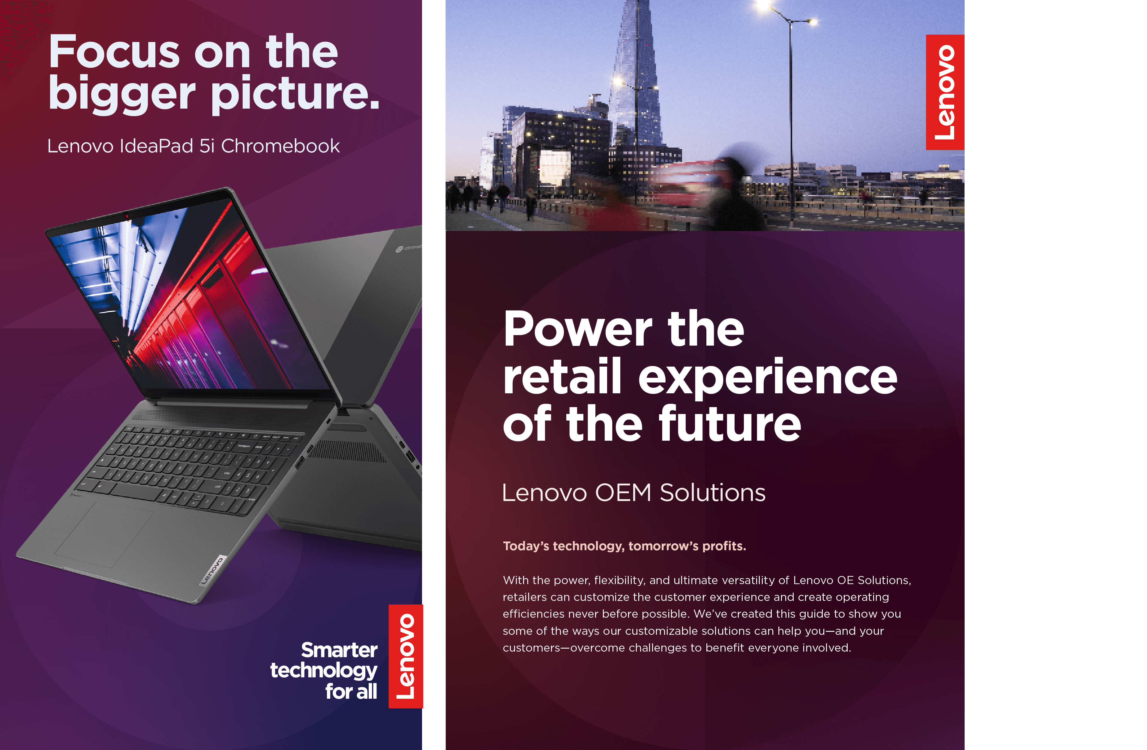
Email banner examples using Arial, our default font for shareable documents.
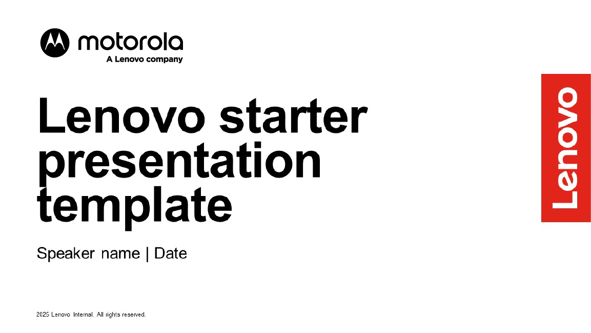
PowerPoint example using Arial, our default font for shareable documents.

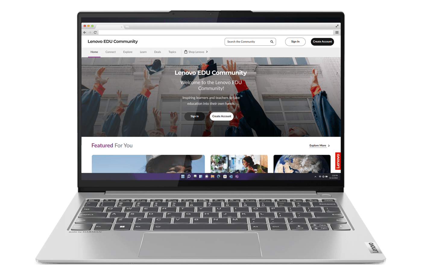
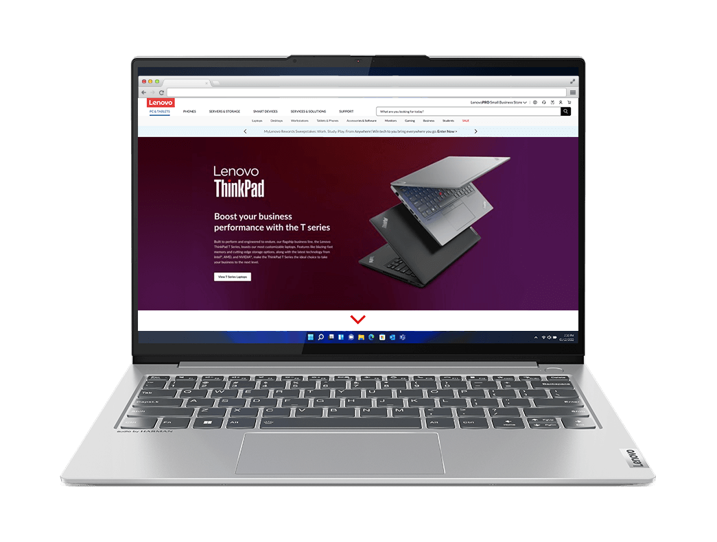
Online example using Monserrat, our default font for the web.
Applications


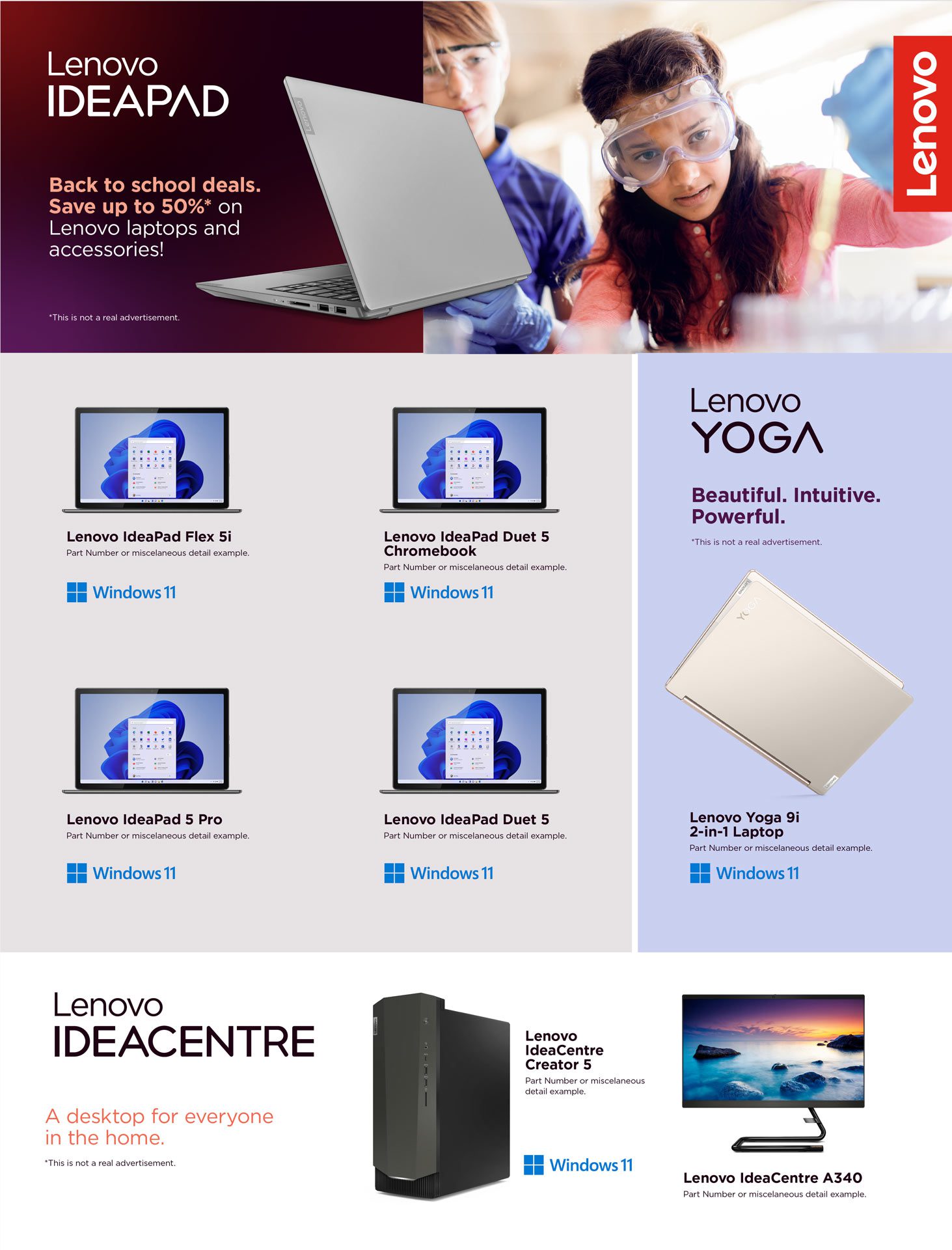
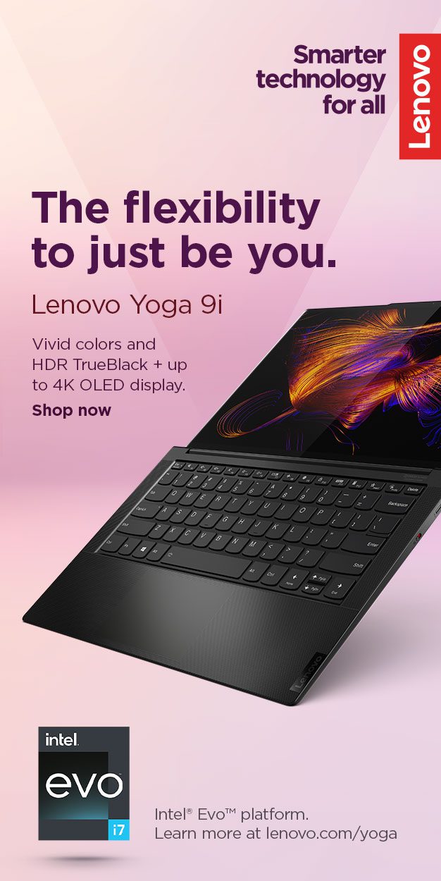
Examples of what not to do
These examples represent the wrong way to apply our brand elements. Email the Brand Help Desk for review and/or approval of an asset not within our brand library.
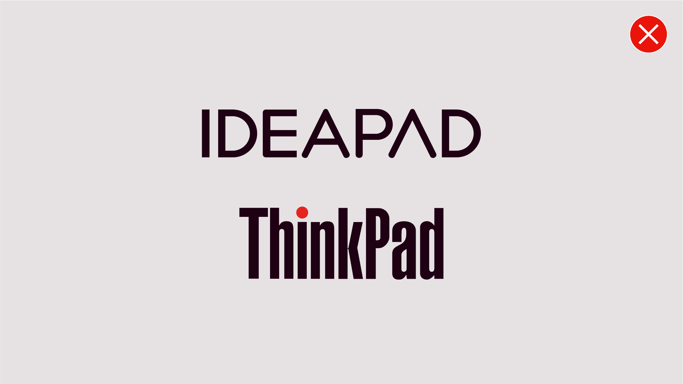
Don’t use older versions of the product wordmarks.
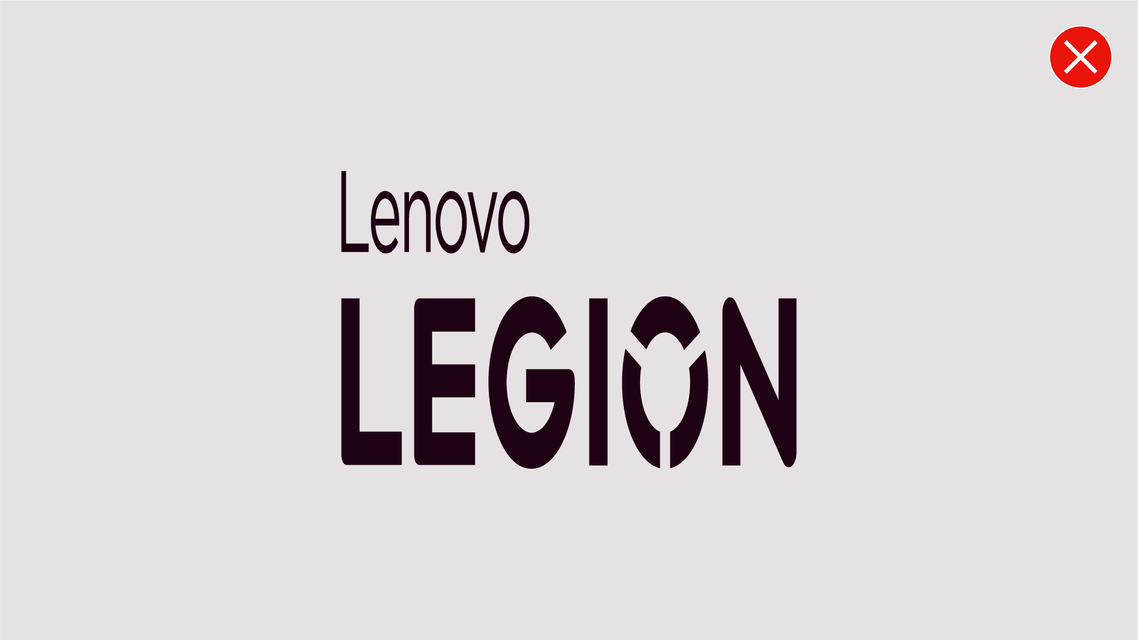
Don’t distort the product wordmark.
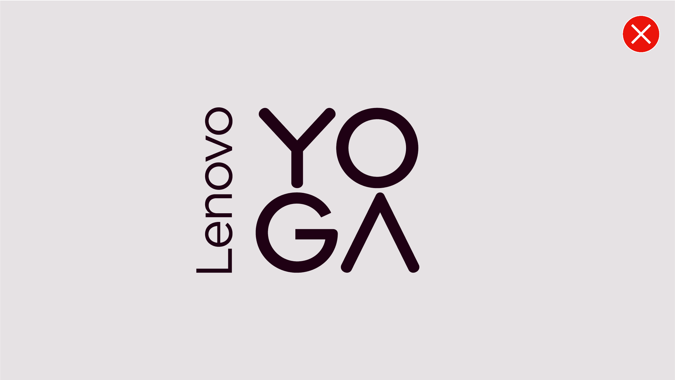
Don’t reposition the elements of the product wordmark.
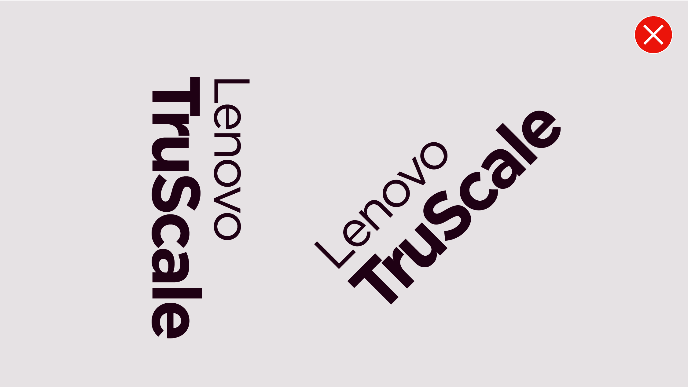
Don’t orientate the product wordmark in wrong direction.
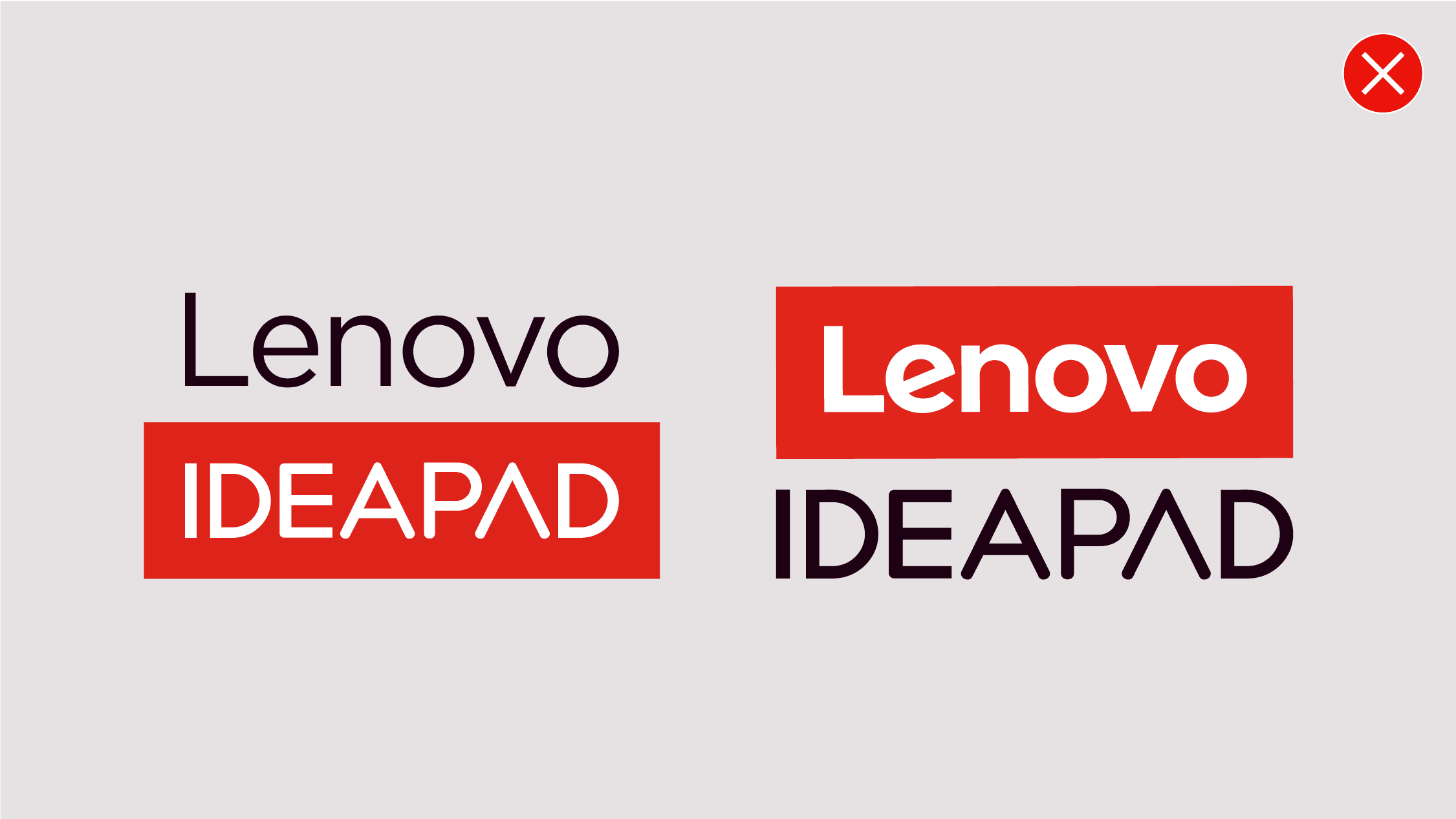
Don’t place the product wordmark in a containing shape.

Don’t apply different colors to subbrand wordmarks.

Don’t use product descriptors with the subbrand wordmarks.
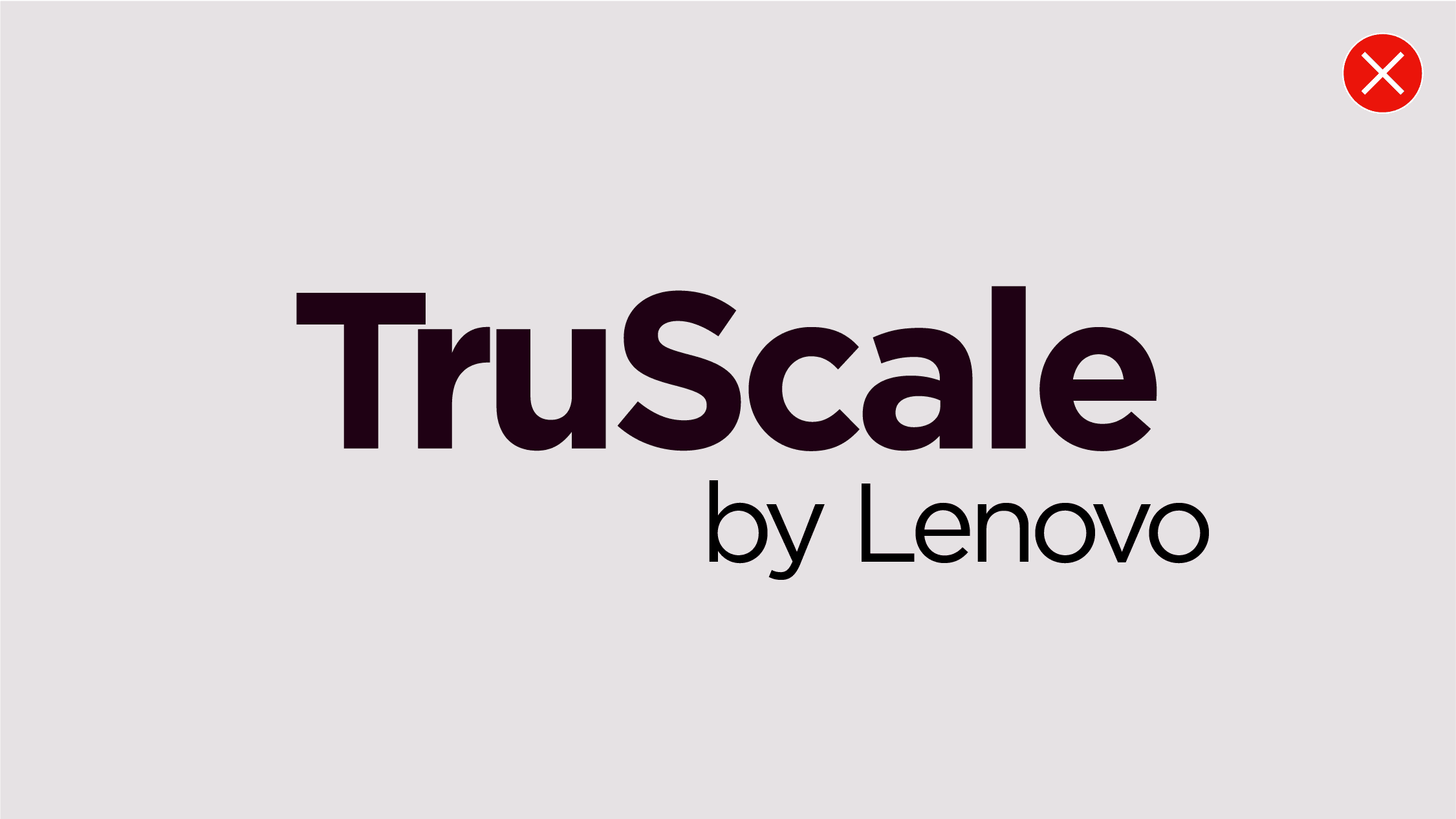
Don’t move, add or rearrange the elements of the subbrand wordmarks.
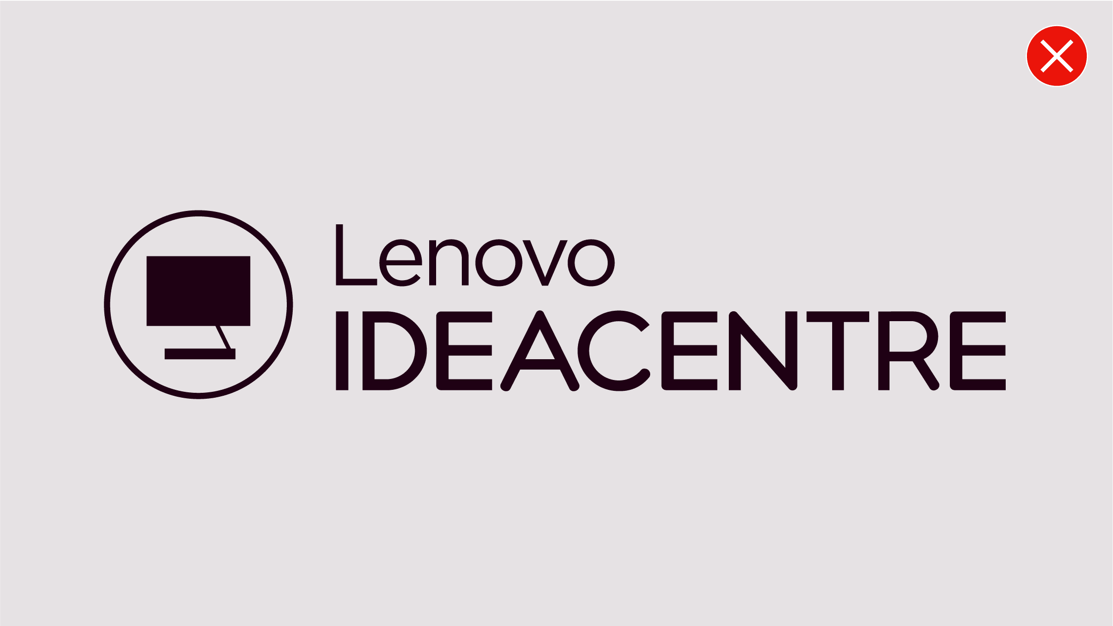
Don’t combine icons or other graphic elements with subbrand wordmarks or descriptive names.

Don’t create new or modify the existing subbrand wordmarks.

Don’t add descriptors with containing shapes to the subbrand wordmarks.
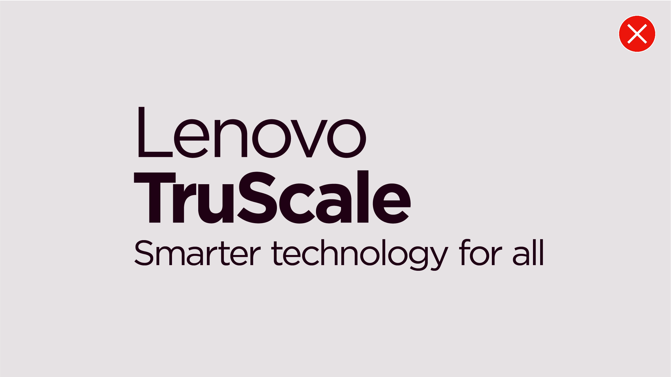
Don’t lock up STFA text with any of the subbrand wordmarks.

Don’t apply subbrand wordmarks on backgrounds with low contrast or legibility.
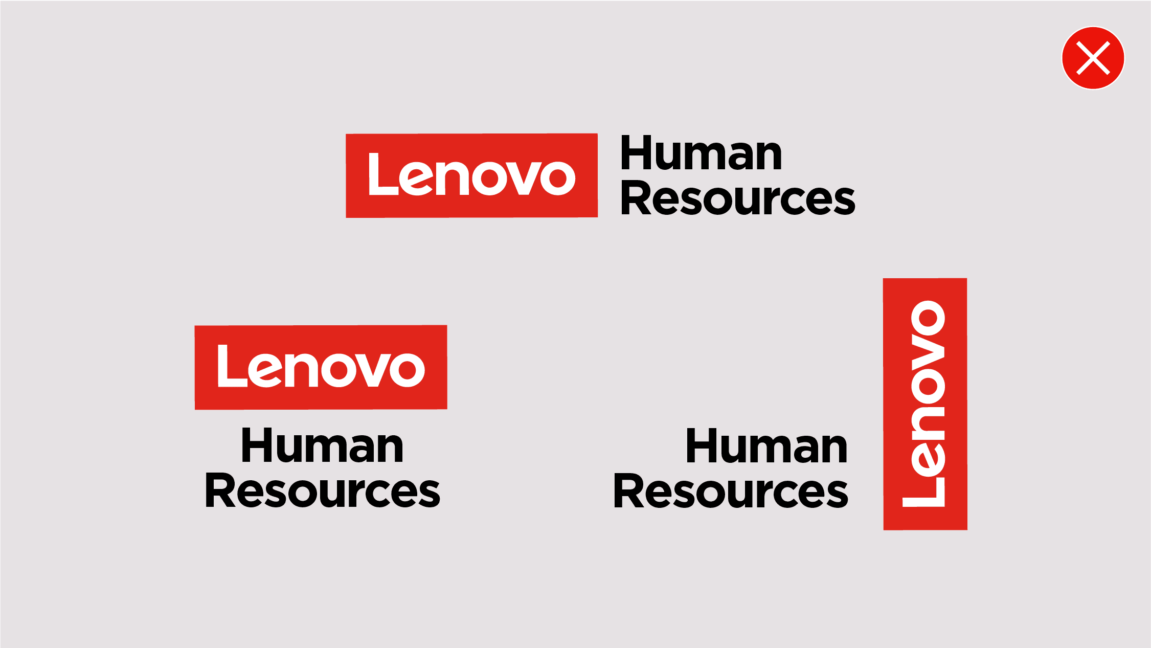
Don’t lockup subbrand wordmarks or organization names with a partnership logo and/or Lenovo logo.

Don’t apply different weights of a font within a single organizational name and/or descriptor. Don’t use multiple colors or gradients as infills.

Don’t lockup subbrand wordmarks or organization names with a partnership logo and/or Lenovo logo.
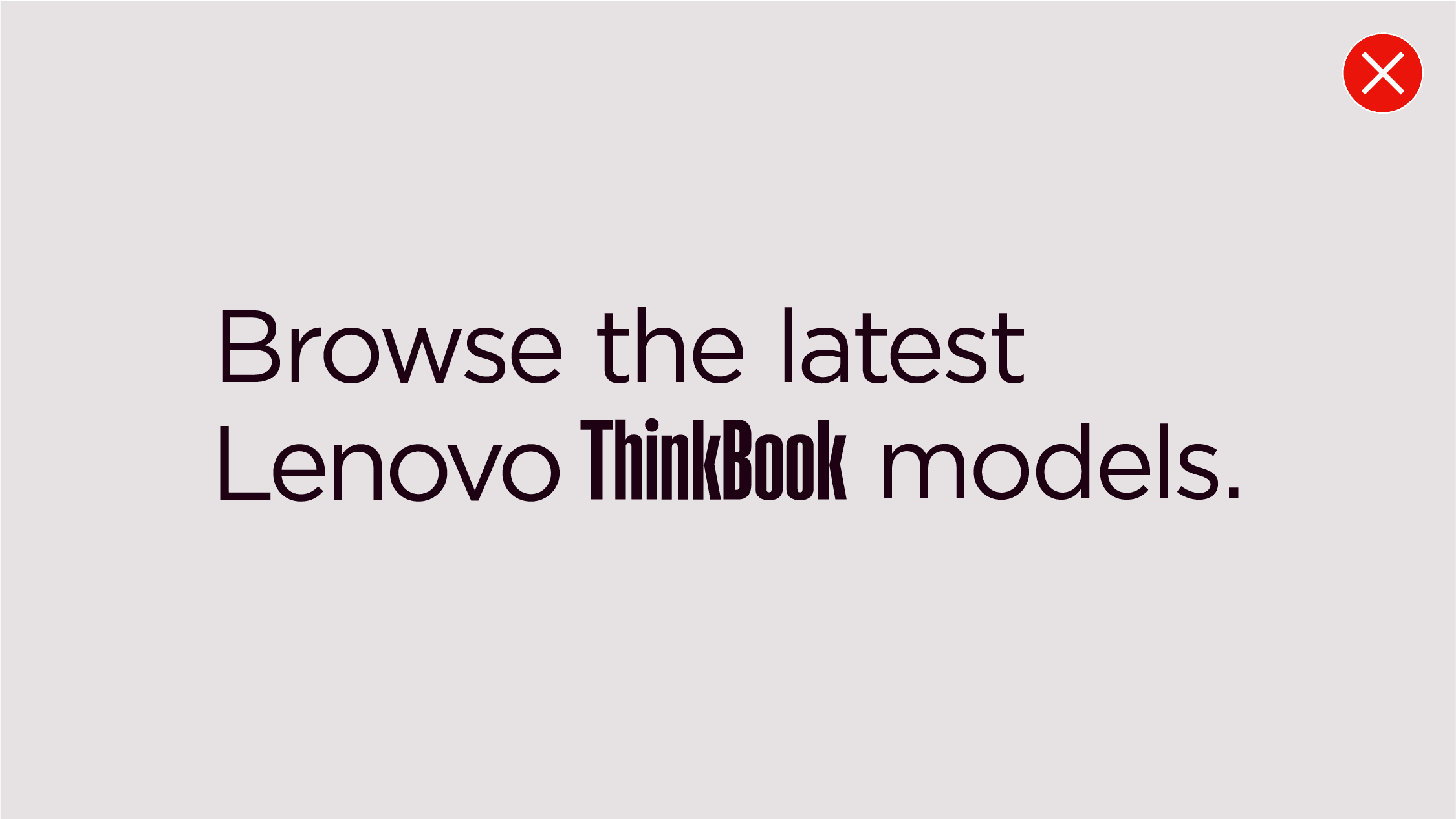
Don’t use the subbrand wordmarks as a replacement for text in headlines or written sentences
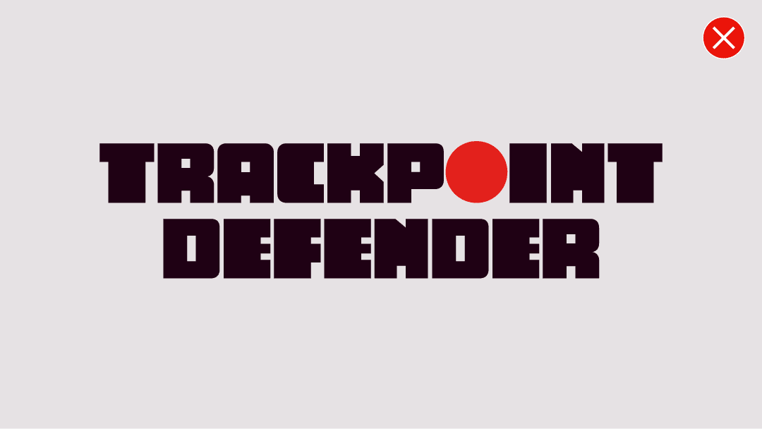
Don’t apply special treatments to names/descriptions outside the subbrand category.
Don’t apply red as a color treatment to only punctuation or replicate any design aspect of our Lenovo logo or subbrand wordmarks. Don’t embellish STFA or SAFA with unique design treatments.
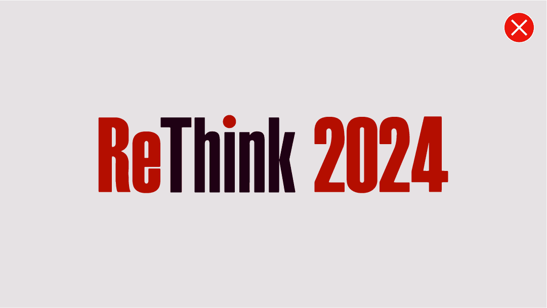
Don’t use “Think” as a wordmark by itself or combined with another word. Only use the approved subbrand wordmarks found on Brand World.


