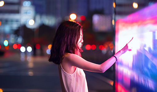
Our imagery communicates how we see the world and helps bring our brand to life.
We use imagery to tell stories and to communicate our point of view. Our imagery should be used to deliver on the brand vision of “Smarter technology for all” and reflect our brand personality.
- Purposeful – Our images should reflect an intent and a well-thought-out reason for being.
- Unexpected – Our images should be surprising to capture our audience’s attention.
- Brave – Our imagery should feel confident, command attention, and provoke a reaction.
Download brand imagery
Important note: Brand assets, sonic or visual, cannot be used to train AI models as they are not licensed for that particular use.
Brand image collections
Our brand image collections, just like our business, cover a wide range of themes. From specific industries to our global reach.
Our library of imagery is vast – you can use the collections below to pinpoint a theme or view the entire brand library to find something that catches your eye. Keep in mind, just because an image has been placed in a specific collection does not mean it can’t be used for another topic. We have curated these collections to help reflect these important areas of the business. Imagery should always be supported with strong copy to deliver context and impact.
Abstract
Abstract imagery can add texture, depth, energy and movement. From big and bold to subtle and sophisticated, they can be used as metaphors to help communicate messages or purely as backdrops for communications.


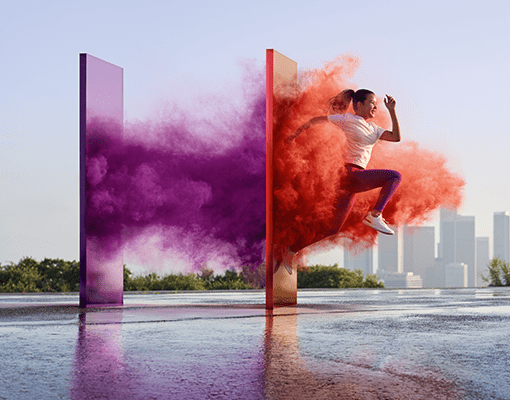
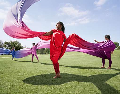
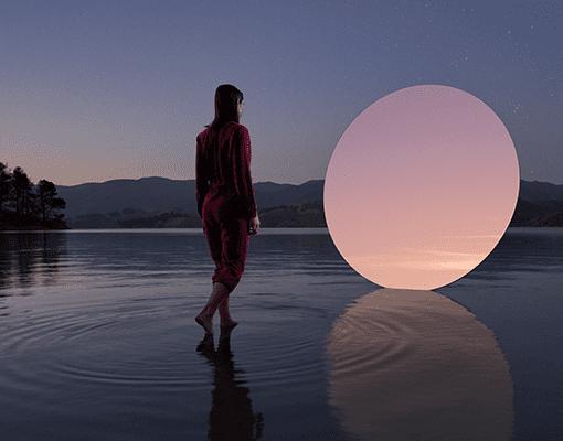
Brand-level
Our bespoke collection is our unique custom photography and cinemographs that the brand team creates from concept to production. These images have been produced with the framework of Lenovo’s mission of leading and enabling the world’s intelligent transformation.
For questions regarding licensing of our brand level imagery, please email the Brand Help Desk.
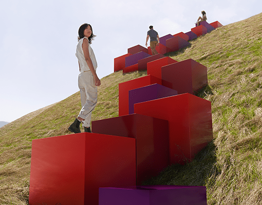
Human element
Authentic photography capturing people in real moments. This imagery is not staged but grounded in reality. The citizens of our world are energetic, inquisitive, diverse and unafraid, and our photography should reflect these important traits.


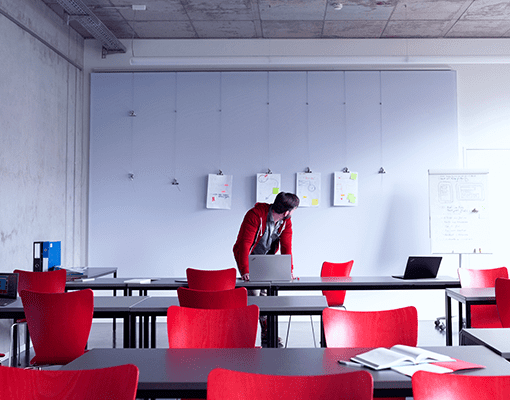
Industry
Our business serves many industries. Here is a list of a few of those you will find in this collection: agriculture and landscape, education, finance, healthcare, manufacturing, small business.



Innovation
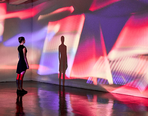
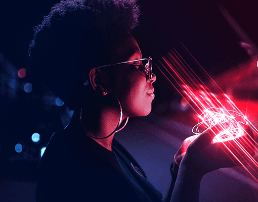
This collection depicts with photography the latest advancements in big data, analytics, machine learning, cloud computing, edge computing, 5G and AI.


Service-led
We solve business challenges by being a trusted source for customers. This collection offers a glimpse into the service and solution areas that drive our mission to lead and enable the world’s intelligent transformation.


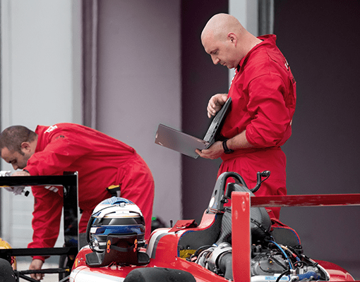
Sports-themed
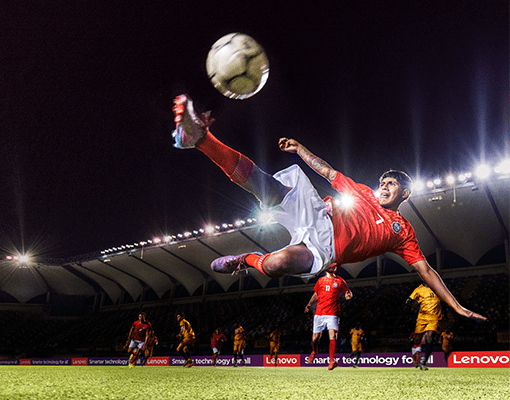
These images celebrate the exciting and inclusive spirit of sports, supporting the narrative around Lenovo’s sports sponsorships.

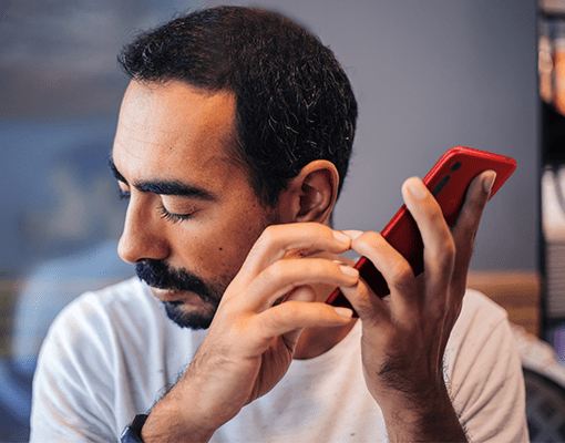
Technology-in-use
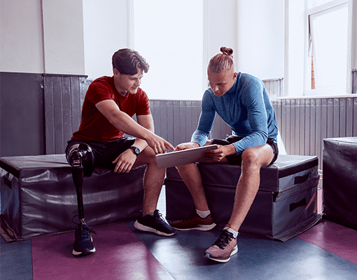
Different from product lifestyle photography, this collection is less about our product and more about the environments and people who use them.


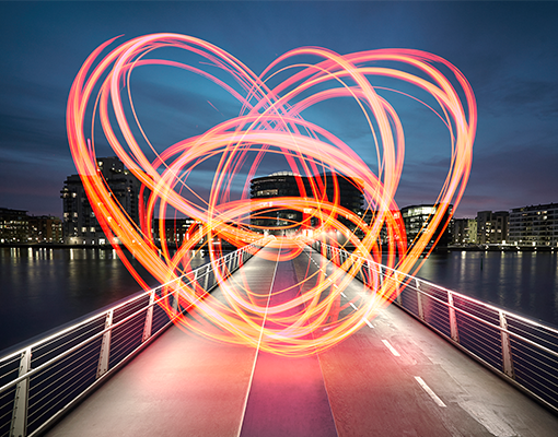
Workplace culture
As a uniquely global business, diversity is one of Lenovo’s greatest strengths. This collection highlights our employee cultures from around the world as well as the values we hold as a business.


Photography
A bold use of our brand colors and a distinctive visual point of view is something we use consistently across our brand elements to help us stand out and differentiate ourselves from our competitors.
This should also be the case across our product, lifestyle and use case imagery. The following guidance in conjunction with guidance in our color section will outline how this can be achieved through the choice of environments, propping, and wardrobe.
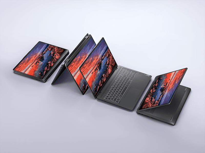
Product photography
Backgrounds
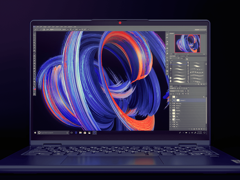
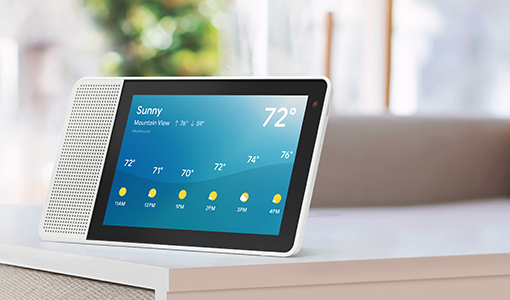
Our products can be showcased on a variety of backgrounds. From simple graphic backgrounds and sets, to environments that reflect ‘real life’ use cases.
- When placing a product digitally into a simple graphic background, please use one of the approved backgrounds found in the color and texture backgrounds section of this site. This will ensure we maintain a consistent visual approach and quality across this area of product imagery. Do not place products onto backgrounds of completely flat color.
- If you are shooting a product on a simple graphic set. Make sure that the set accurately reflects our brand palette.
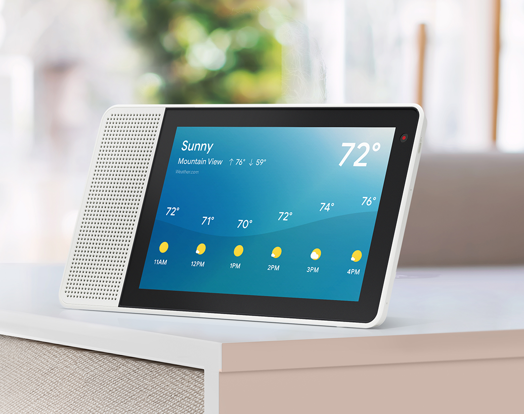
- When shooting a product in a ‘real life’ set or environment, make sure that the brand colors are represented within the shot. This could be through the paint color on a wall, or the color of props/furnishings.
Props
Props may be used in the space to help tell the product story. We recommend that props be used in a purposeful manner to help communicate the product feature or benefit in a clear yet distinctive way. Less is more. Make sure the overall design and color of the props and other elements complement the product and the color background chosen.
Composition
The angles and framing of the products within the images should feel interesting and distinctive and should be used to enhance the visual storytelling.

Lifestyle and use case photography
The guidance in this section is intended primarily for lifestyle and use case photography and imagery that is set in a more real context. We have differentiated the guidance for the consumer and commercial parts of the business where applicable. This guidance applies to both custom and stock photography.
Mood
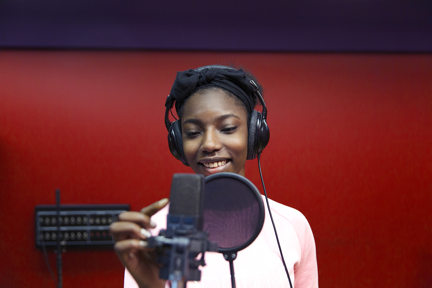
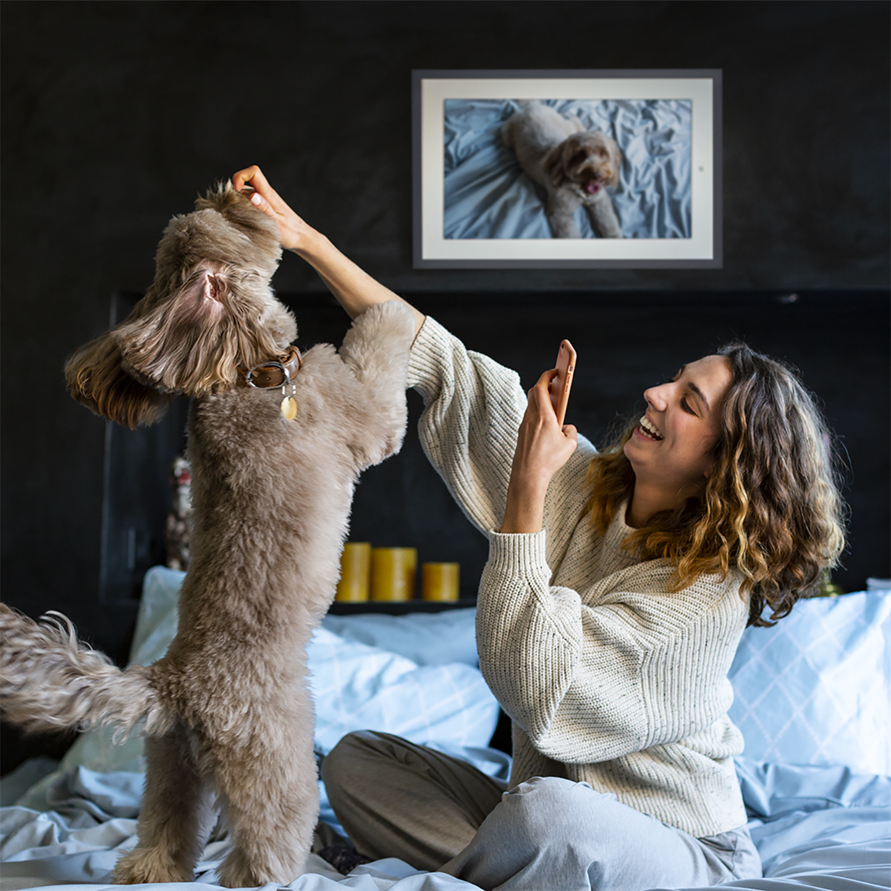
Make sure the image feels like a moment captured; it should feel natural rather than posed. We should feel like we have captured people completely engaged in a moment. Do not have people smiling unless there is a reason for it. We don’t want happy shiny people, we want real people in real moments. Always avoid staged or fake scenarios, interactions with the product should always look natural, never forced.

Composition
We should look for angles and framings for our shots that create a more distinctive look. Each shot should be created to tell its story in an effective but graphically interesting way. Whether that is finding an interesting foreground element to frame the action or positioning the subject in an unusual way in the frame.
Color
Our photography approach uses a bold application of our color palette to create a distinctive world that is ownable and differentiating for the brand. Our signature red color plays an important role in our imagery. The connecting and secondary colors of our palette support and elevate the red while adding character and balance to the overall color of the imagery.

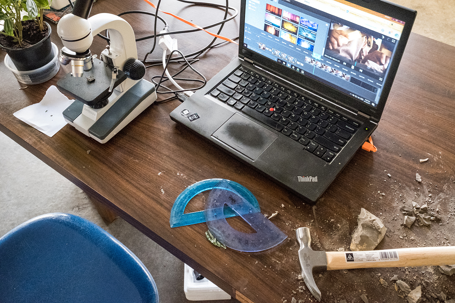
Environments and propping
Environments should reflect the brand color palette and an elevated design aesthetic, but not be too perfect or overly styled. Although well designed, our environments should have a texture of the real world.
Talent
Our imagery must reflect the inclusive and global nature of our brand.
No single image can represent everyone, but together, our visual storytelling should reflect a wide range of people across age, race, ethnicity, geography, gender identity, and ability, to demonstrate our commitment to providing smarter technology for all.
Here are a few important things to consider:
- Actively avoid stereotypes in portraying social or workplace roles (e.g., how family roles or management roles are portrayed). Think about opportunities to ‘unstereotype’ how a role is portrayed.
- Actively avoid unconscious bias in who displays what emotions. Recognize that all people express the full range of emotions, whether serious, happy, playful, etc.
- When casting, choose people who are real representatives of the scenario (e.g.don’t have actors portray disabilities)
- Be inclusive when depicting cultural traditions; avoid religious or cultural bias (e.g., don’t just use Christmas references when showing end-of-year celebrations)
- Use cultural references thoughtfully. Ask whether the message is respectful or is at the expense of someone’s cultural beliefs and traditions.
Consumer
- The citizens of our world are energetic, inquisitive, and unafraid. Our talent should embody that same spirit, with attitude, curiosity, and character that reflect the richness of the world we live in.
- If they were in a crowd of people, they would stand out through the attitude they project through their choice of clothing, the way they hold themselves and interact with their environment.
- At the same time, they should feel authentic and real.
- They should not feel like caricatures or stereotypes. We are not a bunch of hipsters.
- They should not pose for the camera but be found by it.
- They should be caught in the middle of doing something they love with our technology.
- Their expressions should be real, and natural to the situation.
- They should not be grinning for the camera, if they are laughing or smiling it needs to be a fitting reaction to what they are experiencing.
Commercial
- Always look for people that have a slightly unusual quality. This could be because of the unique job they do, or the look they’ve cultivated, or simply the expression on their face. They shouldn’t be your average businessperson or over-stylized model.
Wardrobe and styling
Consumer
Our talent should be styled in a way that communicates an independence of spirit and way of being, but not typically fashionable.
Wardrobe doesn’t follow the usual fashion rules, but reflects their personality, creating their character and projecting their story.
Their clothing and props should feel lived in and real, not like it just came off the rack at H&M. Bags don’t have to be zipped shut, both straps don’t have to be on the shoulder. Makeup should be unnoticed, and hair is not perfectly styled.
Commercial
In our world, people dress to reflect the way they do business, and they always have a unique point of view. They own a business wardrobe, but they put their outfits together with a slight twist. The wardrobe in our imagery can be used in layouts as a way to express the brand’s color palette as a hit of energy to contrast a neutral base, or the more neutral element to play off a more colorful environment.
Inclusivity in imagery
When selecting images or talent for video and photography, be representative in your choices and strive for inclusion. Imagery best practices:
- No single image can represent everyone, but collectively, our imagery should reflect people across a wide range of ages, races, ethnicities, geographies, gender identities, and abilities in a way that feels inclusive and authentic. Follow all other brand guidance when depicting talent in our world.
- Be mindful to not depict stereotypes (e.g., how family roles are portrayed)
- All people live full lives. Allow all groups to depict the full range of emotion and experience.
- When casting, choose people who are real representatives of the scenario (e.g. don’t have actors portray disabilities)
- Be inclusive when depicting cultural traditions; avoid religious or cultural bias (e.g., don’t just use Christmas references when showing end-of-year celebrations)
- Use cultural references thoughtfully. Are you being respectful? Is anything at the expense of someone’s cultural beliefs and traditions? Are you preserving context?
Stock photography
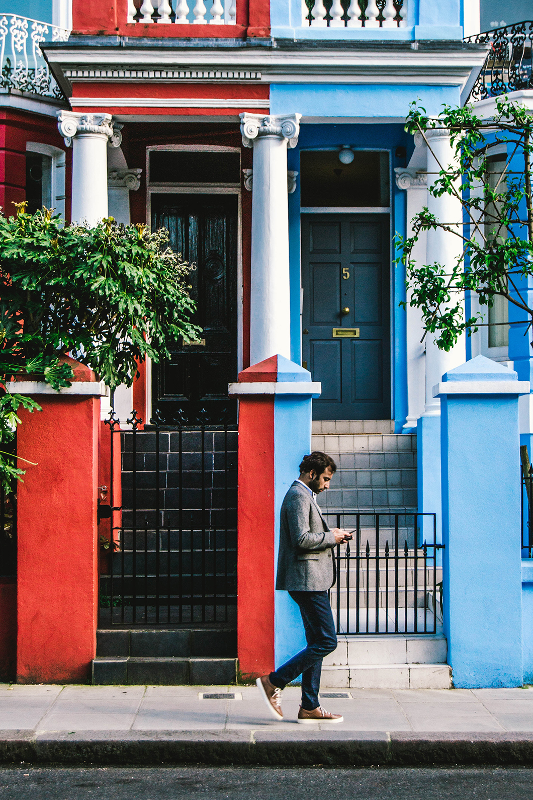
Look for images where the talent is engaged in doing something they love.
Photography should be real and un-staged, it should reflect the same approach to talent and environments as outlined in the above section. However, finding images that have the right colors or the right balance of color can be challenging. A solution is to look for images that have neutral backgrounds where it is easier to apply color in retouching. This allows the Lenovo brand to be expressed to the deepest level.
AI in brand imagery
We believe in the transformative power of AI and its ability to provide positive, human-centered outcomes. Images or subjects that feel fake or staged, sci-fi, surreal or including robots, cyborgs, or humanoids do not represent the Lenovo brand personality.
If you are sourcing new images to showcase AI in use, our innovation imagery collection offers a range of AI-themed visuals that can inspire your next creative project.
Resourcing
It is important as a brand that we show global, diverse, and inclusive individuals in both custom and stock-sourced imagery. For additional imagery resources that focus on real individual(s) with a disability please use one of the following pre-selected sites using the search criteria of “real people with disabilities” or “disability”:
Getty Images | Getty Images video | Eye Em
Image retouching
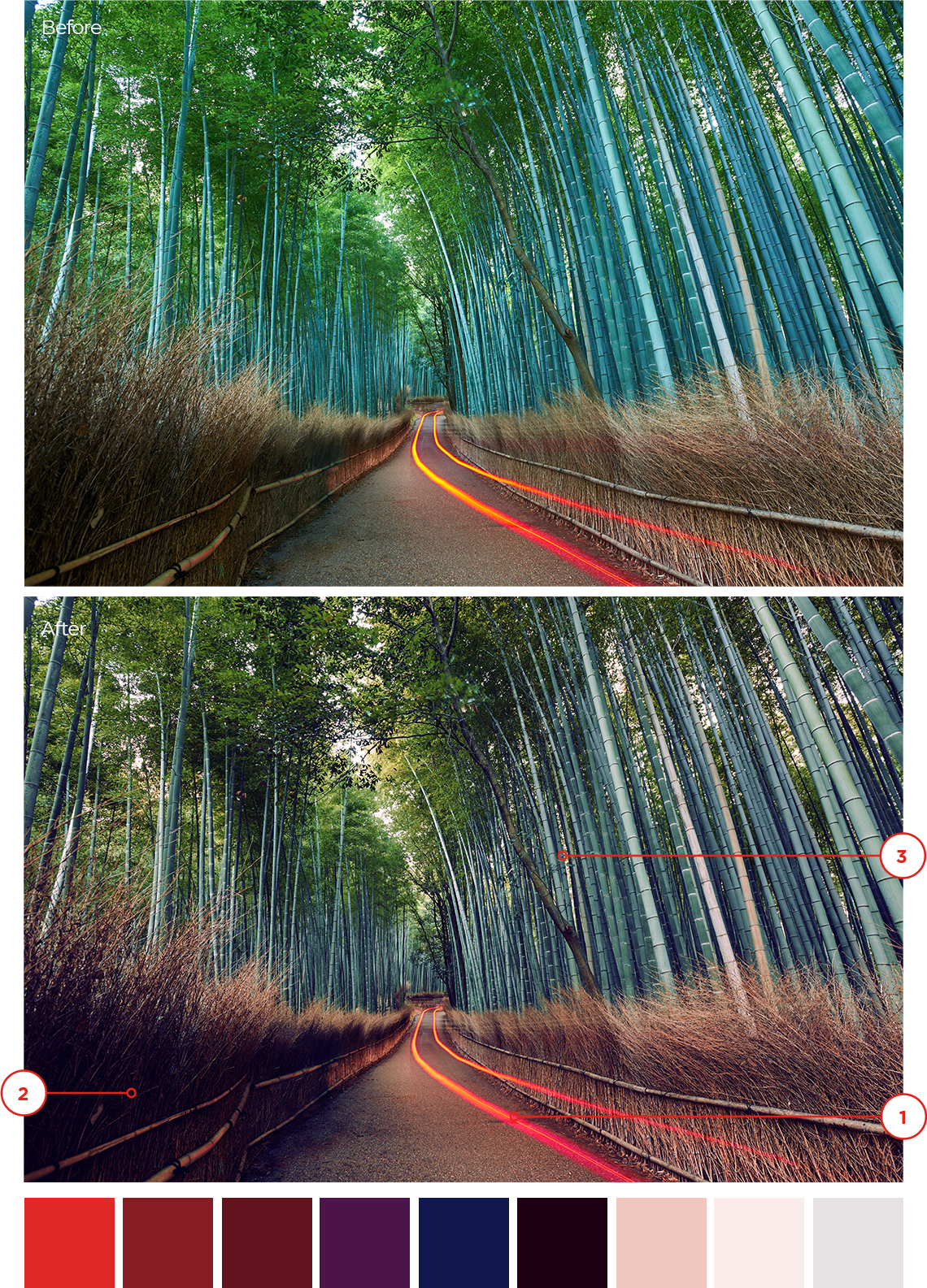
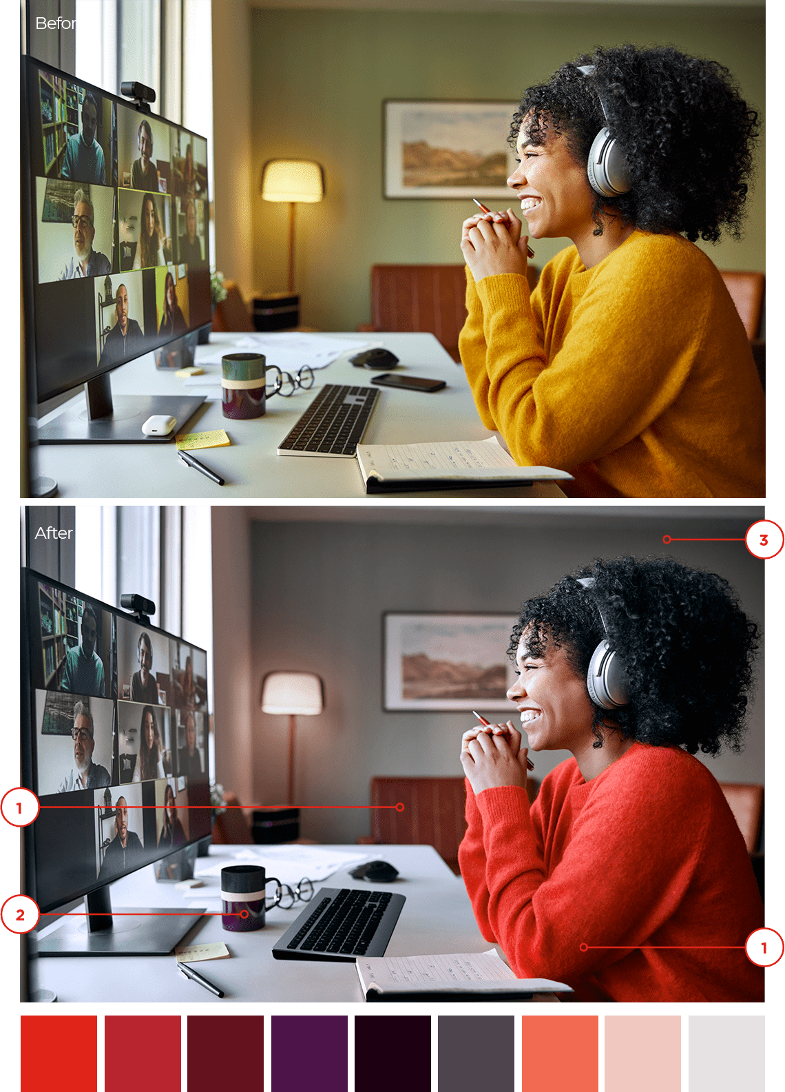
Regardless of the source of the photography, it is important to use our brand palette to bring the Lenovo experience to life. Use the following examples as a framework when image retouching is needed. There are several considerations for adjusting imagery:
1 Determine the role of red
Consider the role red will play in the image. Will red be added as an accent color to focus on an important subject or object? Will the red spectrum replace a dominant color? We never want to flood an image with the color red or unnaturally use red.
2 Brand color
Shift the hues to align with the Lenovo brand colors with an authentic approach. Cool colors get warmer while maintaining their original hue; warm colors shift towards our reds and purples without overwhelming or creating a monotone appearance.
3 Balance
Adding deeper, warm and rich tones to the neutrals, especially black, can connect the warmth back to our brand palette. Additionally, add a small amount of red to greens and cyans in a natural and authentic application to support the role of red.
Color best practices
To optimize visual impact, avoid excessive use of red in the frame. Instead, strategically use the palette to balance the addition of red, considering how it enhances focus and communicates your intended message. This choice will influence the image’s tone and purpose, guiding viewer perception and giving it meaning.
Human touch
Option 1
When featuring people in an image, one option is to focus on one item of clothing in our primary palette. Then adjust other subjects’ clothing by desaturating greens or yellows, darkening or maintaining denim’s natural tone and shifting the color of other clothing towards secondary tones from our approved palette.
Original


A balanced composition with emphasis on a single individual.

A yellow filter shifts the tone of the photo to aged or antique.

A blue filter shifts the overall tone of the photo too cool.
Option 2
Adjust all subjects’ clothing by shifting colors to our palette. Either direction will ensure a cohesive look with a focus on your intended color scheme.

A balanced composition with emphasis on the group.

A yellow filter shifts the tone of the photo to aged or antique.

A blue filter shifts the overall tone of the photo too cool.
Abstract
Choose a visually dynamic image with movement and substantial visual interest. Adjust warmer tones to align with the red from the brand color palette. For cooler tones, shift towards our blues and purples or aim for a more neutral and slightly desaturated appearance. Ensure a dynamic range across the frame to enhance overall visual impact.
Original


Bring the overall color in line with the brand palette.

A blue filter shifts the overall tone of the photo too cool and lacks visual interest.

Over-saturating the color will overwhelm and draw attention from the Lenovo signature red.
Nature focus
Begin by selecting imagery that already has aspects of our brand palette. It should not feel too wild or unkempt. Vegetation should be slightly desaturated while maintaining a natural feel.
The temperature of the sky depends on the time of day:
- Early morning – warm sky with pale reds and purples
- Mid-day – blue temperature shifts to our pale blue, less cyan
- Late afternoon – blue temperature shifts to our deep blue 2 and deep purple 2
- Dusk – deep sky tones, using our red palette to indicate the glow of the sun
Original


Subtle changes to the blue in this image add a bit of warmth to align with our brand palette.

A blue filter applied shifts the overall tone of the photo too cool.

Too much emphasis on green will contrast significantly with our brand palette and lack support for our signature red.
Usage Rights
All images accessible on the Lenovo AEM DAM (Digital Asset Management) platform are subject to usage terms and conditions governed by legally binding license agreements.
Using imagery beyond the expiration date, or outside the rights granted, is a breach of these agreements. This could result in an unauthorized use/copyright infringement claim against Lenovo. This could also put Lenovo in an unleveraged position of having to renew all usage fees at whatever cost is demanded or required by law. A copyright claim against Lenovo is costly and damaging to the company from a PR standpoint. It is essential that anyone utilizing the imagery on the AEM DAM be aware of the use restrictions noted in each file’s properties and follow them accordingly. This will help ensure that Lenovo is in compliance of any agreements and avoid significant financial and legal issues.
Email the Brand Help Desk for questions regarding licensing our brand-level imagery.
Applications

Examples of what not to do
These examples represent the wrong way to apply our brand elements.

Don’t use colors or a combination of colors that are not within our brand palette.

Don’t use a flood of a Lenovo brand color, a duotone filter or a gradient to recolor a photograph.

Don’t use black and white photography.

Don’t superimpose or combine multiple images into one image.
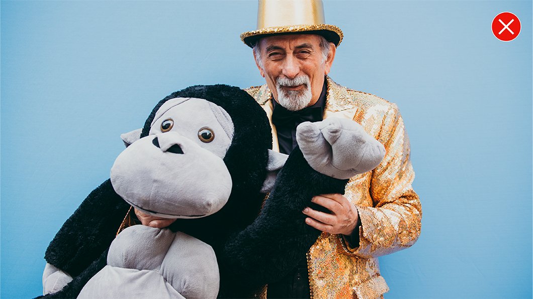
Don’t use overly posed, over edited or unnatural photography.

Don’t use composites of multiple images, cutouts to change backgrounds or combine images unnaturally.

Don’t use cliché photography.

Don’t use stylized objects as a replacement for real people without purpose.

Don’t combine illustration with photography.
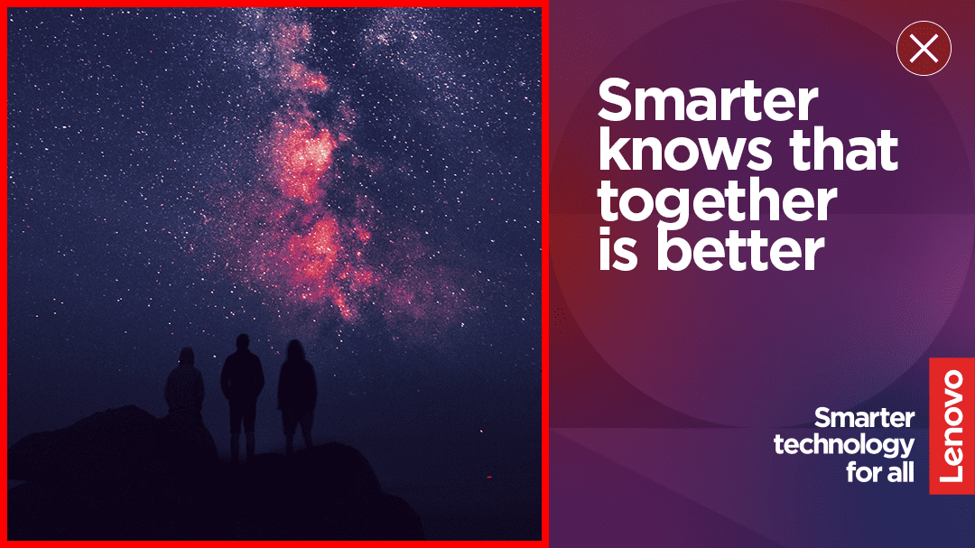
Don’t add an outline to images in a composition.

Don’t crop images in the shapes of our alpha blocks.

Don’t use blue as a primary color for imagery.


