Showcasing the Lenovo brand at events allows us to connect with our audiences with a boost in vitality and presence, increasing brand awareness.
This guidance, combined with our event toolkit, ensures a coherent Lenovo brand experience across events through consistent messaging and a unifying visual identity.
For strategic event questions not related to brand design guidance, contact globalevents@lenovo.com.
Download the event toolkit and templates
On-brand event checklist
1
Adhere to brand guidance
Use approved logos, color palettes, typography, and visual elements as outlined in the visual identity section of Brand World and the event toolkit, linked at the top of the page.
2
Download the event toolkit and templates
Always use the key visual template and brand-approved templates for your event, available to download near the top of the page to ensure visual cohesion across all touchpoints.
3
Event theme cohesion
Ensure all event-specific visuals align with the style and tone set by the event key visual.
4
Consistent messaging
Follow our tone of voice and messaging framework to maintain alignment with brand values and objectives.
5
Music, video and motion graphics
Use music from our sonic asset library and follow our video guidelines when creating media for events.
6
Agency alignment
Share this page, the event toolkit and all brand guidance with vendors and partners to ensure materials are on-brand from production to execution.
Brand hierarchy
Following brand hierarchy guidelines ensures that there is a clear brand hierarchy between the Lenovo corporate brand and the individual product and service brands.
The intention is to design a holistic space that is purposeful and easy to navigate to those familiar with Lenovo and first-time guests alike. This is achieved by structuring the design and messaging of the space into three levels, each with distinct purposes and roles in event communications.
Event design system
A strong visual design system ensures a cohesive and memorable visual identity that aligns with our brand while reflecting the unique essence of the event.
This section provides guidance, downloadable templates and examples on two key components: the key visual and the event wordmark.
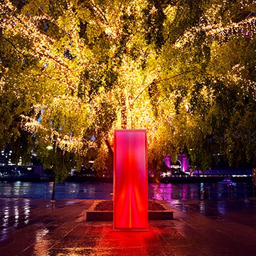
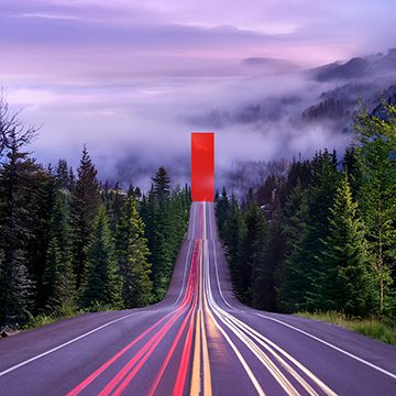
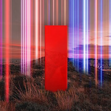
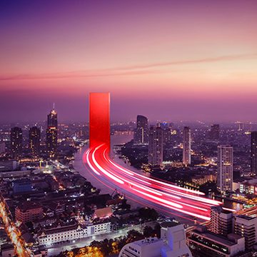
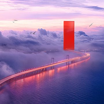
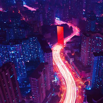
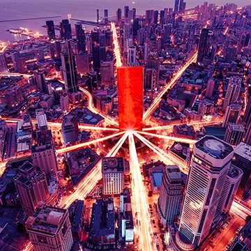
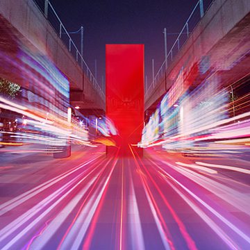
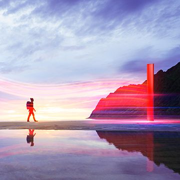
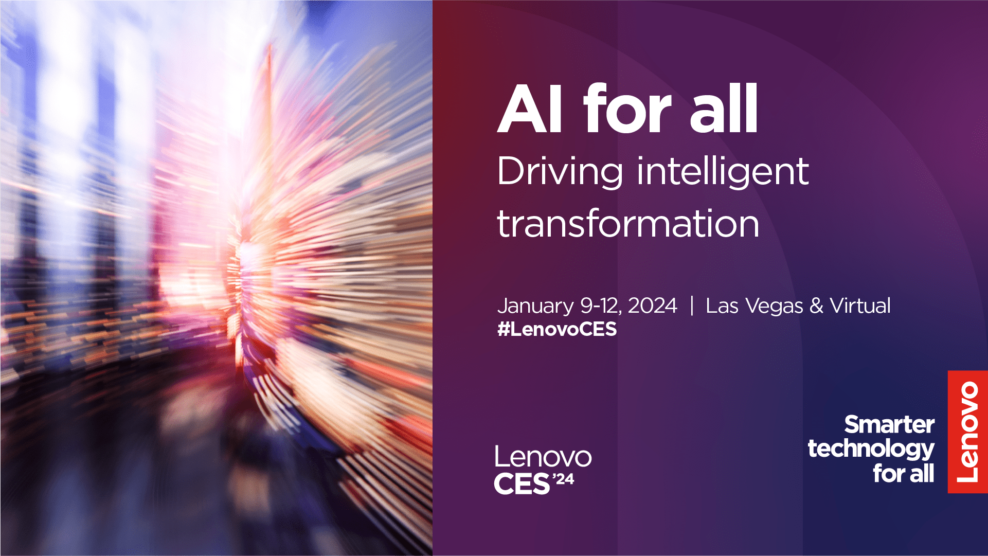
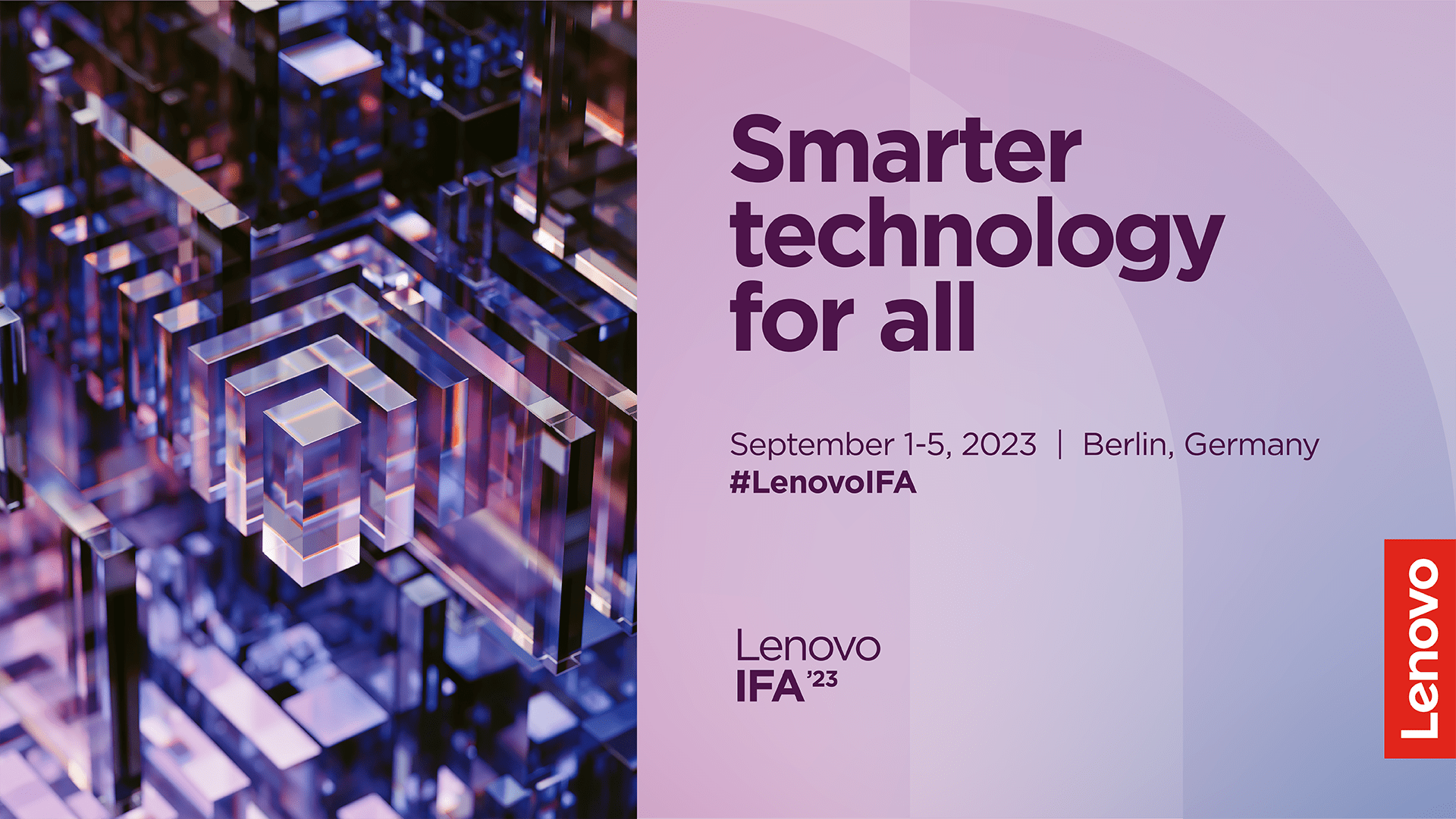
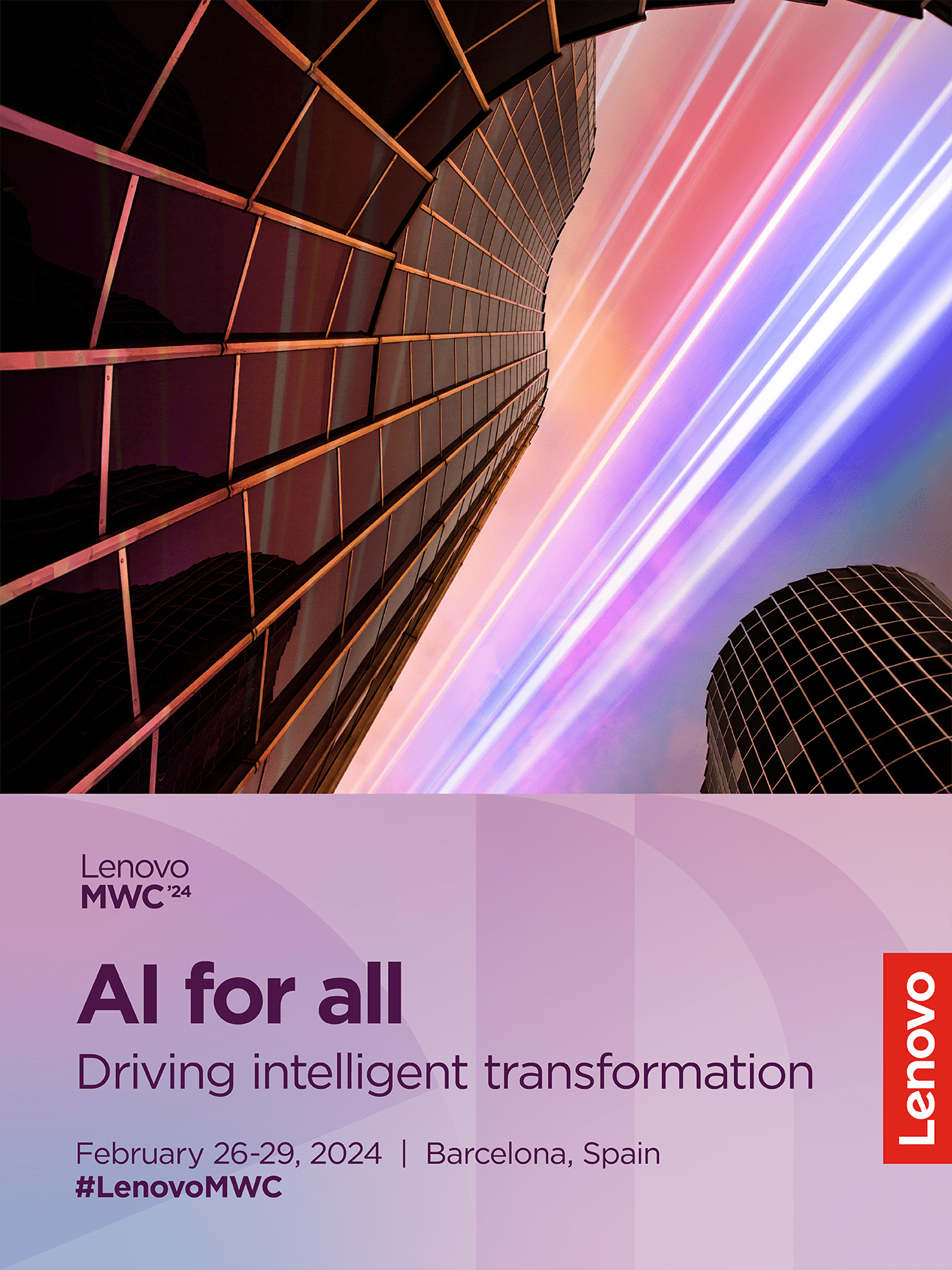
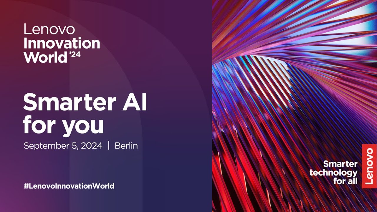
Key visual
The key visual is a design composition built from a defined set of visual elements that acts as a foundation to inspire and translate into various applications in the months leading up to an event.
The key visual should be used thoughtfully and sparingly within the event environment. Elements from the key visuals, e.g., imagery, pattern, colors and messaging, should be used instead to create a consistent experience from the communications that led up to the event.
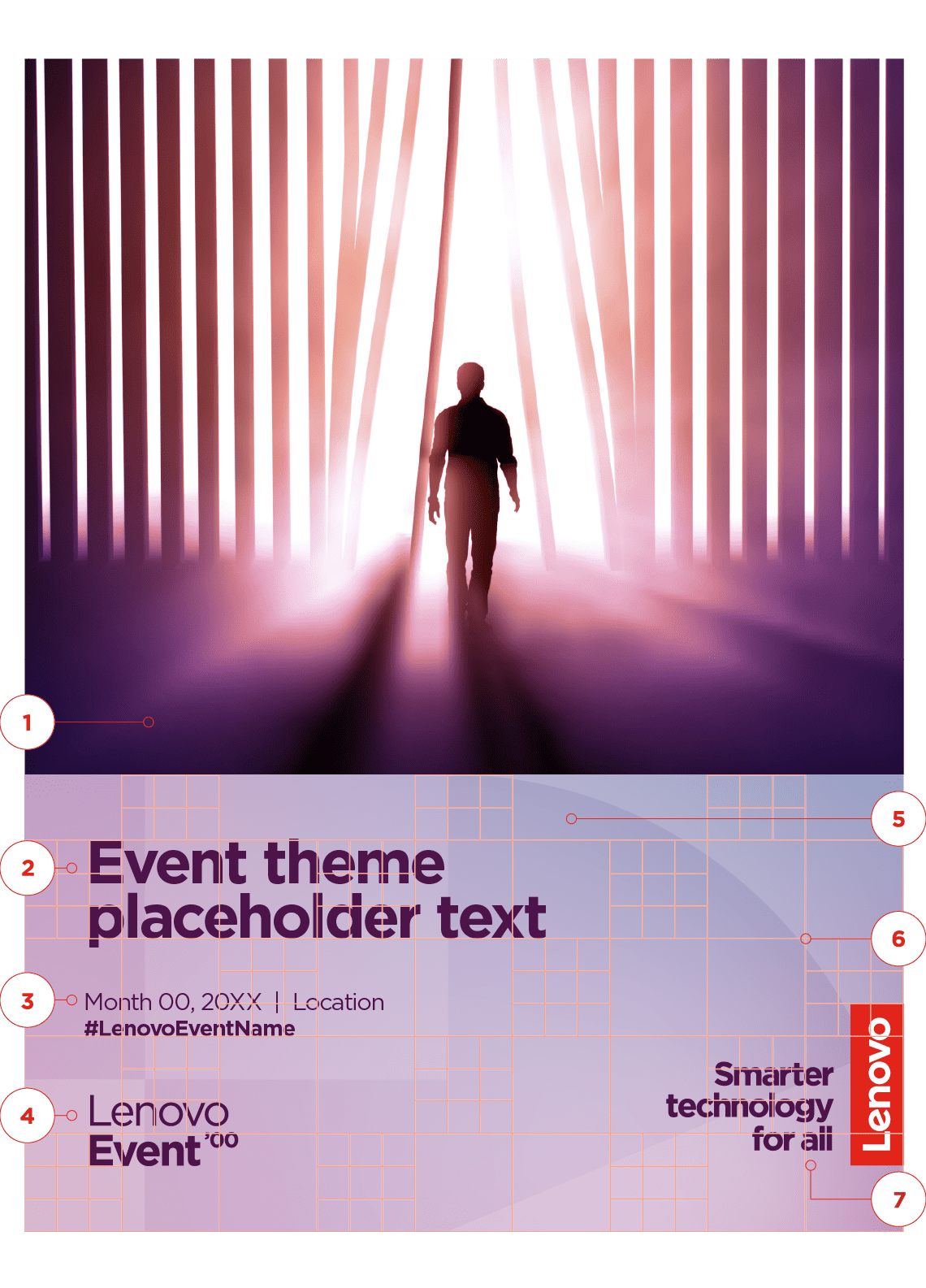
Elements of a key visual
1 Event imagery
2 Event theme
3 Location, date and hashtag
4 Event wordmark
5 Smarter gradient with 2×1 alpha block overlay
6 Lenovo modular grid overlay*
7 Lenovo logo or Lenovo logo lockup**
*The Lenovo modular grid allows for optimized spatial alignment and sizing of the key visual elements. Once elements are aligned, the grid should be removed from the final asset.
** Use the Lenovo logo if the event theme is “Smarter technology for all.” If it differs, use the Lenovo logo STFA lockup.
Additional guidance
- Always use the provided templates for creating a key visual.
- Only use approved alpha block combinations on the lower portion of the KV.
- Alpha block(s) should always equal the height of the background area.
- The alpha block(s) should be placed on the smarter gradient that matches the event’s visual identity. Select a smarter gradient that complements the KV image.
- The template files also include an alternate landscape orientation.
Portal image library
A uniquely crafted collection of images that represents the transformative power of Lenovo’s devices, solutions and services. Use this selected image library only if the event has a clear transformation story.
If the event does not focus on a transformation story, use the brand image library to select an image for the key visual.
Portal event imagery is intended exclusively for event use — it should not appear in campaigns, web content, business-as-usual materials or other communications.


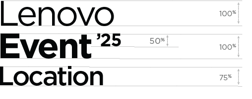
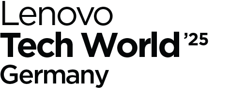
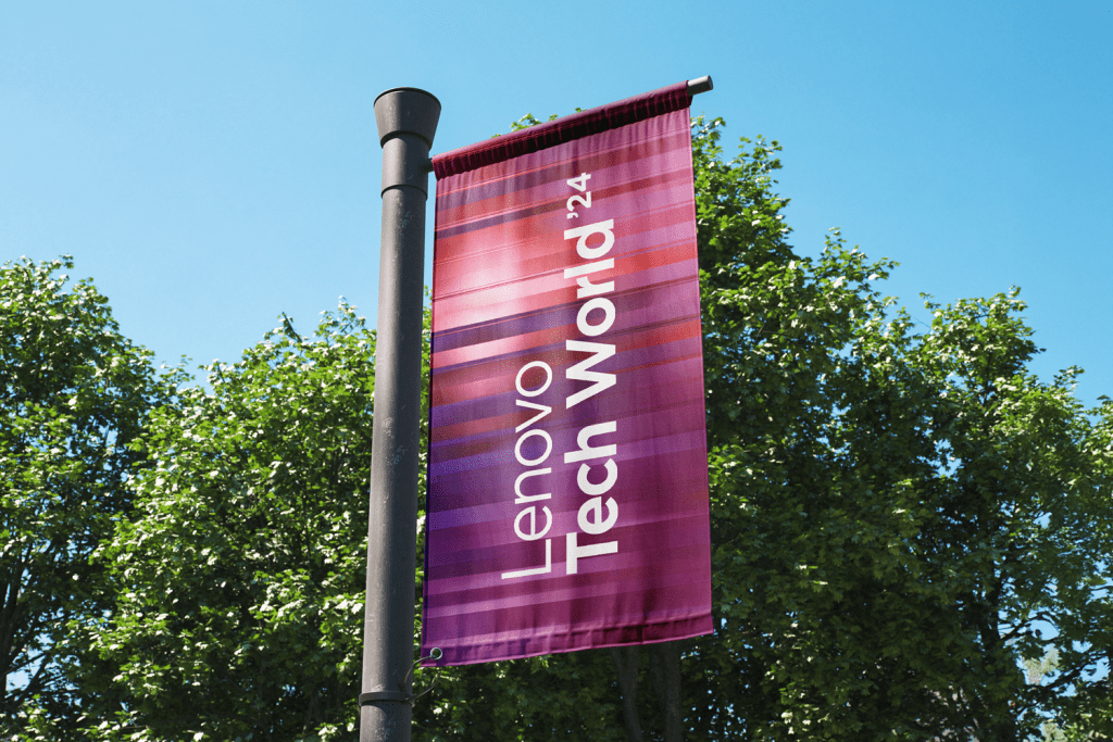
Event wordmarks
Always use the wordmark template to create an event wordmark.
- Do not alter the leading, spacing or size of elements.
- Our corporate typeface Gotham should be used for all wordmarks. (Lenovo in book weight, Event in bold weight, Location (optional) in medium weight.
- Event wordmarks should always use one solid color. Black, white or deep purple 1, depending on the background.
Event wordmark
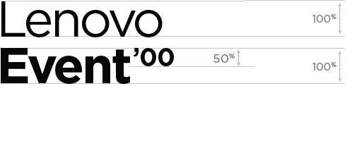
Event wordmark multiple lines
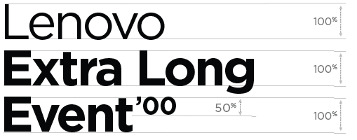
Event wordmark with location
Example

Example

Example
Past key visual examples


Event showcase
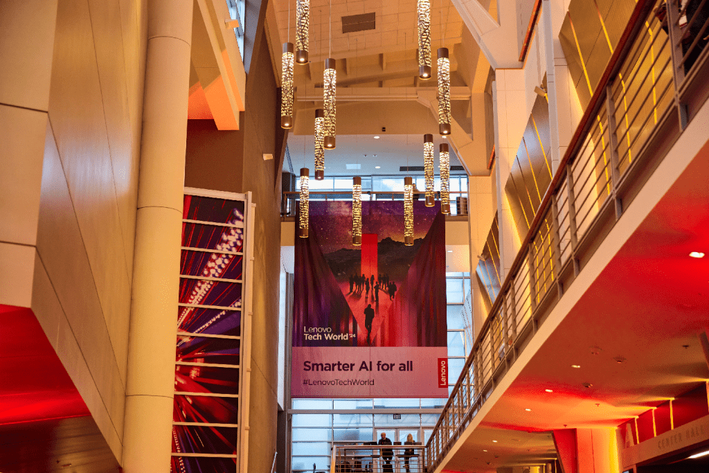
We use every event as an opportunity to bring our brand to life through thoughtful design, clear messaging and immersive activations.
This gallery showcases examples from recent events. Click on each photo to enlarge it for better viewing.
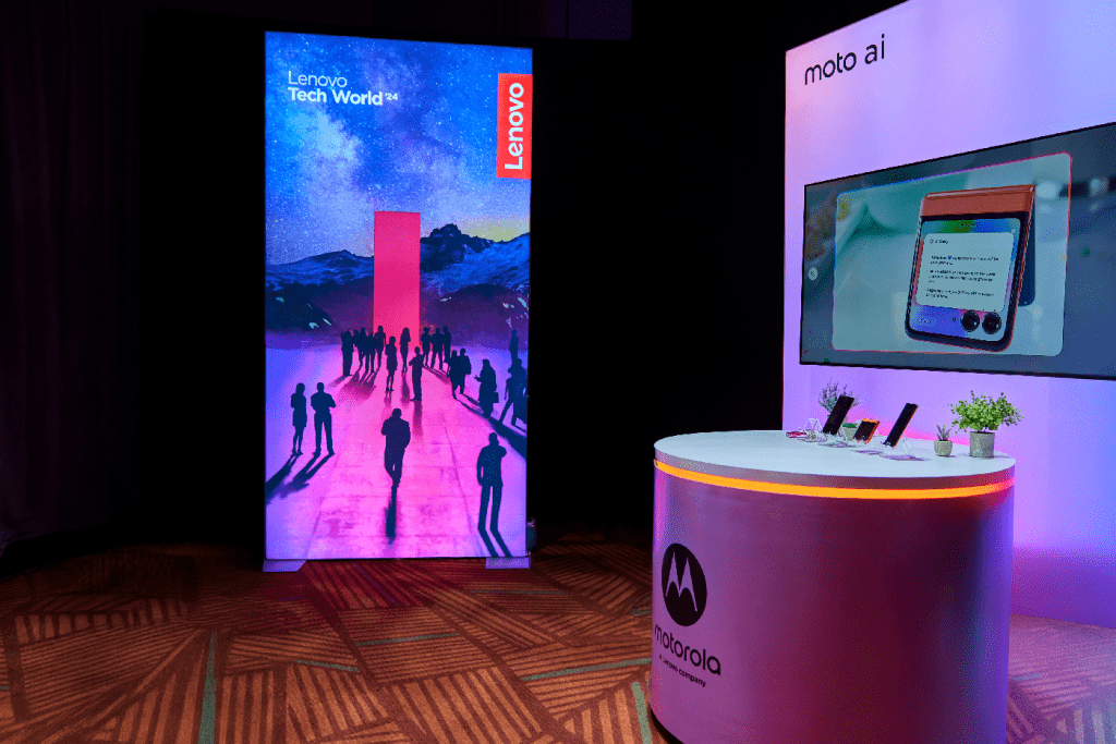
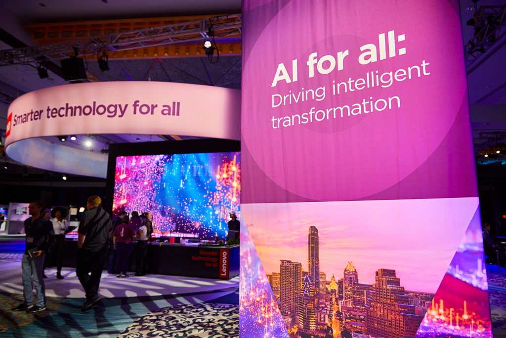
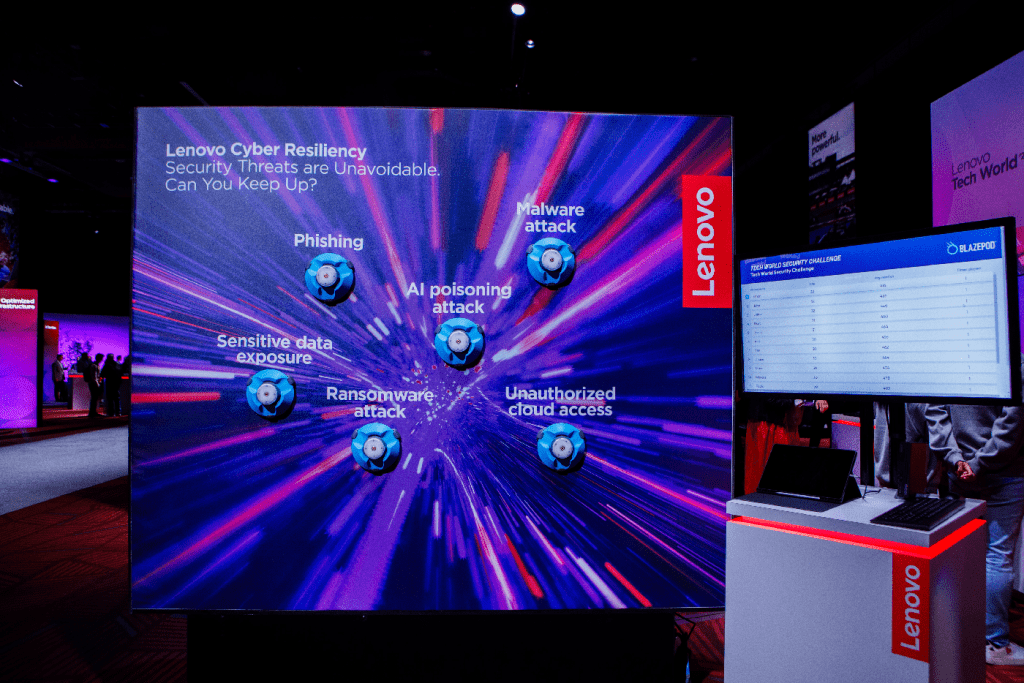
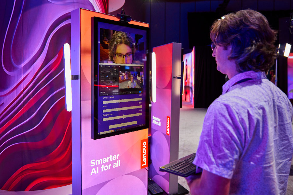
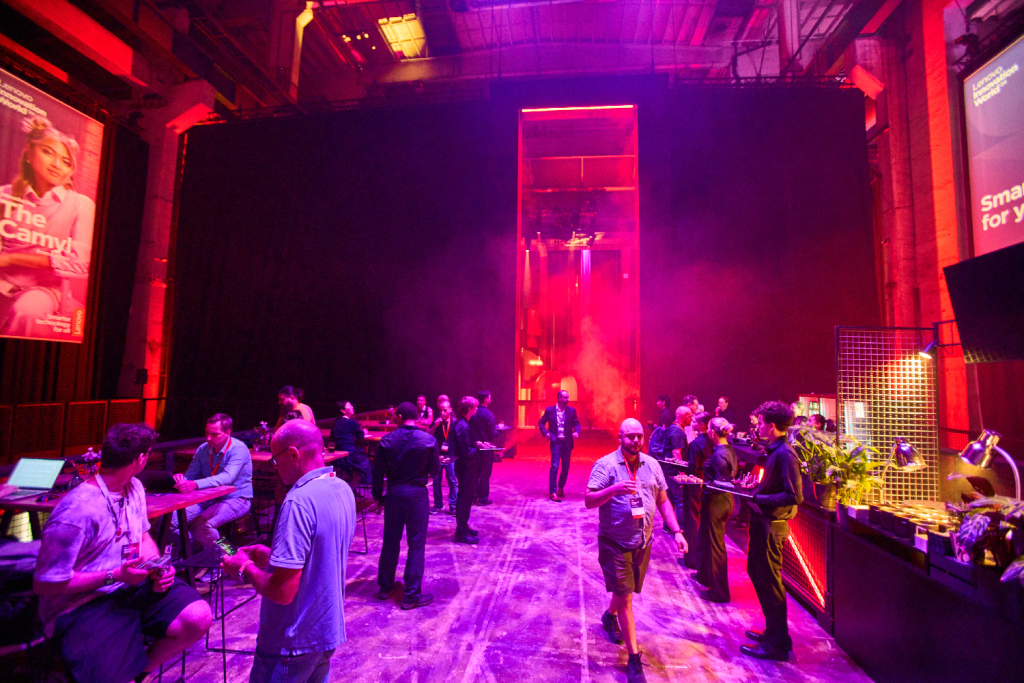
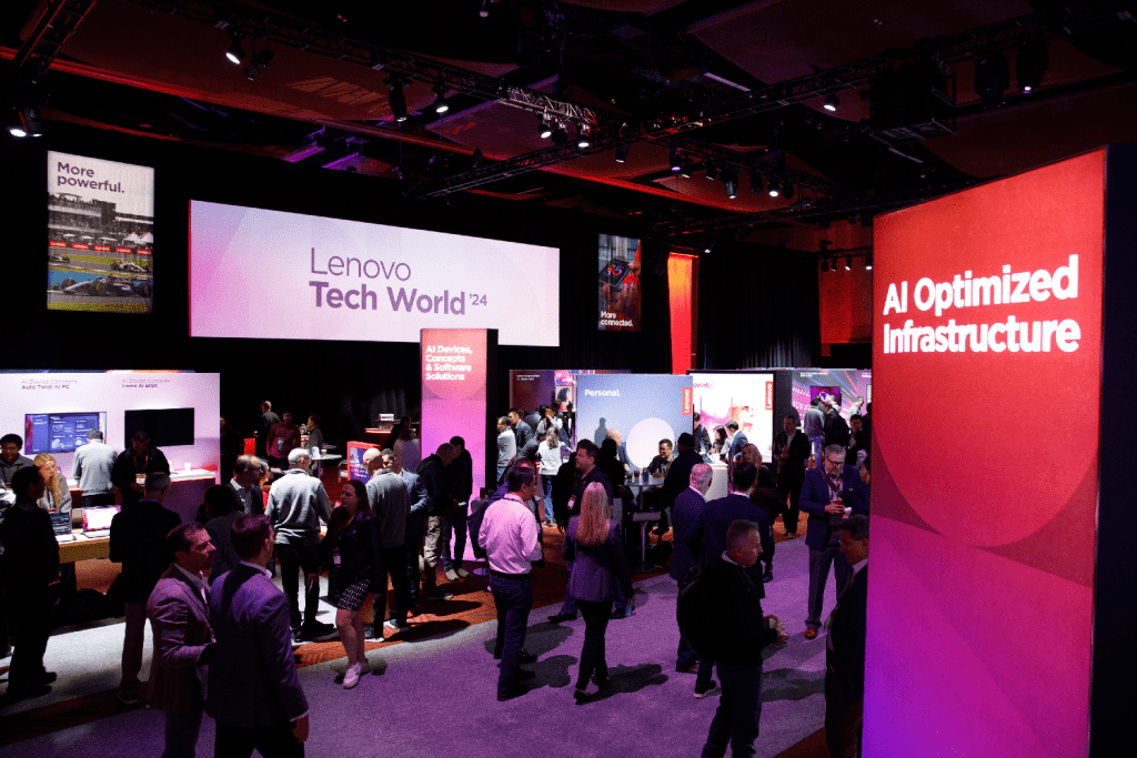
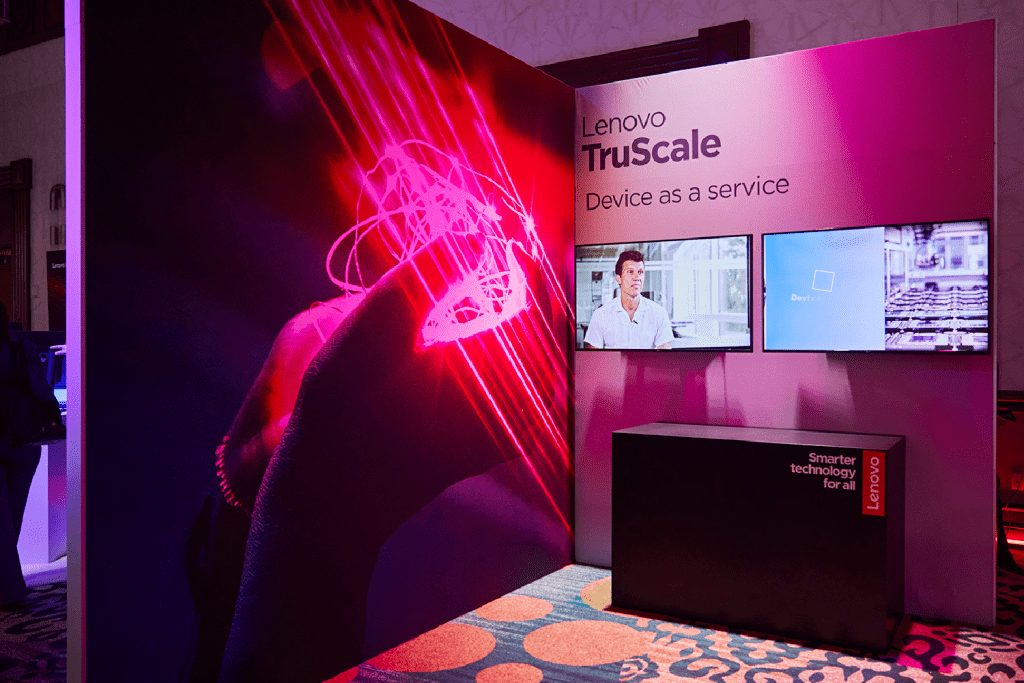
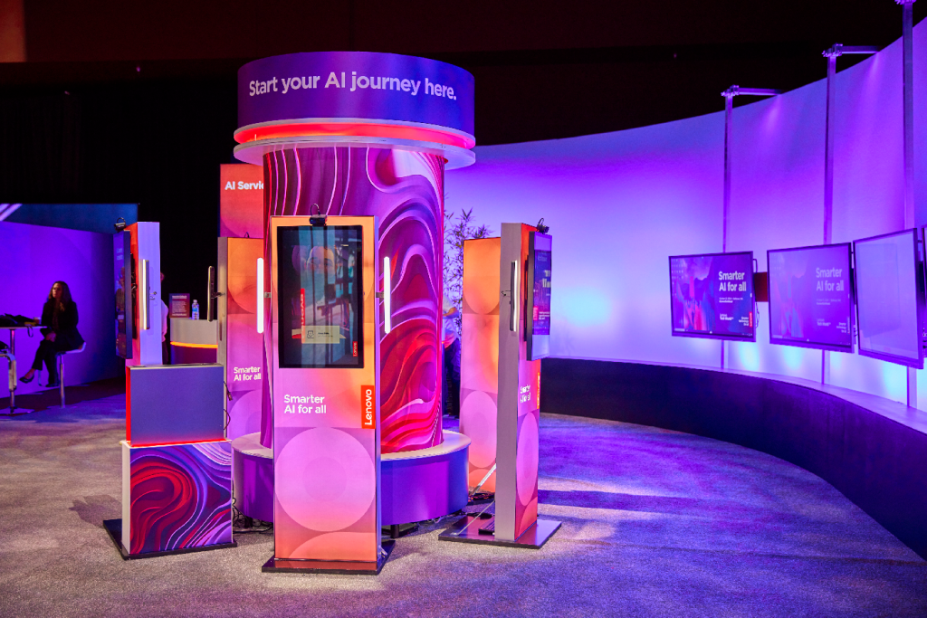
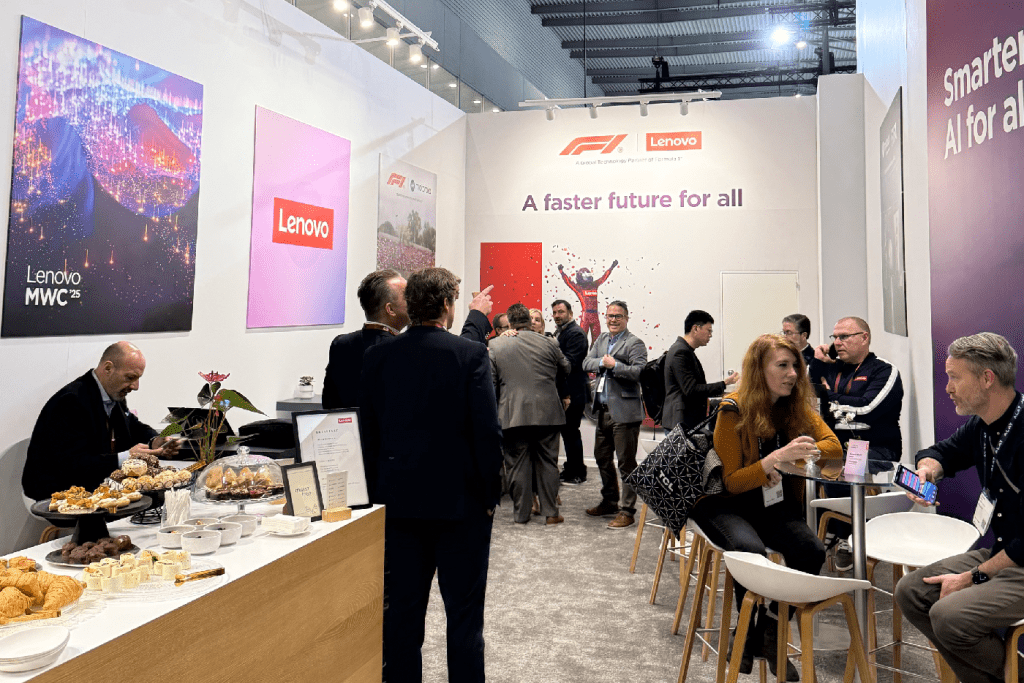
Activations and lighting
Engaging activations and strategic lighting work together to create immersive brand experiences that are shareable and memorable moments for the audience. Thoughtful use of color, motion, and interactive elements draw attendees in while maintaining a cohesive visual identity.
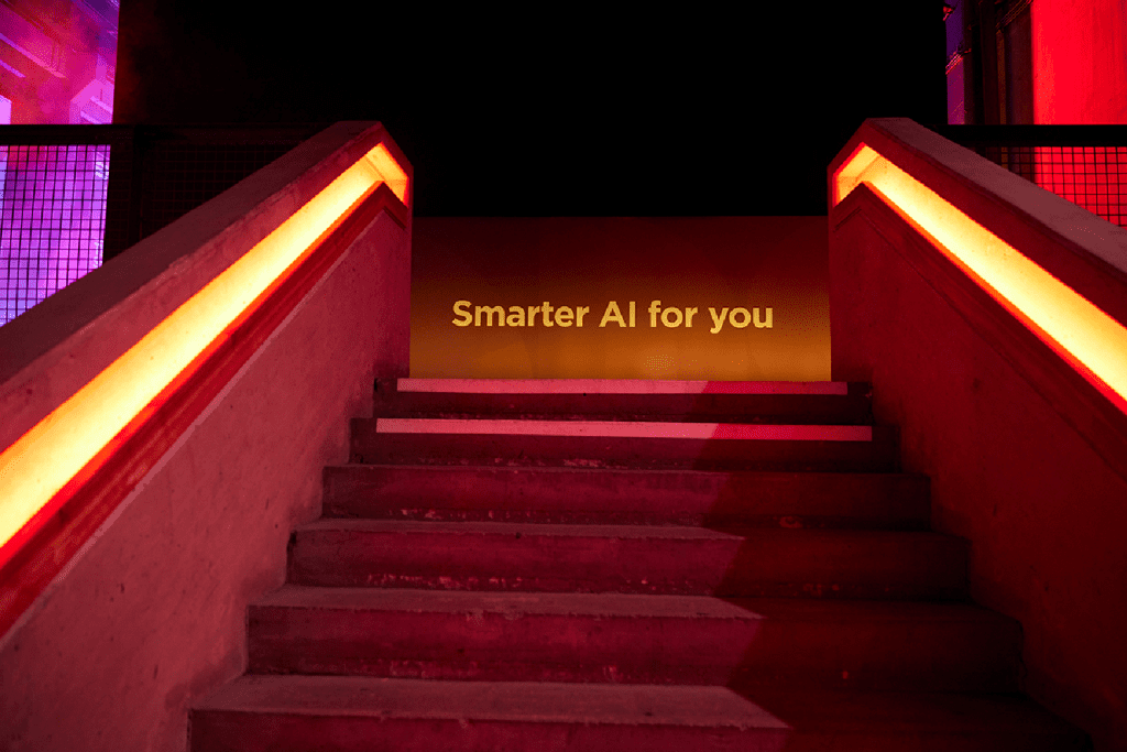
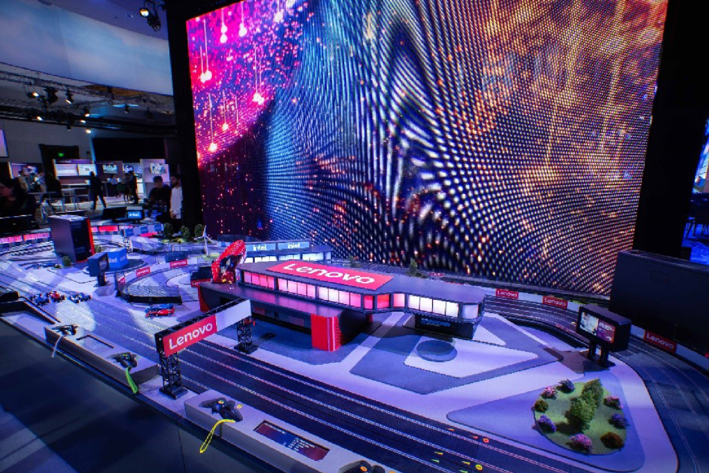
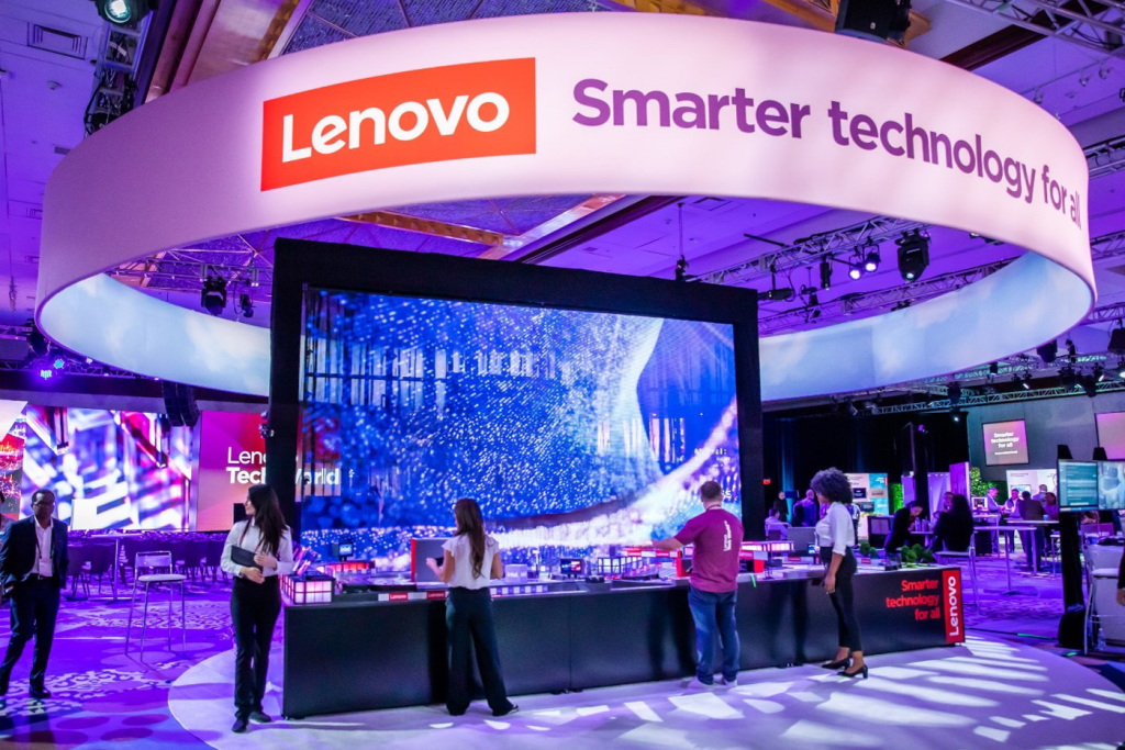
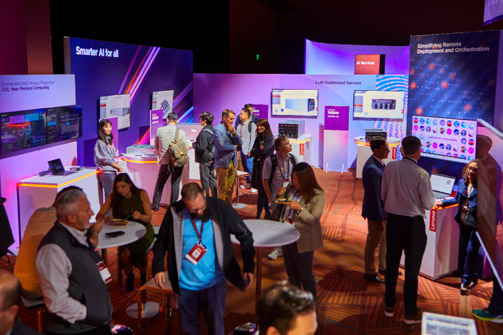
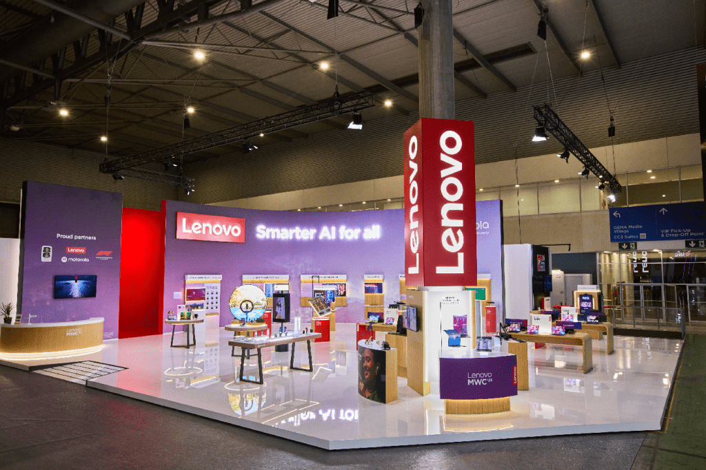
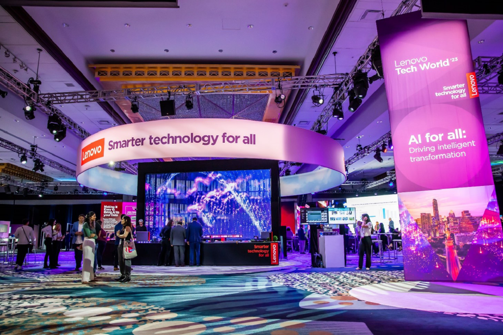
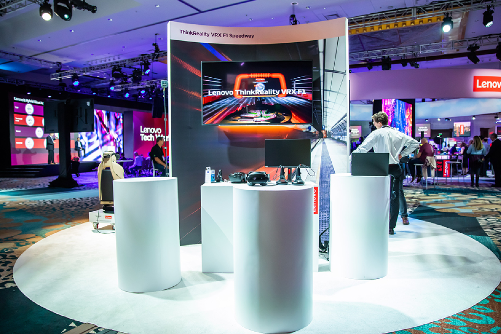
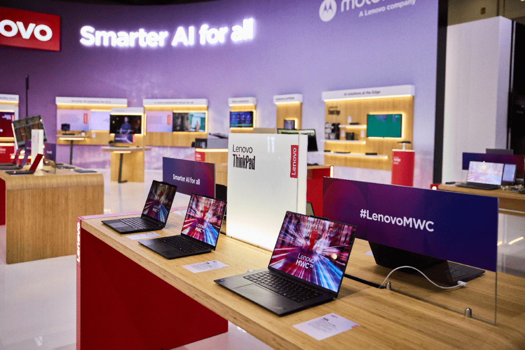
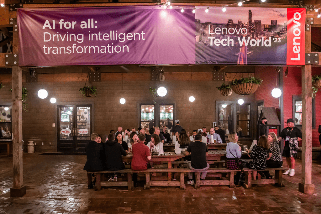
Main show floor
The intention with the main show floor is to design a holistic space that is purposeful and easy to navigate to those familiar with Lenovo and first-time guests alike. Be consistent with materials and finish and always provide clear messaging and wayfinding.
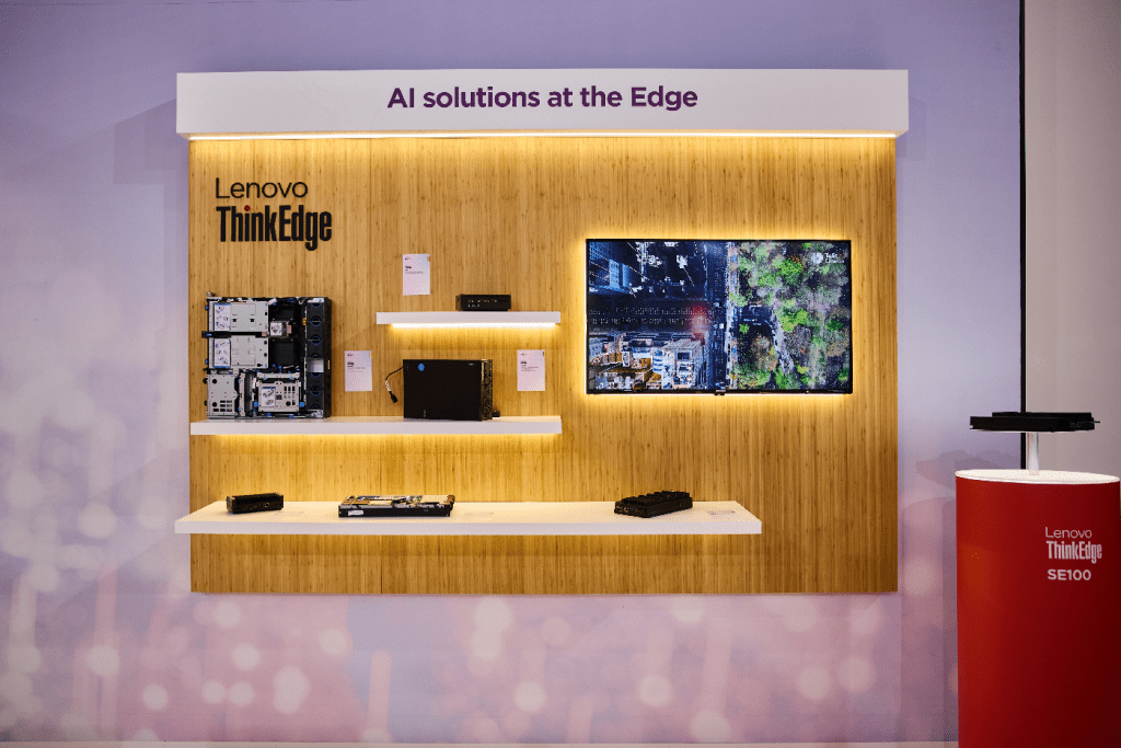
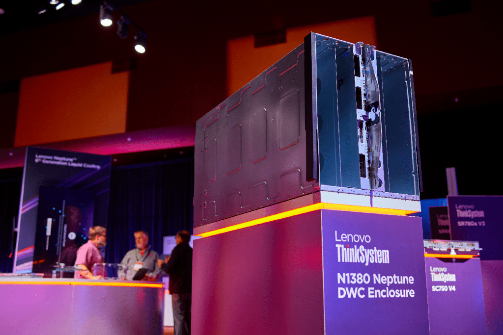
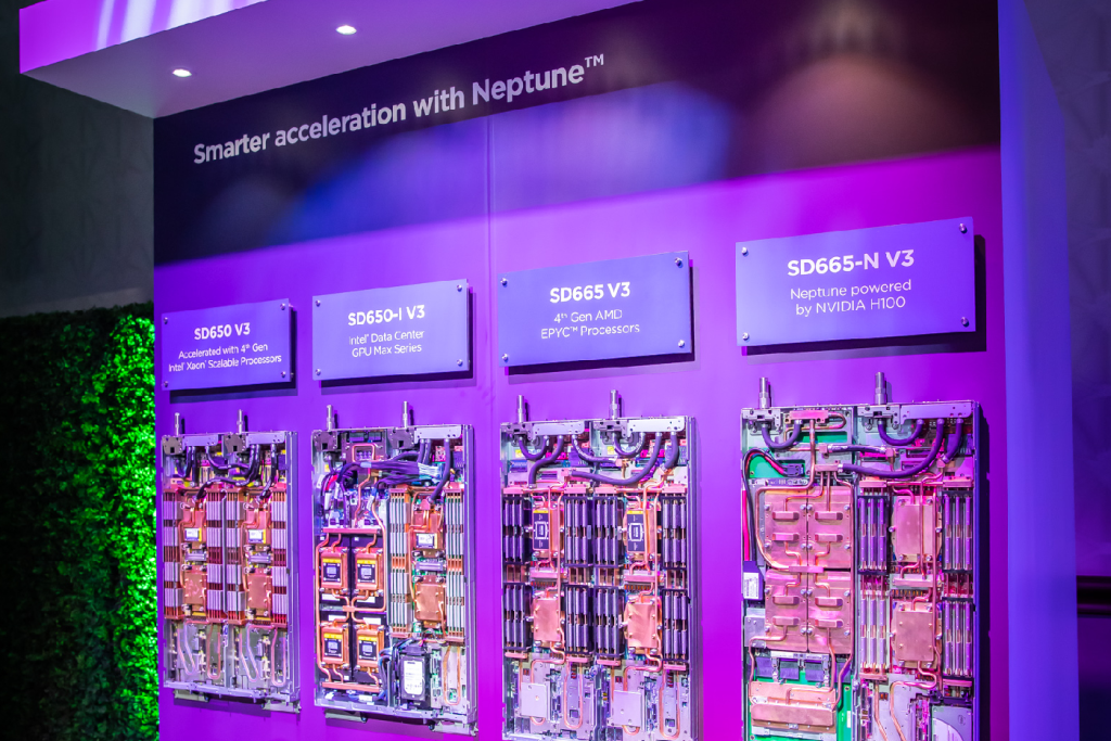
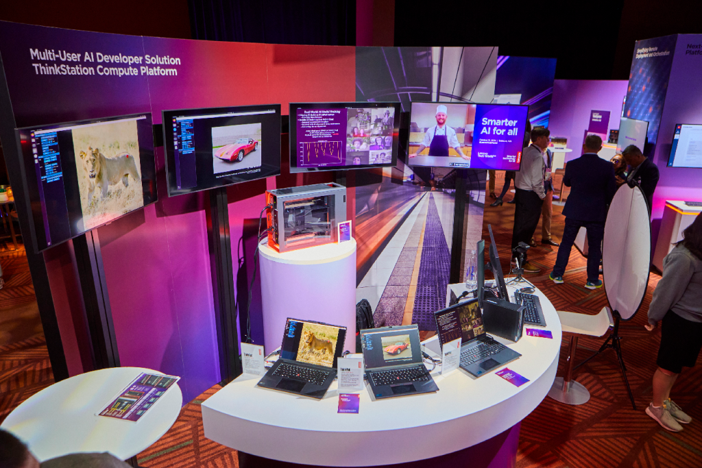
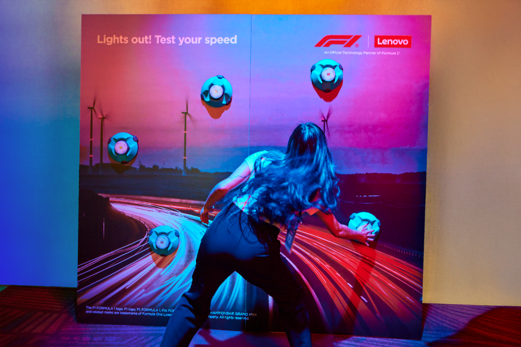
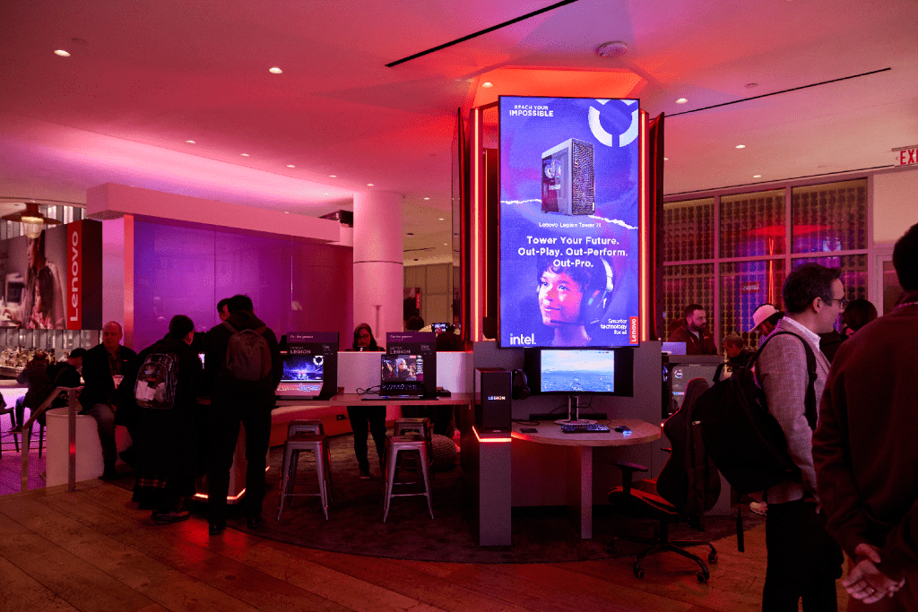
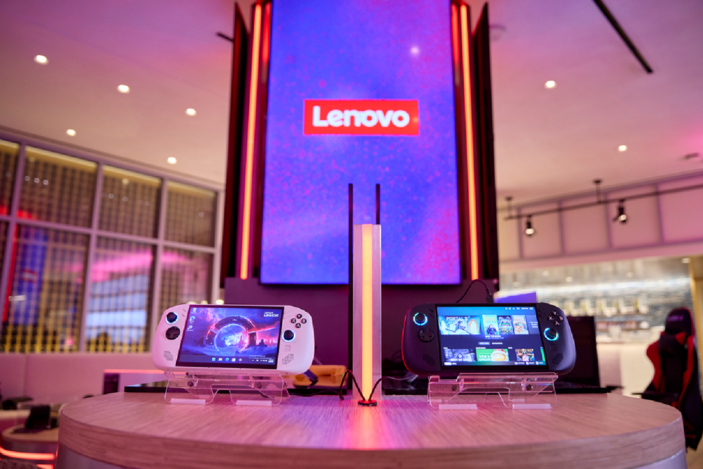
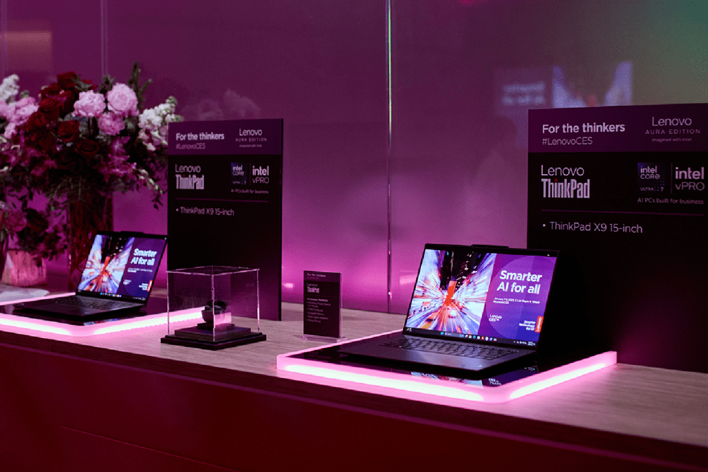
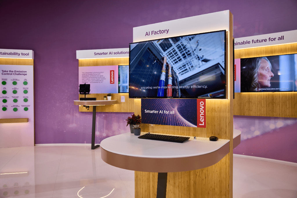
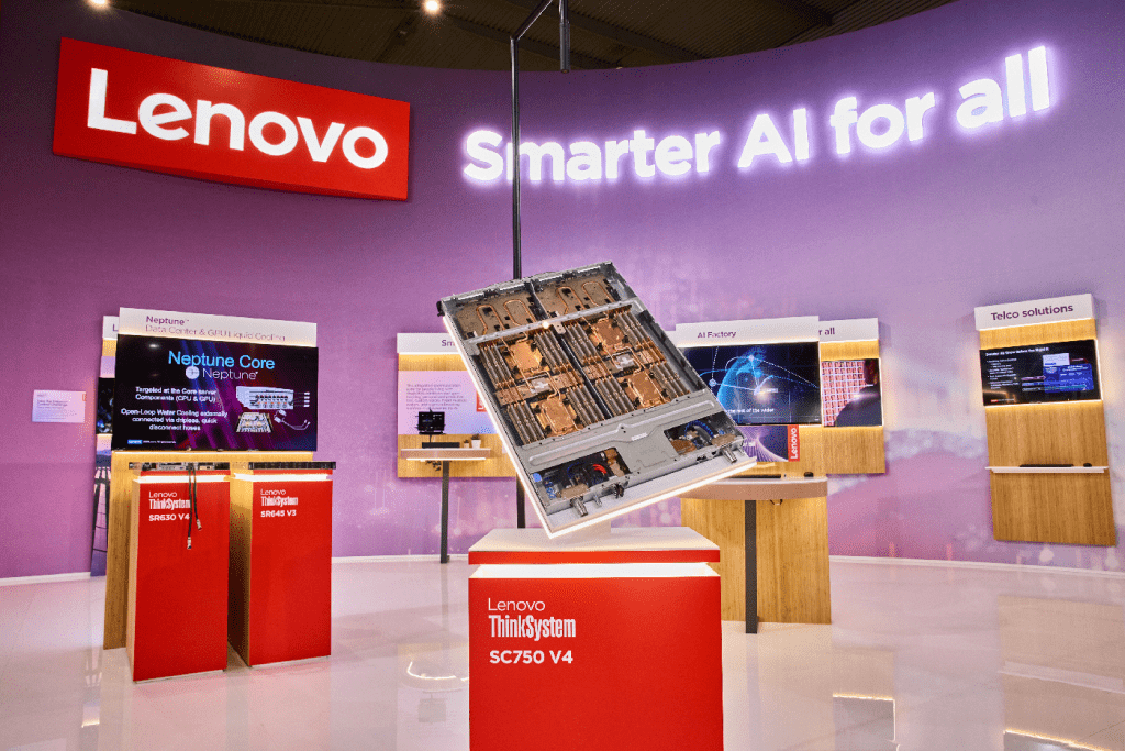
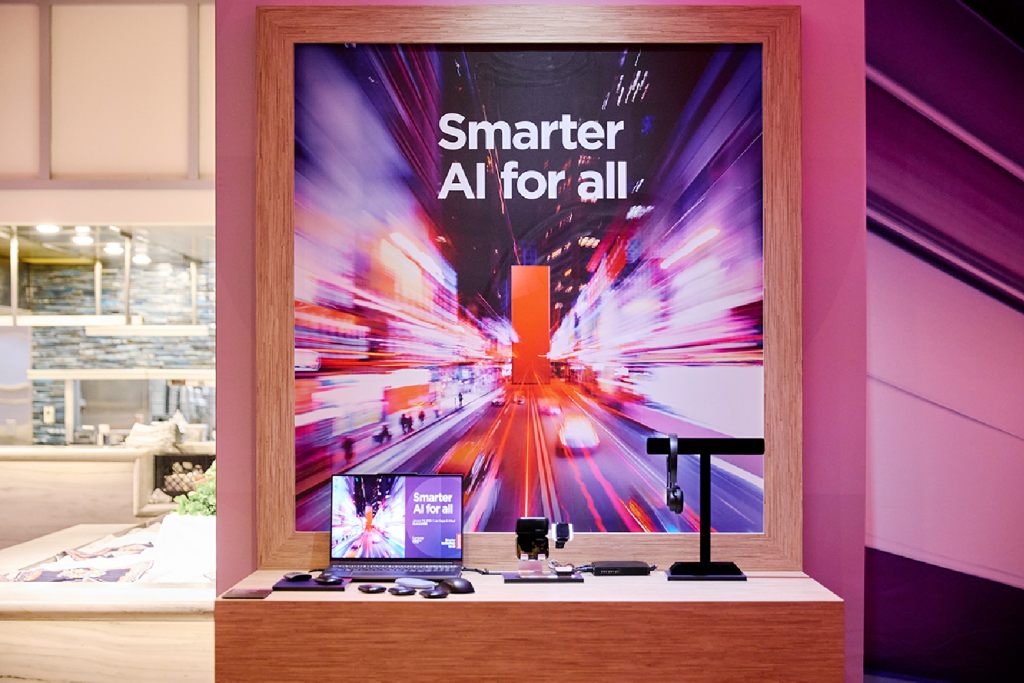
Product showcases
Product showcases highlight innovation through focused design and compelling storytelling. Lighting, materials and displays should enhance product visibility by remaining clean, simple and neutral while reinforcing key brand messages.
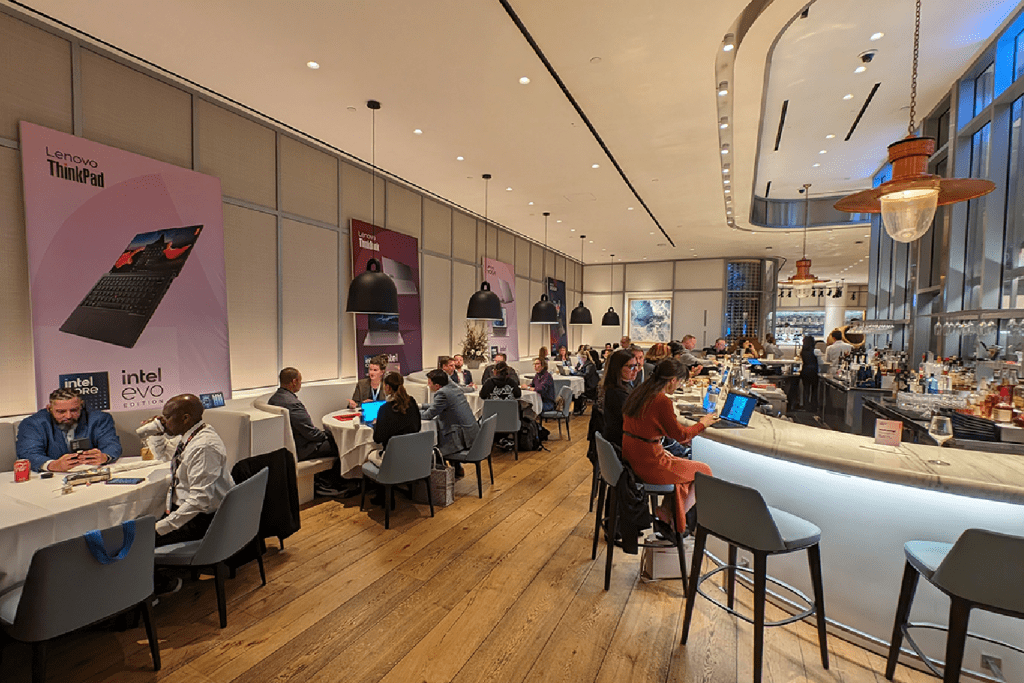
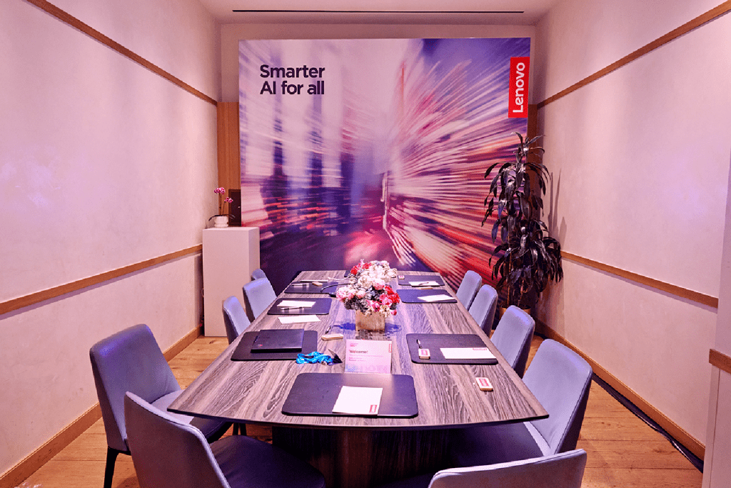
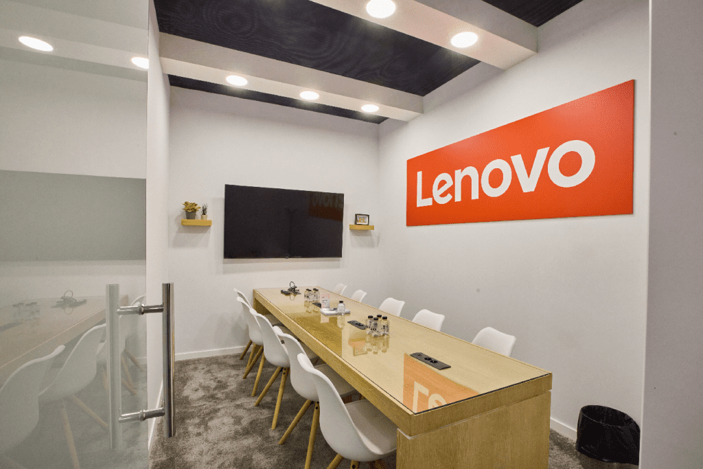
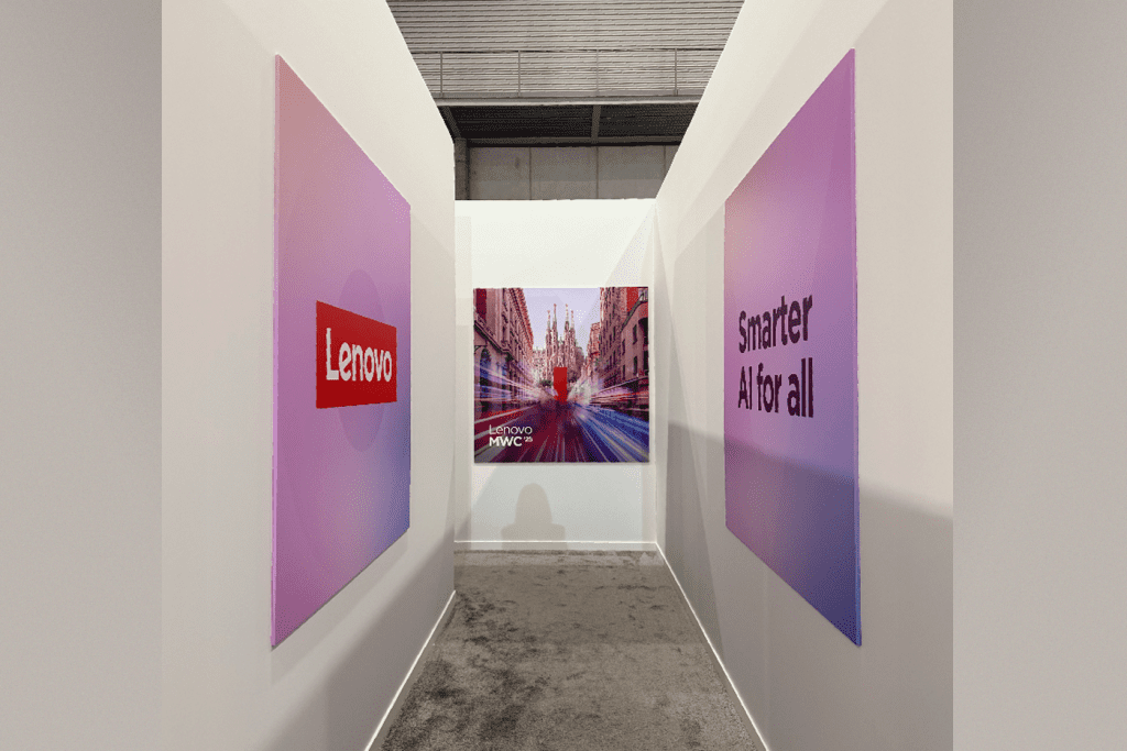
Small spaces
Even the smallest of spaces provides an opportunity for impactful branding. In these spaces, branding should be clear and intentional. Simple yet high-impact graphics and brand elements maximize the space without overwhelming the environment.
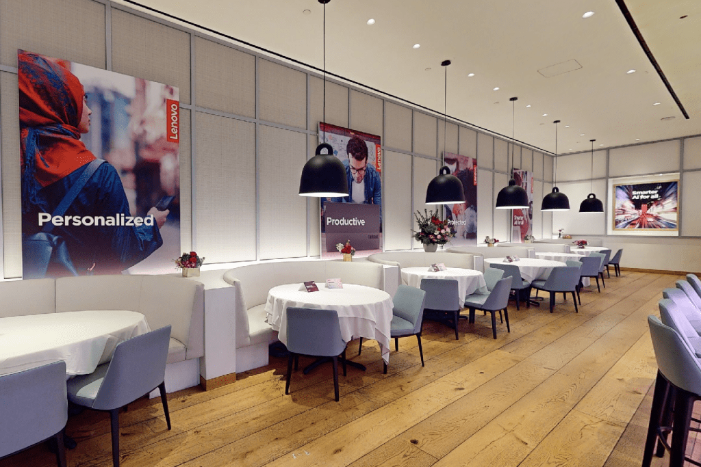
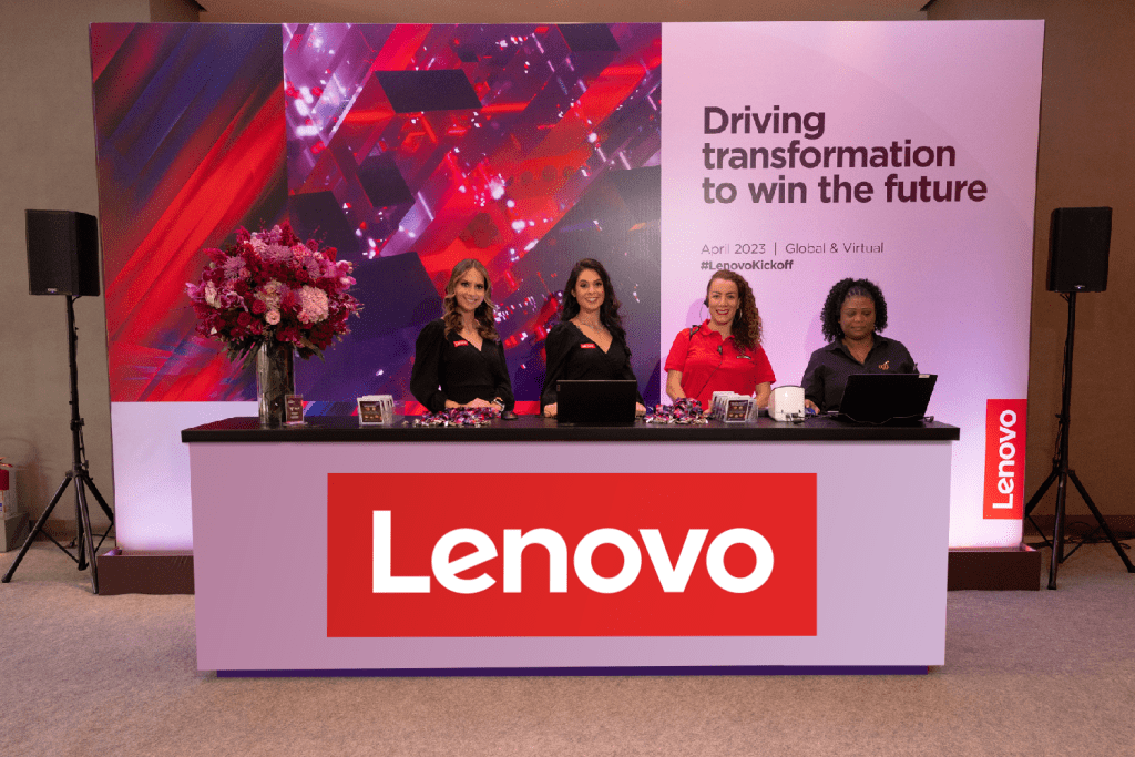
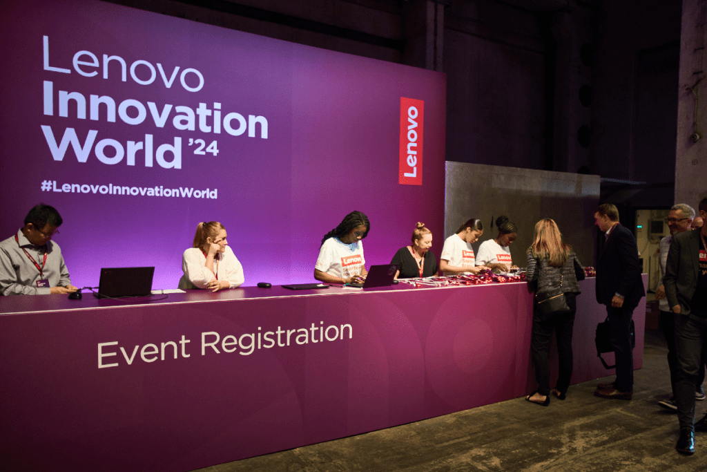
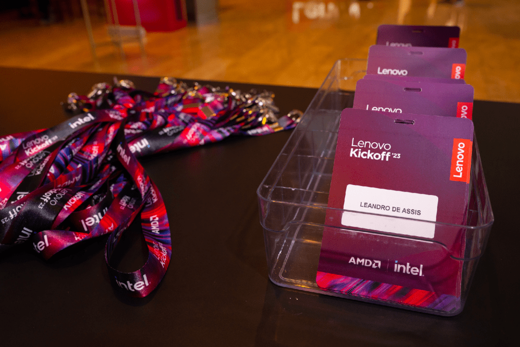
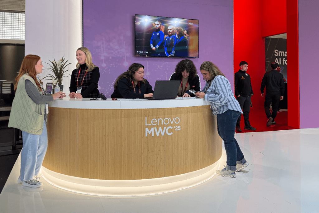
Registration
Registration sets the tone for the attendee experience with a welcoming and efficient process. Signage, lanyards, badges and digital interaction all should align with the overall event design and branding guidelines to create an engaging and immersive first touchpoint.
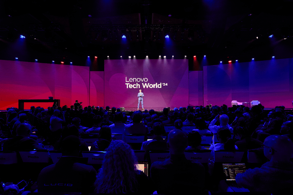
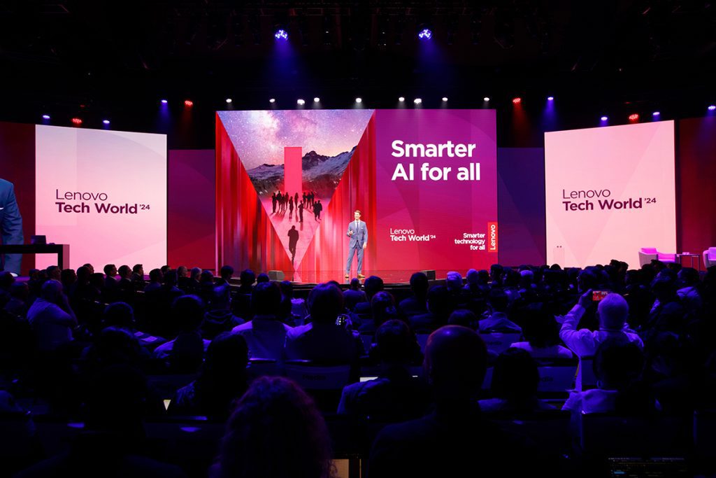
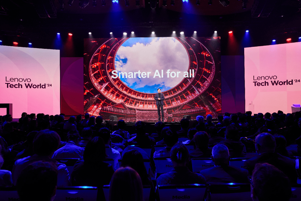
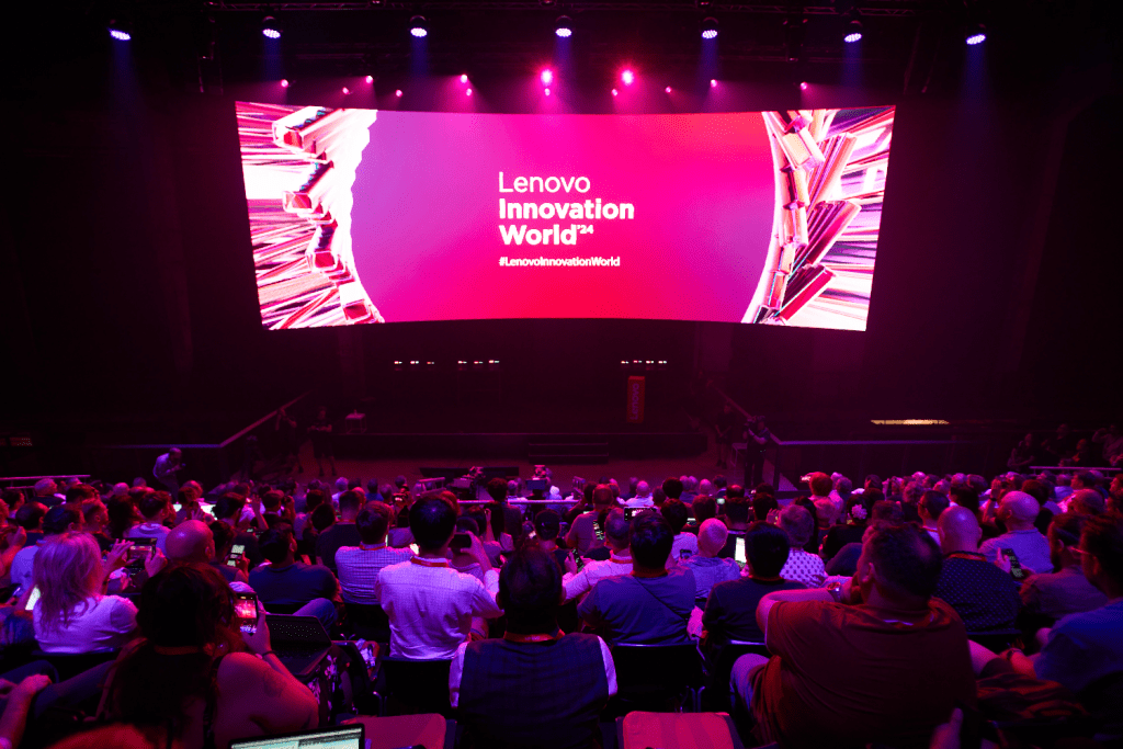
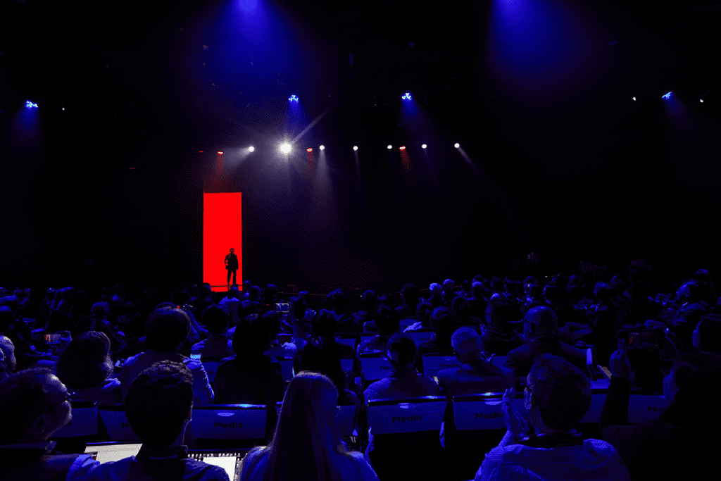
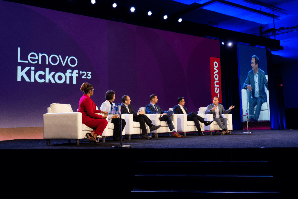
Stages
Stages and keynotes serve as a focal point for storytelling and brand presence. A strong visual hierarchy, dynamic lighting and use of our PowerPoint templates ensure speakers and content take center stage in a powerful and concise way.
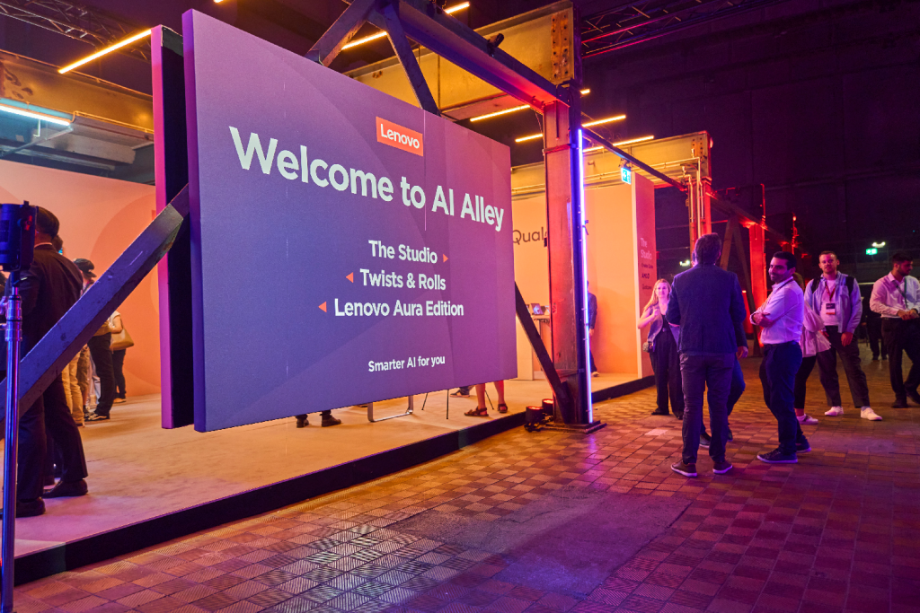
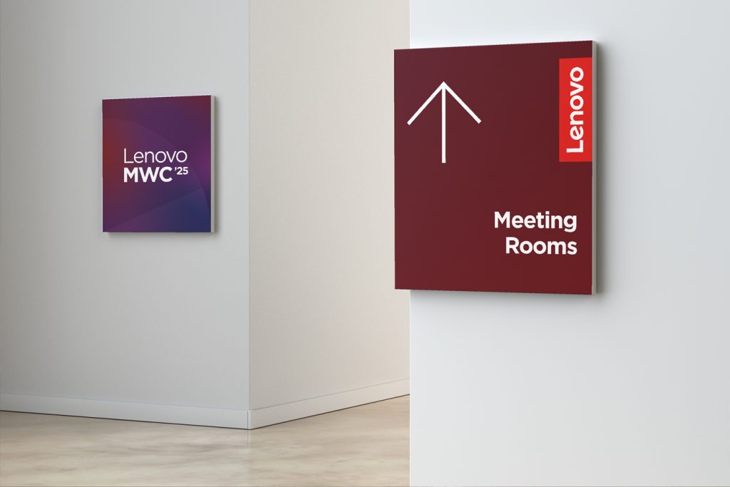
Wayfinding
Wayfinding should be intuitive and aligned with the overall event identity. Clear typography, recognizable brand elements and strategic placement of signage will guide attendees seamlessly from arrival to engagement.
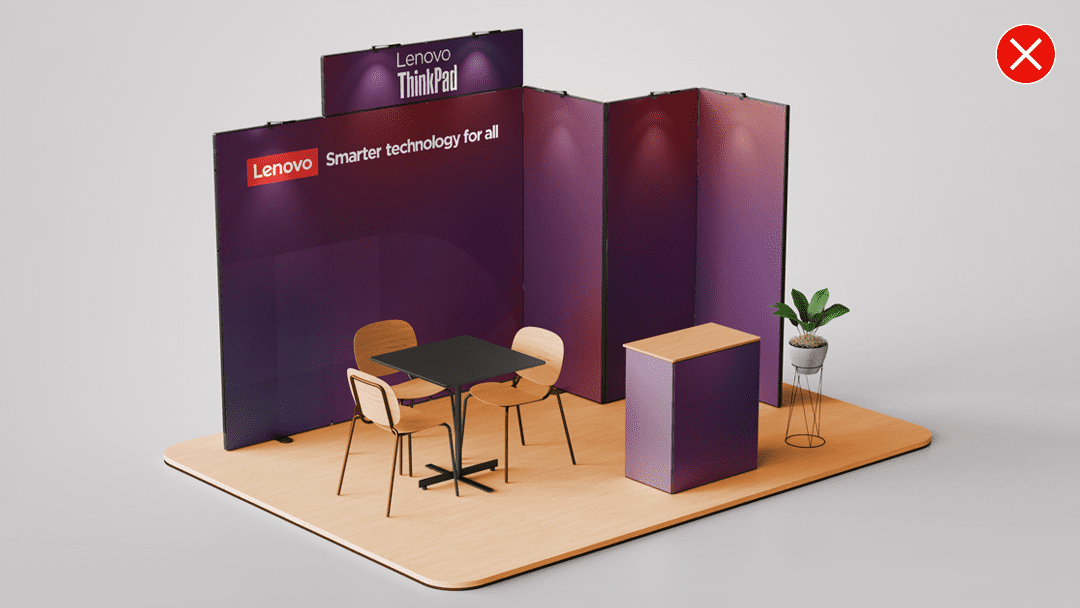
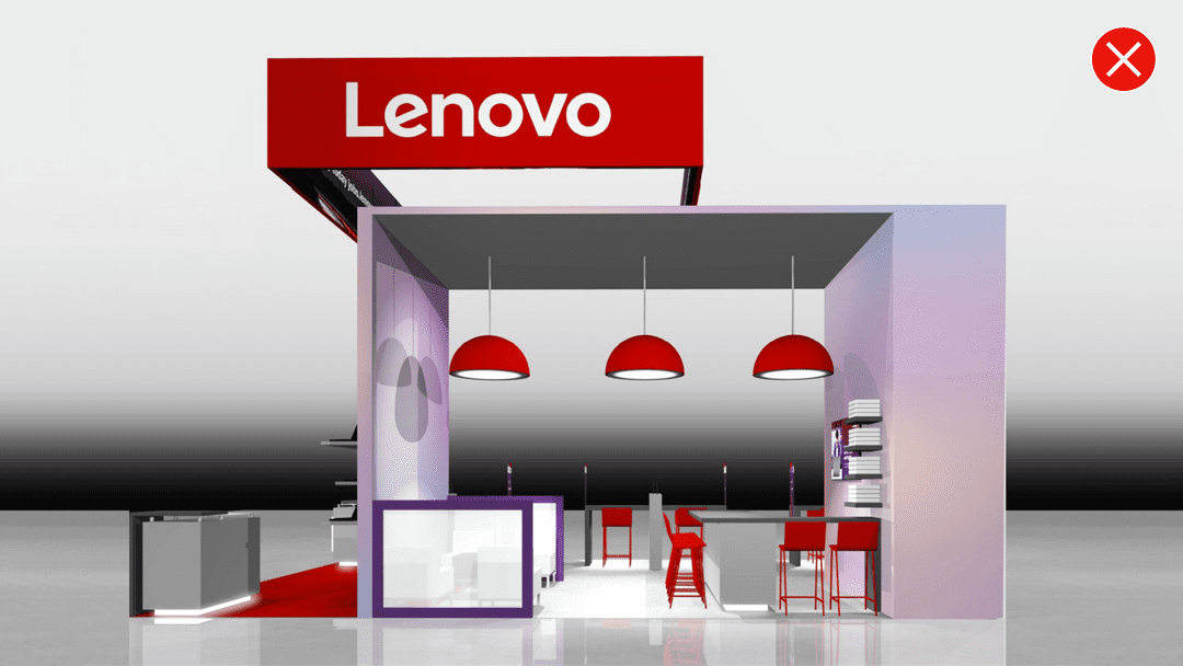
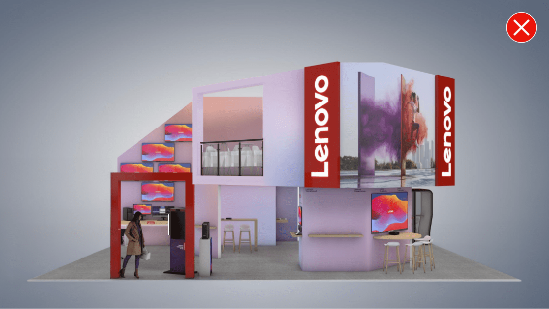
Examples of what not to do
These examples represent the wrong way to apply our brand elements in an event space.
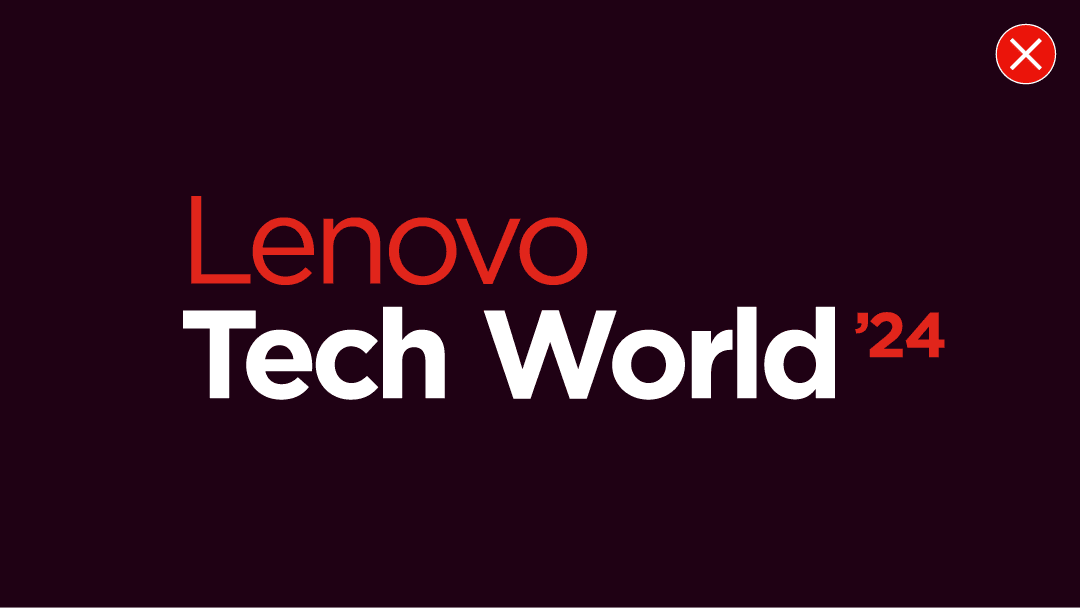
Don’t create or use multi-colored event wordmarks.
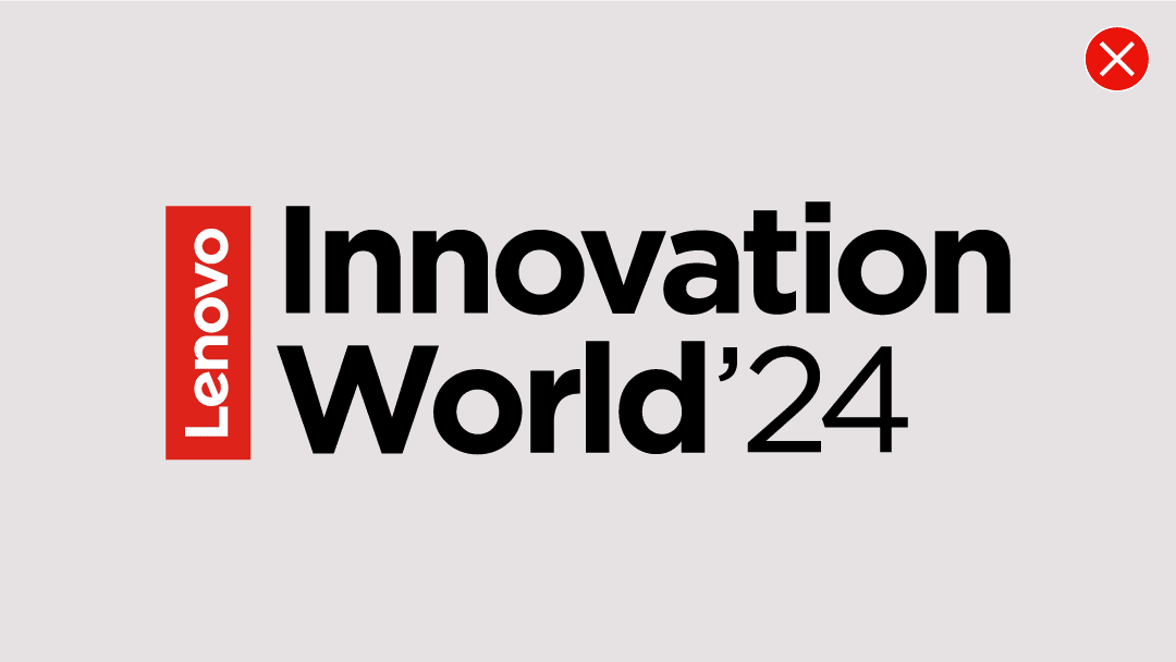
Don’t create special event wordmarks or logos that don’t align with the Lenovo event wordmark template.
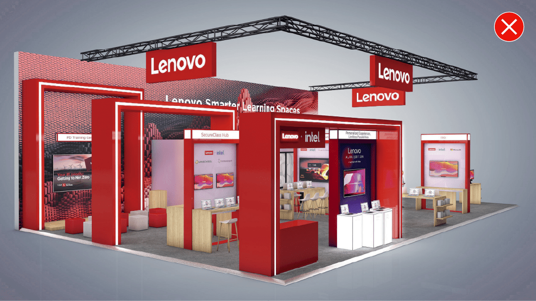
Don’t flood the event space with red that detracts from the Lenovo logo.
Don’t place subbrands or offerings above Lenovo in hierarchical applications.
Don’t use the Lenovo wordmark in the wrong proportions. It should always be in a 3:1 ratio.
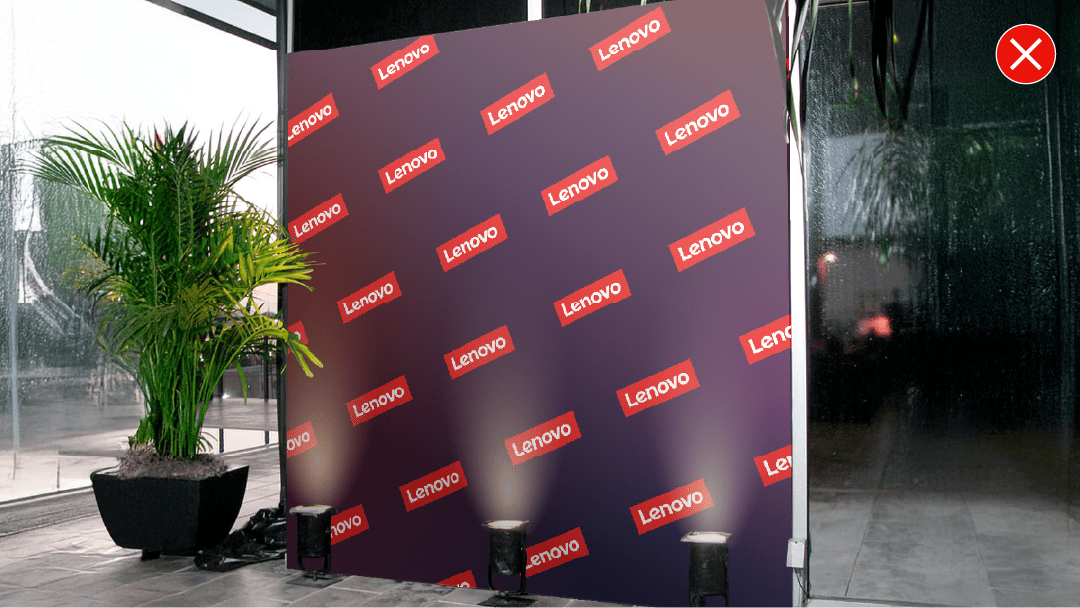
Don’t create event backdrops with slanted Lenovo logos or text.
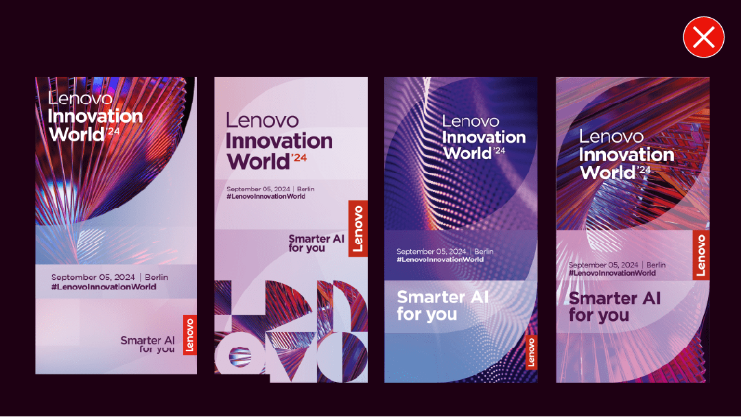
Don’t create special event key visuals that don’t align with the Lenovo key visual template.
Don’t use overly angular and futuristic fixtures. Instead, use simple framing and pops of color through image and pattern which exhibit the Lenovo brand personality.
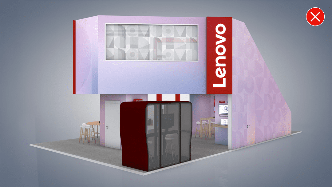
Don’t use the smaller alpha pattern application in an event space. Instead, use an approved alpha block combination.