We have a simple single-minded icon style that is consistent across all product brands, across all platforms. From print to packaging to digital, our icon style helps users quickly and simply identify and navigate.
Our icons are always surrounded by a circle to ensure a consistent visual footprint, whatever the icon. This circle can be solid or a keyline depending on its need and application. Our icon style should be used for all marketing and communication materials. We do not use this approach for hardware and software icons due to their specific requirements.
Download icon library toolkit and icons
Important note: Brand assets, sonic or visual, cannot be used to train AI models as they are not licensed for that particular use.
Toolkit
A corporate iconography library that spans all marketing and communication materials.
Before you create new icons, please consult this library first through the above links. Our brand toolkits are specialized guidance combined with production ready assets to use in implementing your latest and greatest idea.
Iconography versions
Depending on the communication, our icon style can be executed in a number of ways using either a keyline or solid-fill container and by applying color from the Lenovo color palette.
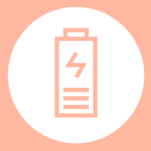
Keyline icons
The keyline icon style is a linear application that allows the background to be visible behind each icon.
This style is a lighter choice and allows the element to integrate with other elements in the surrounding space.
Positive icon – the icon is the feature color
Reverse icon – the background is the feature color
Solid-fill icons
The solid-fill icon style uses a solid area of color to define the icon space.
This style is a bold choice as the solid area of color is prominent and can draw the eye to the area for attention.
Positive icon – the icon is the feature color
Reverse icon – the background is the feature color
Applying color
Use any single color for the icon and apply to a neutral background or use a color background with a neutral icon. Always choose colors that align with our brand palette.
Specialty icons
Service and in app icons
Our one style works across the whole Lenovo brand including icons for services and in applications. This category of icons can be shown with or without the key line or solid fill circle.

With circle

Without circle
Industry-standard icons
Industry standard or third-party icons are to be treated as property of the third-party. Industry standard icons should not be recreated in the Lenovo icon style and our icon guidance does not apply to them.
Application icons
Standard
Our standard icon style applies here as well, however since the icons will be interacted with on screens, at different sizes, infill icons must be used.
Pixel size will range from approximately 1000px to under 30px, so the design must be able to communicate the application yet stay true to the Lenovo Brand.
Designs should be simple and airy to always be recognizable at smaller sizes.





Icon shape
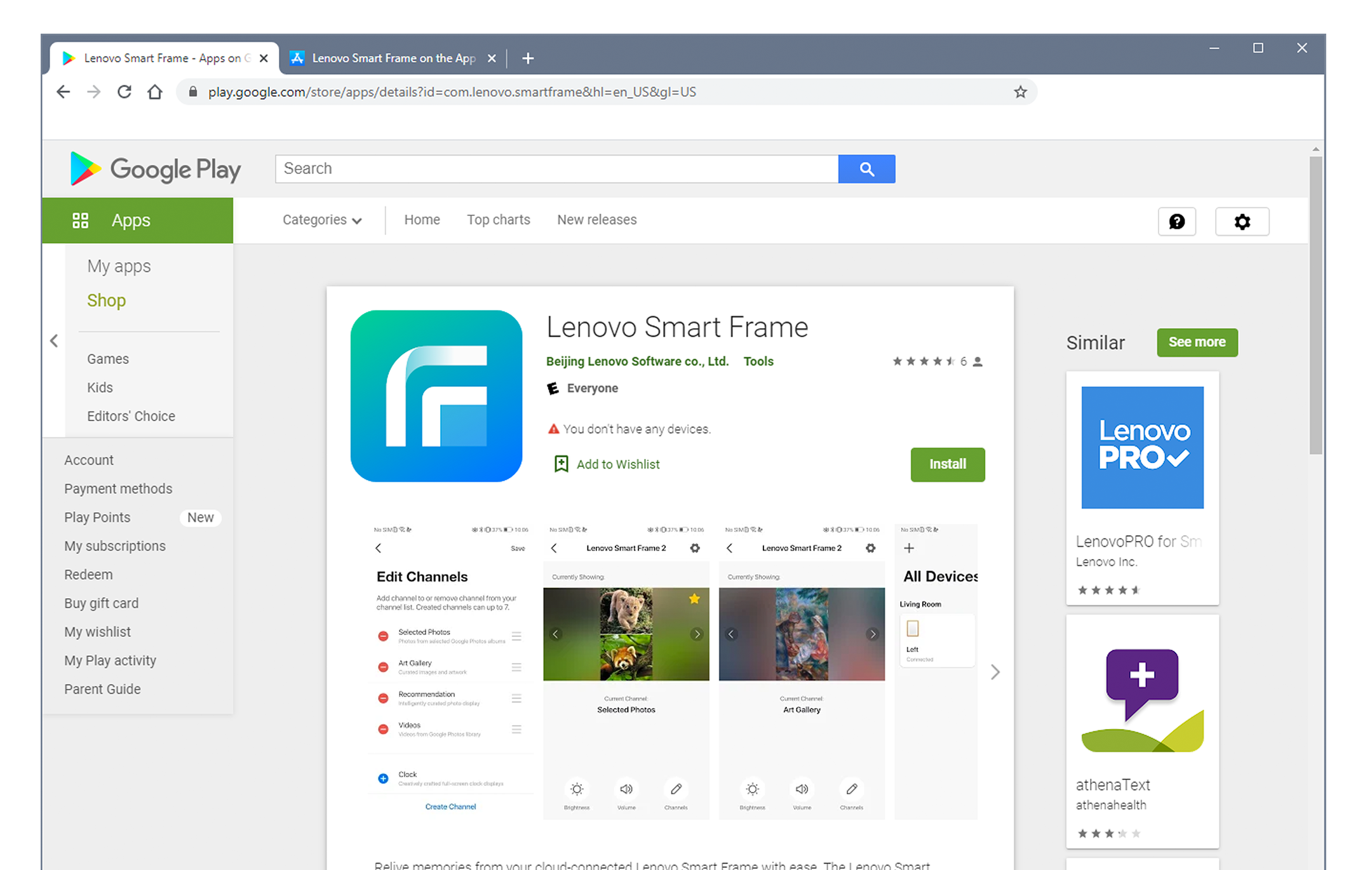
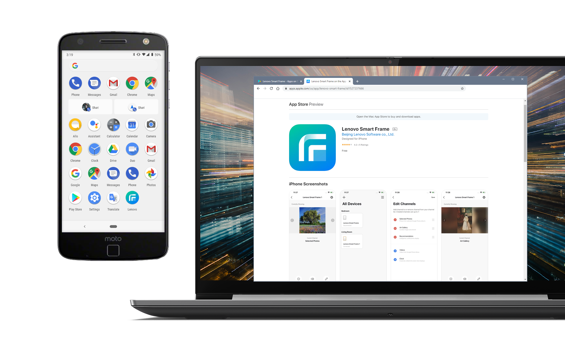
The shape of the icon will, on most occasions, be the standard circle. But, depending on the device or operating system, you may have to adhere to another standard shape.



Size and readability
Make sure you consider everywhere your app icon will appear. Icons can appear anywhere from an app store on a mobile device or computer, the device home screen, the Settings or Notification screens. So, your icon should be legible at any size.
Creating icons
Construction grid
We use a grid to make sure all our icons can be produced consistently. Always use the grid shown to create new icons to ensure both the line weight and the distance between elements are always the same.
A professional design template of this grid is available through the download links at the top of this page. Use the files with “Master” in the name, e.g.: LEN_ICO_Master_RGB.ai
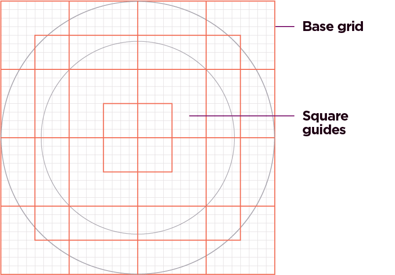
Base grid – Our base grid ensures all line weights and spacing between elements are consistent.
Square guides – The square guides, shown in blue, help define and maintain a consistent visual proportion across all icons.
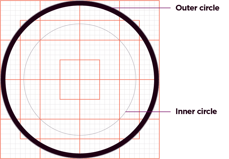
Outer circle – The outer circle is the same for all icons. It indicates where the circular icon container is positioned.
The container can be defined as a keyline or a filled circle. This is the base element for our icon family. When using the keyline the stroke weight should be 4.42pt/1.56 mm when scaled to 100%.
Inner circle – The inner circle is the maximum space allowed for the unique icon content. This ensures consistent spacing and maximum legibility when produced at small sizes.
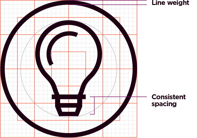
Line weight – Using the established grid ensures the line weight remains consistent.
Consistent spacing – Using the established grid ensures consistency of space between repeating elements.
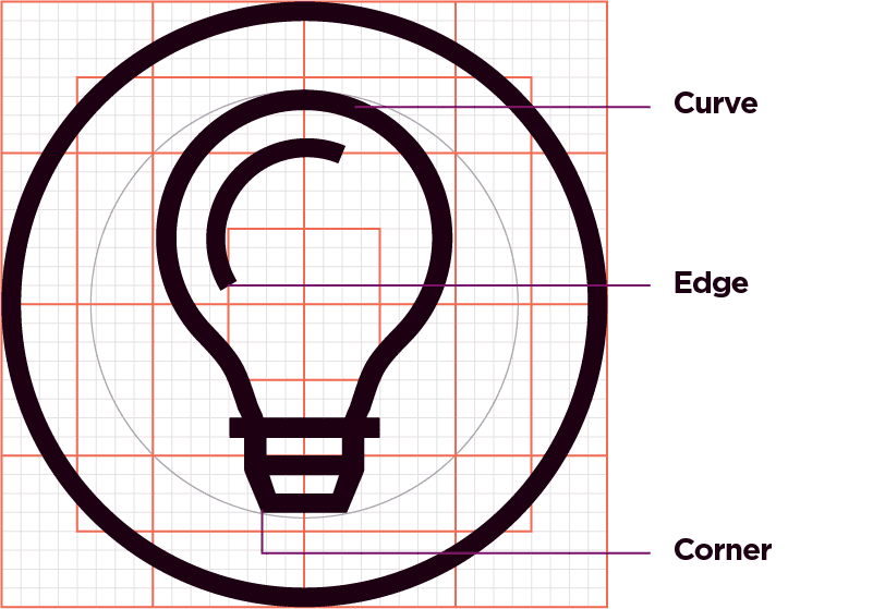
Styling principle: Curve – Only use curves when essential to create a fluid line to illustrate an object (eg., hand).
Styling principle: Edge – Only use square, flat edges.
Styling principle: Corner – Only use squared, angled corners.
Minimum size
The minimum size for reproducing icons in print is 8mm and 23px for digital applications. Use a spot color to avoid misalignment issues when printing at a minimum size. See the Pantone references in the color section for more information. Remove the outer stroke when working with smaller scales and limited space applications if necessary.

Styling principles
Using the following principles will ensure consistency in the style of our icons.

Simplicity – Keep it simple. Only include elements in the icons that are necessary to clearly communicate a message.

Stroke ends – The ends or our strokes are always straight, no rounded endpoints.

Squared – Just like our containing shape, we primarily use squared, flat corners for objects.

Curves – The use of curves is allowed in instances where a fluid line is necessary to correctly illustrate an object (ie. hand, clouds, sphere).
Typography
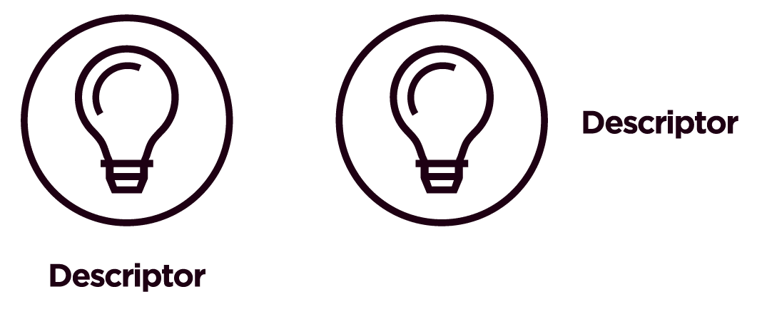
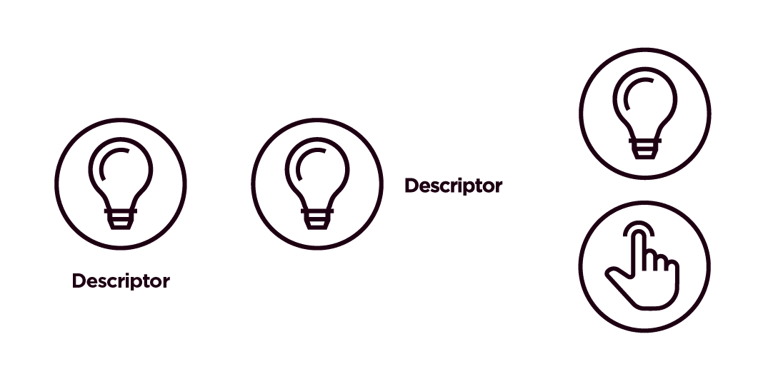
Where appropriate, a description or title can be paired with our icons to provide clarity. For more information on which typeface you should use, visit our typography section.
Positioning and Alignment
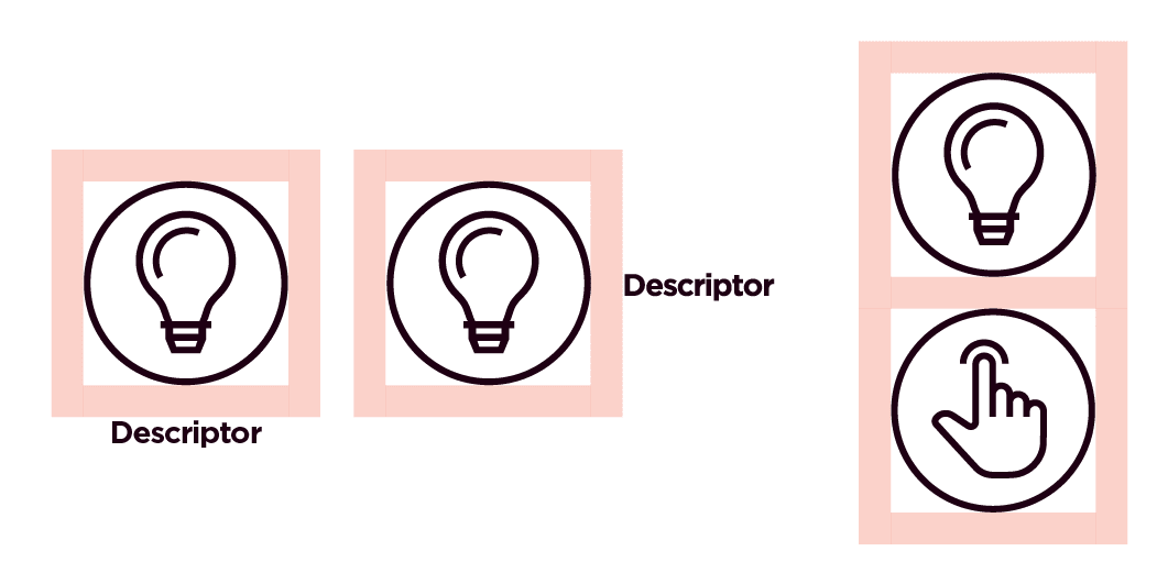
We align the descriptive text to the center or to the right of the icon. If centered, the text may be wider than the icon but should not exceed the minimum clear space. Descriptions should be brief and should not run over more than three lines.
Clear space
We use the clear space rule to determine the distance between the icon and the descriptive text. The size of text depends on the application and intent of the icons.
As a guide, it is recommended to use text no larger than the size of body copy.


Examples of what not to do
These examples represent the wrong way to apply our brand elements. Email the Brand Help Desk for review and/or approval of an asset not within our brand library.
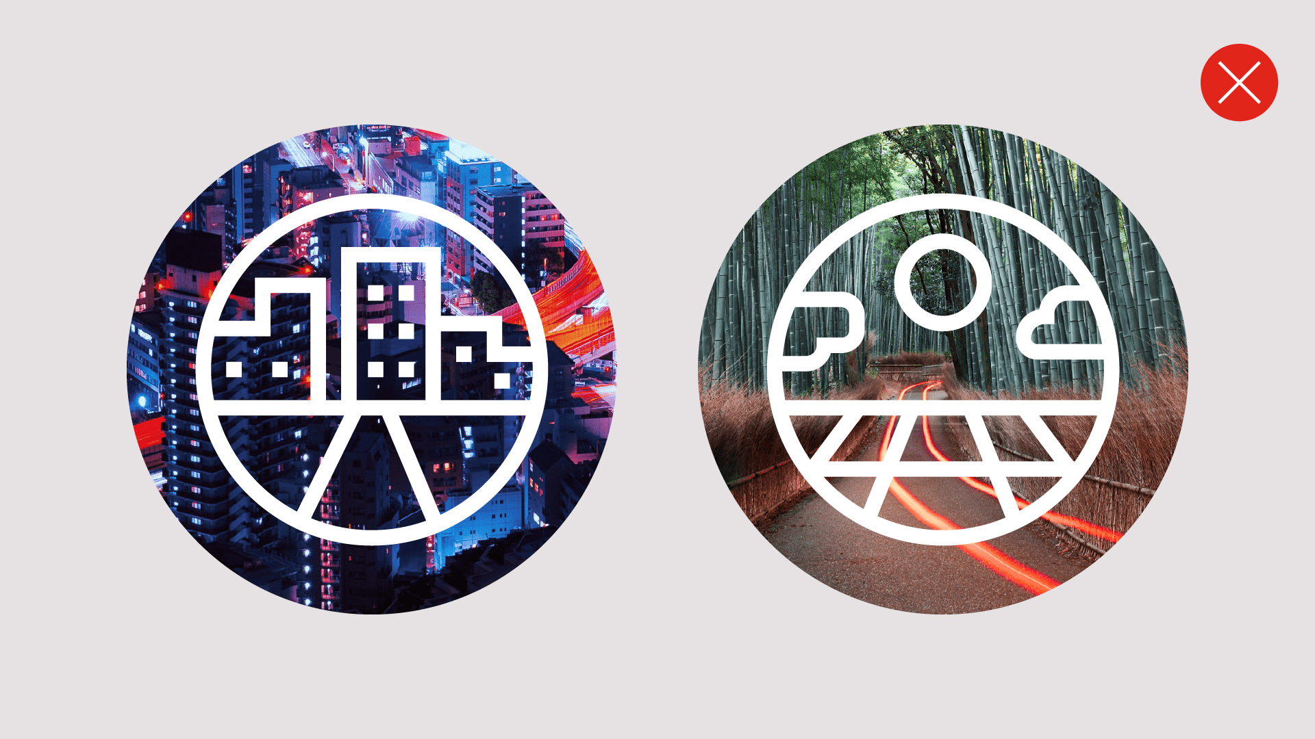
Don’t use our imagery to fill an icon.

Don’t use our Smarter Gradients to fill in icon strokes.

Don’t use color combinations with low contrast.
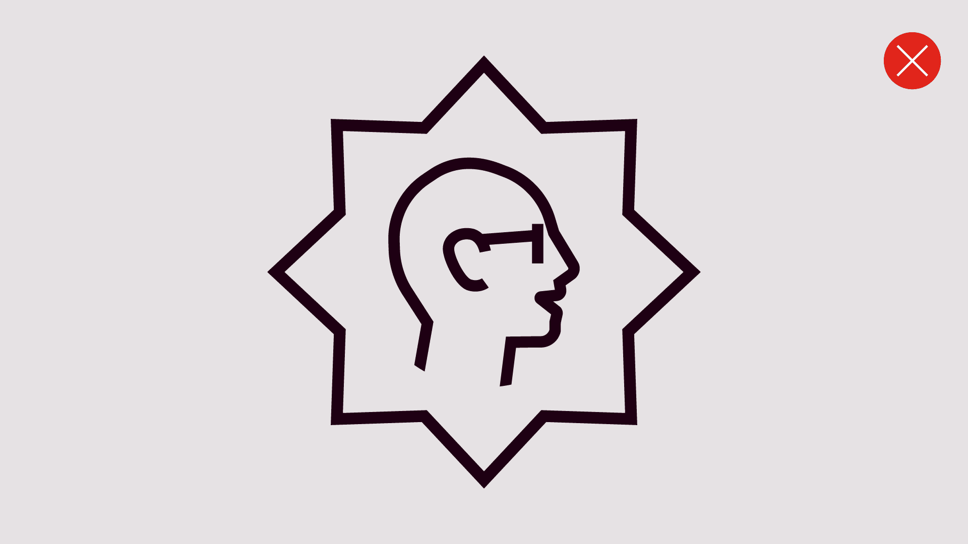
Don’t put the icon in a different shape container.
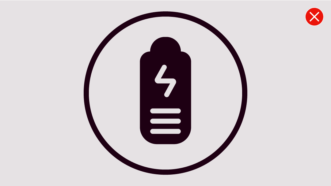
Don’t use rounded strokes or corners without purpose.
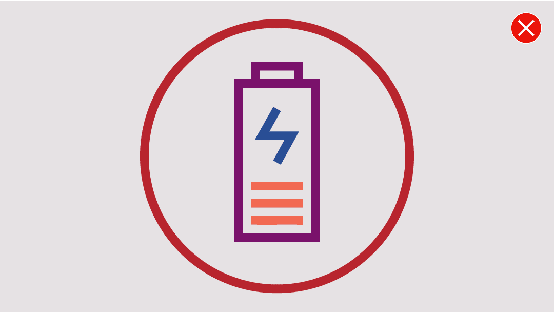
Don’t use multiple colors within the icon.
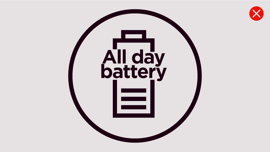
Don’t use complete phrases as part of the icon.

Don’t use overly figurative icons.

Don’t make icons overcomplicated.

Don’t use overly figurative icons.

Don’t add extra details or use different stroke weights.
