Our illustration style reflects our inclusive and authentic approach to imagery.
The characters depicted should foster a collective sense of inclusion, belonging and acceptance. Each character is styled as flat and two-dimensional, only using cabinet perspective in objects for added depth.
The illustration palette includes our primary, connector and secondary palettes combined with unique human and nature palettes.

Download illustrations
Important note: Brand assets, sonic or visual, cannot be used to train AI models as they are not licensed for that particular use.
Usage
Use case
Only use the illustrative style for two purposes: in compositions where a playful or stylized tone is required or when the concept is abstract and challenging to capture in photography.
Illustration use case example:
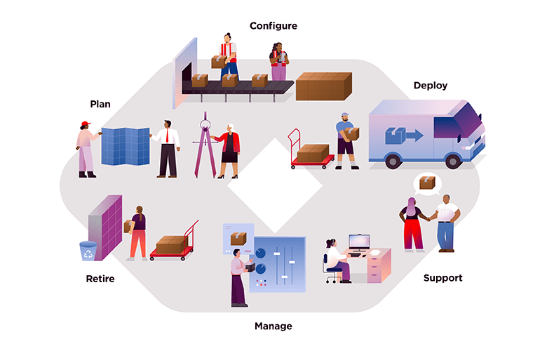
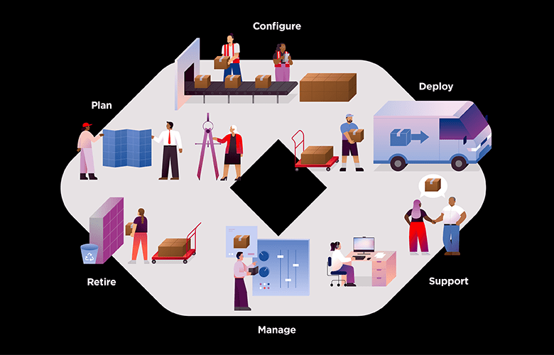
Illustrating a complex or multi-step process can be challenging with photography. Illustration can efficiently communicate complex concepts, ecosystems, data and infographic diagrams.
Photography use case example:
Creating a human-centered campaign or product launch campaign can be solved with natural photography.
Licensing or usage rights
All images accessible on the Lenovo AEM DAM (Digital Asset Management) platform are subject to usage terms and conditions governed by legally binding license agreements.
Using illustration beyond the expiration date or outside the rights granted is a breach of these agreements. This could result in an unauthorized use/copyright infringement claim against Lenovo. This could also put Lenovo in an unleveraged position of having to renew all usage fees at whatever cost is demanded or required by law. From a PR standpoint, a copyright claim against Lenovo is costly and damaging to the company. Anyone utilizing the illustration on the AEM DAM must be aware of the use restrictions noted in each file’s properties and follow them accordingly. This will help ensure that Lenovo complies with any agreements and avoids significant financial and legal issues.
Email the Brand Help Desk for questions.
Characters
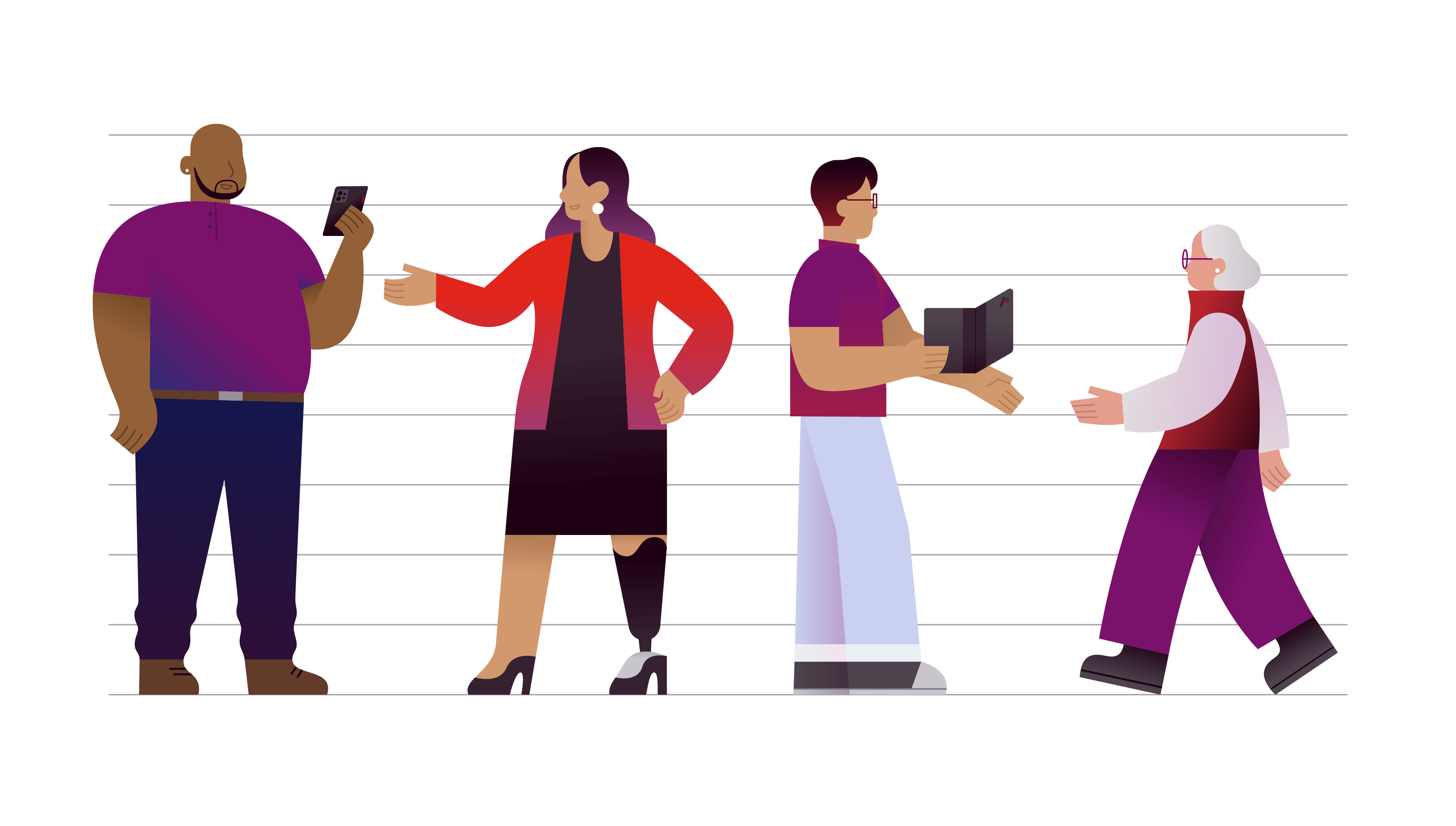
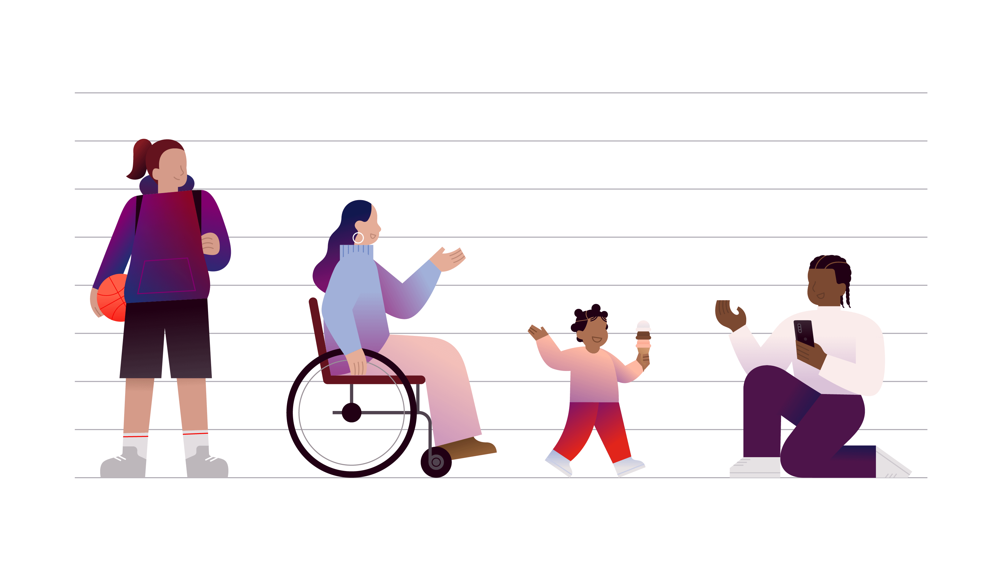
Our characters visually represent the interconnected global community we serve, from employees and customers, to citizens around the world.
They reflect a wide range of lived experiences across age, skin tone, disability, and body type.
The characters shown showcase a wide range of diversity in age, skin tone, disability and body type. Moreover, they are depicted in various poses and perspectives, including standing, walking, sitting and 3/4 view. You can use these characters as a reference to create new scenarios that align with our vision of smarter technology for all.
Shapes
When creating the shapes for each character, begin by drawing the linework. Use simple vector shapes with the least amount of anchor points (see the example on the right). Curves are highly encouraged to convey a soft, harmonious look and feel. Follow these tips for consistent and seamless character creation:
- Use our character starter vector file.
- Simplicity is key to creating a character.
- Build sections separately, then join those sections together before adding color.
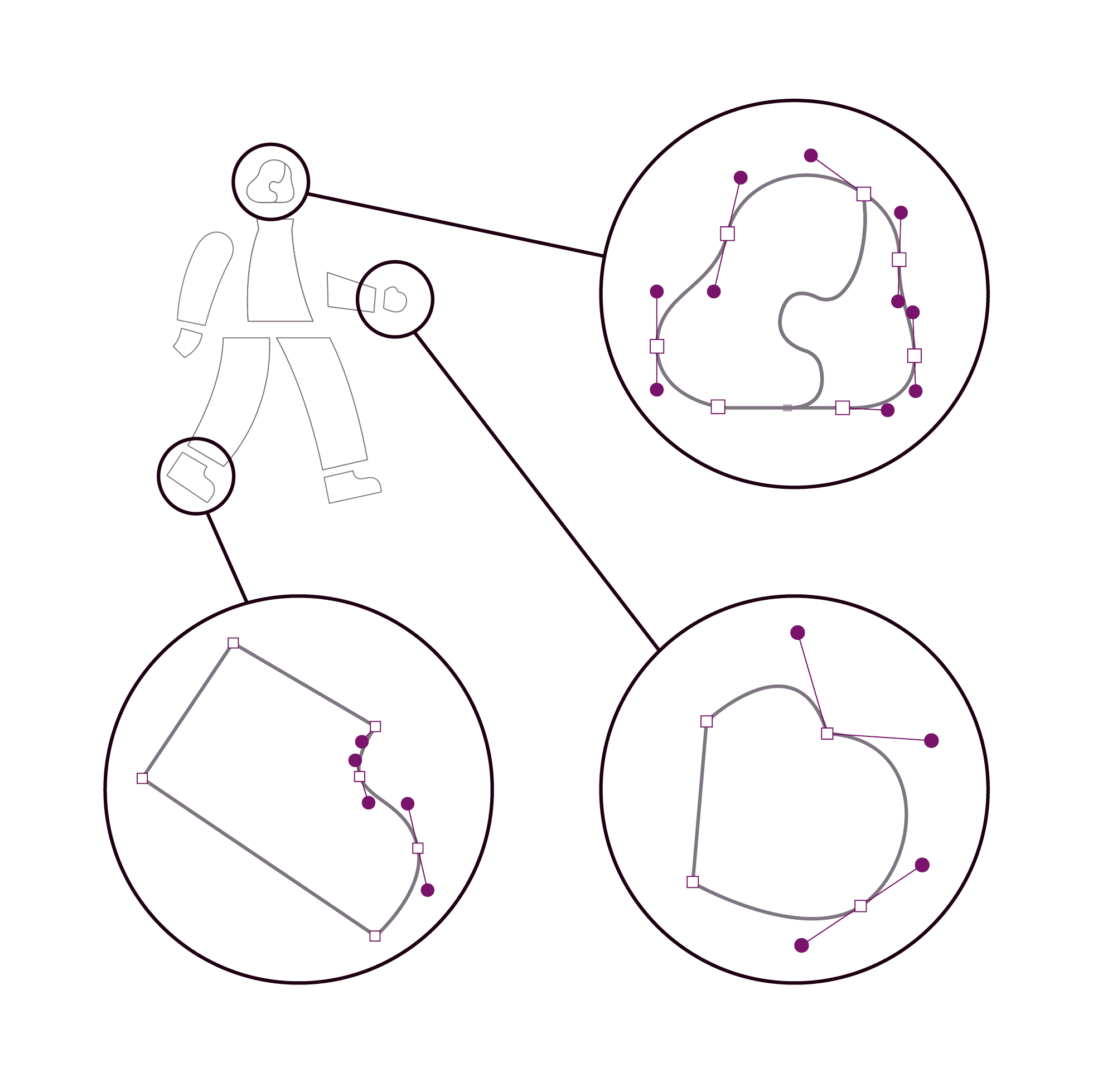
Anchor point detail of simplified shapes
Proportions
Standing
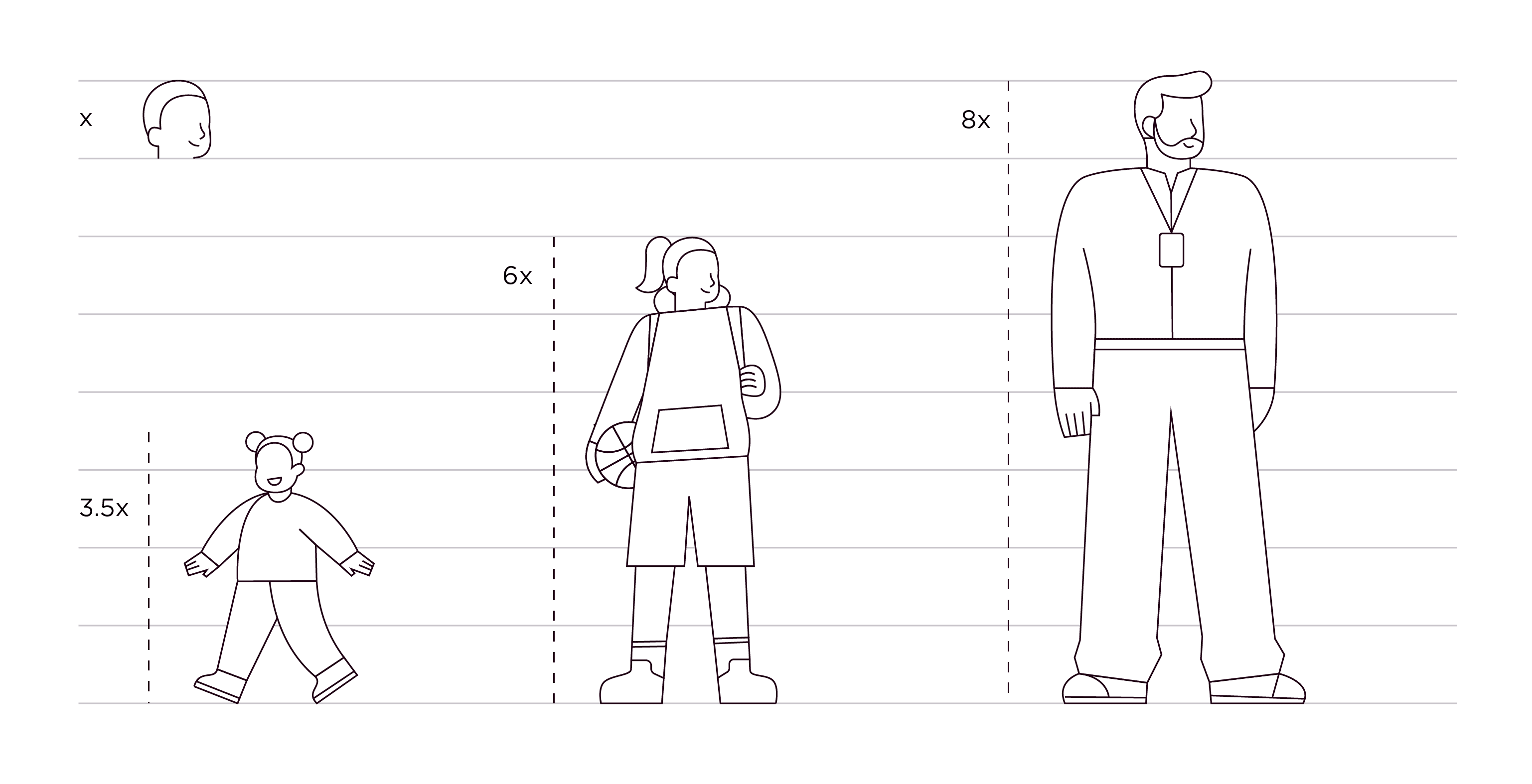
Characters’ heights and widths can vary widely to depict body diversity and age. To create a proportional character, start with 6-8 horizontal rows evenly spaced apart. Follow these tips for creating consistent characters:
- Adult heights should range between 7-9 heads
- Teen heights should range between 6-7 heads
- Children and toddler heights should range between 3-5 heads
Use the Lenovo modular grid to help establish realistic proportions between characters and their environment.

Evenly spaced rows are used to create characters

Height example of standing characters
Seated
When seated, characters’ heights should not exceed 6 heads. Seats will typically be situated around 2 heads.
- Seated adults should range between 5-6 heads
- Seated teens should range between 4-5 heads
- Seated children and toddlers should be around 3 heads
Use the Lenovo modular grid to help establish realistic proportions between characters and their environment.

Height example of seated characters
Color
Our illustration color palette is based on Lenovo’s brand color palette.
Reference the color page to understand how to apply the brand palette.
When choosing colors, we highly recommend matching the HEX codes provided because RGB and Pantone values can cause file conversion issues.
Extended palette
Intermediary colors are included between our brand palette’s deep and pale colors for greater range and variety in illustrations. Do not use the intermediary colors outside of illustration touchpoints.
Red (primary)
#FAECEB
#F0C7BF
#FFB9A2
#F26A52
#E1251B
#B8252E
#871C23
#64131E
Purple (connector)
#F1E1ED
#D9C1D8
#C195BD
#AA6AA2
#923E86
#7A126B
#4D144A
#330D31
Blue (secondary)
#EAEEF5
#C9D0F0
#A1B0D9
#6B85C3
#516FAC
#294E95
#153476
#11184F
Neutral (secondary)
#FFFFFF
#E6E2E4
#C9C5CB
#ABA8B1
#7D7680
#4E444E
#362231
#1E0013
Nature palette
The following color palette brings nature into our illustration environments. Only use this palette for plants and nature-related items, never for accents or clothing. Do not use these palettes outside of illustration touchpoints.
Green (plants & nature)
#D9E6DC
#B5D2C8
#5B968A
#39857A
#00594C
Neutrals (earth)
#ABA8B1
#D3996E
#946037
#664022
#362231
Human palette
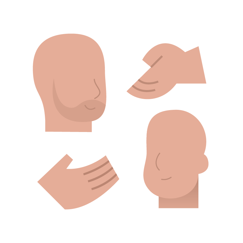
The human palette includes a range of undertones that reflect the variety of skin tones within our communities around the world. Use a thoughtful range of shades to reflect the richness of global skin tones. Do not use these palettes outside of illustration touchpoints. The human palette is divided into two sub-categories:
Main tones should be used as the primary fill for visible skin.
Shade tones should be used for shading and line details (e.g., mouths, noses, and fingers).
Rose (skin with pink undertones)
Main
#E5AD98
Shade
#BF8C78
Main
#E59D8C
Shade
#BF7E6E

Main
#D59B89
Shade
#B37C6B

Almond (skin with beige undertones)
Main
#EAB386
Shade
#BF8B60

Main
#D3996E
Shade
#B37C55

Main
#946037
Shade
#664022

Cocoa (skin with brown undertones)
Main
#AC7052
Shade
#7B4931

Main
#7B4931
Shade
#623B2A

Main
#623B2A
Shade
#46281A

Applying color
Before applying color to characters, reference our brand guidance around applying color. Always use the palette provided and avoid using too many combinations of colors or too many neutrals.


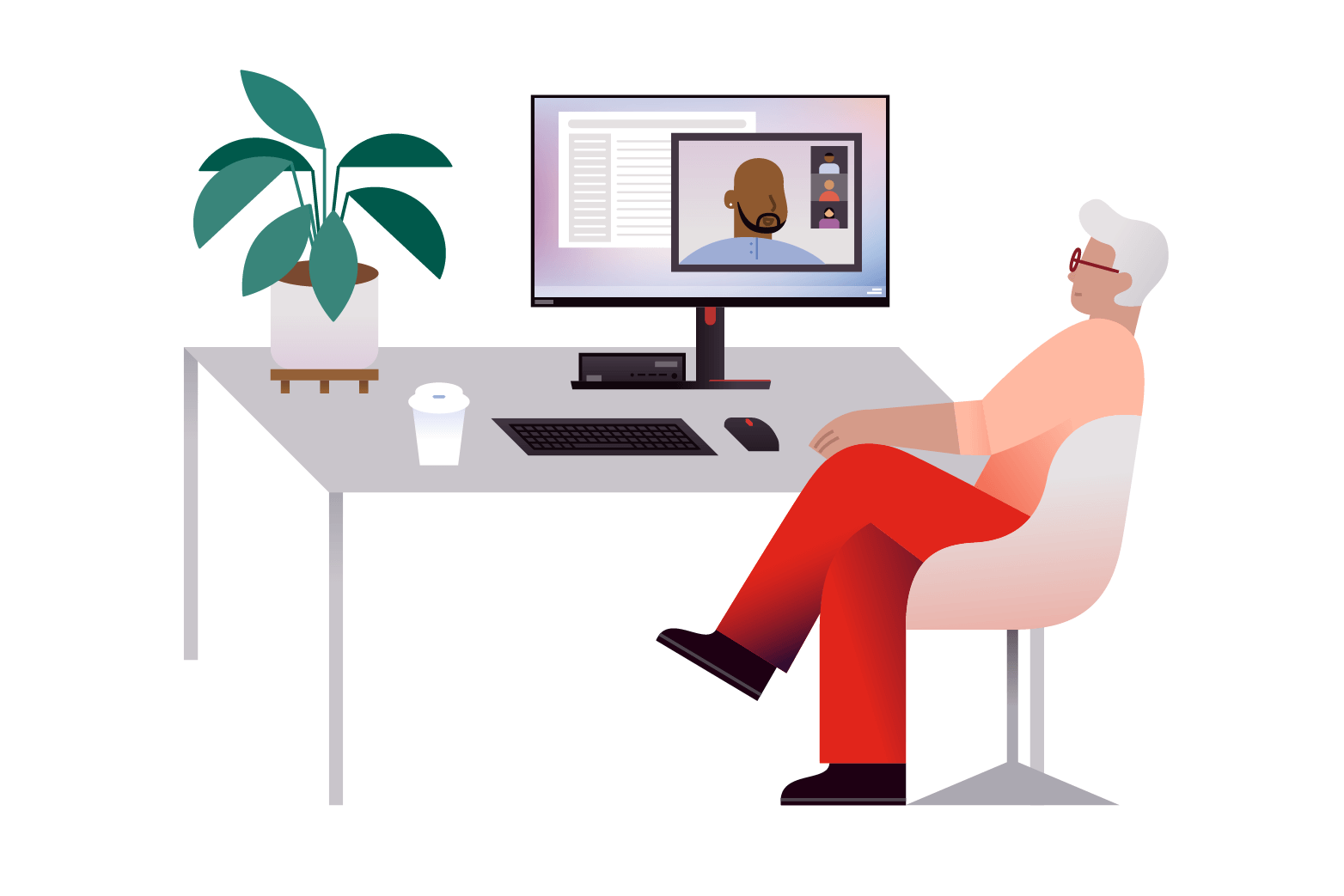
This application uses a balance of color; red is used strategically to highlight one character.

This application only uses colors from the secondary palette.

This application uses too many colors; it uses flat colors instead of gradients, so shapes have no definition.
Shading
Shading characters
Shading is used to show depth and delineation. Shading can be used to differentiate between limbs and folds in clothing.
Use linear gradients to apply shading and combine colors that blend well. Do not create new colors or use colors with low contrast.
Shading objects
Shading can also be used on inanimate objects, like boxes and windows, to evoke depth and dimension.
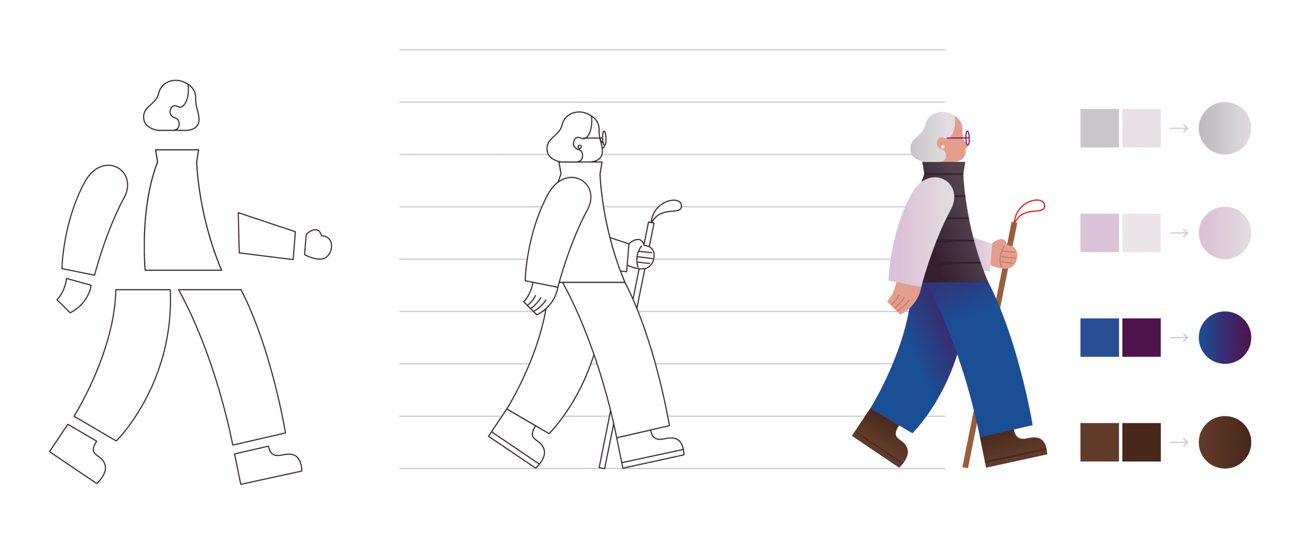
Example steps to create a character with color/shading: Start with simple shapes; combine shapes and add details; add color and shading details.

Example steps to create an object with color/shading: Start with simple shapes; combine shapes and add details; add color and shading details.
Linear gradient examples

#FAECEB
#FFB9A2
Blend the same color 2-3 steps away in the same color group.

#AA6AA2
#F26A52
Blend vertically between red and purple (purple and blue; blue and neutral).

#294E95
#5B968A
Don’t blend the nature palette with the expanded palette.
Treatments
Our illustrations use color and form to create a unique and ownable style. Aim to find the right balance to give a character just enough detail so they are practical and aesthetically pleasing.
Lines
Use lines sparingly. Lines can be used for characters’ mouths, noses, fingers, and other small details, like glasses and the soles of shoes. The recommended line width when drawing characters is 1.5 pixels.

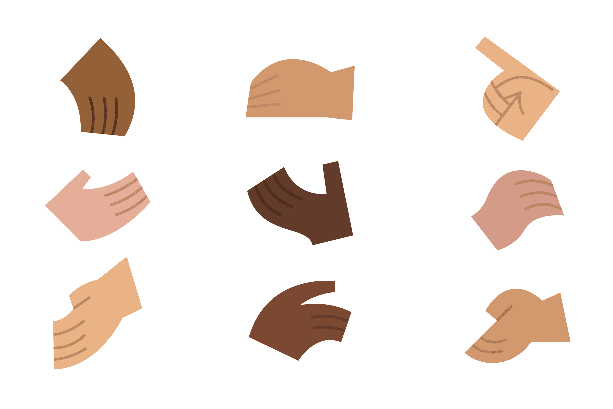
Lines used to show fingers

Lines used to show shoe type

Lines used to show accessories
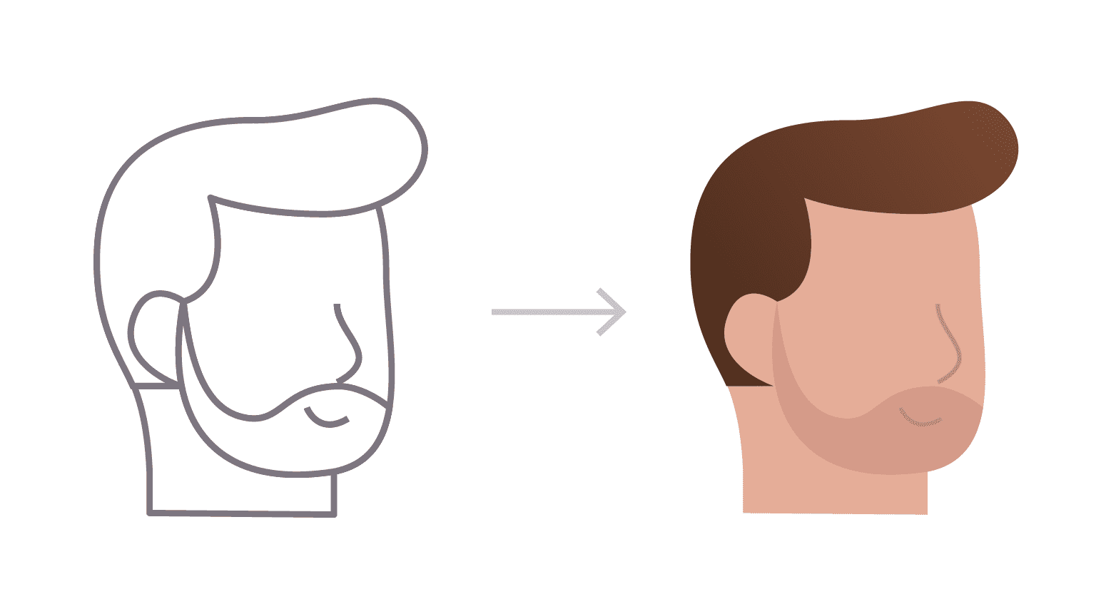
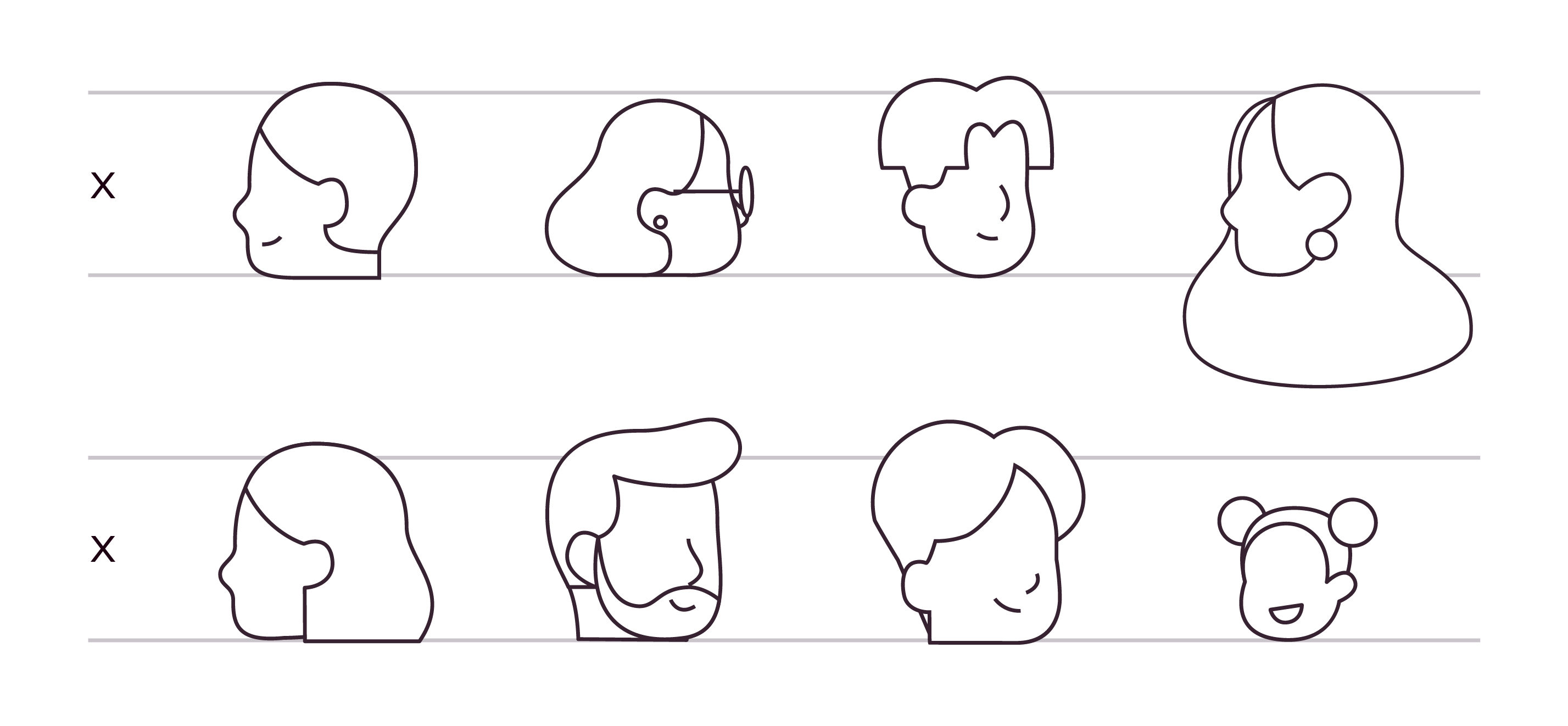
Lines used to show facial features
Details
Guidance for drawing characters’ heads, hands and shoes.
Heads
To create a proportional character, start with 6-8 horizontal rows evenly spaced apart. Heads should be drawn at a height of a single row. Children will have slightly smaller head sizes. Reference the character proportion section to determine the maximum height of a character.
Head shapes and hair treatment may vary to convey diversity. Facial features should also be applied sparingly. Mouths and noses are typically added to characters in a 3/4 view. Avoid drawing eyes and front-facing heads.
Hands
Hands must be simple and easy to perceive. When drawing hands, we recommend drawing the general shape and then adding lines to distinguish fingers.
Shoes
Shoes must also be simple. The base of each shoe is typically flat on the ground with minimal details like laces and soles.
Devices
Devices must be simple but retain a certain level of accuracy to the actual device.
- Laptops and keyboards must be drawn in a “cabinet” perspective.
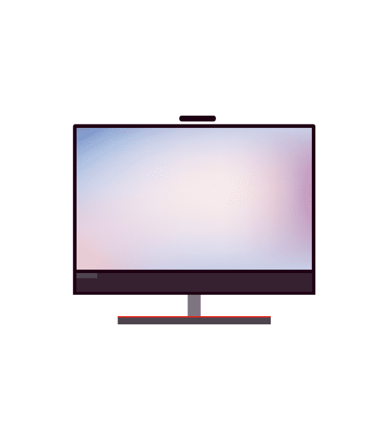
- Desktop monitors and workstations may be drawn flat.
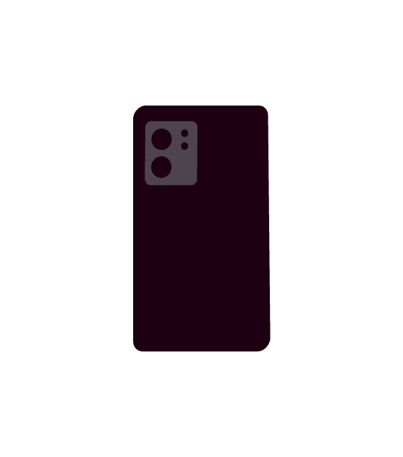
- Mobile devices and servers can be drawn flat or in the “cabinet” perspective.
Nature
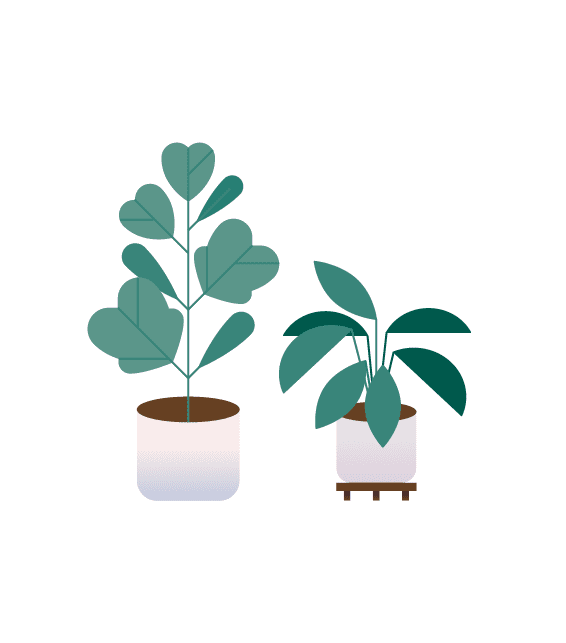
When drawing foliage, shapes must be simple yet organic. Branches and stems should be drawn at 1.5-pixel width. Use the green color palette provided. Shading is encouraged for trees but not necessary for indoor plants.


Perspective
The perspective choice for Lenovo brand illustrations is essential.
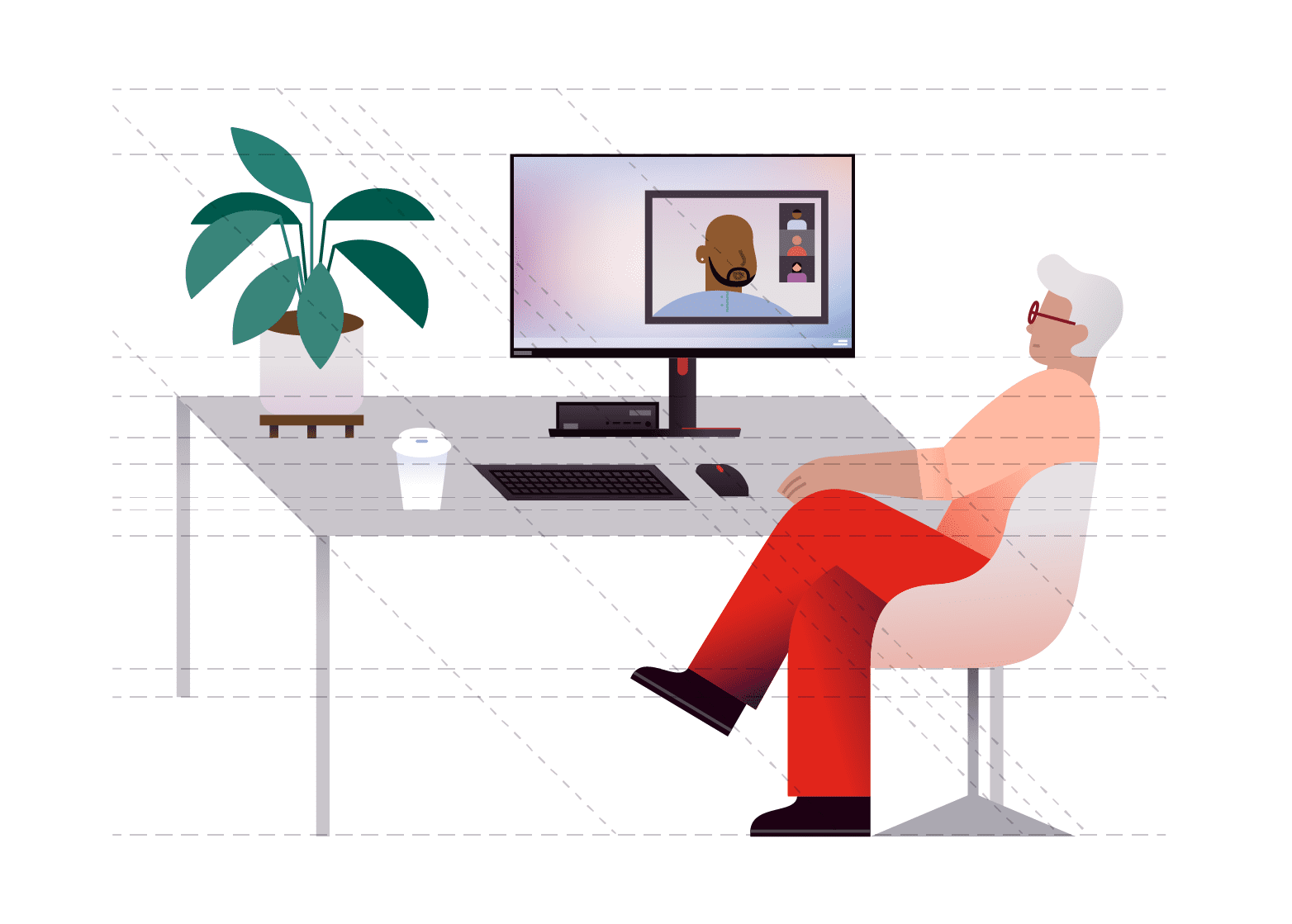
Sample environment
The following scene depicts how all objects can work together harmoniously.
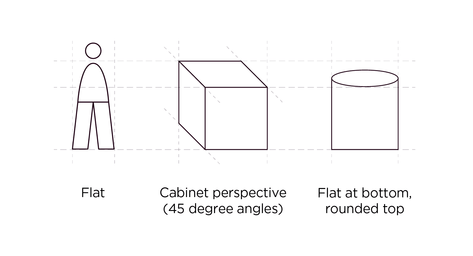
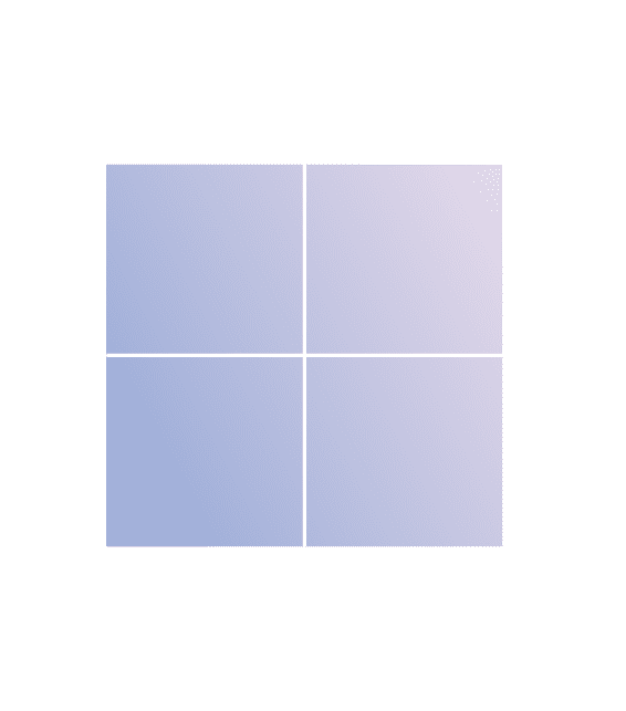
- Flat objects
The character and the desktop monitor are drawn flat. - Boxes & surfaces
The desk and keyboard are drawn in a “cabinet” perspective, extruding at a 45-degree angle. - Cylinders
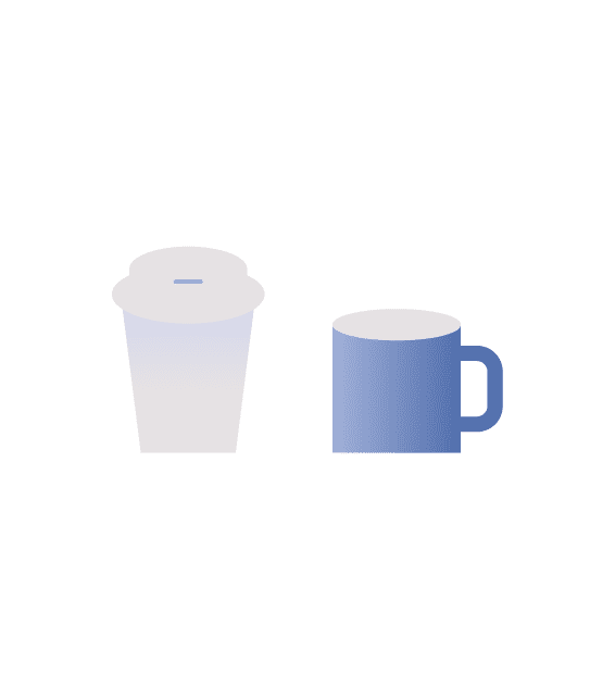
The cylindrical objects are drawn with rounded tops and flat bottoms.
Flat
All characters must be drawn flat along a two-dimensional plane. Other objects, such as windows, desktop monitors, and some chairs, may also be drawn flat.

Boxes and surfaces
Cubic objects within the environment should be drawn in a “cabinet” perspective. The depths of these objects should extrude at a 45-degree angle. These objects include boxes, laptops, desks, tables and vehicles.


Cylinders
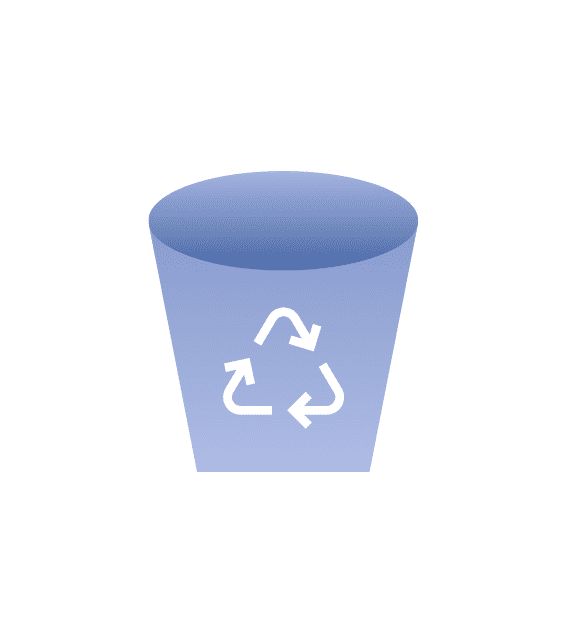
Cylindrical objects have a unique treatment. The tops of these objects must show an elliptical surface, while the bottom terminates as a flat square. These objects include cups, mugs, plant pots, baskets and barrels.
Lenovo scenes
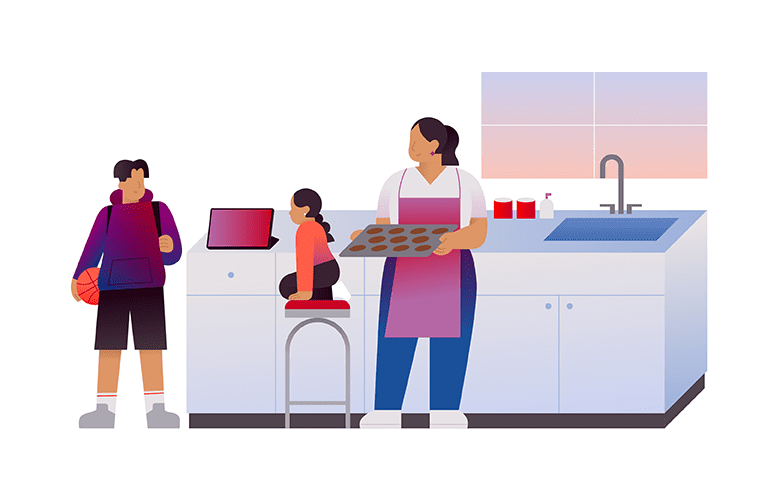
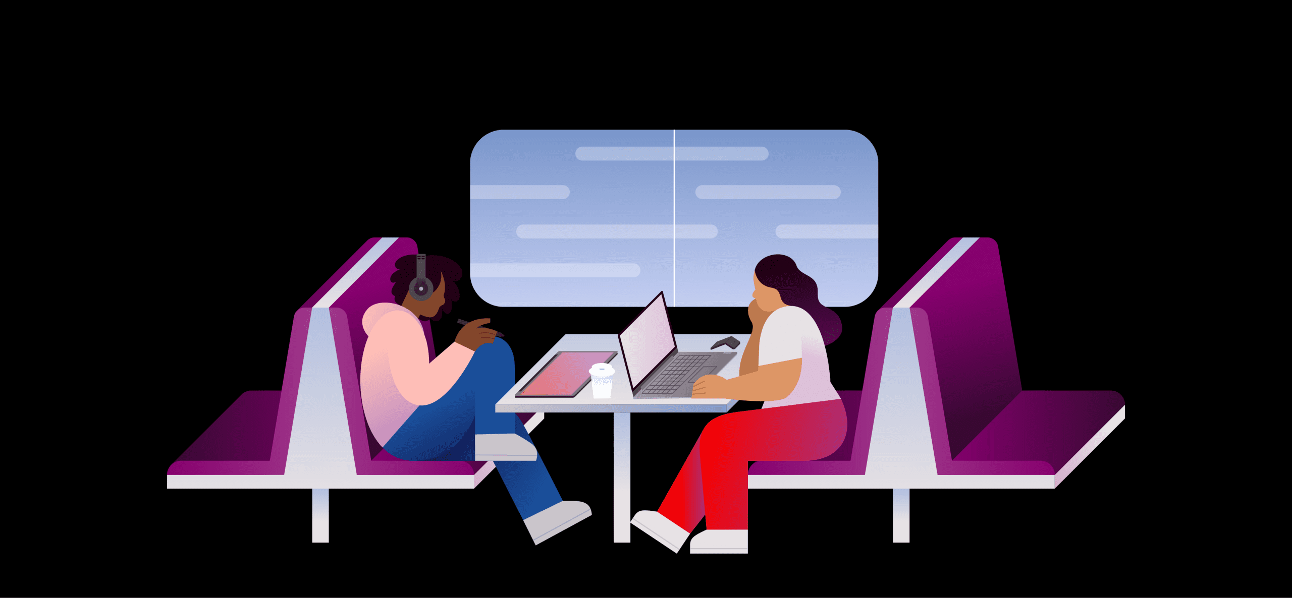
The Lenovo scenes showcase balanced design and color applications. In dark mode, choose high-contrast colors with the background to ensure accessibility.
Server room


Meeting


Home in the kitchen

Transit

Nature
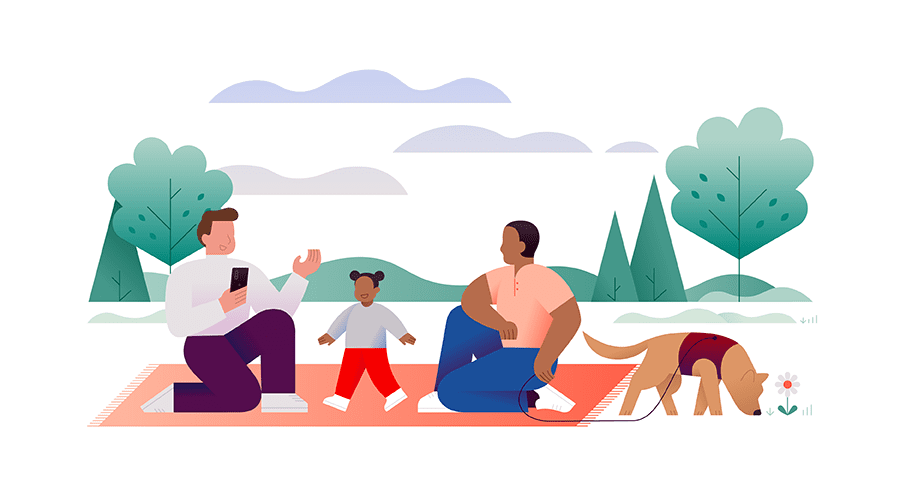
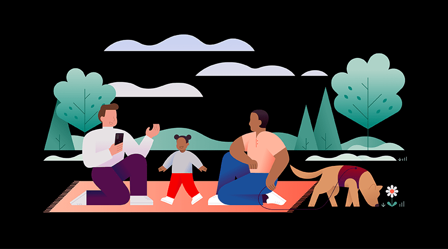
Environmental Social Governance (ESG)
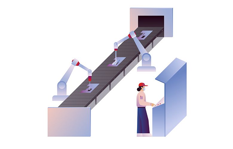
Smart factory

Complex process
What not to do
These examples represent the wrong way to apply our brand elements.
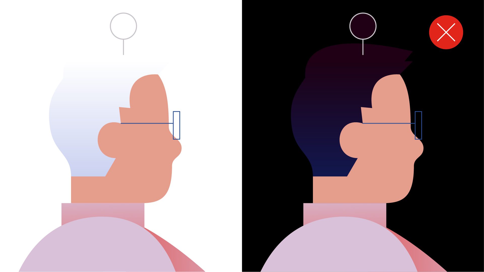
Do not use colors that blend with the background.
Always choose colors that add depth and contrast.

Do not include eyes.
Express each character’s personality through their hair, body language and clothing.

Do not use colors outside the brand color palette.
Do not use the nature palette for clothing.
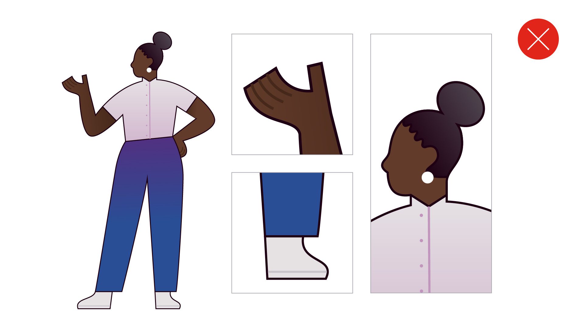
Do not add outlines to characters.
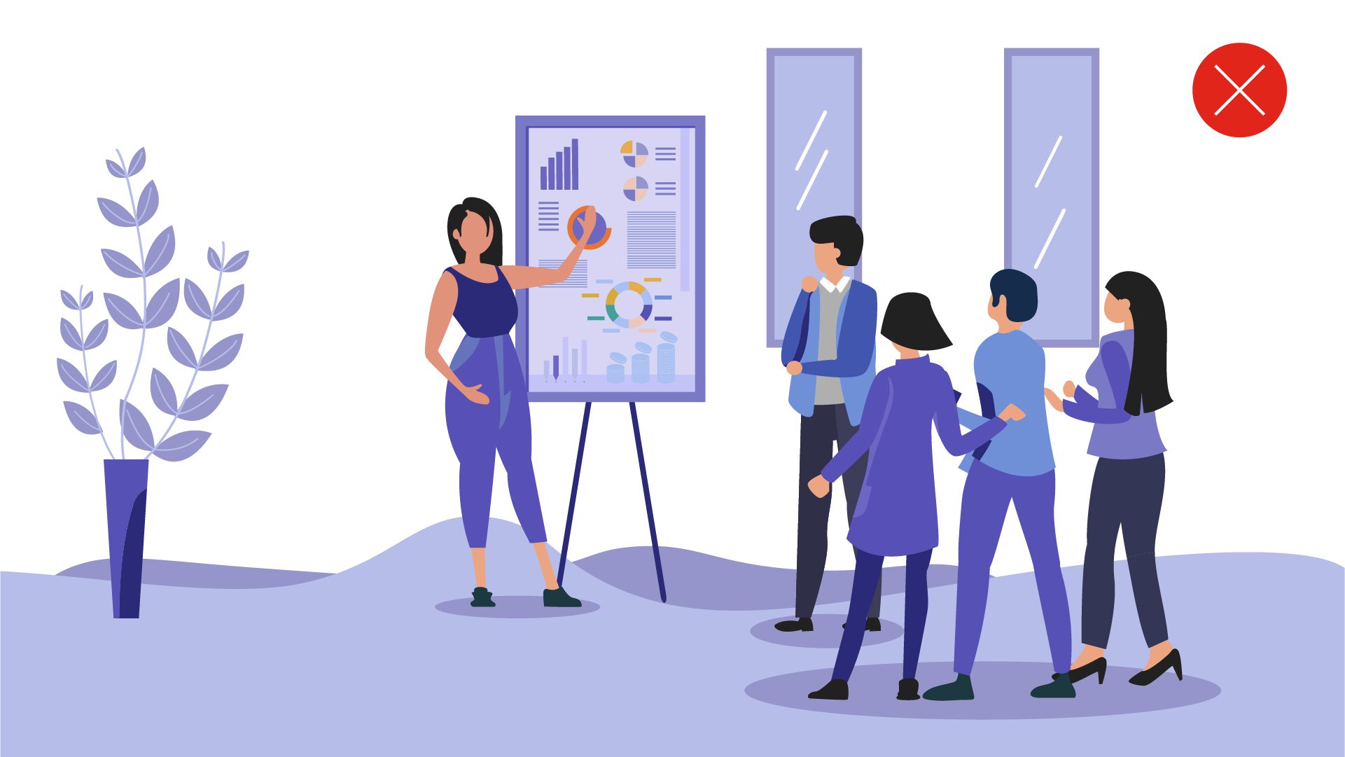
Do not substitute stock illustrations for the Lenovo style.
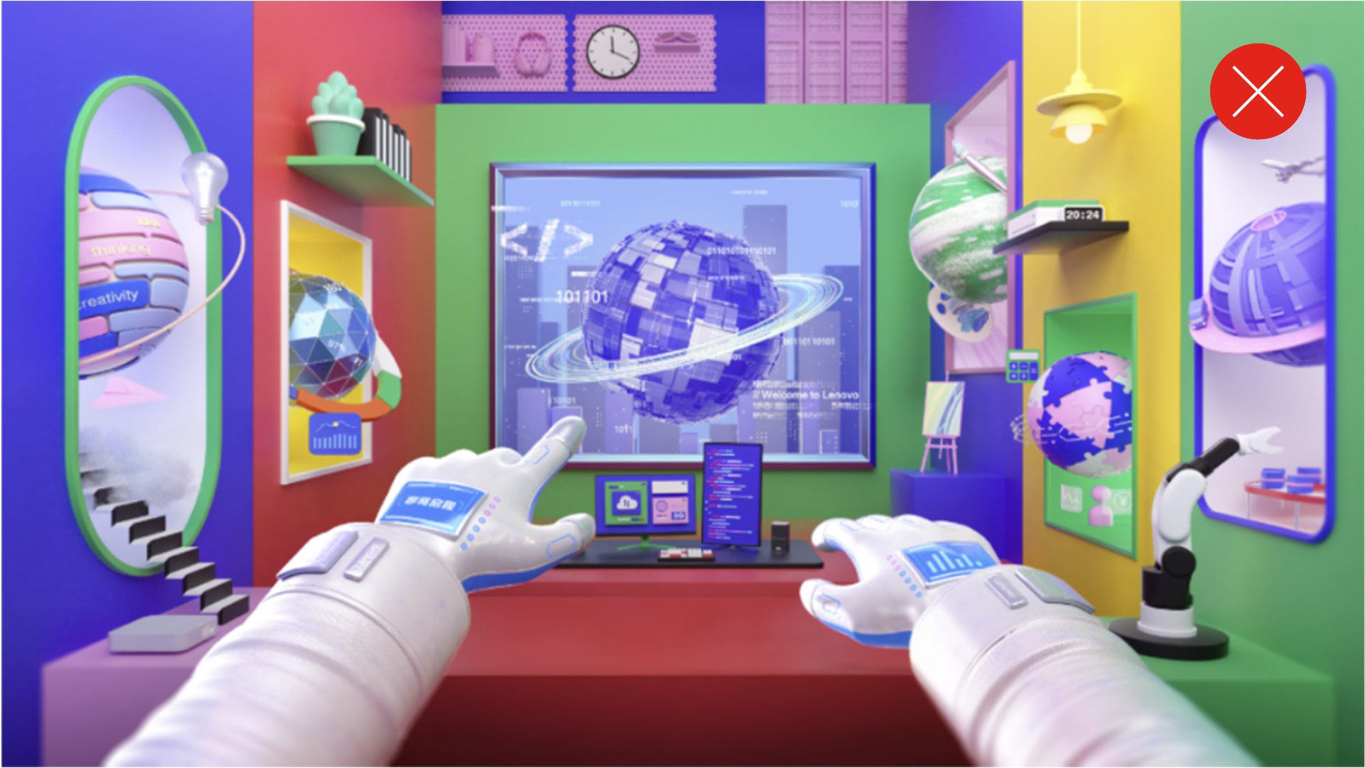
Do not create illustrations from the user’s perspective or use a three-dimensional style for environments or characters.

Do not use overly simplistic ‘sketch’ styles or add conversation bubbles with text.
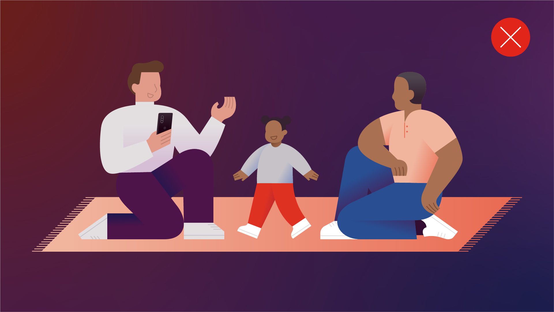
Do not place illustrations on colorful backgrounds.
Only use white or black backgrounds.
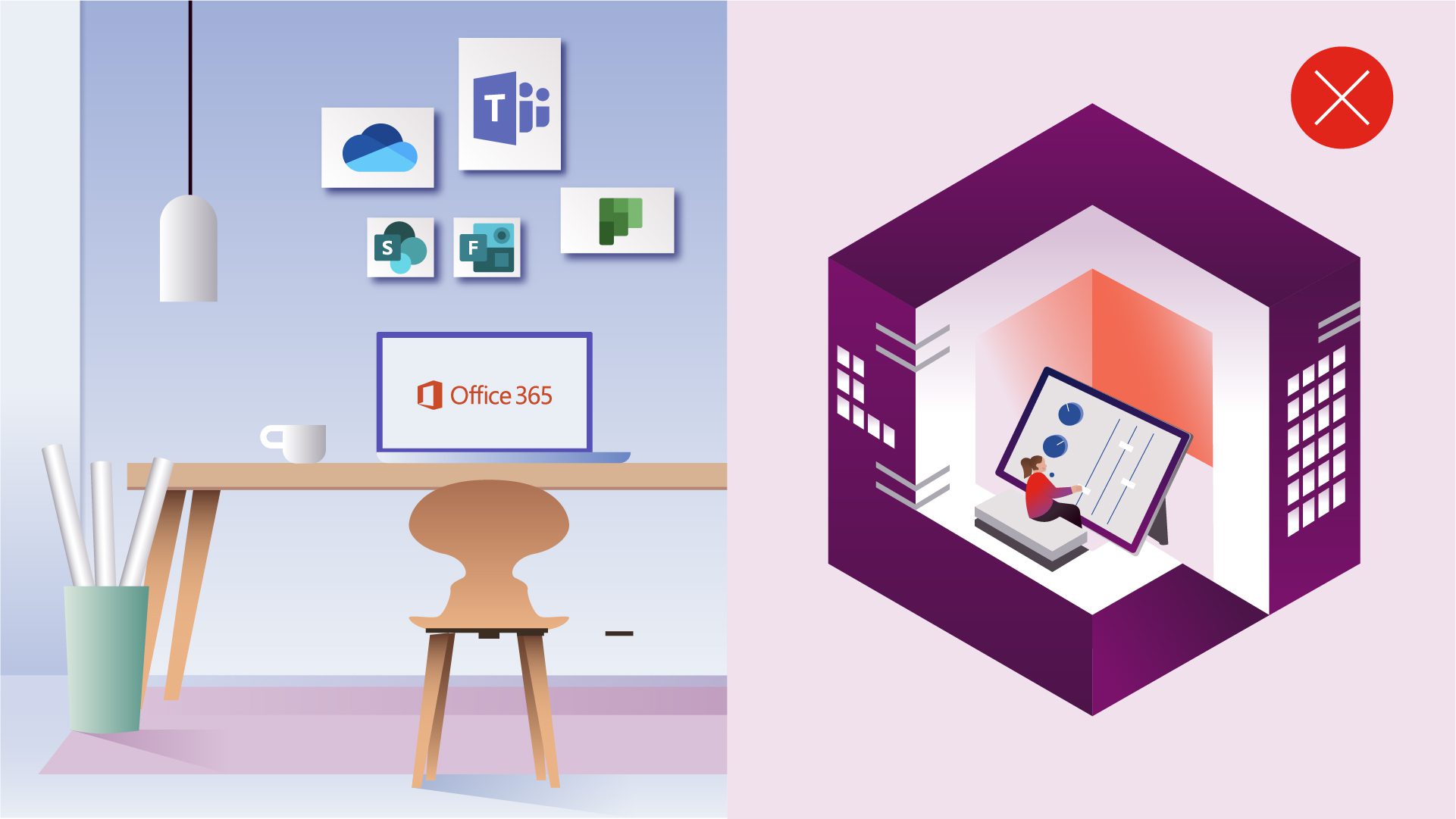
Do not use isometric perspectives or three-dimensional qualities for environments or characters.
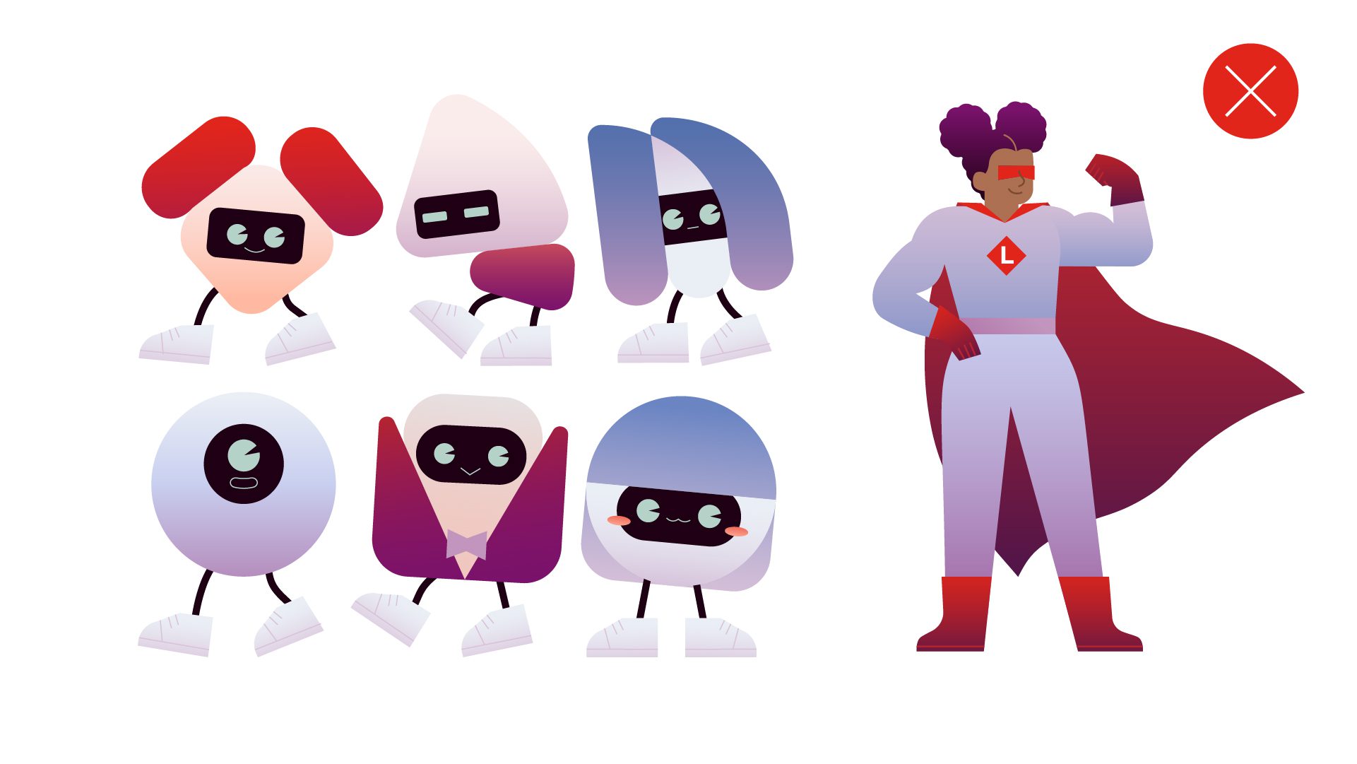
Do not create fictional subjects or incorporate elements of the alpha blocks into unrealistic objects.
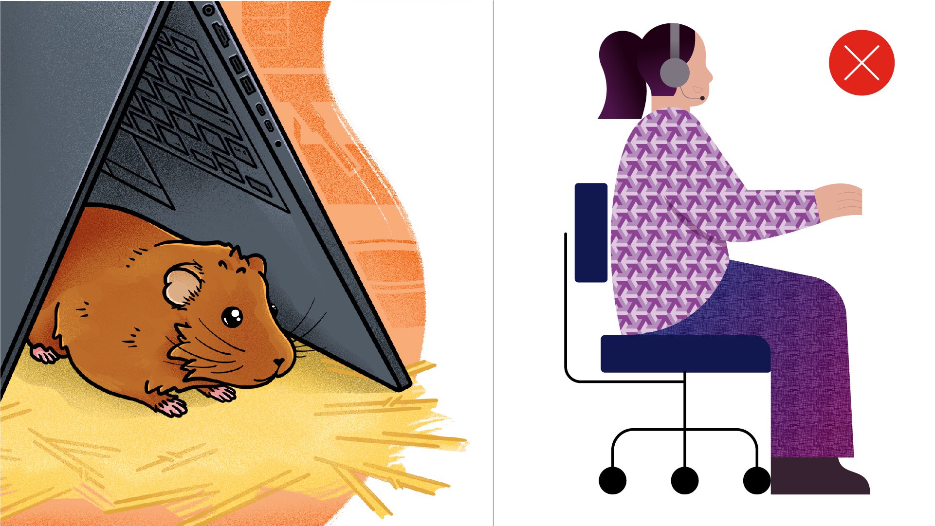
Do not use textures that add unnecessary detail.
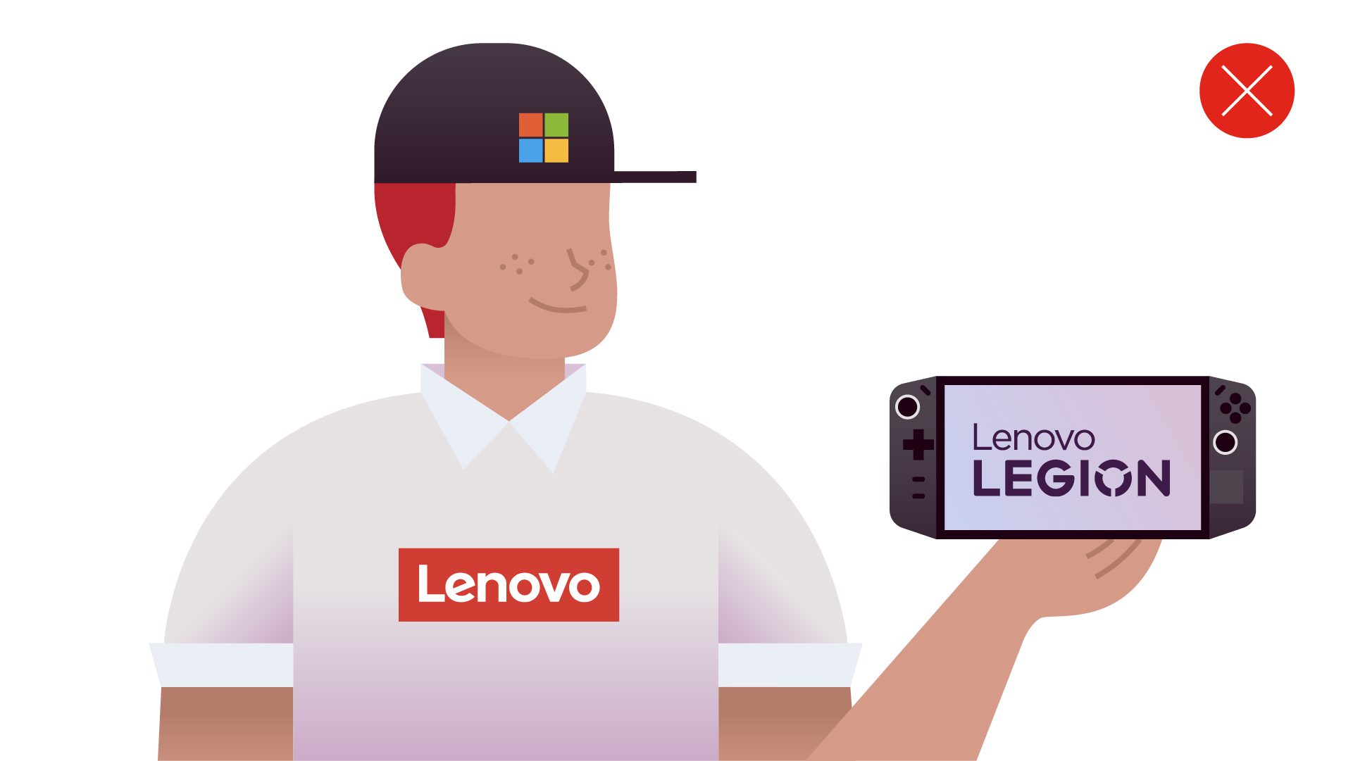
Do not use logos or wordmarks from partners, sponsors, subbrands or descriptive names.


