Our personality comes through not just in the words we use, but also in how those words look and feel.
Corporate typefaces
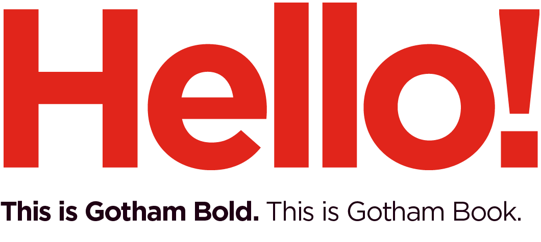
For all marketing and external communications, use our corporate typeface, Gotham. This modern font comes with multiple variations, but only use Gotham Book and Gotham Bold as they provide enough flexibility. Consistency in the typeface helps us achieve consistent brand messaging.
Typefaces are software and licensed per user and should not be distributed.
Visit typography.com/fonts/gotham for information on how to obtain a license for Gotham.
Alternate for Gotham
Gotham does not support the required special characters for all languages.
For typography guidance by Market, reference the Gotham Equivalents by Market spreadsheet. For support outside of these languages, email the Brand Help Desk.


Noto Sans, shown in Chinese and Korean, is an approved Gotham alternative for external communications when special characters are needed.
Shared documents
Use our corporate employee-use typeface, Arial Regular or Arial Bold, for internal communications and shareable documents (i.e., PPTs, Word, Excel and email communications). It is a pre-loaded, standard system font allowing for global access. All of our Microsoft Office templates use Arial as their default font.
Use Noto Sans for internally focused materials in China.

Online typeface
Use Montserrat for body copy, titles and headlines in web applications. The characteristics of Montserrat are similar to Gotham and are accessible to all as an open-source web font.
If using Montserrat in an online application is impossible, use Lato.

Typographic details
Our typography’s letter spacing and leading are important as they distinguish our communications as polished and professional.
Letter spacing
We like our letters close!
- Headlines and prominent messages should use at least a minimum of -20 letter spacing in all communication materials.
- Body copy should be set with no reduction of letter spacing.

Leading
We pay special attention when spacing lines of copy in our headlines, titles, subheads and body copy. To achieve consistent spacing we use percentages to determine the numeric value for leading.
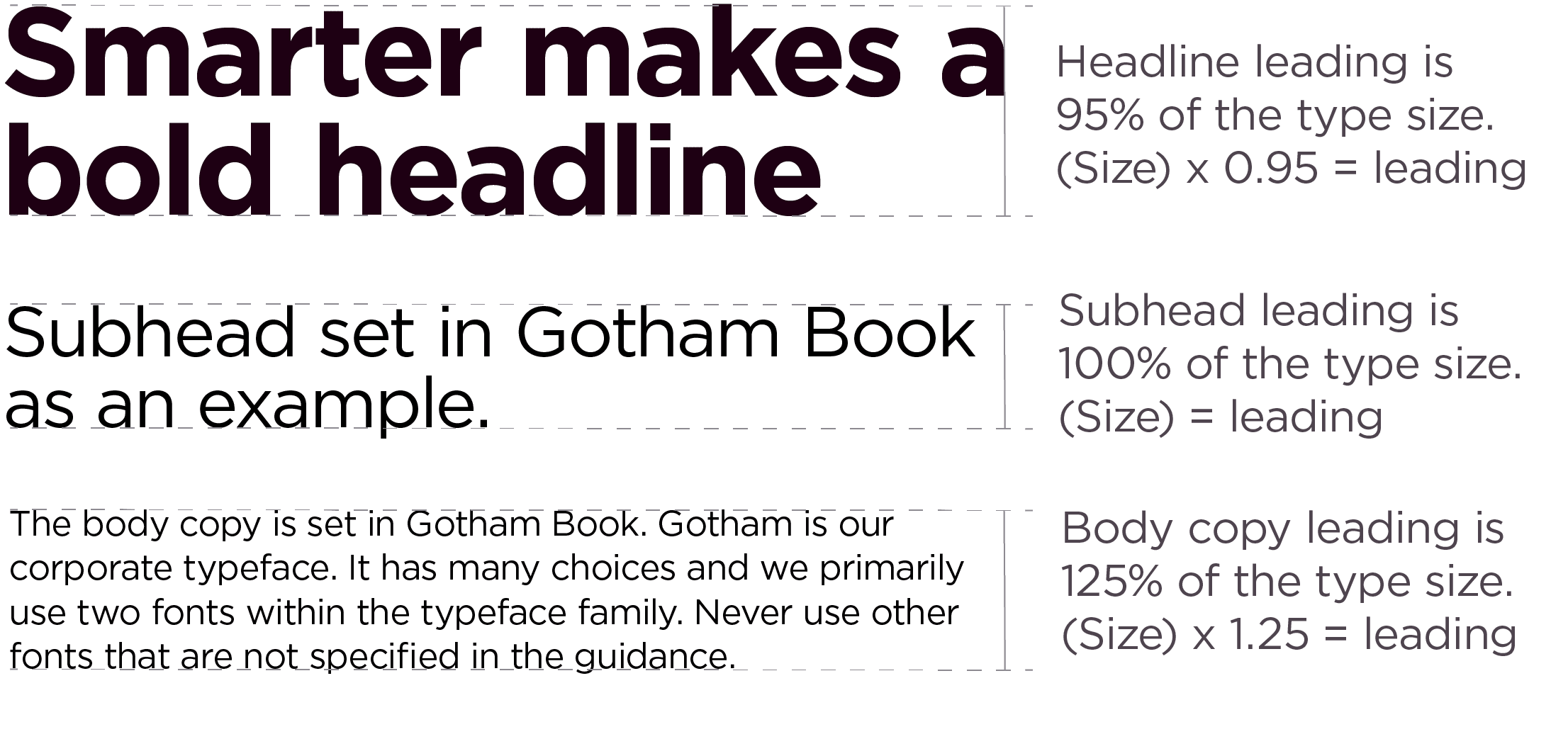
- Prominent text (shown as a headline) should be spaced using 95% of the size of the type. Example: 100pt type = 95pt leading
- Secondary text (shown as a sub-headline) should be spaced using 100% of the size of the type. Example: 100pt type = 100pt leading
- Paragraph text or large amounts of copy (shown as body copy) should be spaced using 125% of the size of the type. The human eye needs more space surrounding larger text areas, so the more text, the more generous the leading. Example: 100pt type = 125pt leading
Preferred style
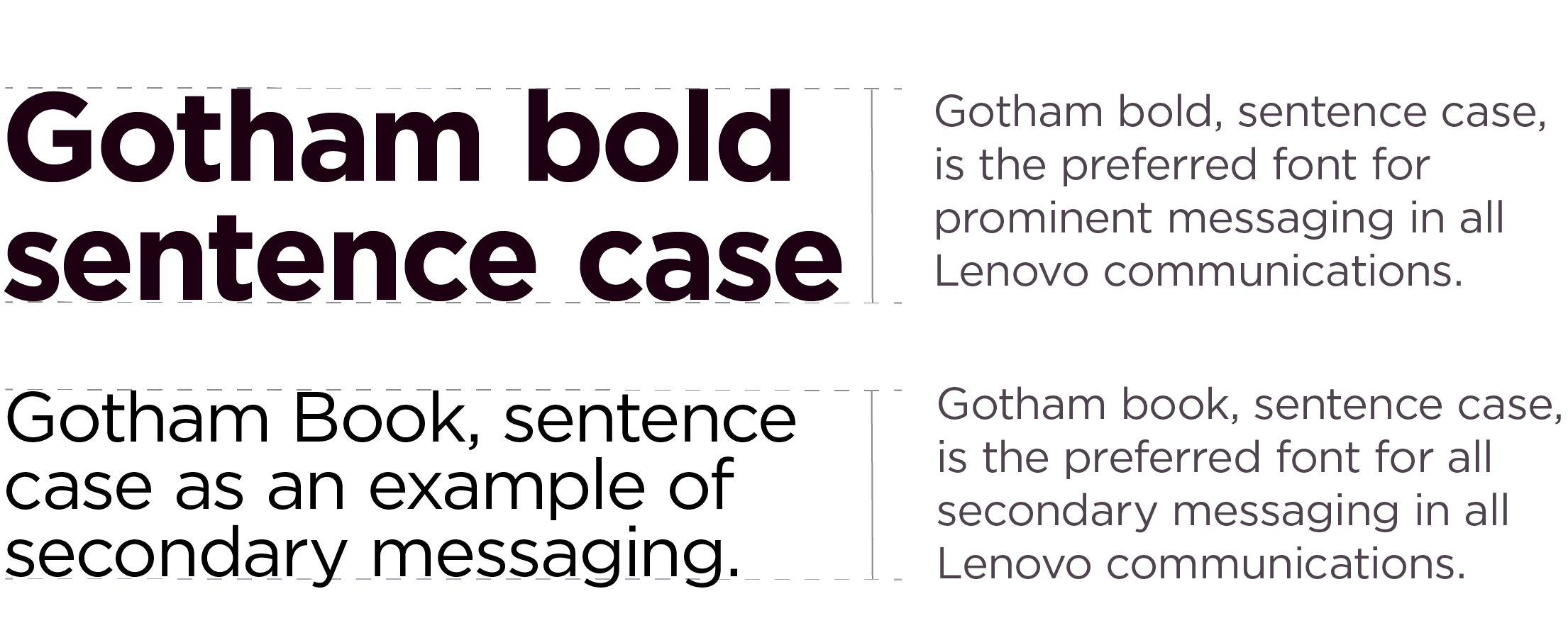
Our preferred prominent messaging is Gotham Bold, sentence case, to maintain consistency with our typographic style. A lighter weight, Gotham Book, can be used as an alternative to balance the composition if needed.
Proper grammar should always be used in communications to express our brand clearly and concisely. While sentence case is our preferred prominent messaging style, there are times when title case and all caps can be used to help distinguish hierarchy or if required by grammatical rules.
Color
Creating engaging content shouldn’t rely on the color of your typeface. Below are some considerations when choosing how to apply color to type:
- Use color to create purposeful meaning and impact or for a connecting thread to an object or special emphasis. Do not apply color as a decorative element.
- Use colors that provide sufficient contrast with the overall background. Visit our color page to learn more about color contrast and our commitment to accessibility.
- Avoid using a combination of colors or smarter gradients as infill for type.
- Avoid using a highlighted treatment to focus on particular words or messaging.
Inclusive design practices
Inclusive design practices are essential for creating innovative and accessible experiences. Typography plays a significant role in making designs more user-friendly. These tips help create more inclusive designs.
- Providing clarity and direction is essential. This can be achieved by using hierarchy, margins and negative space (open space in a composition).
- Line length is another critical factor to consider. The ideal line length for a body of text is between 40 and 90 characters.
- All caps can be difficult to read, especially when used excessively. Use all caps only for purposeful differentiation or emphasis.
- In digital applications, a contrast ratio of 4.5.1 ensures the typography’s legibility to the background. For more information on contrast requirements visit the w3.org.
Hierarchy
A typeface and the choices within can provide levels of information hierarchy.
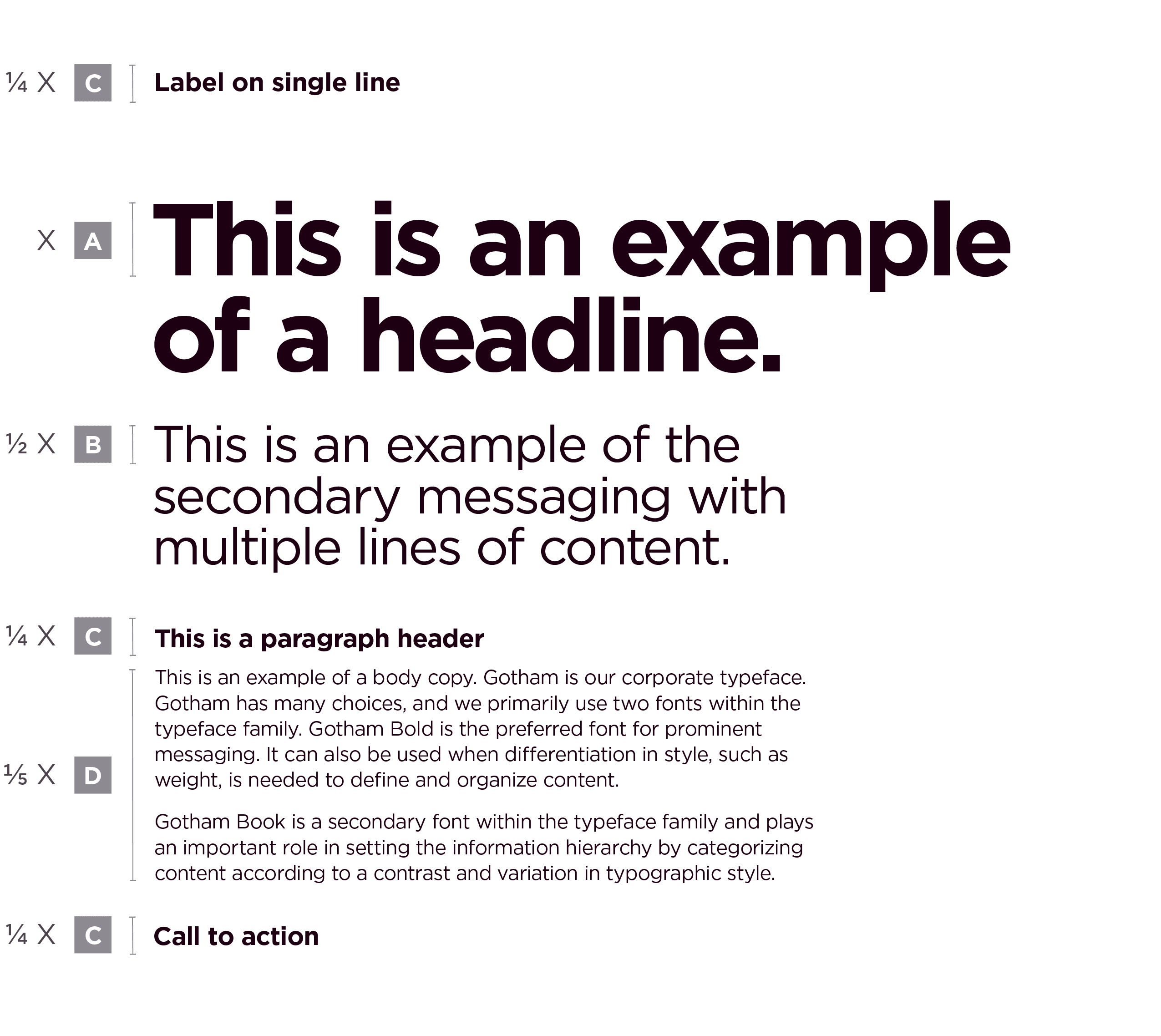
By categorizing content according to its importance, information is visually and cognitively more digestible for an audience. The example demonstrates how our two preferred fonts within Gotham are used to create a hierarchy. Keep in mind, the color can provide additional levels of hierarchy not shown within these examples. Other weights can be used if there’s a hierarchical need; however, weights outside of Gotham Book and Gotham Bold should never be used in prominent messaging.
A
Headline: A brief (sometimes smarter) statement. Determine the size of your headline first, this measurement will be used to calculate the sizes of the other levels of information.
Example X = 72pt
Gotham Bold, sentence case
B
Sub-headline: Short supporting message. Size equals one-half of the headline size
Example 1/2 X = 36pt
Gotham Book, sentence case
C
Label: Identifiers such as organizations, services, offerings, etc. Sizing is variable and should equal between one-quarter to one-third of the headline size.
Example 1/4 X = 18pt
Gotham bold, sentence case
Paragraph header: Short descriptive title. Size equals one-quarter of the headline size.
Example 1/4 X = 18pt.
Gotham bold, sentence case
Call to action: URL, point of contact. Size equals one-quarter of the headline size.
Example 1/4 X = 18pt.
Gotham bold, sentence case
D
Body copy: Long-form content. Size equals one-fifth of the headline size.
Example 1/5 X = 14.4pt.
Gotham book, sentence case
Typographic hierarchy
Typographic hierarchy examples
The Lenovo modular grid helps align and provide ample space between each level of information. Not all levels need to be used in every application.

Applications
The use of our typography in Lenovo experiences like social media, events or our office environments should always adhere to our clean, modern typographic style.
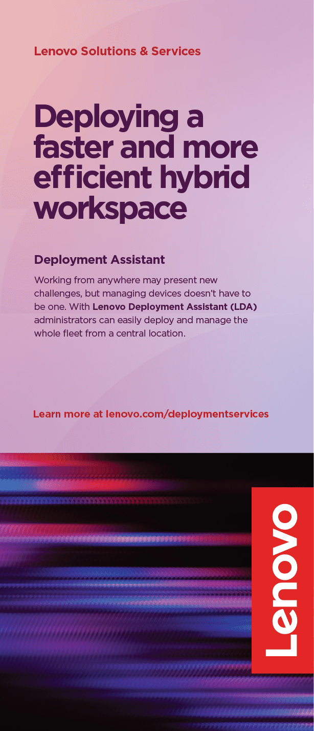




Examples of what not to do
These examples represent the wrong way to apply our brand elements.
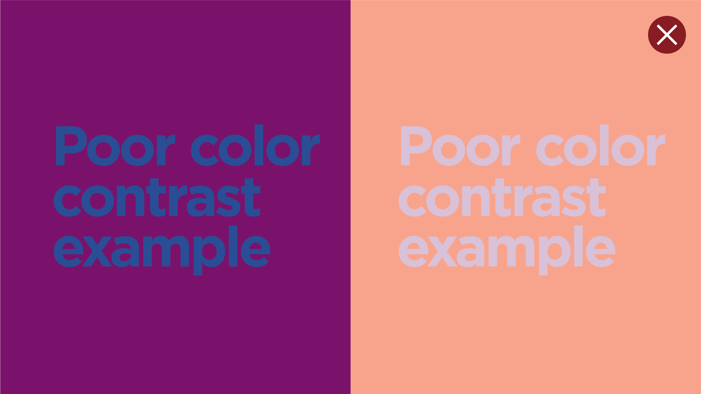
Don’t use non-contrasting color in a layout, copy must always be legible.

Don’t use non-contrasting color in a layout, copy must always be legible.
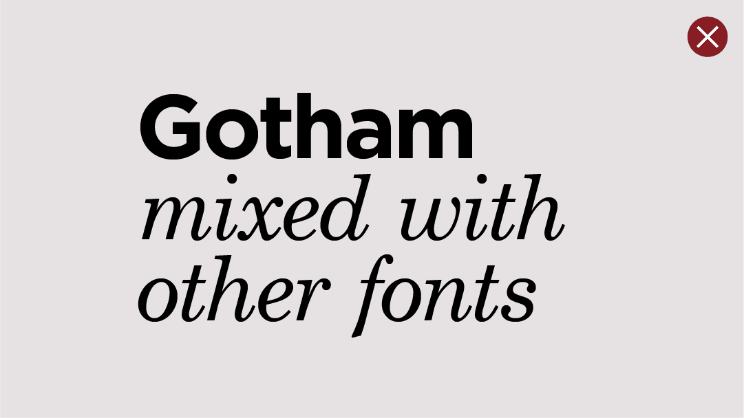
Don’t use unapproved fonts or mix them with Gotham.
Don’t mix weights in headlines.
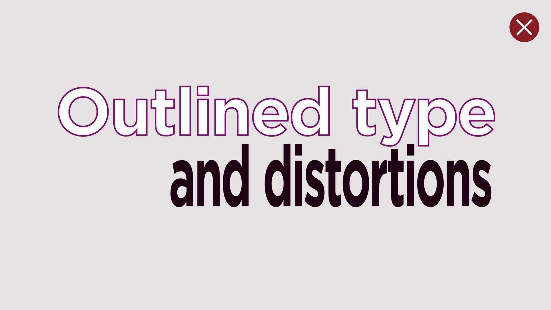
Don’t outline type, use three-dimensional effects, special treatments, or distort type in a composition.
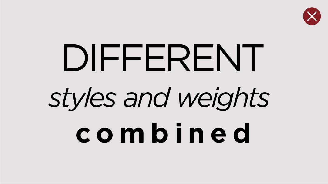
Don’t vary the size of typography or use all caps or italics within prominent messaging. Don’t mix weights in headlines.

Don’t set typography too close to the Lenovo logo or use elements to unite the logo to the type.

Don’t place words, phrases or sentences in shapes or objects.
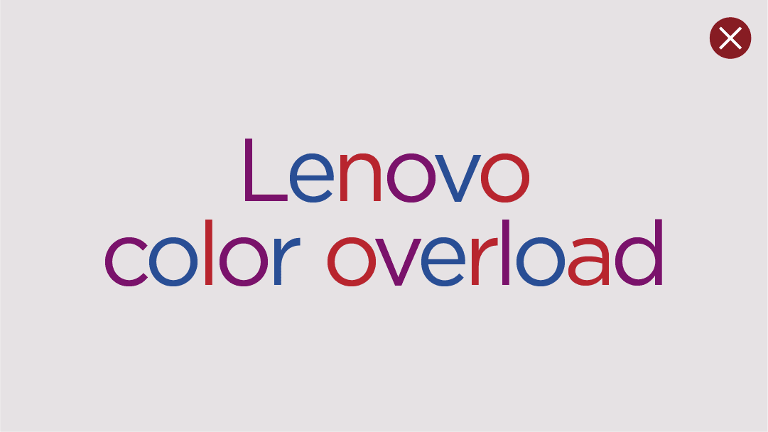
Don’t use an excess of color in typographic treatments.

Don’t use a drop shadow on type, instead always use the appropriate color contrast for backgrounds.

Don’t orient type in different directions to create odd breaks in communication structure.
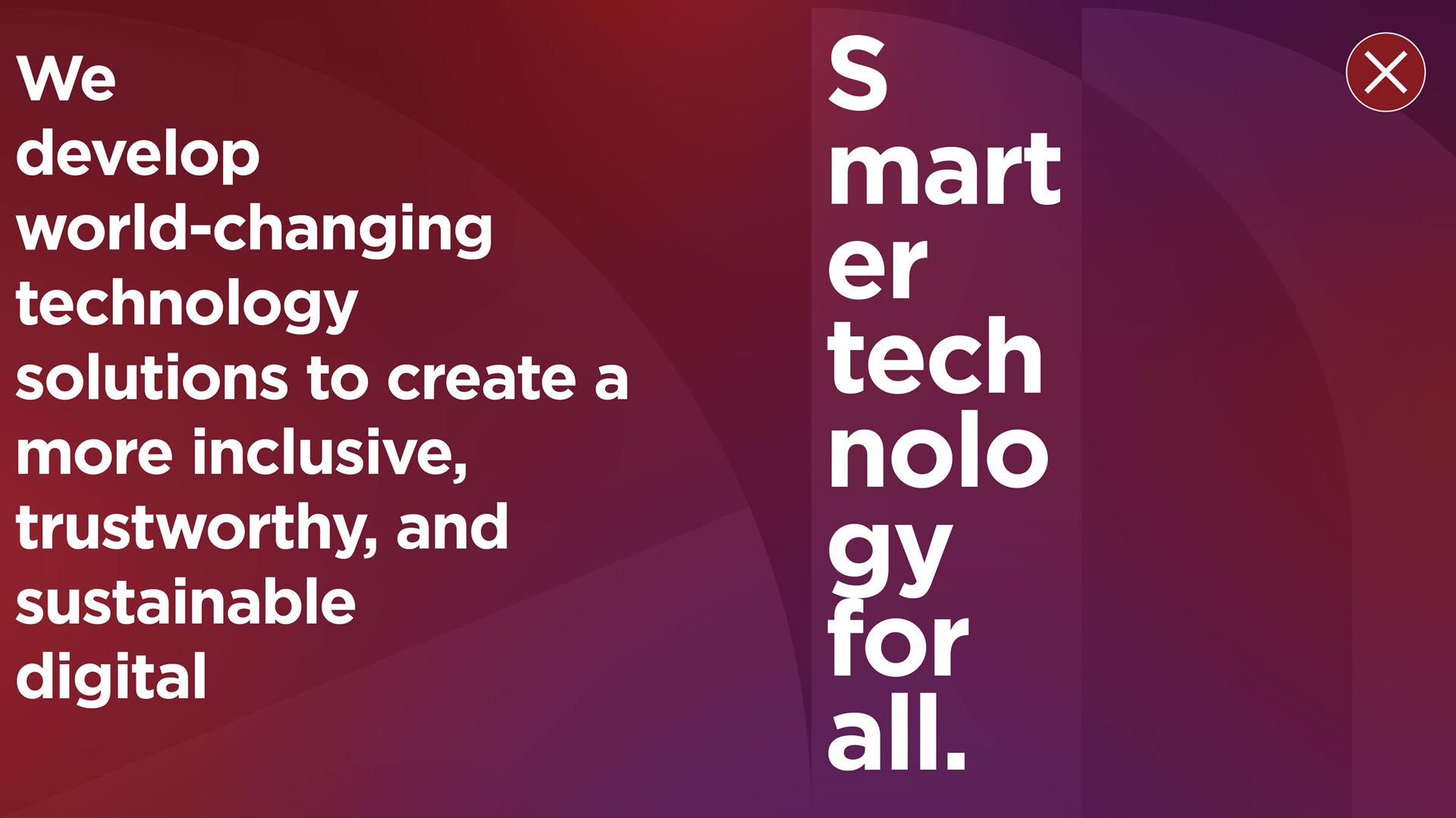
Don’t constrain type to the areas inside the shapes of the alpha pattern.
Additional guidance
Calligraphy and handwritten typography
Calligraphy and handwritten fonts come in and out of trend. This style can be interpreted as casual or unrefined depending on the selection. We recommend not to use these styles in our brand communications.
Licensing
Many fonts (like Gotham) require a license to be installed and used by an individual user. If you do not own a license to a font – do not use that font without first purchasing.
Questions?
Email the Brand Help Desk for questions about typography.
